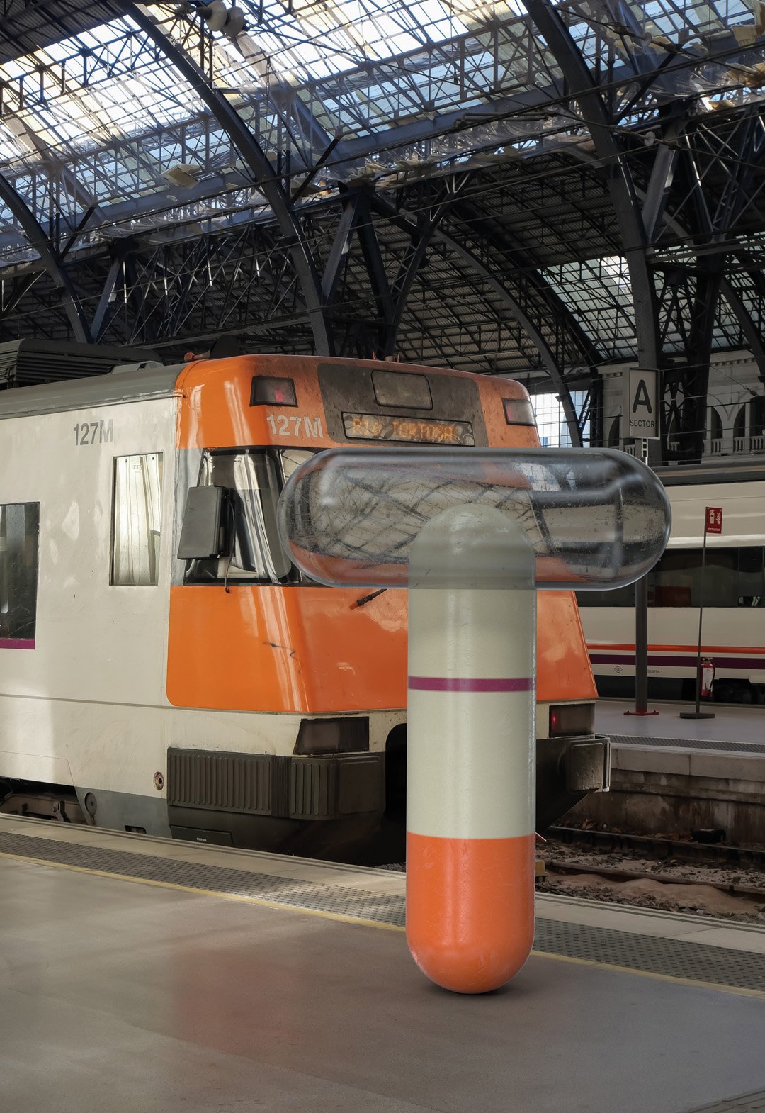
Juliette Foxtrot / Identity - Packaging
BackJuliette Foxtrot is a craft beer produced in Córdoba, Argentina, which is part of the Bravante family of craft beers.
Each beer style represents a fictional character related to maritime codes and the sea. In this case, Juliette represents a mermaid, with a French style of illustration and composition, directly related to the feelings of its flavour.
Team: Mauricio Gallegos / Gastón Garcia Aja
Photo: Alvaro Picca
Córdoba, Argentina (2017)
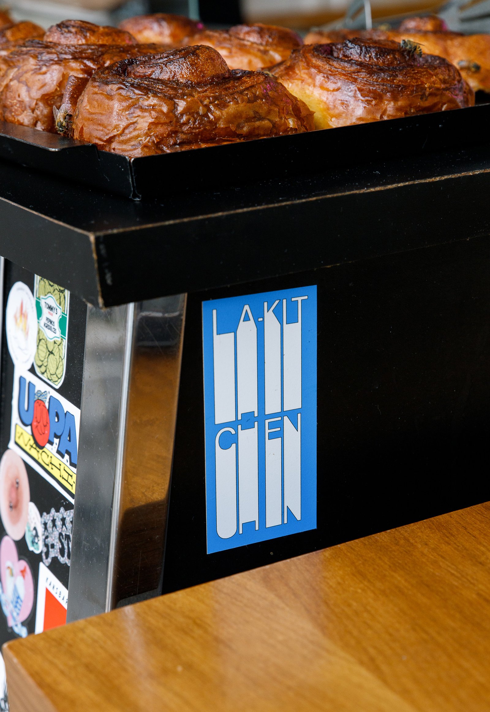
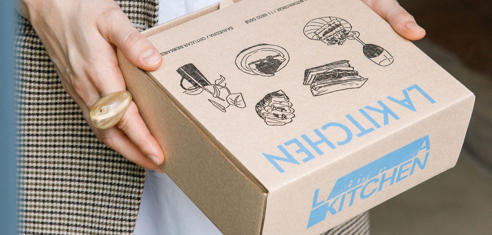
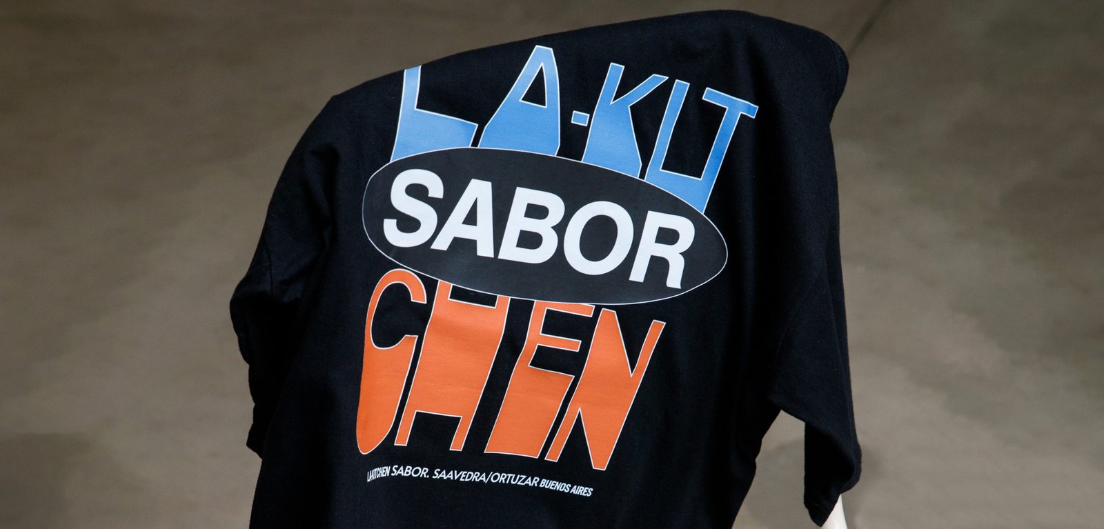
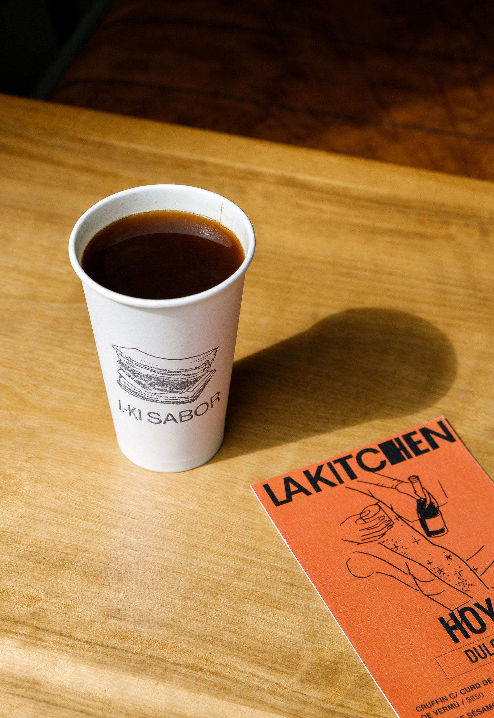
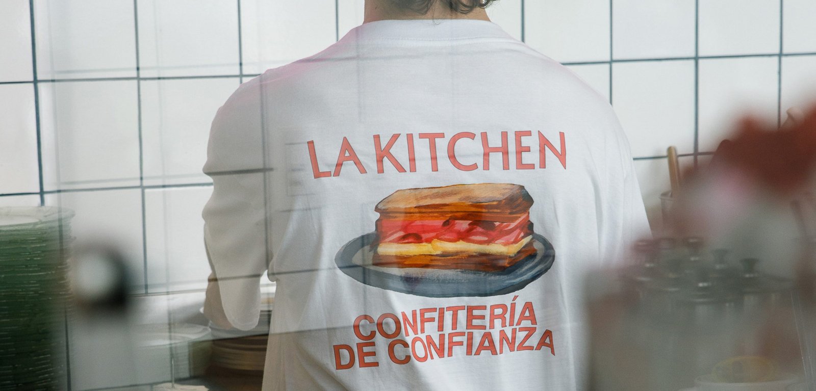
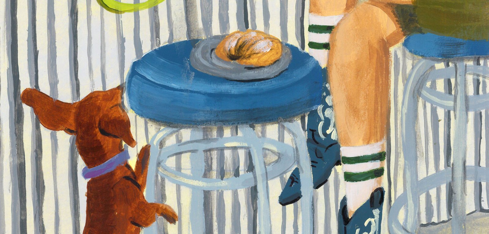
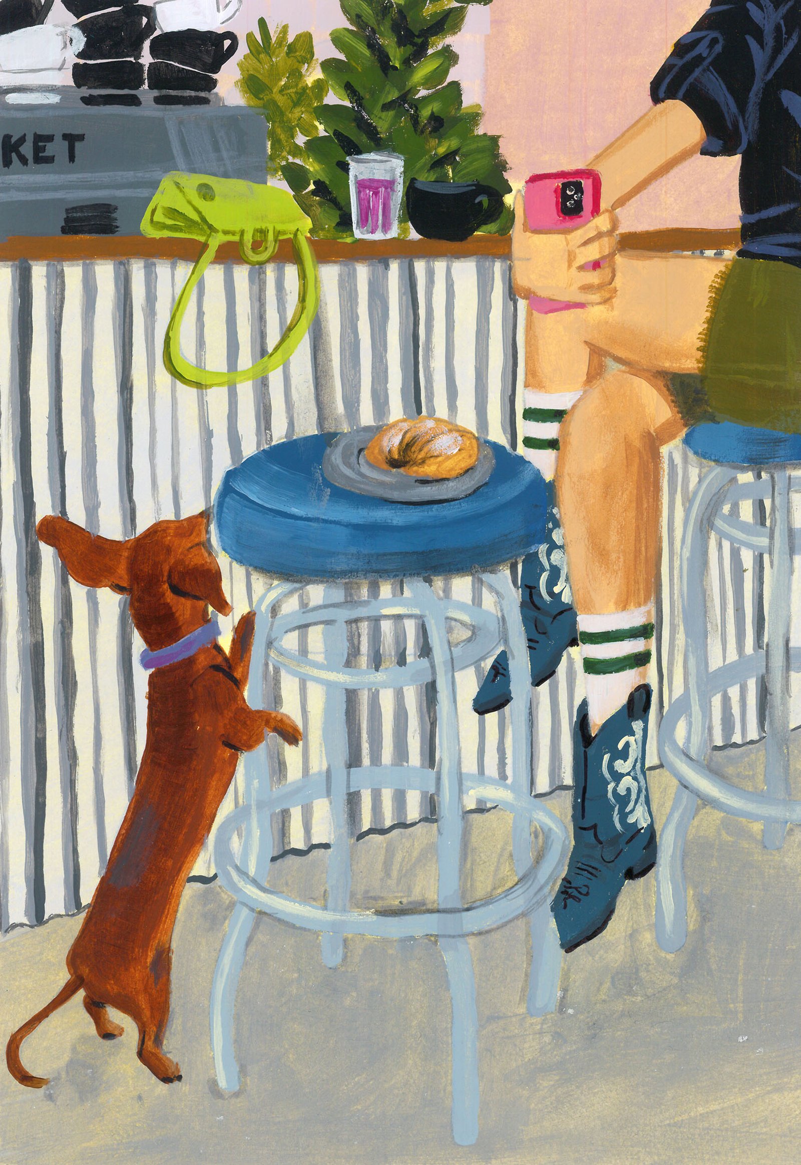
La Kitchen / Concept Development - Illustration - Packaging - Revamp
BackInspired by the traditional aesthetics of the Parisian boulangerie, adapted to the particular and beautiful local culture of the neighborhoods of Buenos Aires.
This new identity tries to combine the transparency and honesty that exists in its products and experiences, from a sincere and fun design.
Everything is related to the "mix", to the handmade, to an attitude of disruption against the established, and to a non-graphic identity full of content that makes its public, true fans.
A multi-logo strategy combined with handmade acrylic illustrations by the brilliant Gabriel Sciutto continues the idea of brand expression.
Team: Gastón Garcia Aja / Mauricio Gallegos
Illustration: Gabriel Sciutto
Photo: Malena Fradkin
Buenos Aires, Argentina (2023)
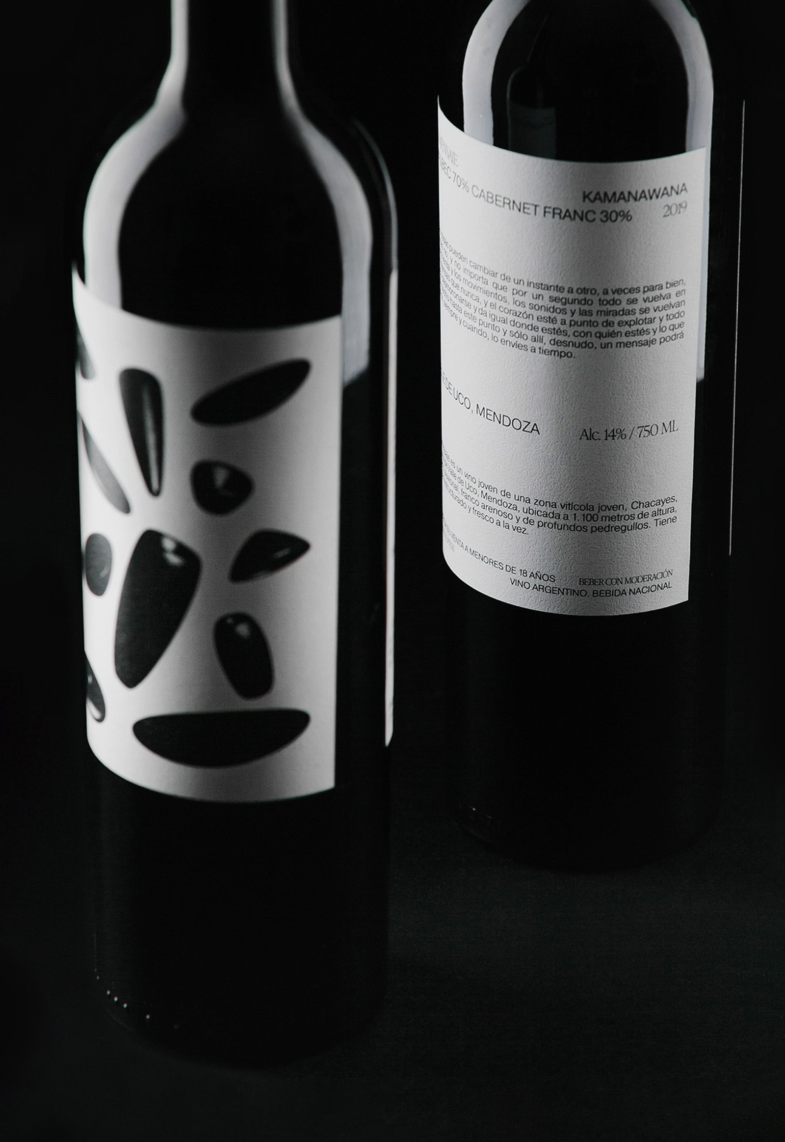
El Mensaje / Graphic Design - Packaging
BackSometimes it's not about front or back labels, or the size of the logo (if it has one) or the aesthetics. Sometimes it's about emotions.
"El Mensaje" is a limited edition of 80 bottles of a high rated blend wine produced in Mendoza, Argentina, in a special (maybe dramatic) harvest.
During the night, after a day of harvesting, the group in charge of the project suffered an armed robbery, the movie kind of robbery if you are asking. One of the members managed to send a Whatsapp message, warning his friends who were not in the farm about what was happening. Thanks to this message, the police were on the scene and only material losses were reported.
The design tries to represent the whole story in a single image: that moment when everything falls apart, plates, food and glasses fly through the air, and it seems to happen in slow motion. The copy of one of the labels keeps the way of speaking that we usually use to describe a bad situation.
Team: Gastón Garcia Aja / Mauricio Gallegos
Photo: Pablo Gasparini / Stefanía Paz
Mendoza, Argentina (2021)
Siempre Sale El Sol / Graphic Design - Illustration
BackSiempre Sale el Sol en Barcelona is a single from Luisa y el Mar's first album. The flower is an element that represents the band and that accompanied Mauro Meloni, Delfina Mancardo and Ola Wagner in their journey from their first concerts to the recording of the album.
This design piece was part of the merch for Luisa y el Mar's London tour, an update of the previous artwork from the live session at the Xefo Gallery, in Poblenou, Barcelona.
Team: Gastón Garcia Aja / Mauricio Gallegos / Delfina Mancardo
Barcelona, Spain (2024)
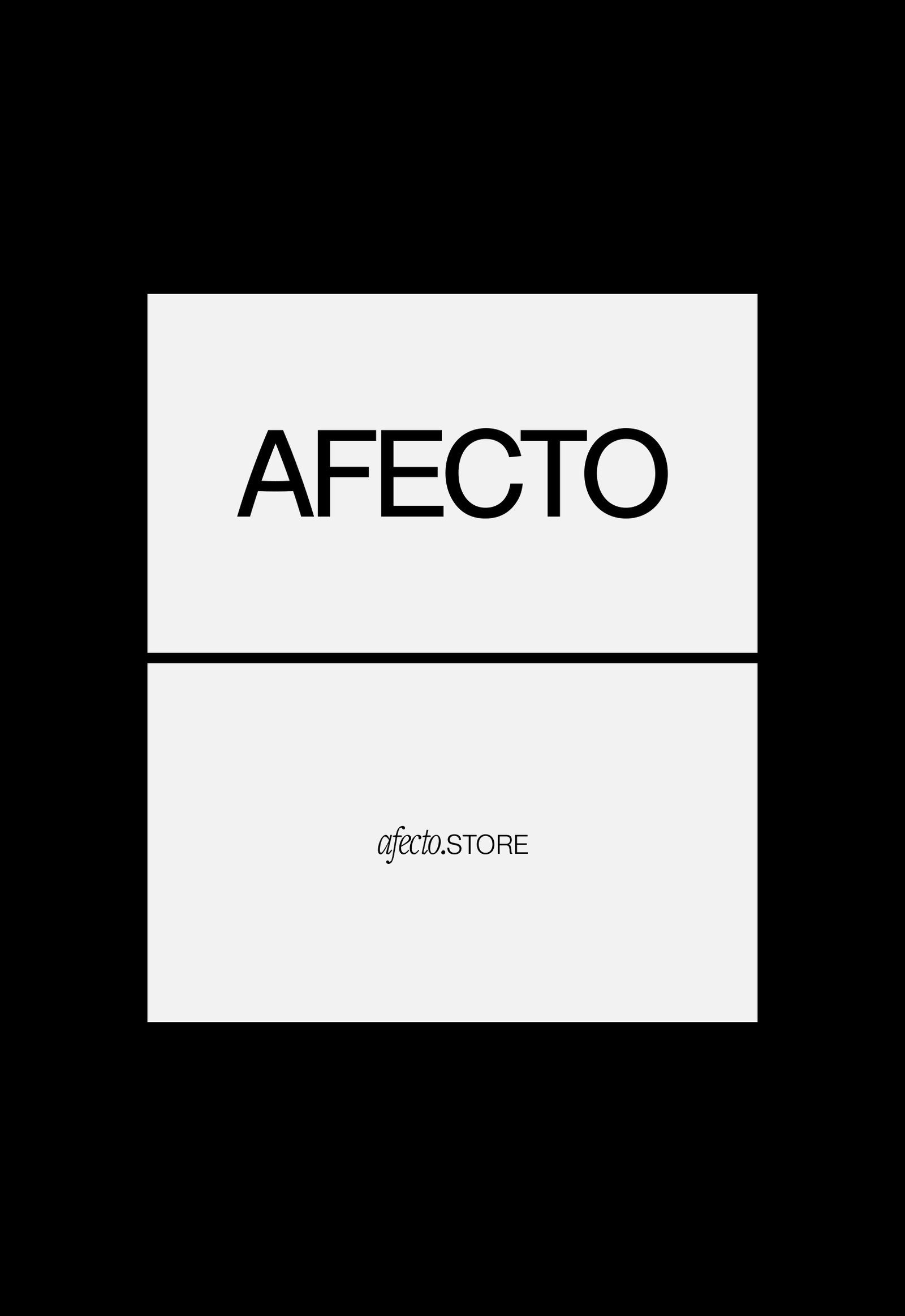
Afecto / Animation - Concept Development - Identity - Naming
BackAfecto is a design brand that creates unique and label-free pieces related to ceramics, glass art, photography, design, clothing and furniture. Just like many other things we experiment and share dairy, the objects can carry stories, personality and expression. Unlike mass-produced brands, Afecto offers special pieces that are redefined by the person who gets them.
Its graphic identity attempts to represent this feeling. Organic forms open to meaning, constantly moving and adapting, ready to tell a countless number of stories.
The logo is a statement, focused on the literal meaning of the word; close to love. The magic hands of the sisters that carry out the creation of each piece are represented in the brand icon. The rest of the system is intended to follow the products in the real world, adding a new digital universe to communicate all the beautiful things happening around this project.
Team: Gastón Garcia Aja / Guadalupe Cáceres / Candelaria Cáceres
Animation: Mauricio Gallegos
Barcelona, Spain (2023)
Feria / Illustration - Packaging
BackFeria juices are part of a sub-brand of market products and food produced by Cafería. Feria keeps the main elements of Cafería's identity, with the particularity that the characters show urban situations representing the brand concept without referring to the product. This graphic system allows labeling any type of products preparing the sub-brand to be marketed in other shops.
The intention of Feria is to bring local and healthy products to a new audience, inside and outside the coffee shop, adding value to the main brand.
Team: Mauricio Gallegos / Gastón Garcia Aja
Photo: Derio Ilari
Córdoba, Argentina (2021)
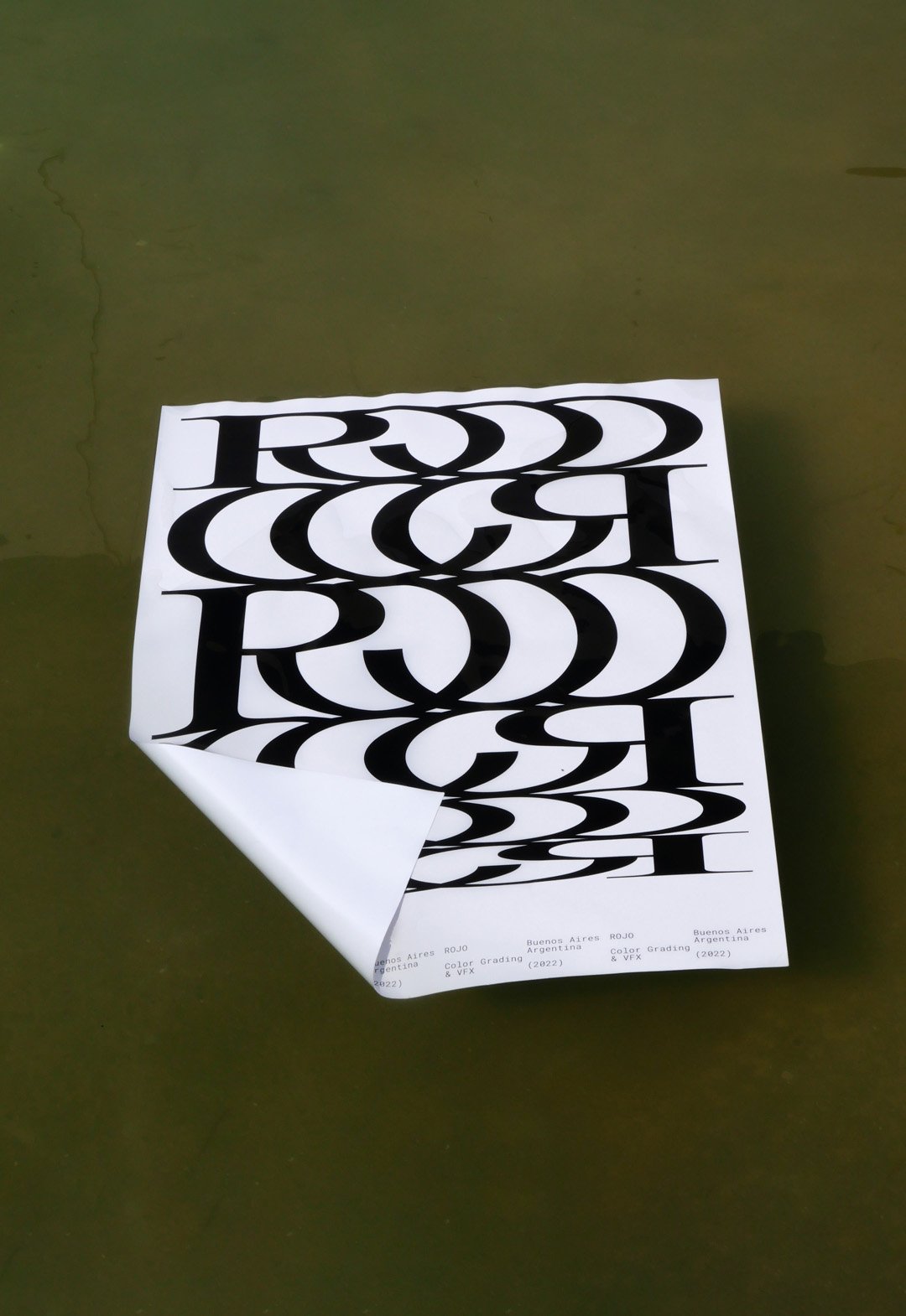
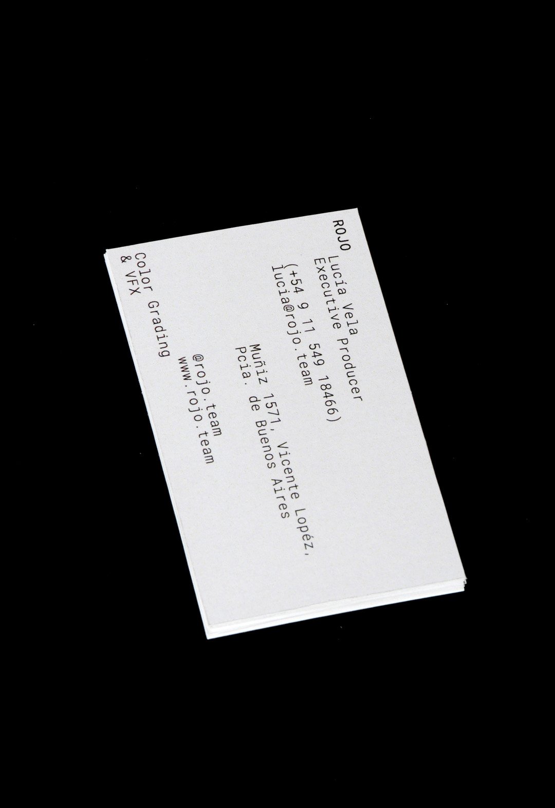
Rojo / 3D - Animation - Revamp - Type
BackROJO is a visual effects, post-production and colour grading studio working for films, TV series and commercials, based in Buenos Aires, working all over the world.
This company works with a large number of studios and collaborators, at different stages of an audiovisual project. In other words, they are always part of a team that is bigger than themselves.
This new logo tries to represent that connection in a very strong and aesthetic way, showing a lot of personality without the need for an elaborate graphic system.
The Rojo logo is big, bold and black. The background colors of the identity change all the time, whether they are video images or textures of real elements.
Buenos Aires, Argentina (2022)
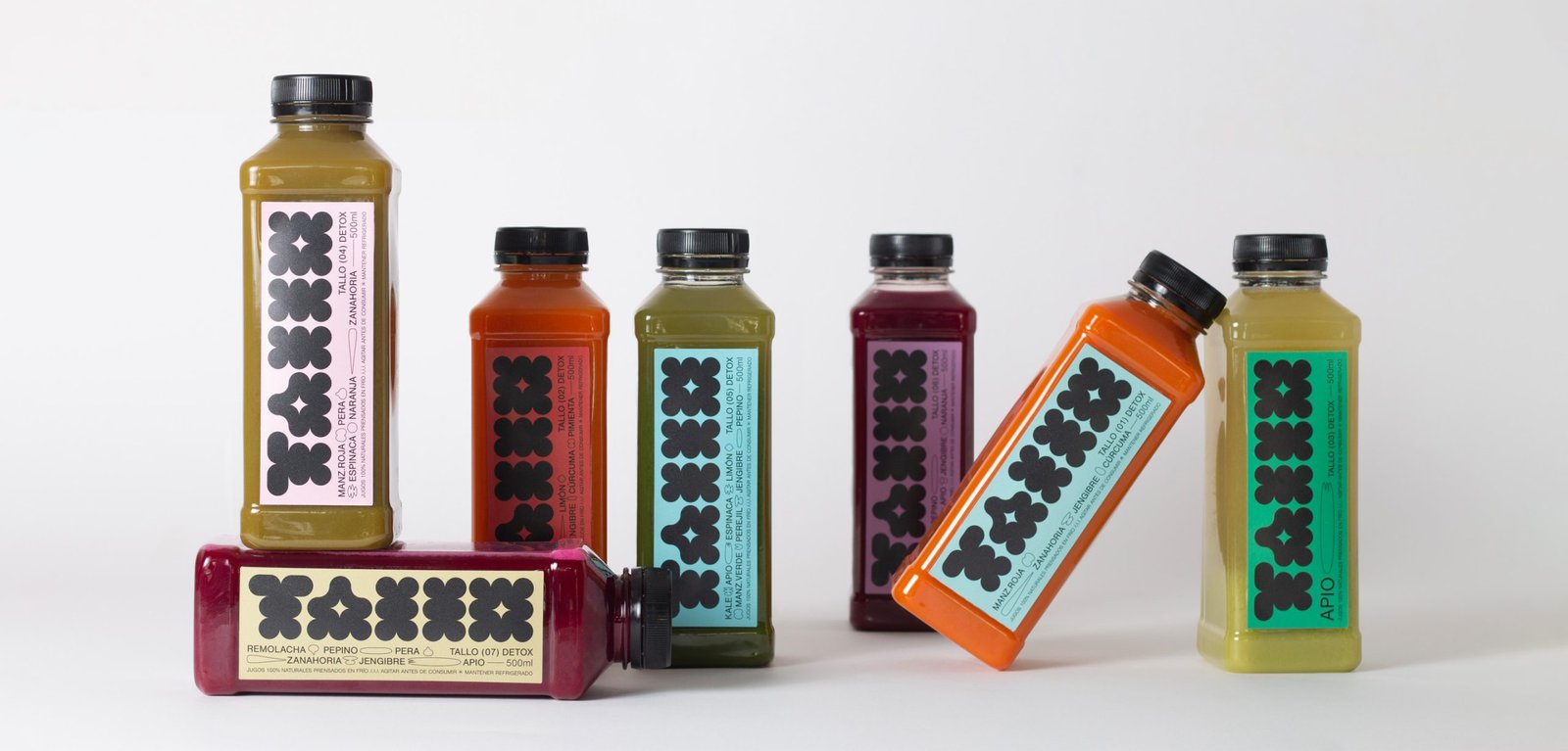
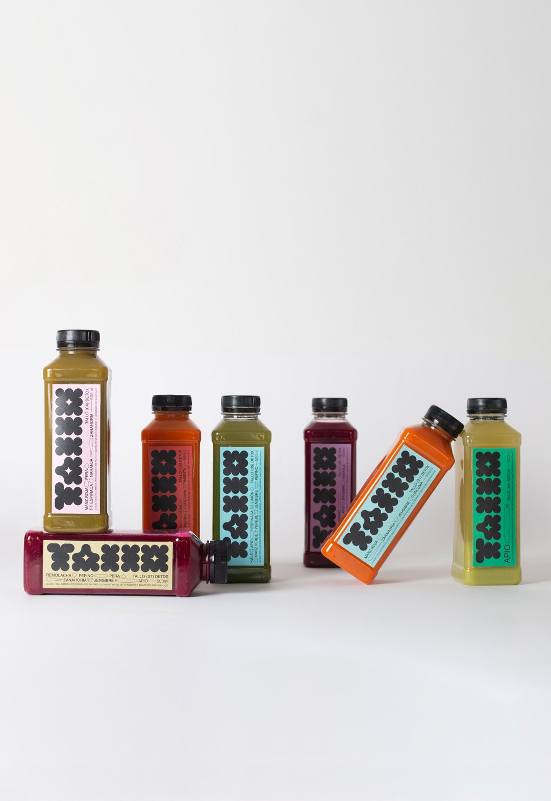
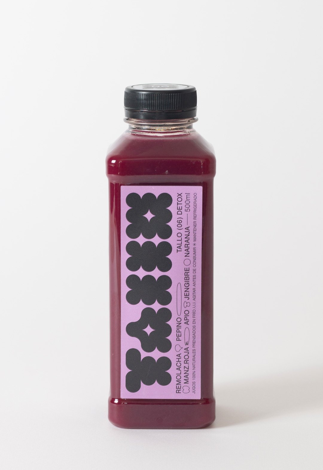
Tallo / Identity - Packaging - Type
BackTallo is a local brand of cold-pressed juices produced in Buenos Aires, Argentina. The graphic idea represents a flower or a fruit instead of the stem itself (Tallo), which brings naturalness to the brand.
The colors of these juices are vibrant and pastel at the same time. The labeling palette vibrates in both directions, to create a fun environment focused on highlighting the main color of the juice.
In addition to a bold geometric logo, the design contains small lineal illustrations to represent the ingredients. This aesthetic is a reference to the drawing of the daughters of the brand's creators.
Team: Gastón Garcia Aja / Mauricio Gallegos
Photo: Rocío Fernandez Charro
Buenos Aires, Argentina (2022)
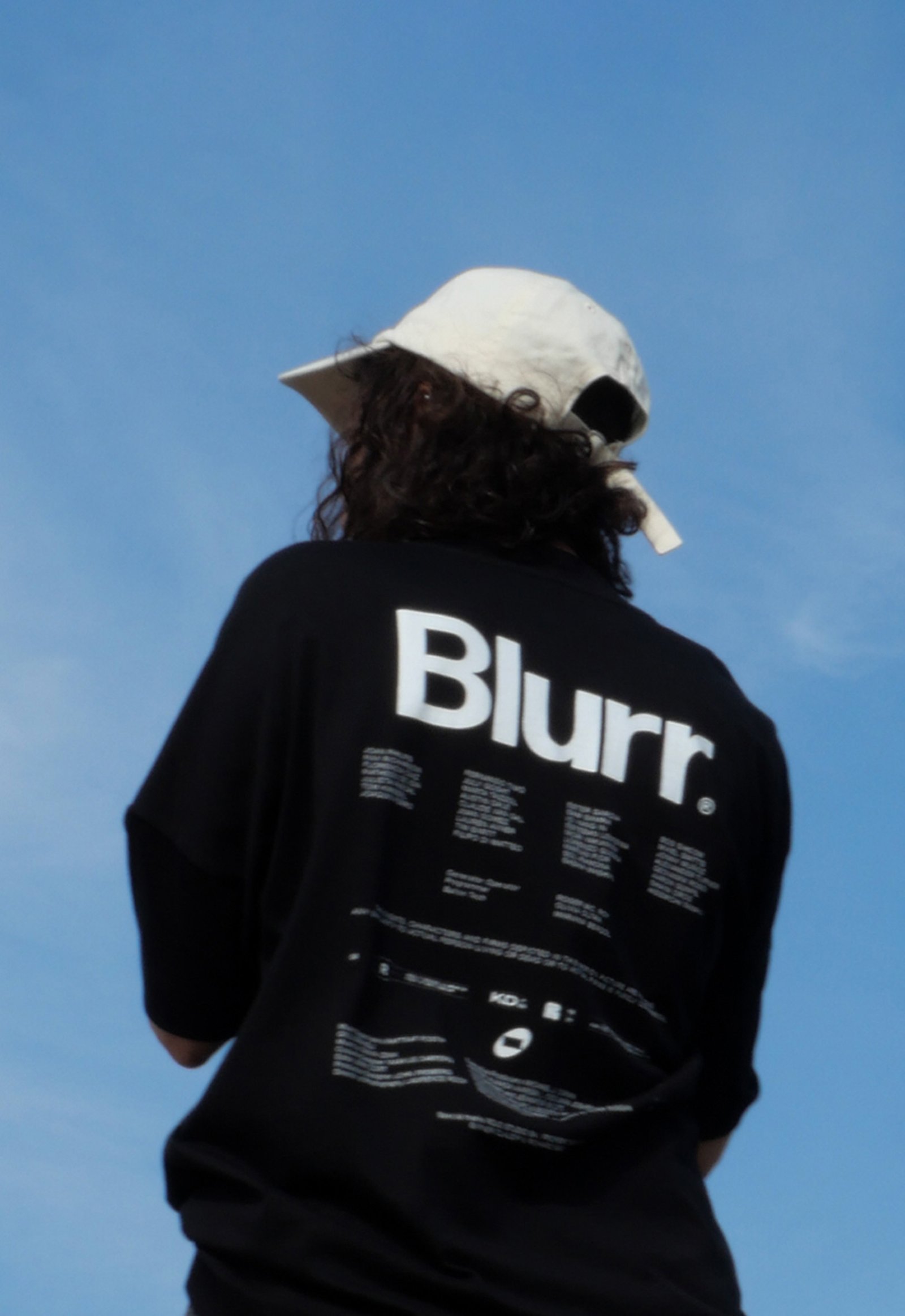
Blurr / Naming - Revamp
BackBlurr is a new independent film production company based in Buenos Aires, Argentina. The company tries to tell stories focused in an alternative and emotional way, outside the mainstream.
The narrative of "The Tunnel". Connecting a story with the audience, moving from one point to another, is usually represented by a bridge. In Blurr, this connection happens symbolically through a tunnel; a subaltern and different path. This new form appears throughout the graphic system, as a seal of a different and unique way of storytelling.
Graphically, the icon emerges from the oval shape of the mountain tunnels, together with a 16:9 horizontal rectangle representing a movie screen.
This new shape is displayed in dynamic layouts and static patterns, and alongside compositions inspired by the graphic art of credit titles.
Team: Mauricio Gallegos / Gastón Garcia Aja
Animation: Martín Cañadell
Buenos Aires, Argentina (2023)
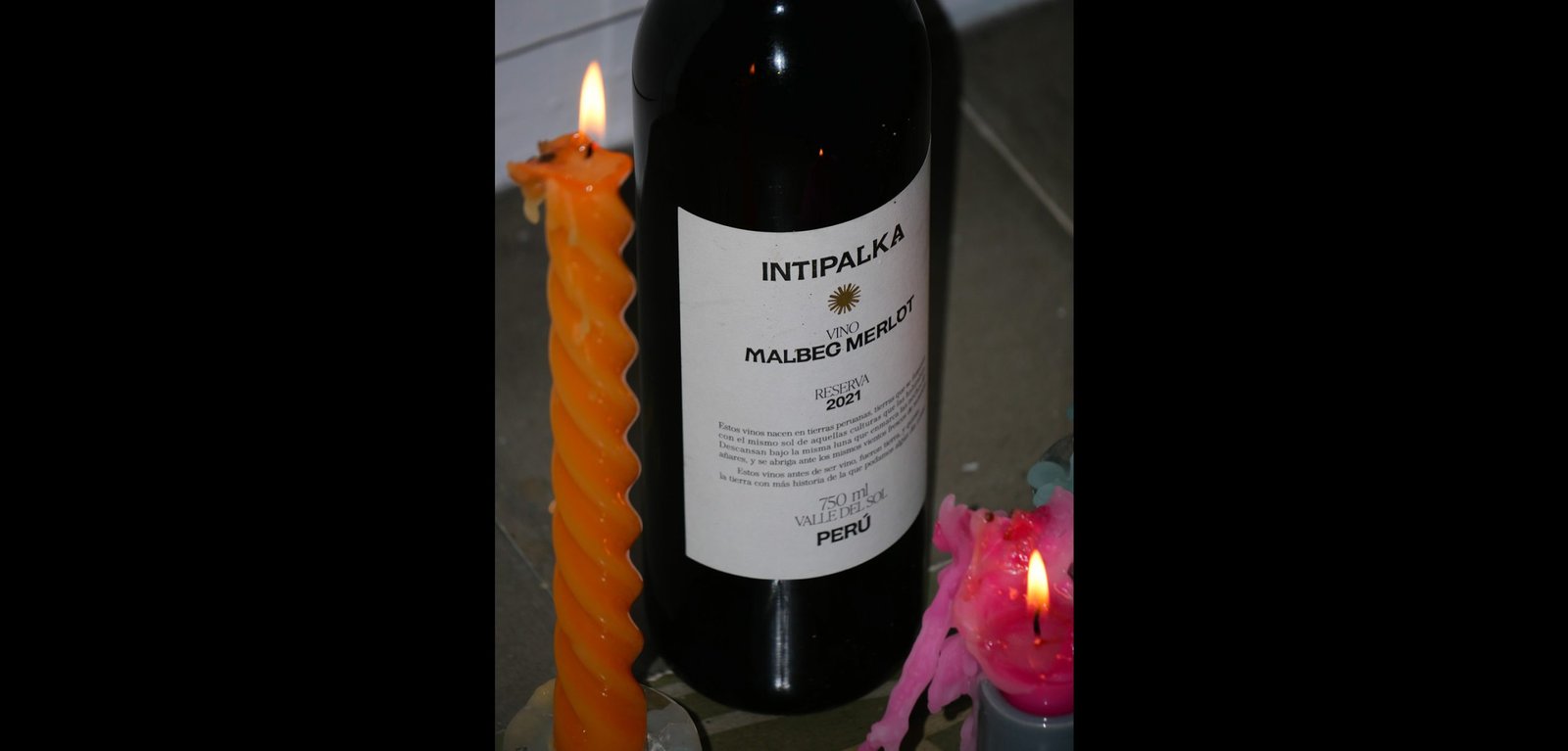
Intipalka Wine Type / Revamp - Type
BackIntipalka is the most important wine producer and wine brand in Peru. The microclimate of the Valle del Sol in Ica region allows it to produce incredible wines, despite not being in the traditional wine belt area.
The redesign process was based on the idea of positioning not only the wine brand in the international market but also to position the Peruvian wine category at a global level.
Under the concept that Peruvian wine must represent Peru, and understanding that the most honest way to share culture is through language, we developed an entire typography born in Peru, representing it in the most subtle and respectful way possible, without obviates.
The letters came from forms found in “Introducción a la Iconografía Andina by Ruiz Durand Jesus”, a book that brings together the aesthetics of the different native Peruvian peoples throughout history.
Each letter has between 3 and 5 variants that represent Peruvian culture's diversity and plurality.
This typography is applied in labeling Intipalka’s large family of wines and in much of its communication and content.
The new brand feeling provides a greater sense of belonging to both the brand and the category, inside and outside Peru, maintaining and improving the appreciation of the quality of both.
Colab: Fibra
Team: Gastón Garcia Aja / Mauricio Gallegos / Andrea Gálvez
Animation: Martín Cañadell
Music: Jin Yerei
Lima, Perú (2022)
Obra / 3D - Animation - Identity - Naming
BackObra is a coding and web development partner agency based in Barcelona working worldwide.
Its focus is to provide programming and web development solutions to any kind of digital project, under the premise of materializing the ideas of design studios and clients.
The identity represents connection and versatility from a simple graphic element such as a line. Lines can be transformed into letters and many other things, just as a code can make almost any idea come true.
Digital projects allow things to move, to be interactive and expressive. The 3D development matches that idea.
Team: Gastón Garcia Aja / Mauricio Gallegos
Team: Martín Cañadell
Barcelona, Spain (2024)
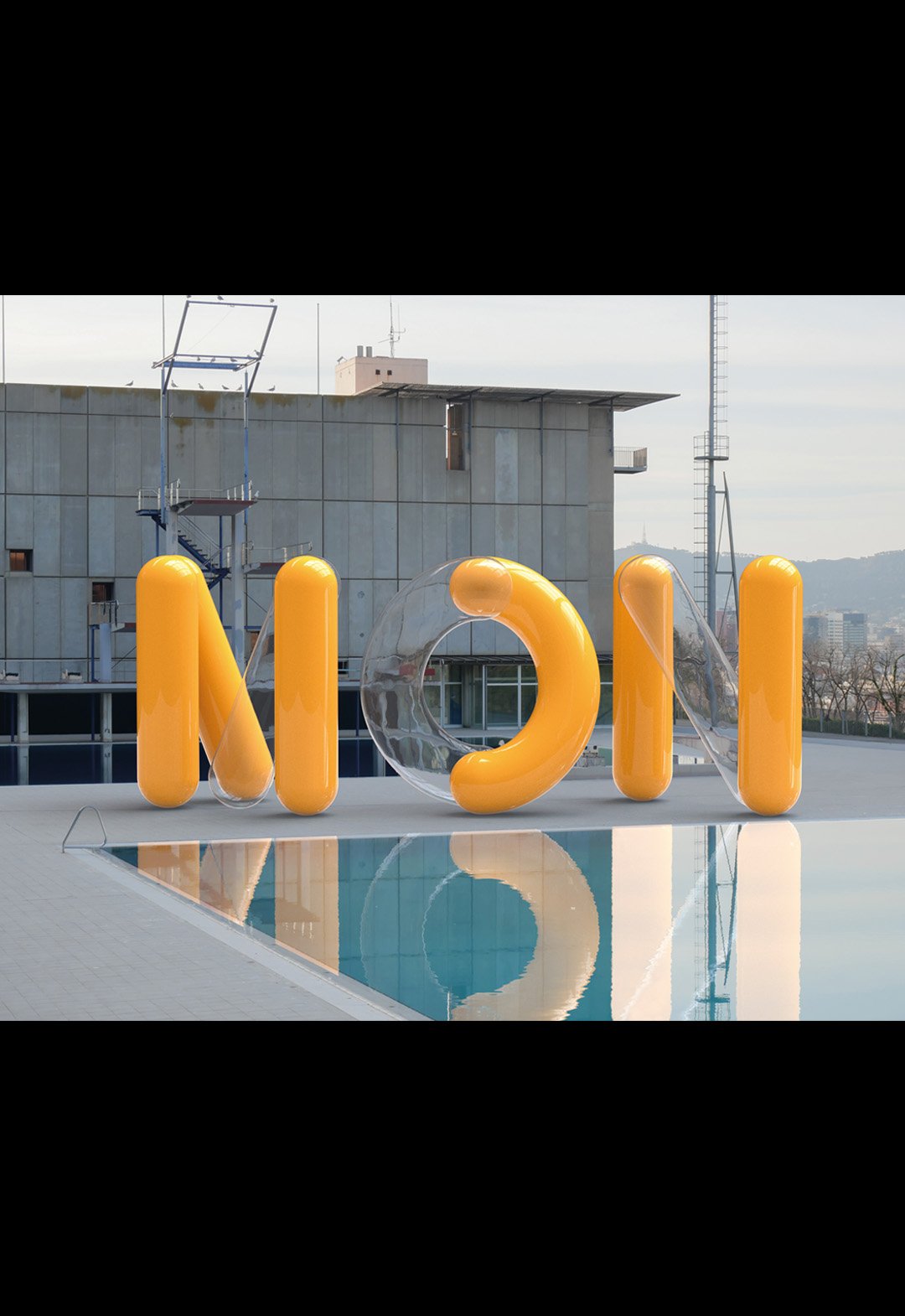
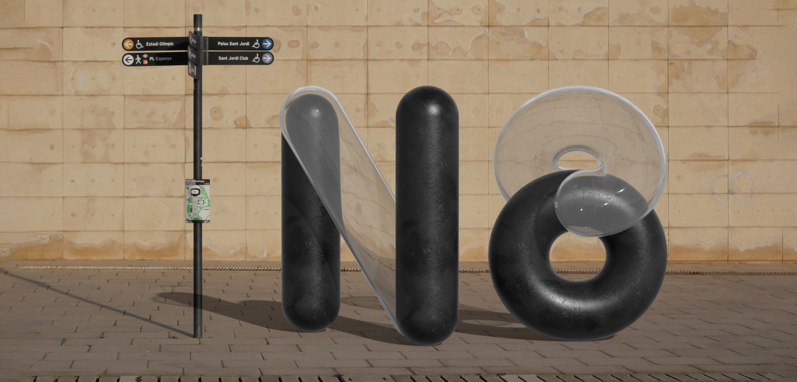
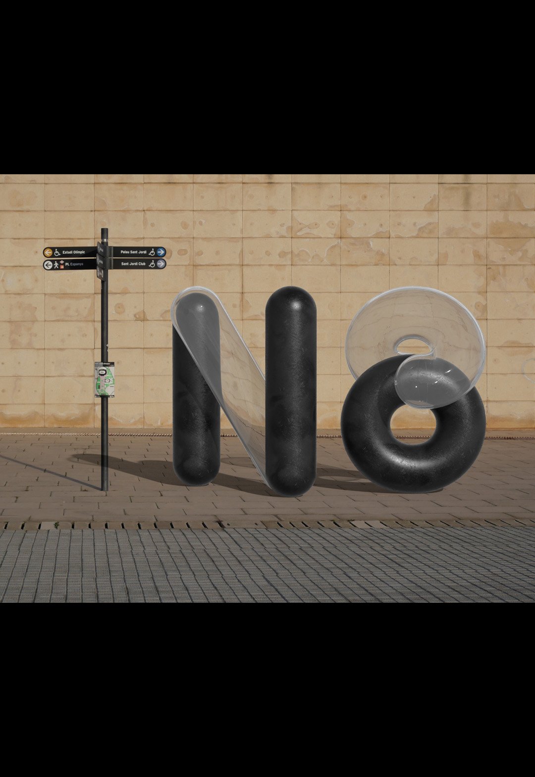
Monocle Type / 3D - Animation - Graphic Design - Type
BackMonocle is a visualization typography inspired by ancient monocles, magnifying glasses and their refractive indexes. By passing a magnifying glass over any object, what happens inside changes and gives rise to something new and unpredictable.
The project recreates the shapes and colors of digital environments, mixing 3D development with animation.
The exercise of mixing worlds was done in the streets of Barcelona, recreating random compositions of a real light moving towards a 3D object and back.
The end result looks new and old at the same time, but best of all, it looks real, because it is real.
Team: Mauricio Gallegos / Martín Cañadell / Gastón Garcia Aja
3D: Martín Cañadell
Photo: Gastón Garcia Aja
Barcelona, Spain (2021)
Media Markt / 3D - Concept Development - Titles
BackThese are some titles and animations we made for the latest Media Markt commercial, directed by Bode Brod Mueller and produced by TPFilm.
Media Markt is a German multinational company that sells electronic products all over Europe. The titles and animations for this project were part of the annual ad directed by Bode Brod Mueller and produced by TPFilm. The exercise "Let's Go" mixes fonts and movements on the range to express power and energy.
Team: Mauricio Gallegos / Martín Cañadell / Gastón Garcia Aja
3D & Animation: Martín Cañadell
Director: Bode Brod Mueller
Production Company: TPFilm
Frankfurt, Germany (2022)
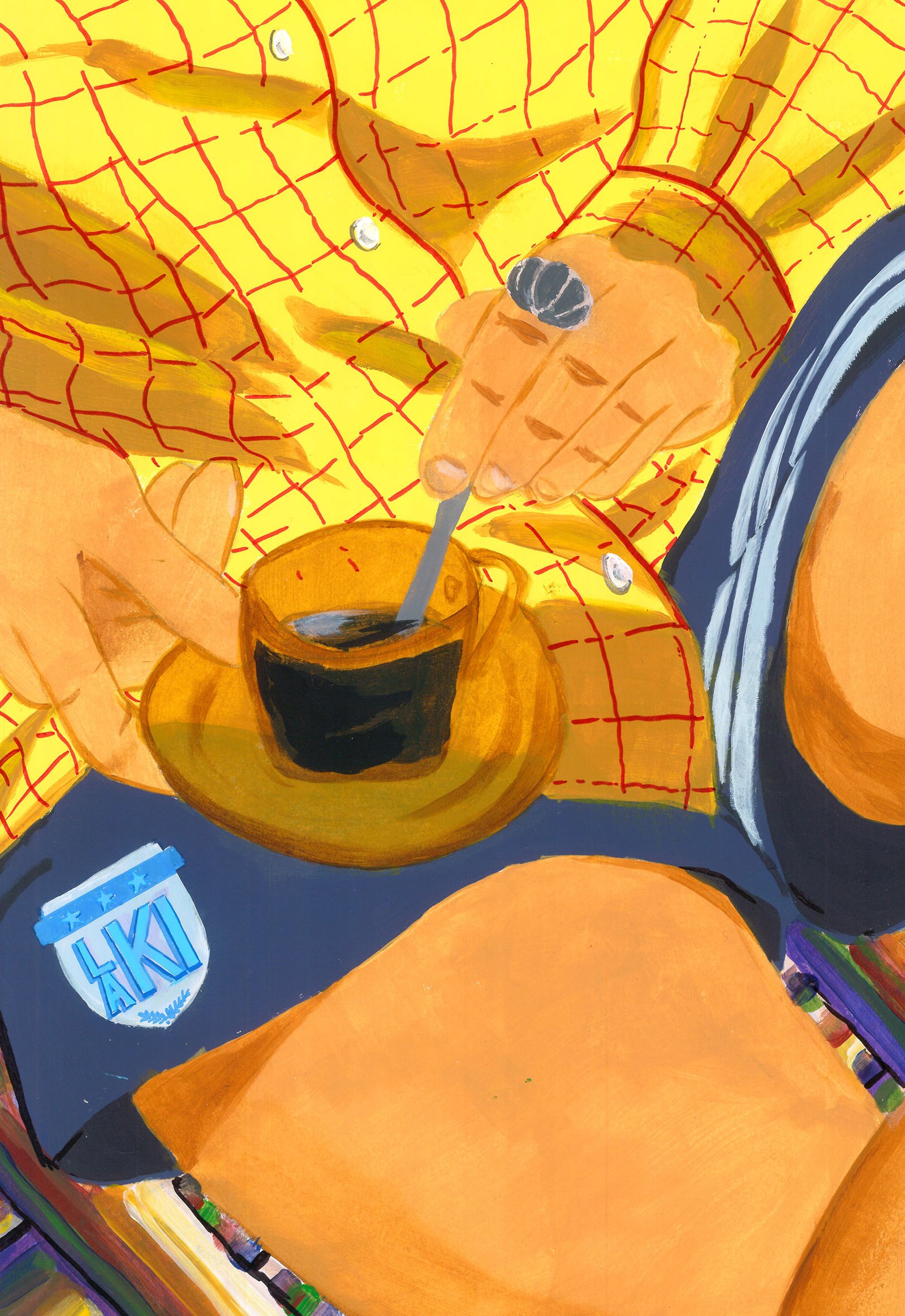
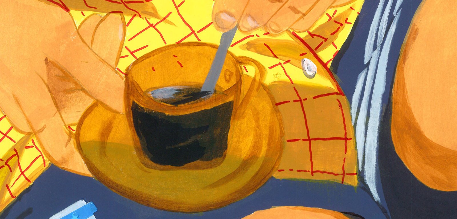
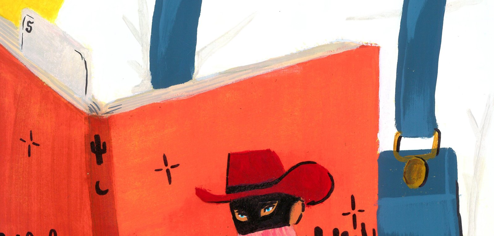
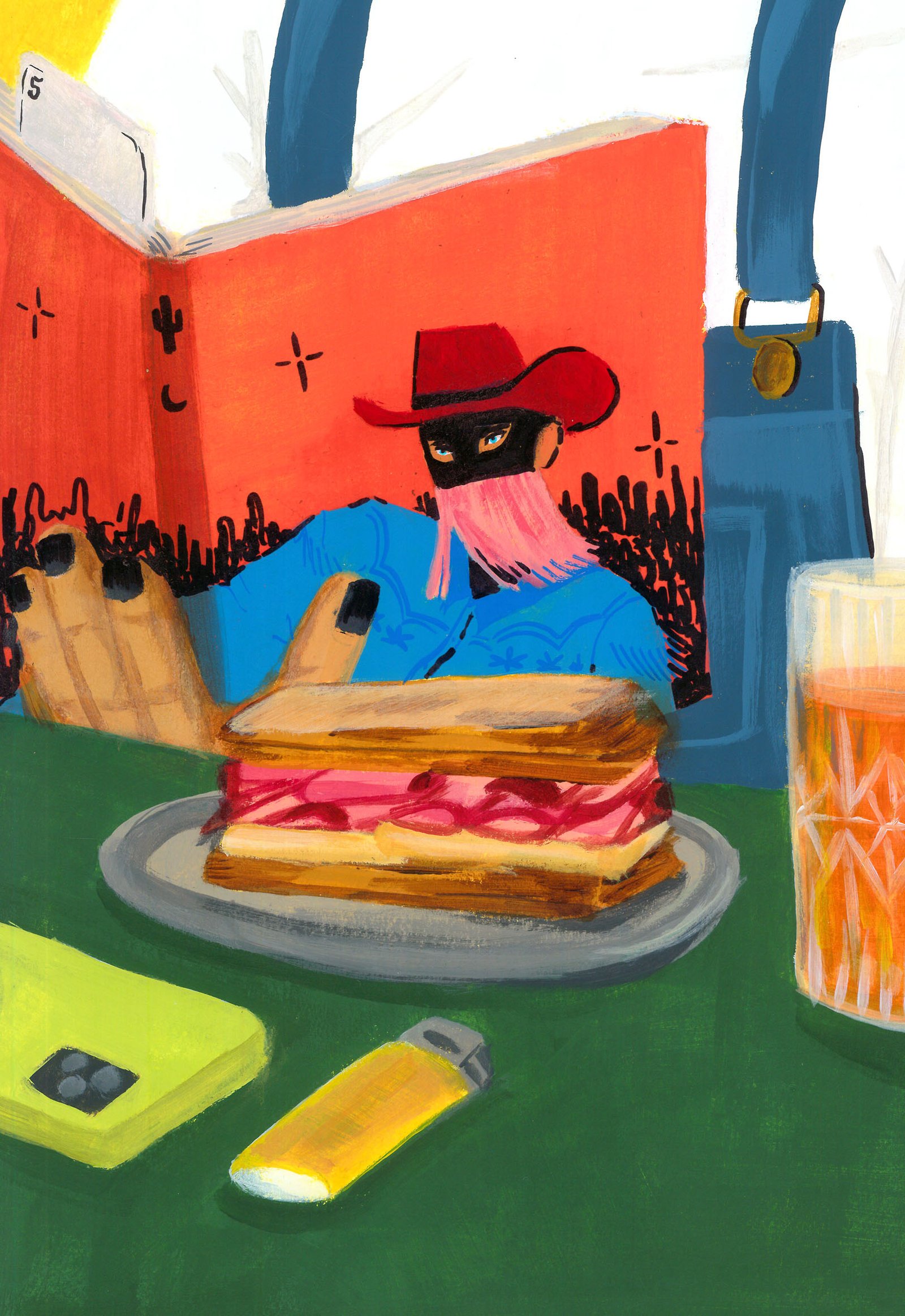
La Kitchen Illustrated / Art Direction - Illustration
BackThese illustrations by Gabriel Sciutto tries to represent the essence of LA-KI; a handmade product, with dedication, love and time, and a close service.
The idea builds a universe of situations related to coffee and its products, focusing on people and their interaction with the place.
The main aesthetic of the illustrations allows to generate a context in which details and hidden messages take centre stage, making these pieces, small stories of the daily life of LA-KI.
These works are a main part of LA-Ki's Revamp project. Today they are exhibited in communication pieces, shops, products and merchandise.
Art Direction: Gastón Garcia Aja / Mauricio Gallegos
Illustration: Gabriel Sciutto
Buenos Aires, Argentina (2022)
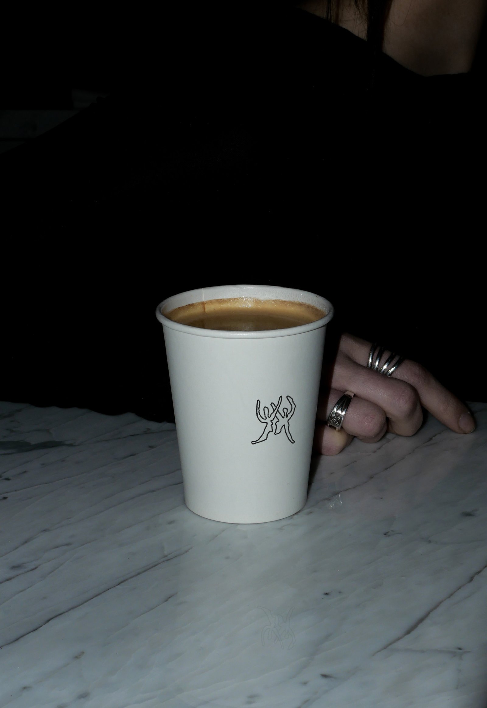
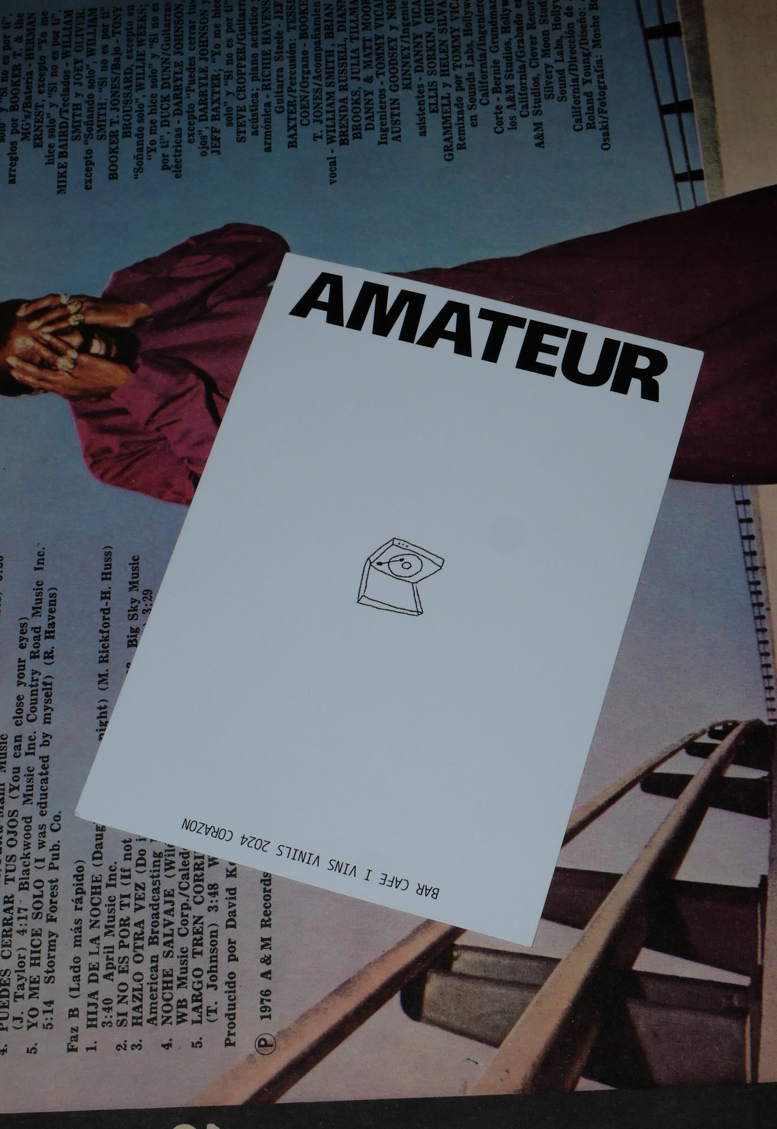
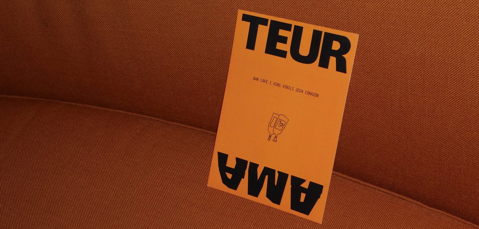
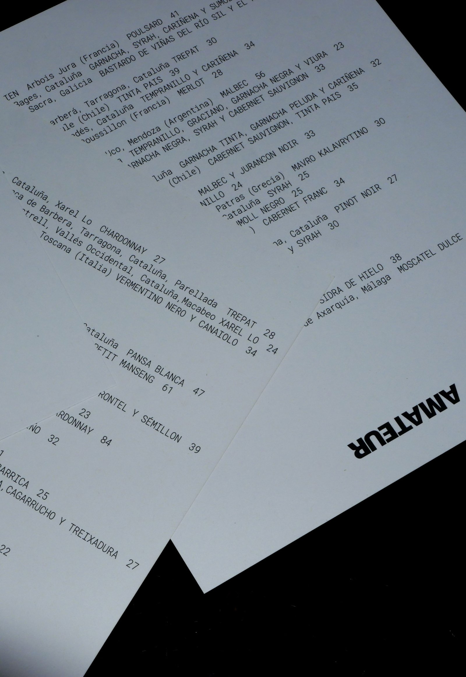
Amateur / Concept Development - Identity - Illustration
BackAmateur (The ones who love), is a new bar that brings together specialty coffee, natural wines, food to share and vinyl records playing in the heart of Poblenou, Barcelona. This place is a celebration of doing the things you love, passion and the intention to do it at your best.
The identity represents the contrast of the brand, matching the seventies vibe of the architecture and aesthetics of the whole project.
Retro typography, clean compositions support the stress free illustrations made by Pegamento, in line to create the graphic universe of the brand. Huge contrast, blank spaces, and details inspired in the vinyls spinning are all across the identity.
Colab: Pegamento
Team: Gastón Garcia Aja / Mauricio Gallegos
Illustration: Pegamento
Barcelona, Spain (2024)
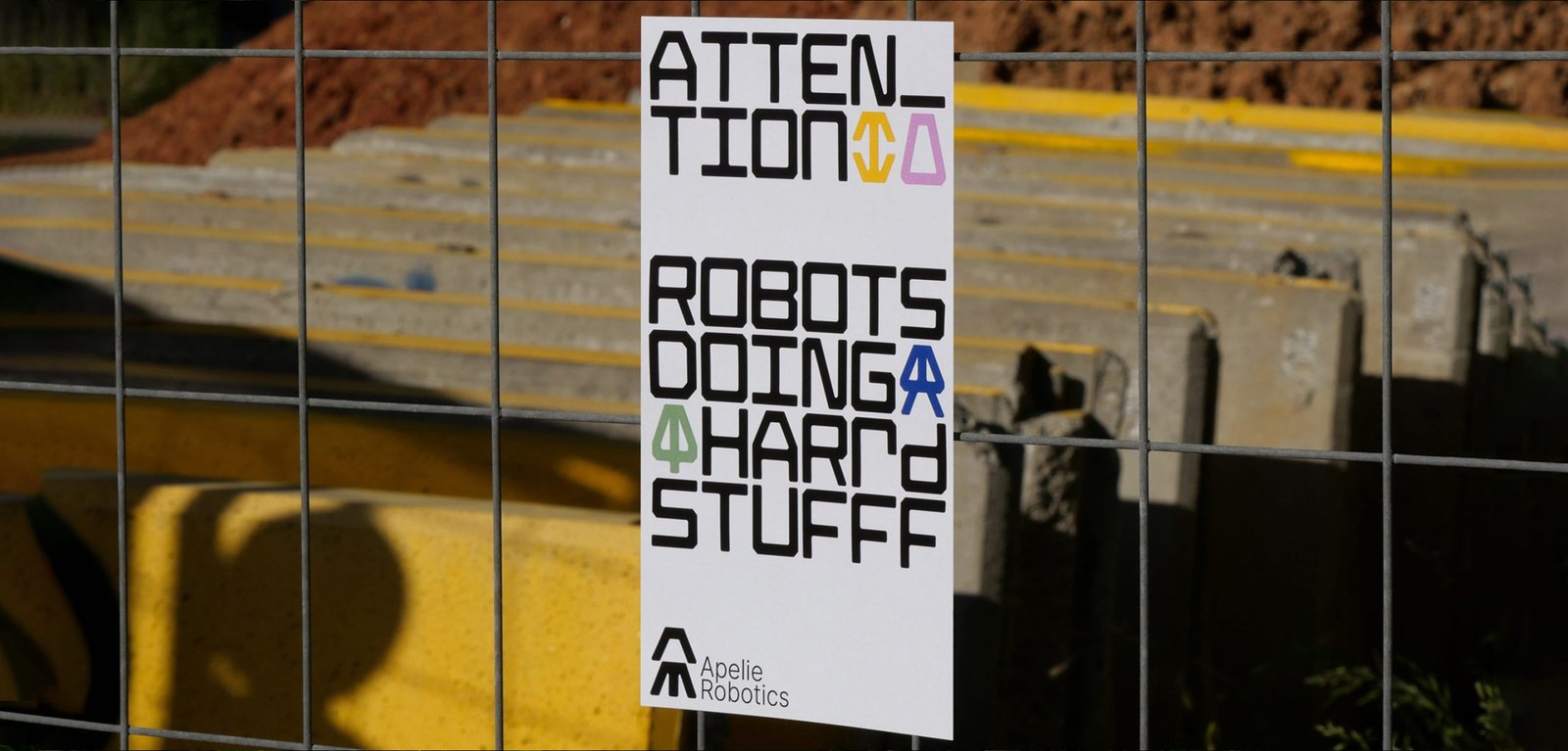
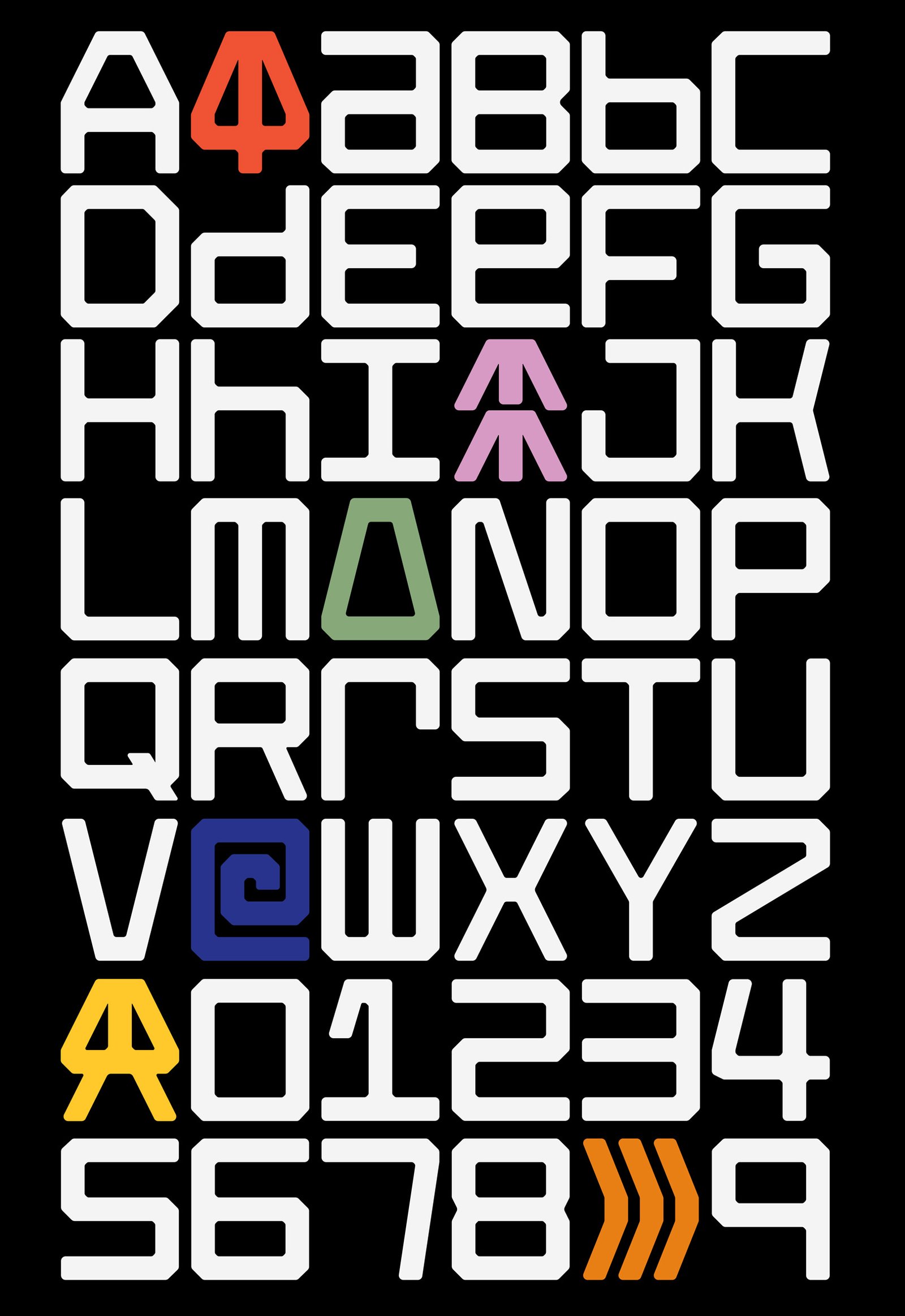
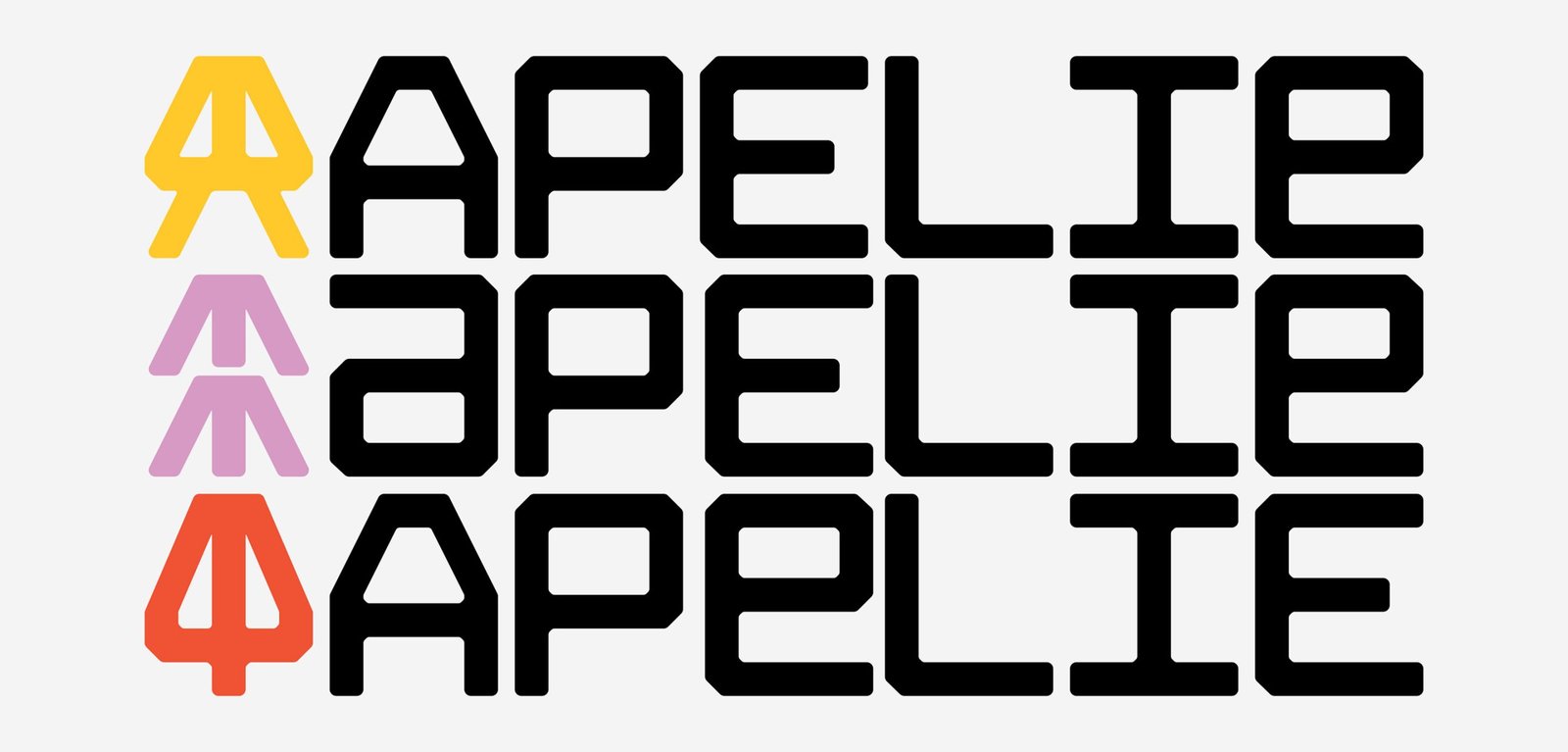
Apelie / Identity - Type
BackApelie is a new company that builds robots that help to solve multi-area problems. The team has the ideas, the tech, and the knowledge to create new robots for custom problems.
Inspired by the car brands that put an icon in front of the vehicle and the name on the back the project starts with the development of an entire typography, using the same main shapes to do the icon and the logotype. The rest of the system is based on grids that let the brand create many communication parts, digital, and print.
Part of this design project work on the final art of the aesthetic of the robots with 3D design and direction.
The identity navigates between old and new feelings, some nostalgia, binary language and symbols, and new ways to show it up. The inspiration for those feelings were Nasa, Nintendo, Star Wars, that kind of sensations summed up in this last thought; "let's make robots fun again, like when we were kids"
Team: Gastón Garcia Aja / Mauricio Gallegos
Animation: Martín Cañadell
Córdoba, Argentina (2022)
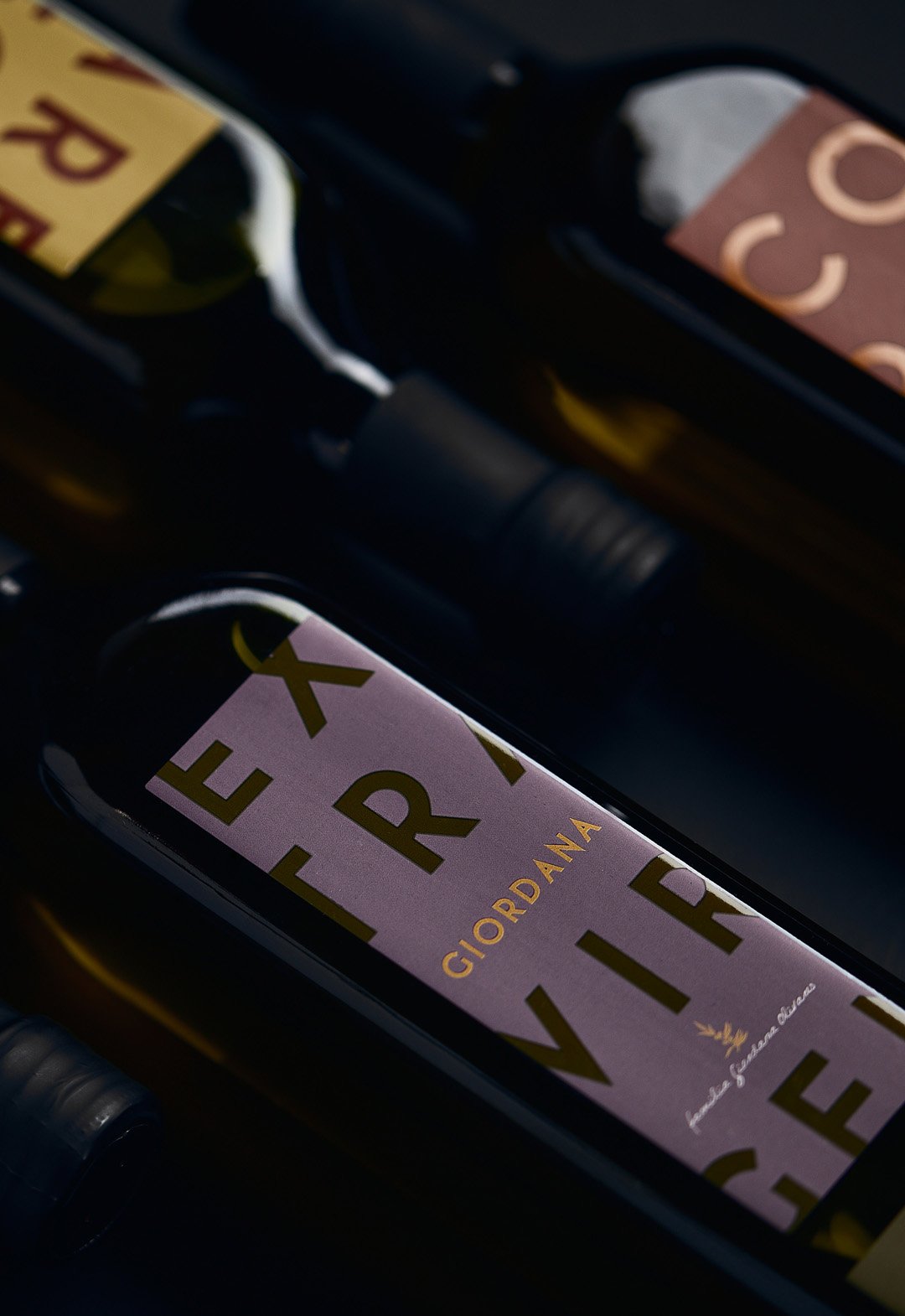
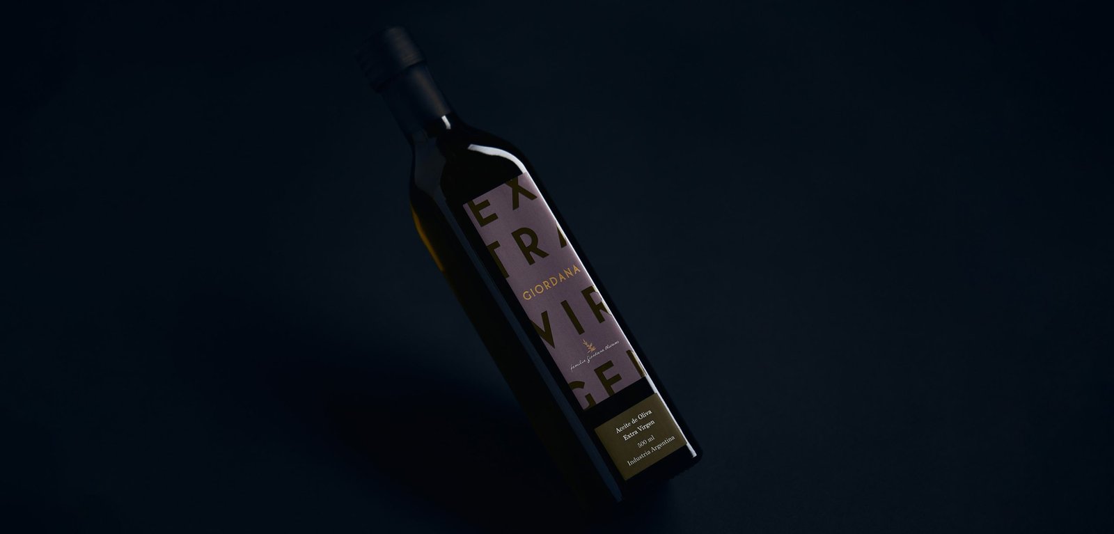
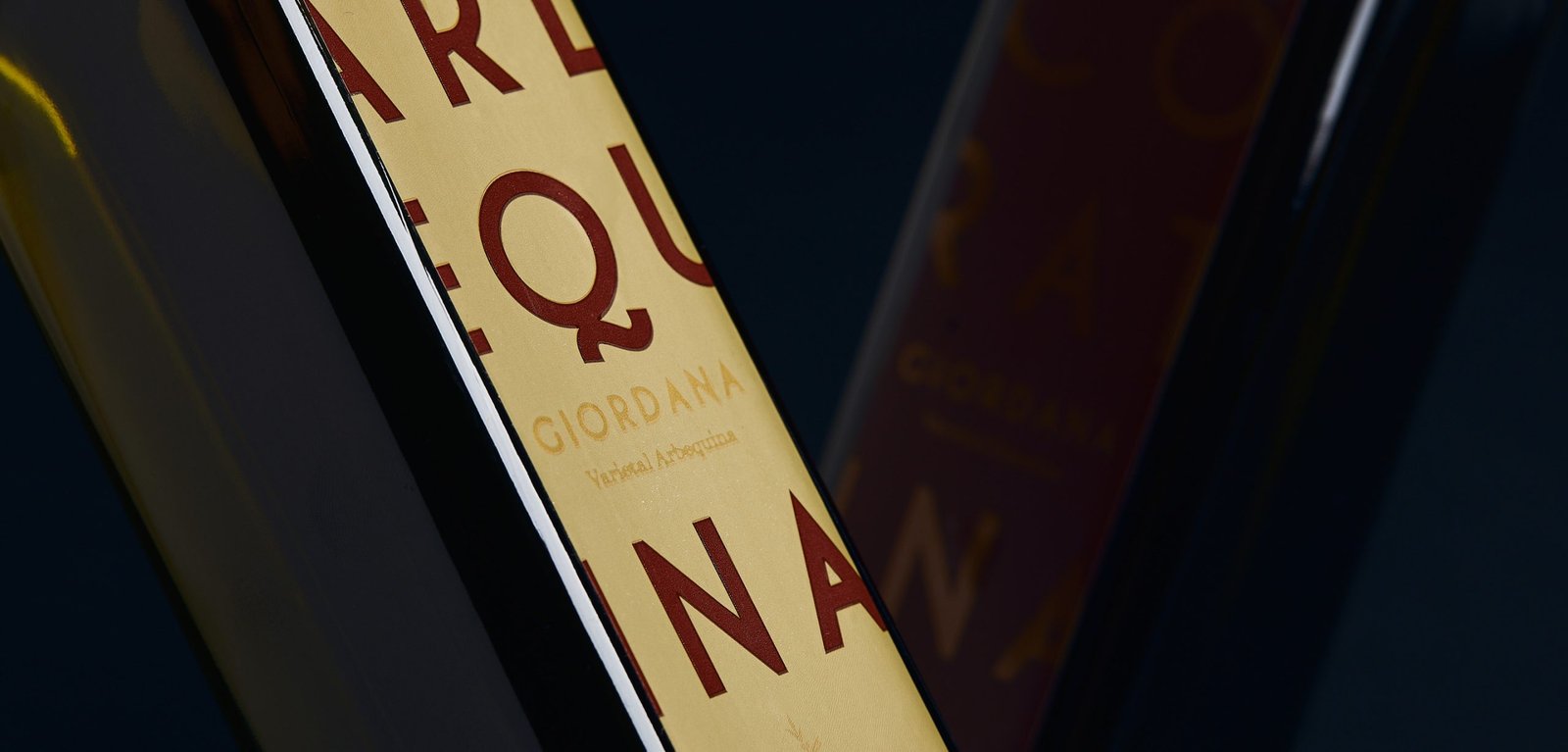
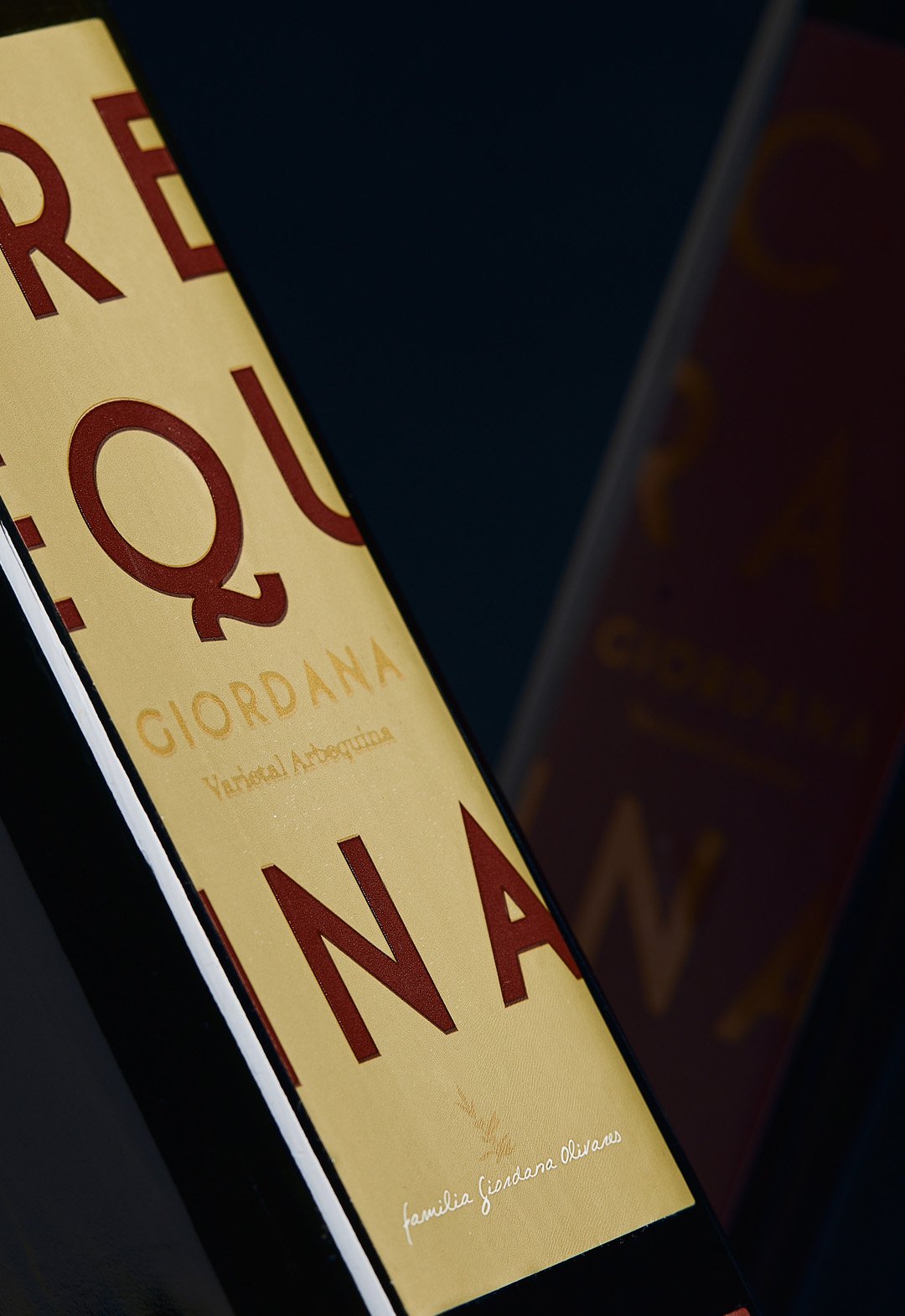
Giordana / Identity - Packaging
BackGiordana is an olive oil brand located in La Rioja, Argentina. The aim was to highlight the product on the store shelf with a color palette and a modern design based on typography.
The label prioritized the type of varietal over the brand, due to the positioning of the word Extra Virgin in the category. This was done by means of a two-color typographic game that highlights the added value of the product.
Giordana currently sells it in the Argentinean market and in some Mercosur countries, without undergoing any modification to the original design from 2014.
Team: Gastón Garcia Aja / Mauricio Gallegos
Photo: Alvaro Picca
La Rioja, Argentina (2014)
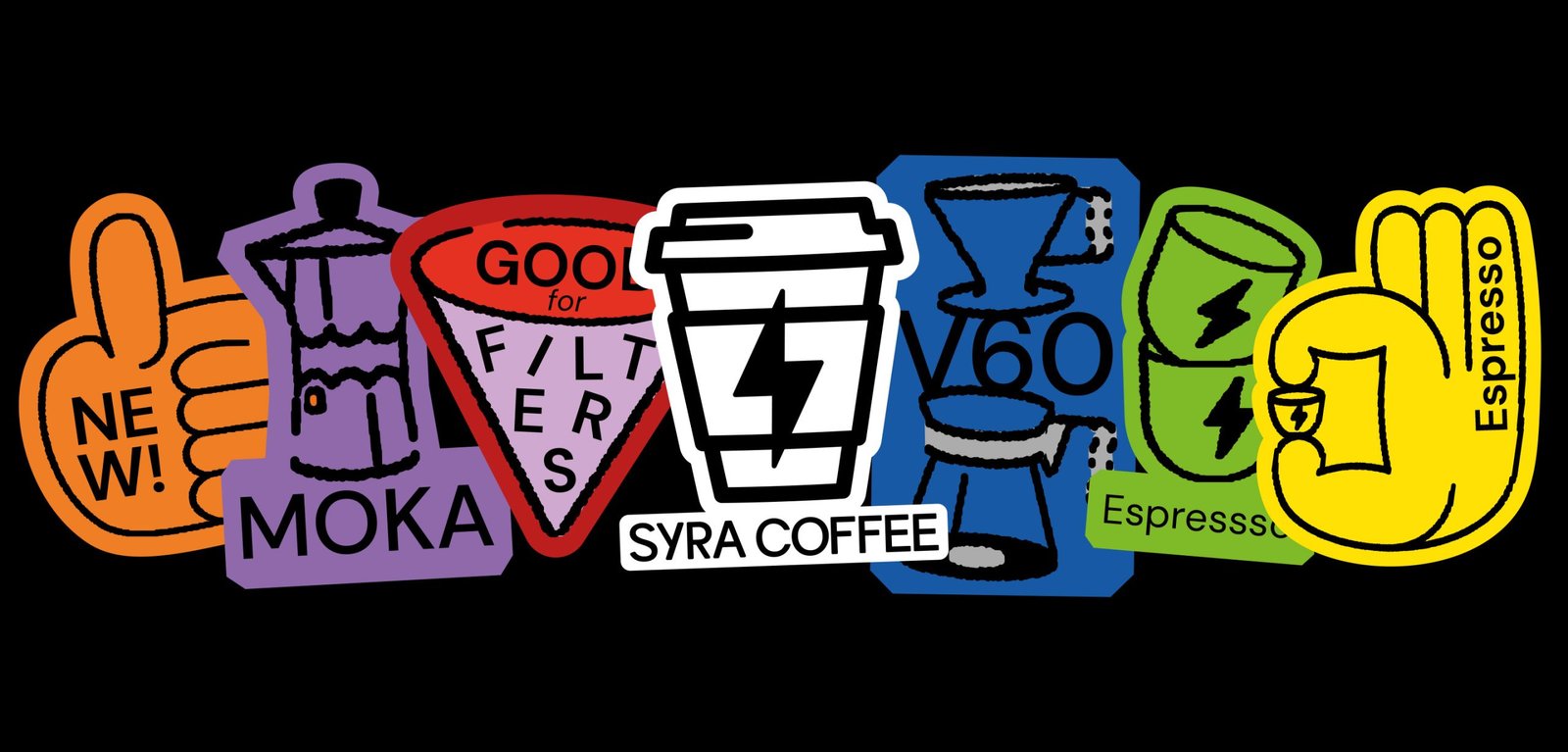
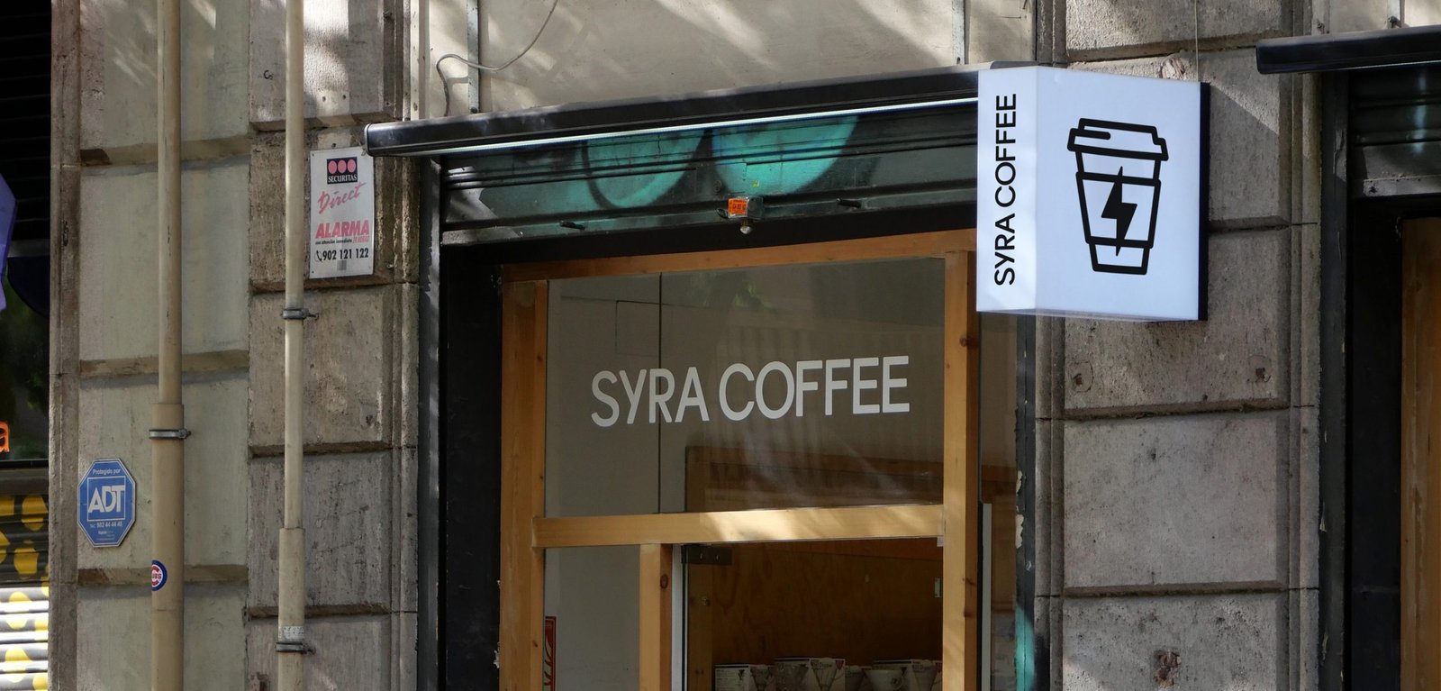
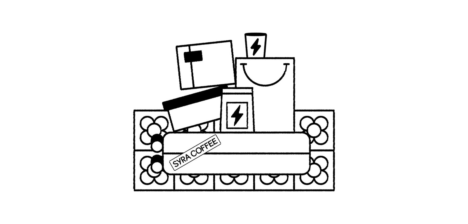
Syra Coffee / Concept Development - Illustration - Packaging - Revamp
BackSyra Revamp Project. Syra is one of Barcelona's biggest specialty coffee companies, with its own roastery and coffee shops, most in Barcelona and across Spain.
Under the idea of democratizing specialty coffee, and betting on small takeaway coffee shops in different neighborhoods of the city, Syra brings coffee closer to many people, offering a more inclusive product.
This new identity aims to modernize the brand's image, bringing it closer to a diverse public, from the design to the narrative. The change of logo allows for a better use and longevity of the icon, while the new typography brings a younger, bolder, and more fun main feeling. It also improves its performance in graphic compositions.
The new look is more colorful, bigger, and easier to use. New graphic resources such as illustrations and stickers help to generate more coherent layouts across platforms and content levels. These design and strategic gestures help the brand to adapt to the new digital era it is going through, where e-commerce, smartphone application, and social media content are at the forefront.
Team: Gastón Garcia Aja / Mauricio Gallegos / Maher M. Mansour
Motion: Martín Cañadell
Special Thanks: Maria Amaro
Barcelona, Spain (2022)
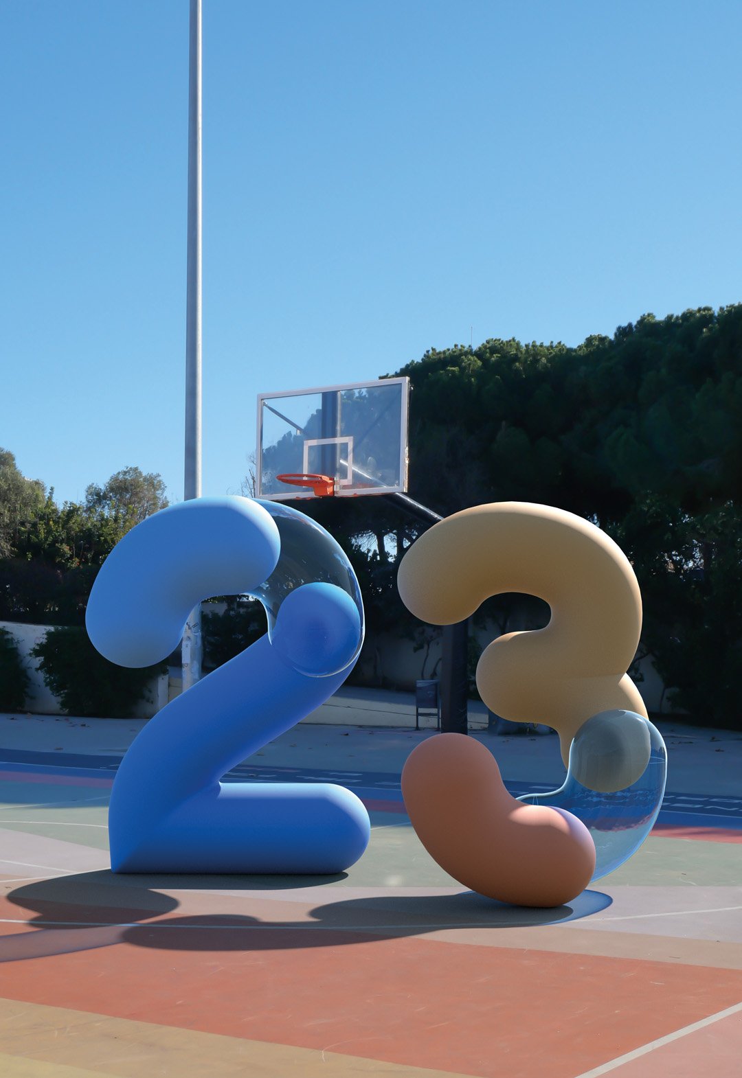
Cielo Argentino - Juegos Olímpicos Tokio 2020 / Animation - Graphic Design - Type
BackThere is nothing more important for an athlete than the Olympic Games and there is almost nothing further away from Argentina than Tokyo. The pandemic context made it impossible for people to cheer on the athlete in this edition.
The purpose of this design was to bring that missing ovation to the stadium, converted into something that travels in the plane's luggage and represents the spirit of Argentina.
This T-shirt was designed from real photos of the Argentinean sky, taken by athletes from all the provinces of the country with their phones. The photos were processed to form a pattern that unifies them into a single design, which more than a design, is a breath, which is born in the sky and felt in the chest, and if you get a little closer, it says: ¡Vamos Argentina!
Team: Mauricio Gallegos / Gastón García Aja
Production: Jacana
Client: Confederación Argentina de Atletismo
Film: Fernanda Scarafía
Athlete: Ezequiel Bustamante
Córdoba, Argentina (2020)
Bondis Porteños / Editorial - Graphic Design - Illustration
BackBondis Porteños is an illustration project based on the synthesis and graphic interpretation of the public transportation system of the City of Buenos Aires.
Like a constant show of colors, patterns and typographies, these huge rectangular canvases generate a landscape where diversity reigns in a medium where normally the opposite happens, turning the streets into a public event of a very particular and "Porteño" design, which brings together styles and graphics from many different periods and contexts in a single moment.
A variety difficult to explain and normalize that deserves to be contemplated in each corner, like a painting in movement, an unfinished work that for some reason represents the chaotic and the beautiful that things can be in such a special city.
Team: Gastón Garcia Aja
Photo: Alvaro Picca
Buenos Aires, Argentina (2019)
Personal Pay / 3D - Animation - Titles
BackThis 3D work and animation was our contribution to the last Personal Pay TV commercial. Personal Pay is the first digital wallet of Personal, a mobile company from Argentina. The main concept of all of this was; if you use this app, you are going to save some Mango, Pasta, or Guita, all different ways to say money in an Argentinian vibe.
These three words had to have the correct feeling within 3 seconds of appearance. We tried to play with the texture of a well-cooked spaghetti, the shapes, and colors of a mango, and the aesthetic, (made from a real photo) of a wad of Argentinian notes.
We work on every detail of the construction of each word for so many hours to finally display it in a very short moment of the commercial, and we love that.
Buenos Aires, Argentina (2022)
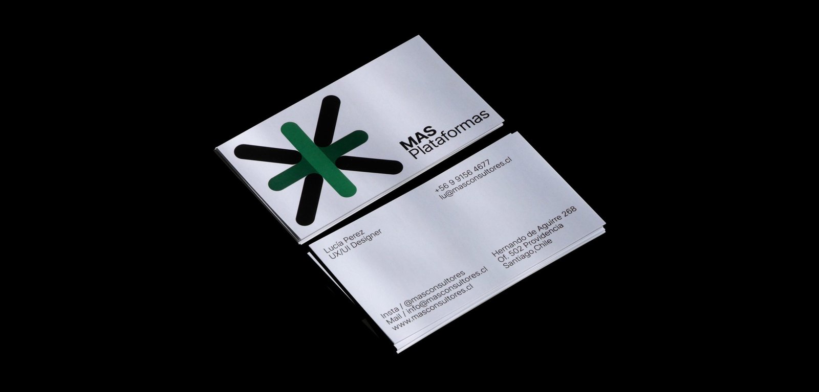
Más / Animation - Graphic Design - Revamp
BackThe new narrative, new brand architecture, and new graphic identity for MAS, a human resources consulting firm based in Santiago, Chile.
From autonomous identities for its business units to a power symbol and system that brings back all the importance and exposure to the main group identity. A new icon that represents a multiplication, rather than an evident addition, and a system that allows each unit to be identified while maintaining versatility and autonomy.
The new graphic system of MAS has two different worlds. Full color, white backgrounds, and clean elements go for the main group institutional communication. A limited color palette, grey backgrounds, and out-of-context size of the elements, go with the communication of each business unit. Both systems work together being different. Clean and noisy, simplicity and mess, serious and playful.
Team: Mauricio Gallegos / Gastón Garcia Aja
Animation: Martín Cañadell
Santiago, Chile (2018)
Haizea / Identity - Type
BackHaizea is a hotel located in the beautiful town of Bakio, Basque Country. The identity tries to represent the cultural mix of a project that counts with Argentinians and Basques, keeping the regional aesthetics of the place overall.
The combination of typographies evidences the mixture, the classic and the new, together. The changes in the formation of the word Haizea, go with its meaning; wind in Euskera; never static.
The icon development and the minimal graphic system try to maintain the identity under a classic, regional, and sincere feeling of a small hotel, aligned to the general concept of the brand to promote not only the hotel itself but also the surrounding environment.
Colab: Foguel Studio
Team: Mauricio Gallegos / Gastón Garcia Aja / Eugenia Foguel / Josefina Barbero
Animation: Martín Cañadelll
Bakio, Basque Country (2023)
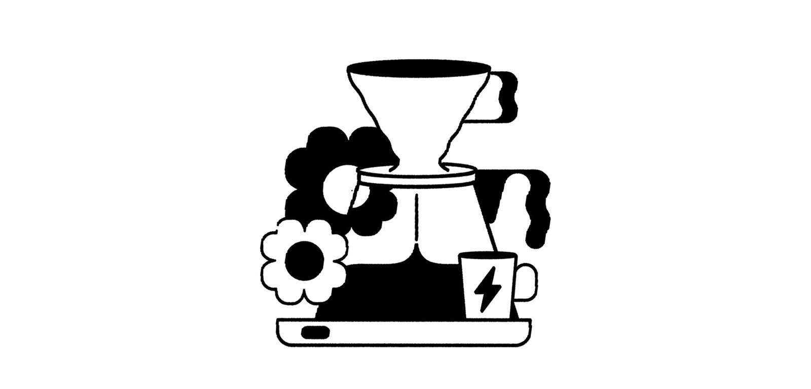
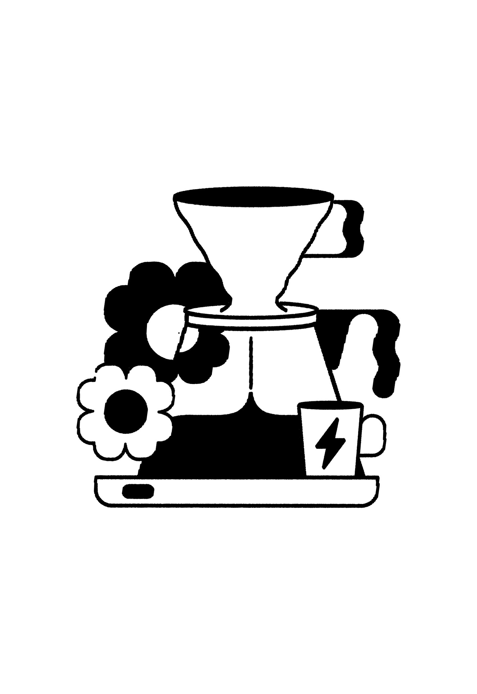
Syra Coffee 2.0 / Illustration
BackSyra is one of the largest speciality coffee companies in Barcelona, with its own roastery and coffee shops all over Spain.
This illustration project tries to represent the new values of the brand, set in the previous revamp process. The aesthetics and construction of the illustrations are part of a manual that allows the project to continue building images maintaining the essence and feeling.
The topics of this delivery add the concept of speciality coffee at home, the machines to make it and the relationship of people with the product.
Team: Gastón Garcia Aja / Mauricio Gallegos
Barcelona, Spain (2023)
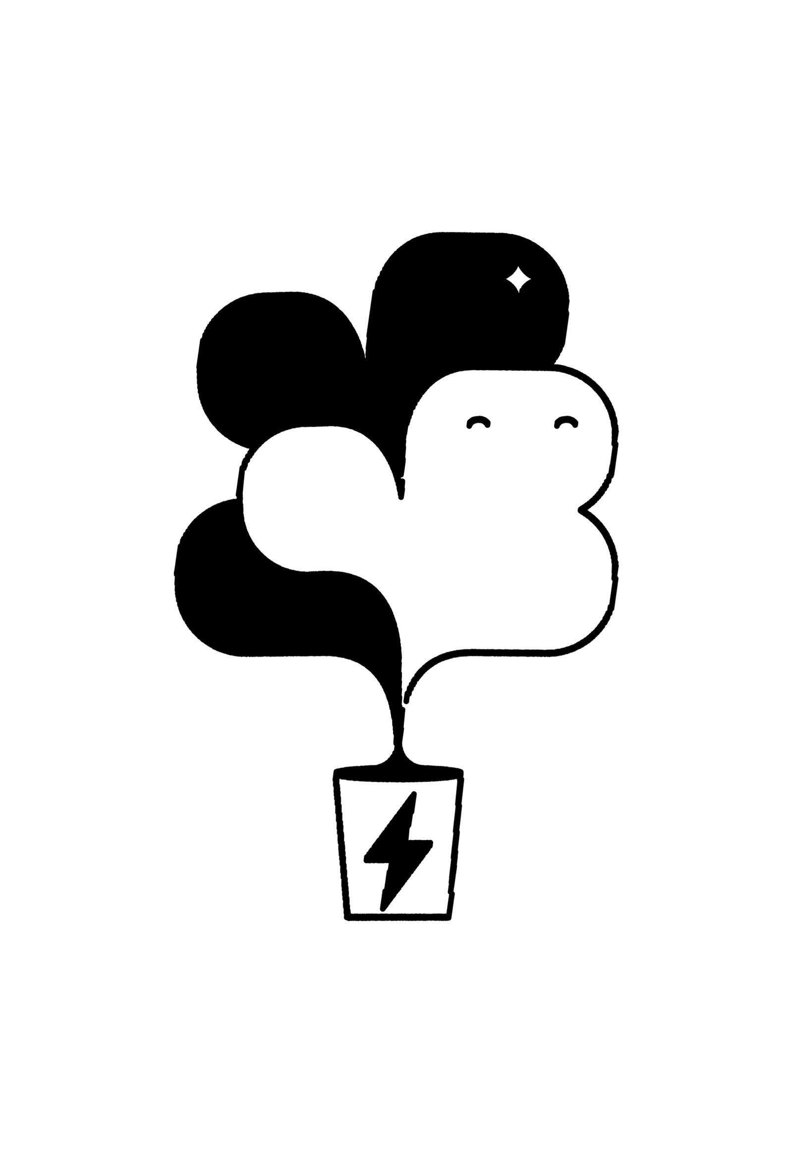
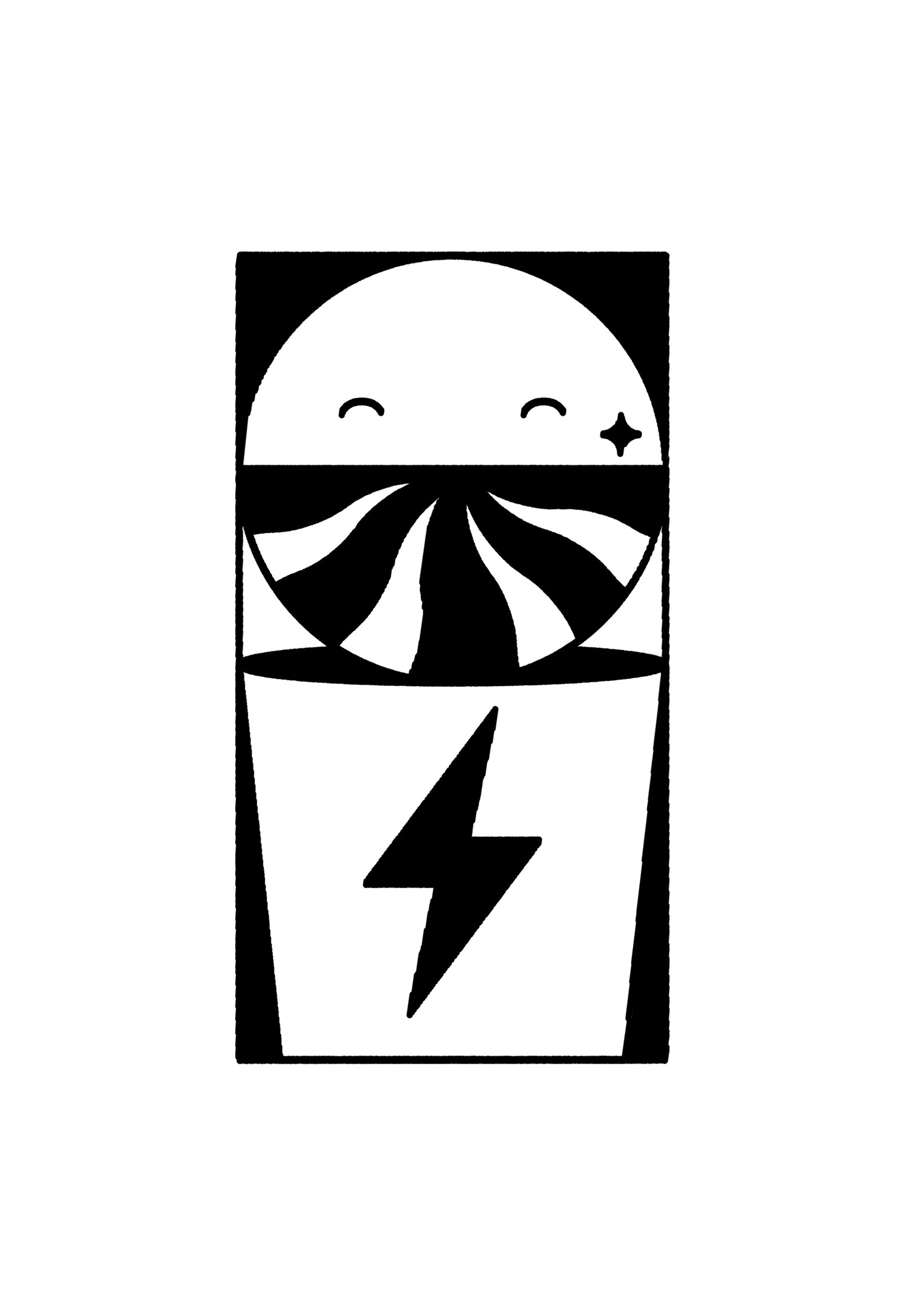
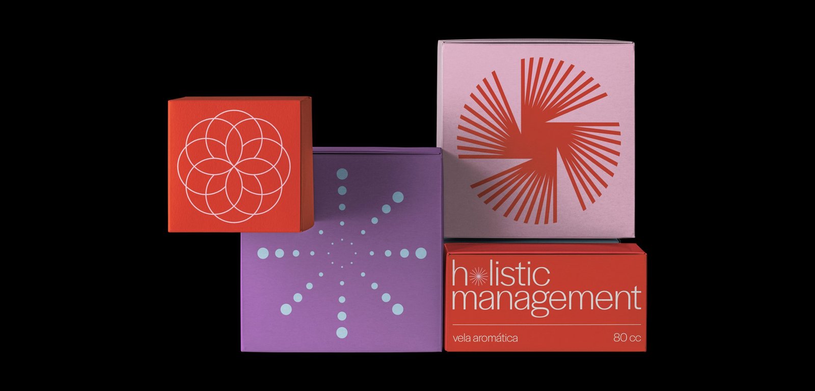
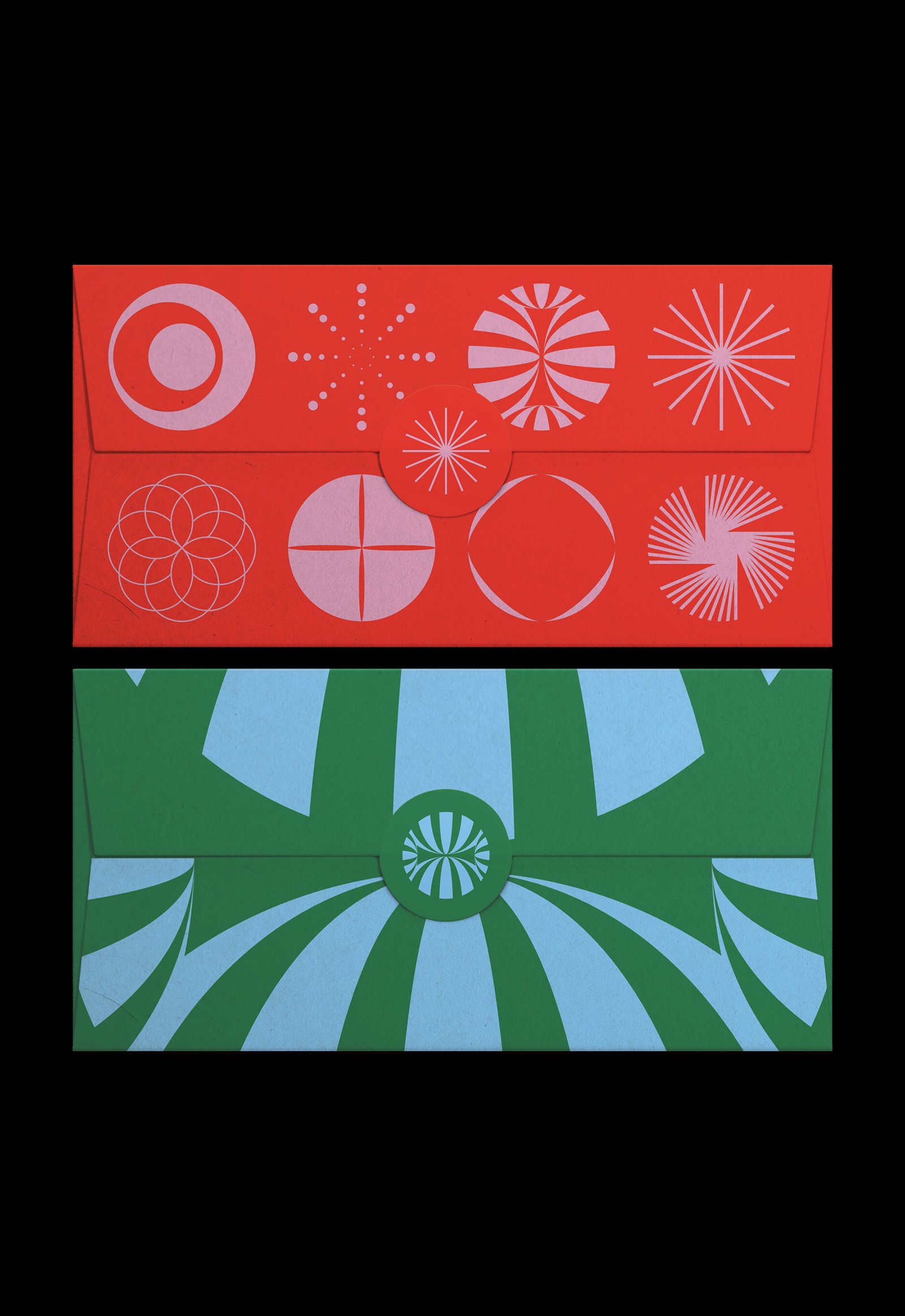
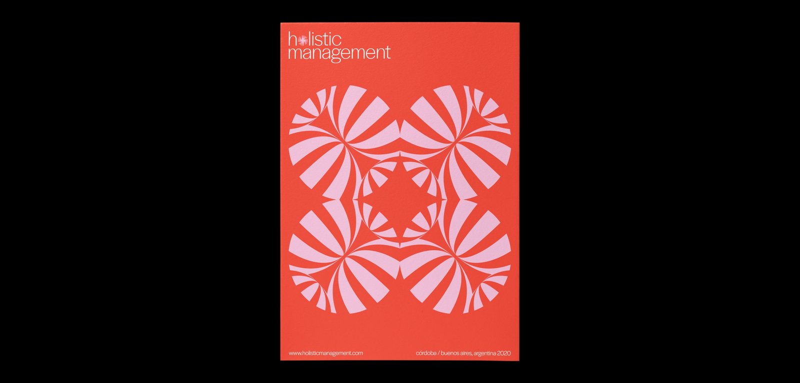
Hol Management / Identity - Type
BackHol Management is a company that provides wellness tools to companies and individuals based on astrology as the main pillar and other holistic techniques such as meditation, mindfulness, yoga, constellations, among others.
The dynamic identity represents the different areas of the brand through portals that open to a new world of energy and information that can help people and companies to be better. Each icon is a portal, and together, they create a super dynamic system that prepares this new brand for any possible scenario.
Team: Mauricio Gallegos / Gastón Garcia Aja
Córdoba, Argentina (2018)
WIP / Animation - Identity - Type
BackWIP is a cultural venue that combines architecture, design, photography and art. Its concept, like its name, has to do with the creative process as a state of continuous search.
Its identity moves representing the before, during and after of a creative process, and also, the interaction of different disciplines in the same place.
Team: Gastón Garcia Aja / Mauricio Gallegos
Córdoba, Argentina (2018)
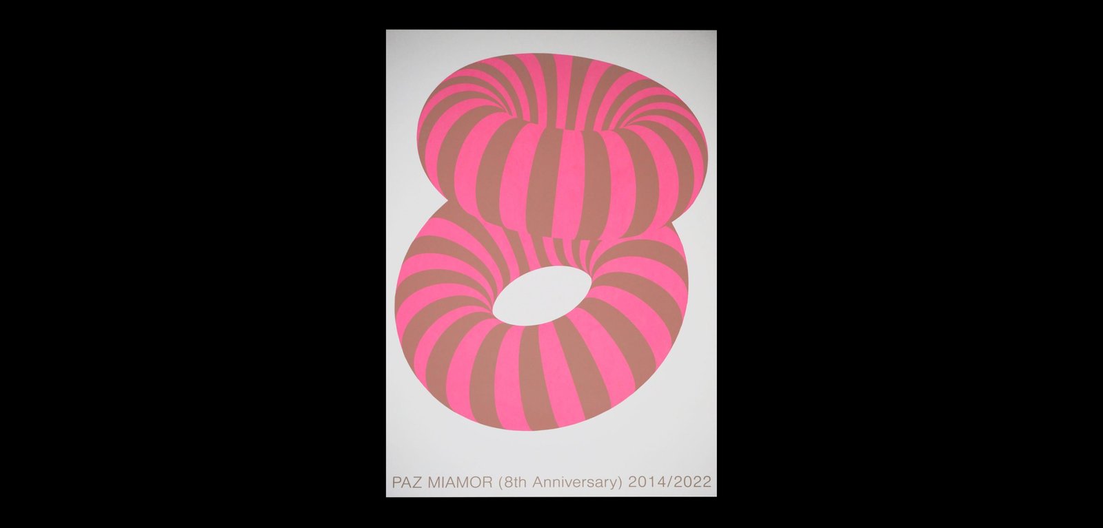
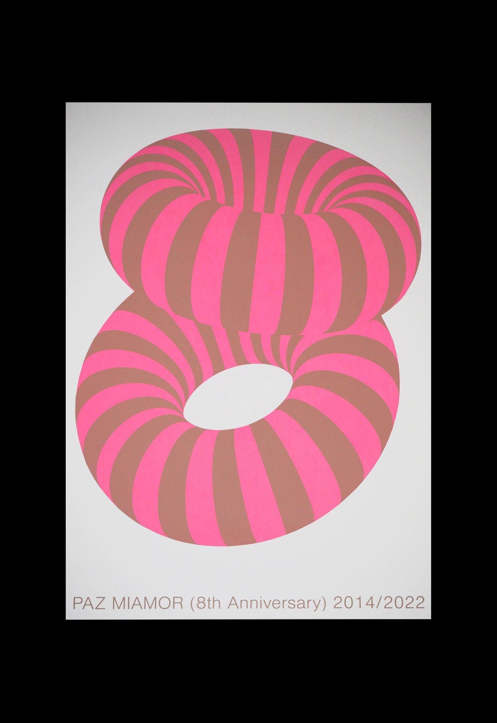
PM 8th Anniversary / Graphic Design
BackPAZ MIAMOR 8th Anniversary. This celebratory poster represents the number 8 using a design in keeping with the studio's actual moment.
The graphic experimentation with different graphic styles and universes, mixing clean and minimalist design with 3D compositions and photos; a kind of synthesis of PM's the 2022 aesthetics.
An old reference comes up to capture those feelings, that's why some can see in this poster the "Cheshire Cat from Alice in Wonderland". Magical, simple, only two colours and fun.
Team: Gastón Garcia Aja / Mauricio Gallegos
Silk/Screen Print: House of Prints
Barcelona, Spain (2022)
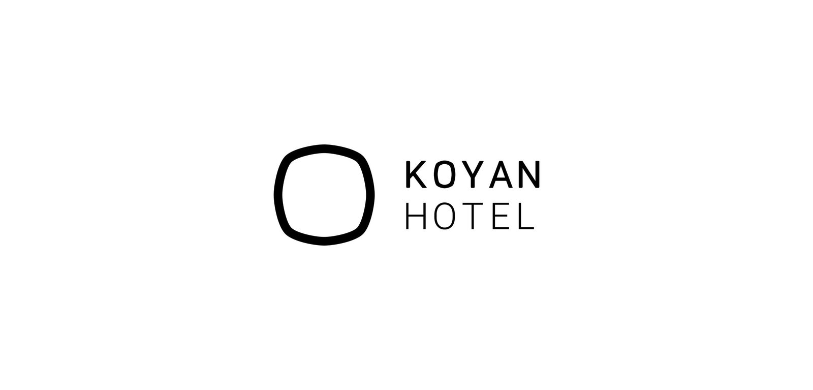
Koyan Hotel / Concept Development - Identity
BackKoyan is a hotel located in Panguipulli, Chile, that seeks to connect people with nature in a pure and simple way, taking advantage of the majestic surroundings of the region.
The isologo results from the combination of a square, which represents the systemic life of people in the city, and a circle, which represents the flow of things in nature. Ideally, the Koyan experience is located between these elements, with balance as the main value.
This intermediate form gave rise to the typography terminations, giving personality and distinction to the logo without losing simplicity.
Team: Mauricio Gallegos / Gastón Garcia Aja
Santiago, Chile (2018)
Taste My Aruba / 3D - Animation - Illustration
BackTaste my Aruba by Mauri's honeymon souvenirs. “During my honeymoon, leaving aside I realized the amount of stimuli and objects saturated with messages that try to tell what happens on a tourist island, compressed into small souvenirs.
The point is that any object, regardless of its functionality, can transform you into a souvenir, and for it to be from here, and not from there, you have to imbue it with some sort of identity. An identity that is a mix of many things. A keychain that represents a swordfish, that can also uncork beers, that also says Aruba, just to start.
This idea was in my mind, and together with the team, as if we had nothing else to do, we tried to give it the form of animated gifs and 3D”.
Team: Mauricio Gallegos / Gastón Garcia Aja
3D & Animation: Martín Cañadell
Buenos Aires, Argentina (2023)
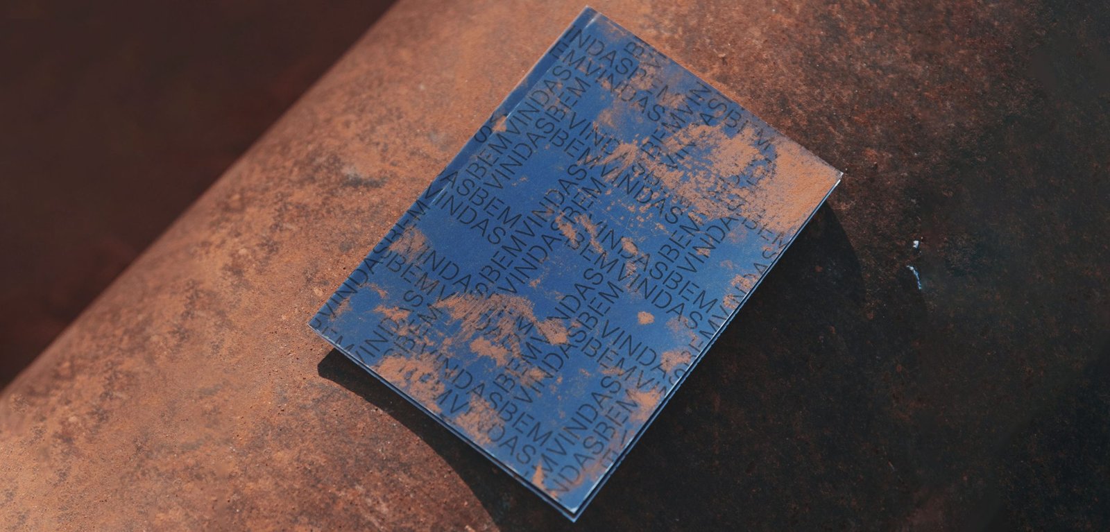
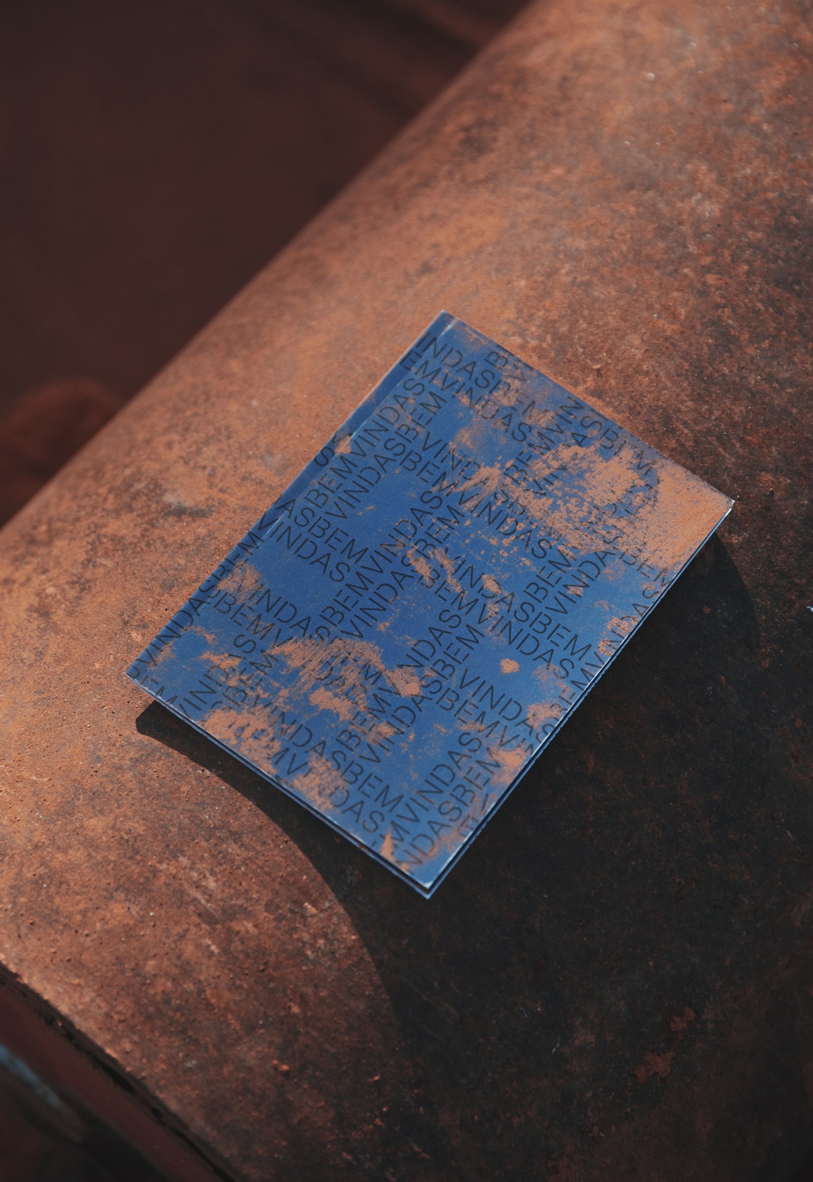
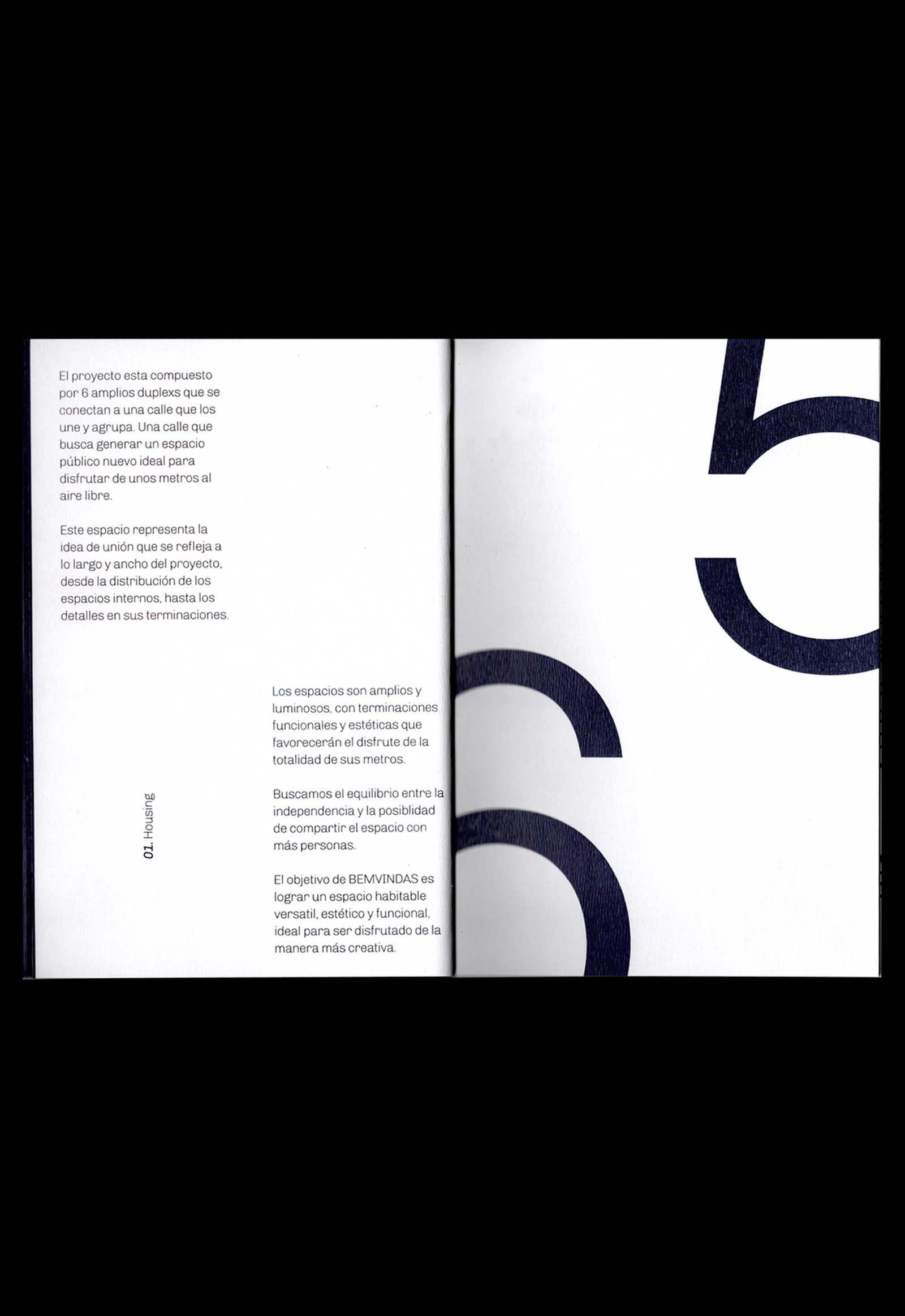
Bemvindas / Concept Development - Editorial - Identity
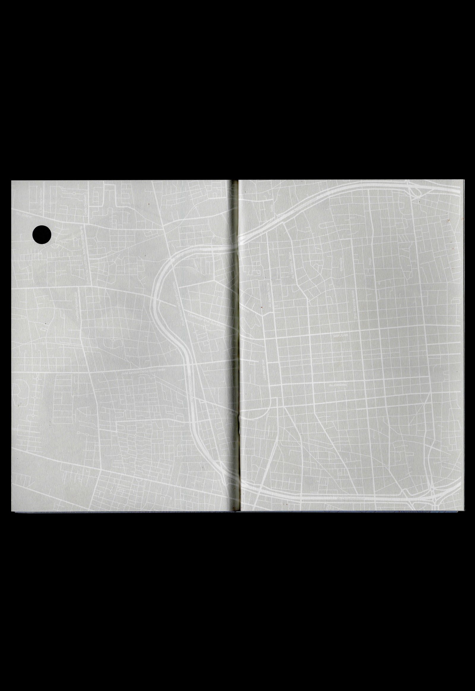
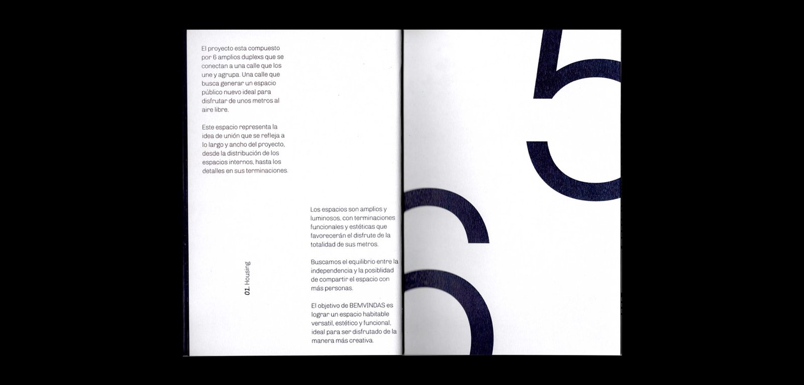
BackBemvindas is a housing project located in San Juan, Argentina. Beyond its architectural quality, the six duplexs are connected to each other from one street that becomes a public space, increasing the meters and the private garden of each house; a “welcome / bemvindo” space, especially for the category of homes to which Bemvindas belongs.
The application of the logo in pattern is a direct reference to the visible brick screening that the whole project looks like. This identity seeks to highlight the materials and the general idea of the project from sincerity and details.
Team: Mauricio Gallegos / Gastón Garcia Aja
Photo: Derio Ilari
Architecture: Estudio Montevideo
San Juan, Argentina (2019)
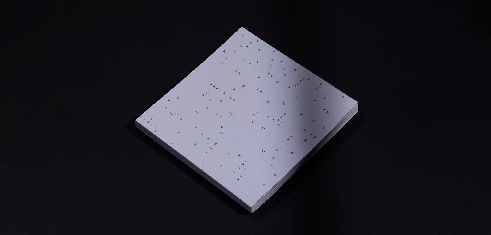
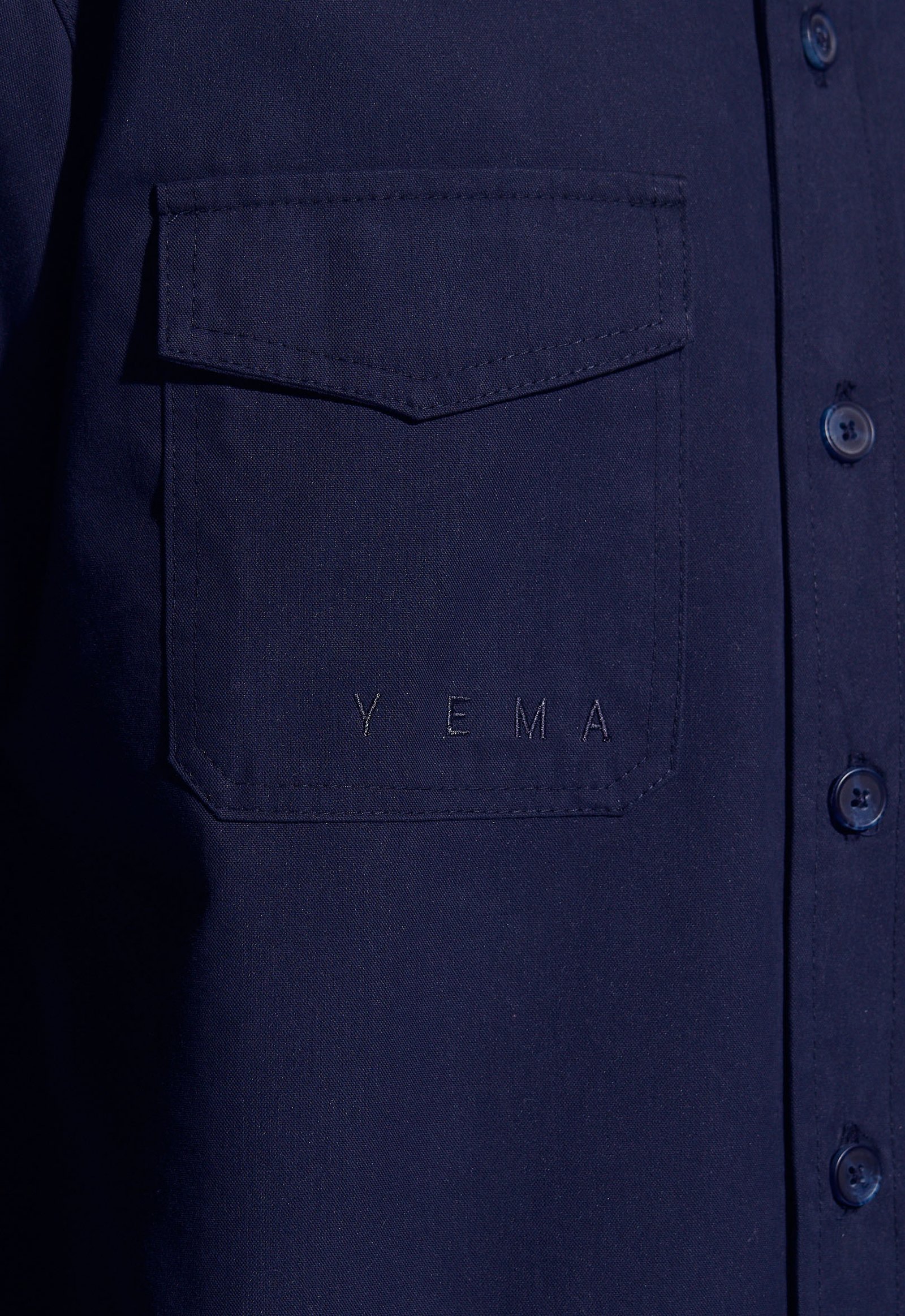
Yema / Identity - Naming
BackYema is an experimental clothing project based on expression as the main concept. Expression consists of two parts, a visible and an invisible side. The name is an adaptation of an Argentinian terminology that means "to have courage".
This concept runs through the whole brand. Graphically, the idea of crossing out elements allows to generate varied pieces with a double reading, narrative and aesthetically.
Team: Mauricio Gallegos / Gastón Garcia Aja
Córdoba, Argentina (2017)
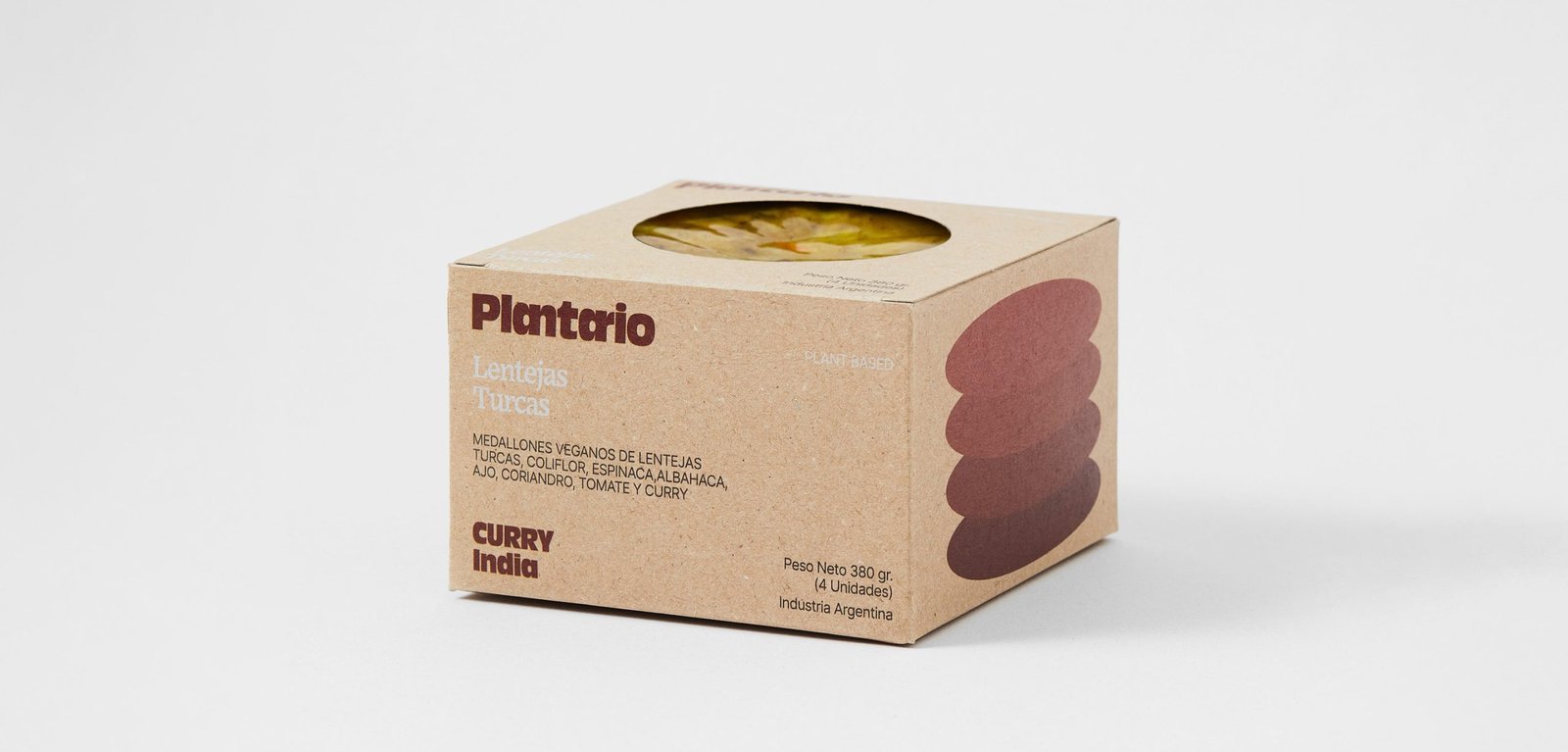
Plantario / Concept Development - Identity - Naming - Packaging
BackPlantario is a plant-based brand that makes burgers with local ingredients and recipes inspired by different parts of the world. The name is a combination of Spanish words meaning; a planet full of plants.
The narrative is around the concept of responsible consumption. It is impossible to save the world by making vegan burgers, but it could be the first step in a series of changes that could help keep the planet alive a little longer.
The packaging tries to be as environmentally friendly as possible, taking into account the nature of the product.
"PLANTARIO is an idea that respects the planet, from the food we eat to the small habits that contribute to the cause. Moving to the right side is the main idea, the side that helps the planet. It's not perfect and it's not going to happen tomorrow, it's going to take time, but we have to start at some point and if a vegan burger is given a chance it's going to be a starting ceremony or a historical event, all the work will have been worth it.
Team: Gastón Garcia Aja / Mauricio Gallegos
Photo: Alvaro Picca
Córdoba, Argentina (2020)
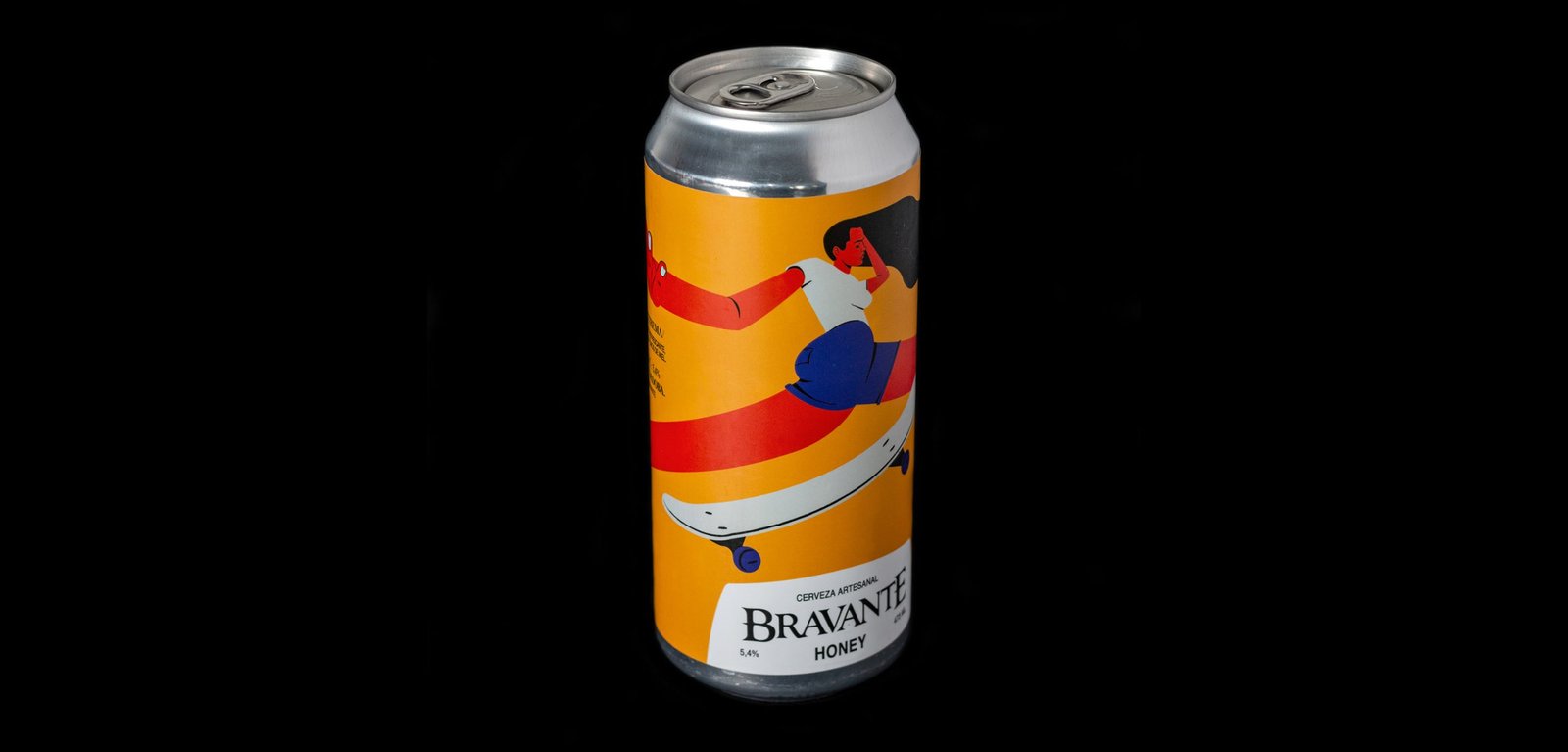
Bravante / Illustration - Packaging
BackBravante is one of the rising craft beer brands of Córdoba, Argentina. After selling on draught to bars, it decided to market its beers in cans at different points of sale such as supermarkets and wine shops.
The idea tries to represent the personalities of each beer with a character, in a modern and fun way, differentiating the aesthetics of these packs from the rest of the main identity.
The brand had a classic and rustic feel to it. In these new labels, a system and a graphic code show around to turn things down and display a whole new world of possibilities, ready to use for these, and the next beers.
Team: Mauricio Gallegos / Gastón Garcia Aja
Photo: Rocío Fernandez Charro
Córdoba, Argentina (2016)
RFL / Revamp - Type
BackRodrigo Fernandez Lara is an expert training and development consultant based in Santiago, Chile. His talks reach universities, congresses and companies, motivating and sharing knowledge.
The graphic identity prioritizes the search for personality in its acronym RFL. The dialogue box formed by the letter R represents a dialogue box, a main element in its nature.
Santiago, Chile (2017)
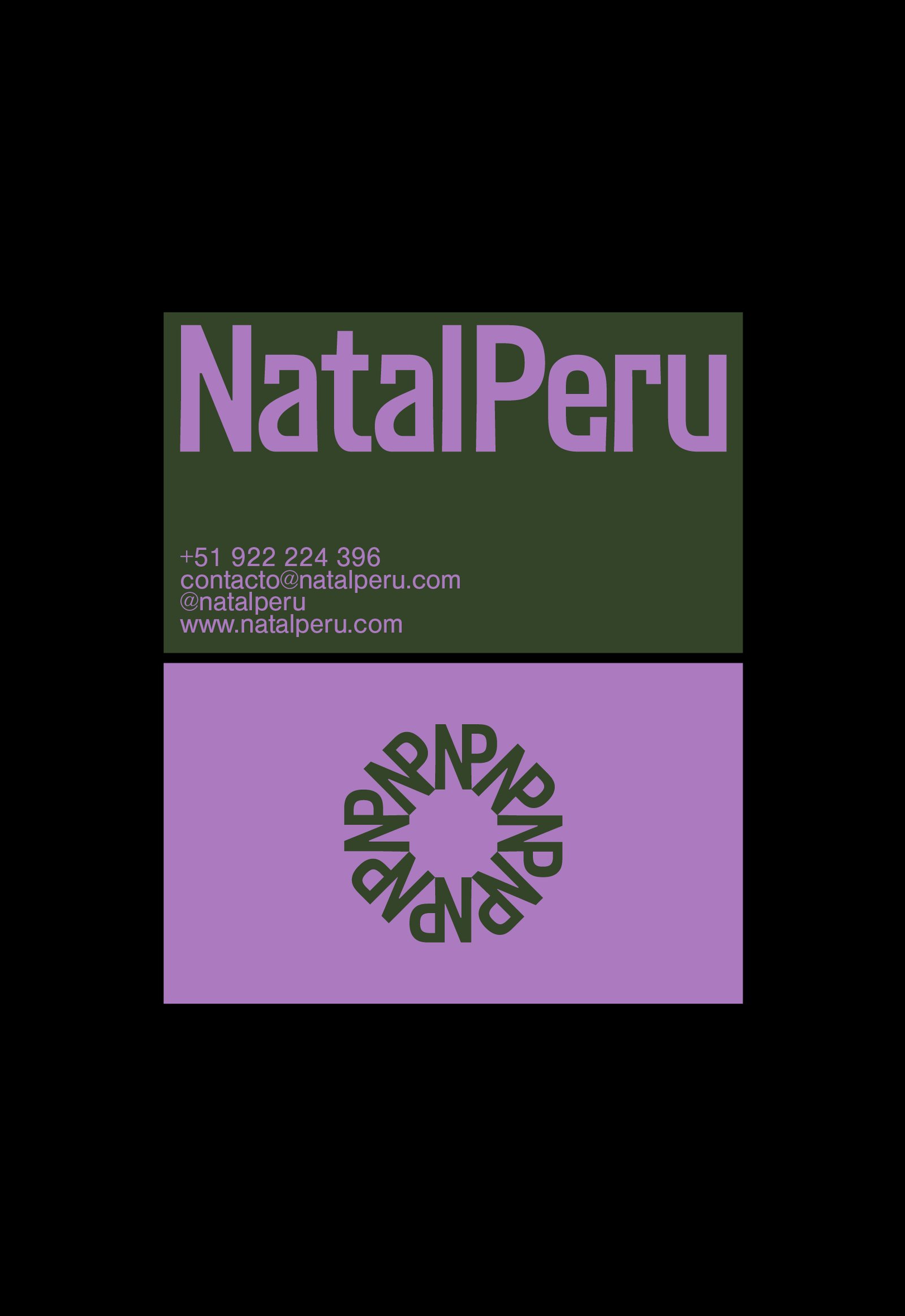
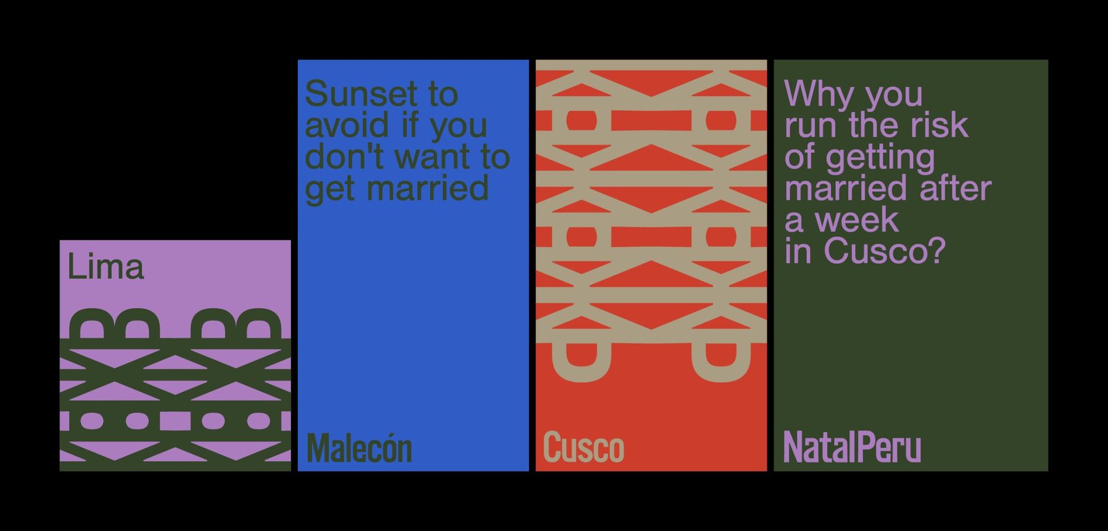
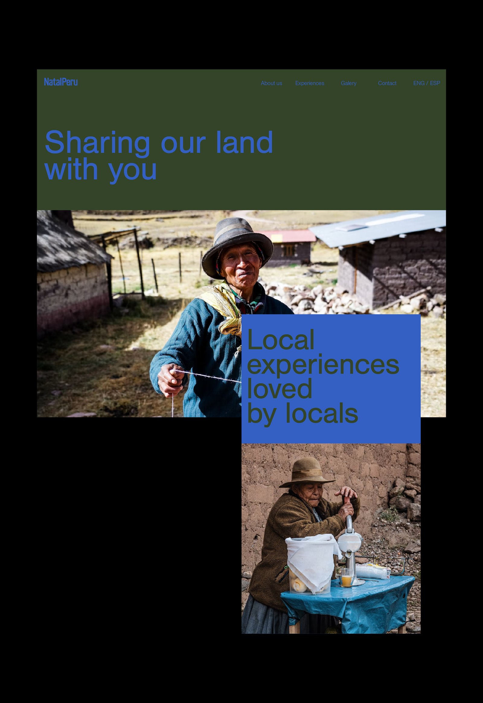
Natal Perú / Concept Development - Identity - Naming
BackNatal Peru is a travel agency focused on generating real experiences for all those who want to get to know Peru. Customized travel agendas based on the tastes of the tourist, combined with experiences verified by locals, generate a unique travel opportunity in the Andean country.
The identity tries to reflect in a simple way the Peruvian spirit, using European codes and aesthetics, in relation to the origin of the target audience. The use of color, patterns from the logo and details in the narrative complete this identity.
Collaboration with: Fibra
Team: Gastón Garcia Aja / Mauricio Gallegos / Andrea Gálvez
Lima, Perú (2022)
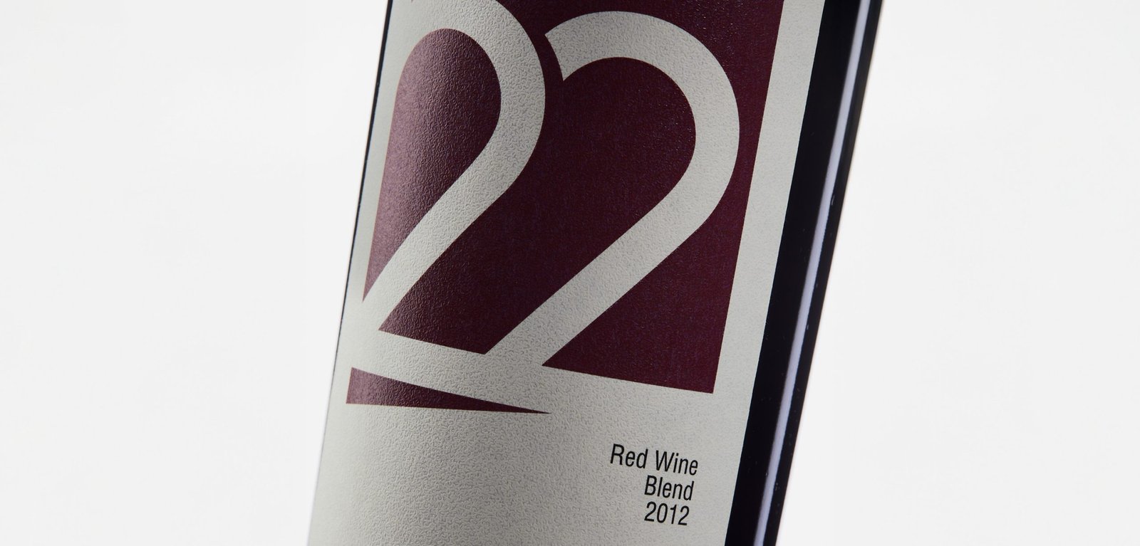
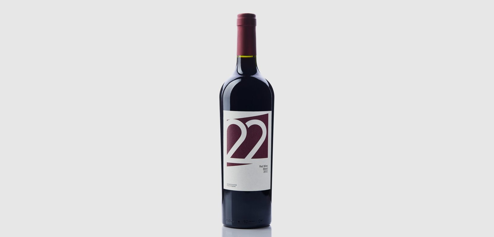
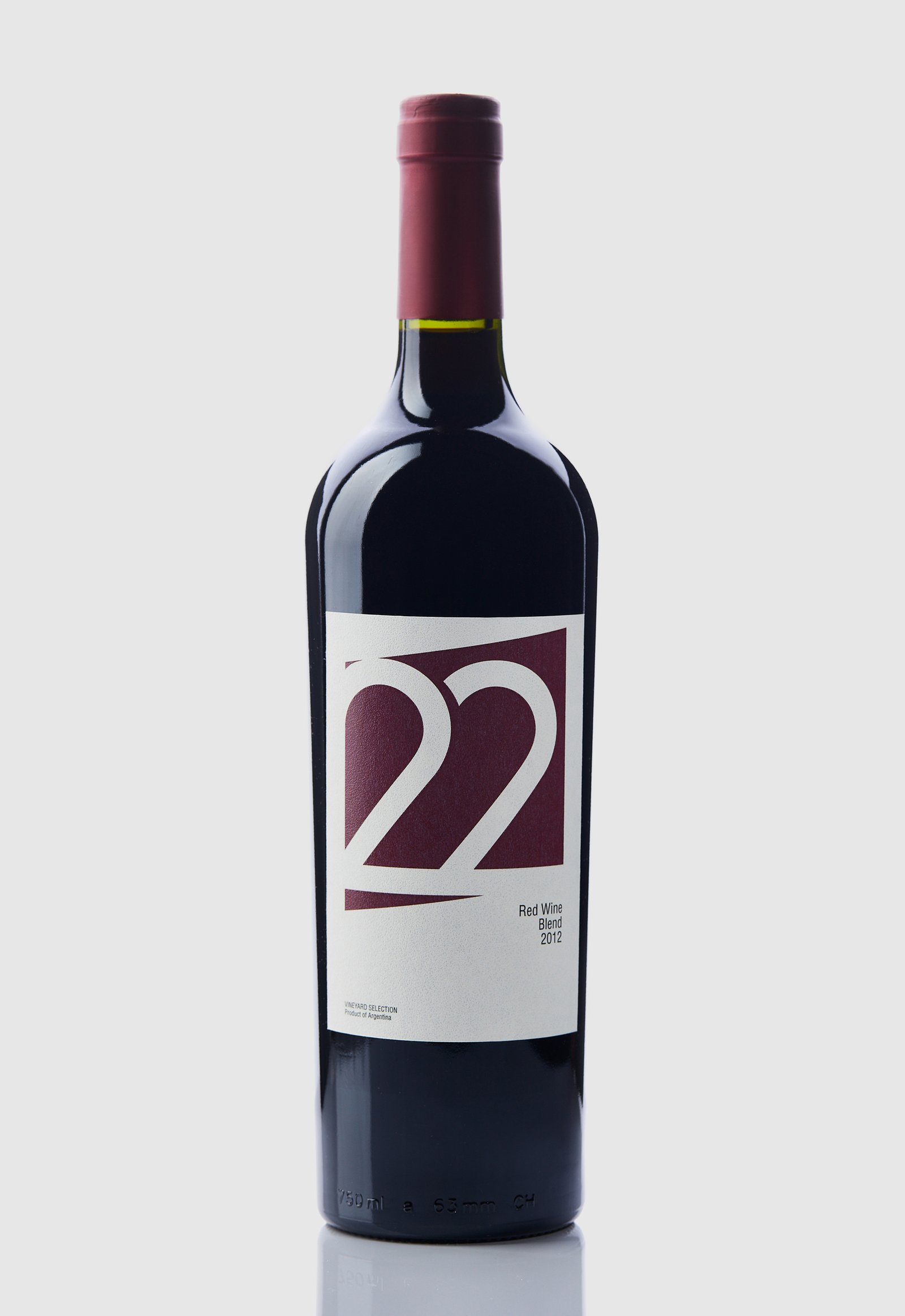
22 Tañidos / Graphic Design - Packaging
Back22 Tañidos is a Blend Red Wine brand that belongs to the Las Cañitas vineyard, located in the Sierras de Calamuchita, Córdoba, Argentina. This specific brand was developed with the aim of exporting its entire production to Turkey.
Being a new and developing region for the cultivation of vines, it does not have the positioning that other provinces of the country have in the category. Therefore, in the design we chose to show a more European and minimalist image without representing the roots or personality of the product.
The number 22 was used as the logo and main element of the label, considering that numbers are more legible than letters, especially in such different languages.
The colour of the label represents the product, and the shade was matched to the only capsule colour (top label) available on the local market at the time of project development.
Team: Mauricio Gallegos / Gastón Garcia Aja
Photo: Alvaro Picca
Istanbul, Turkey (2014)
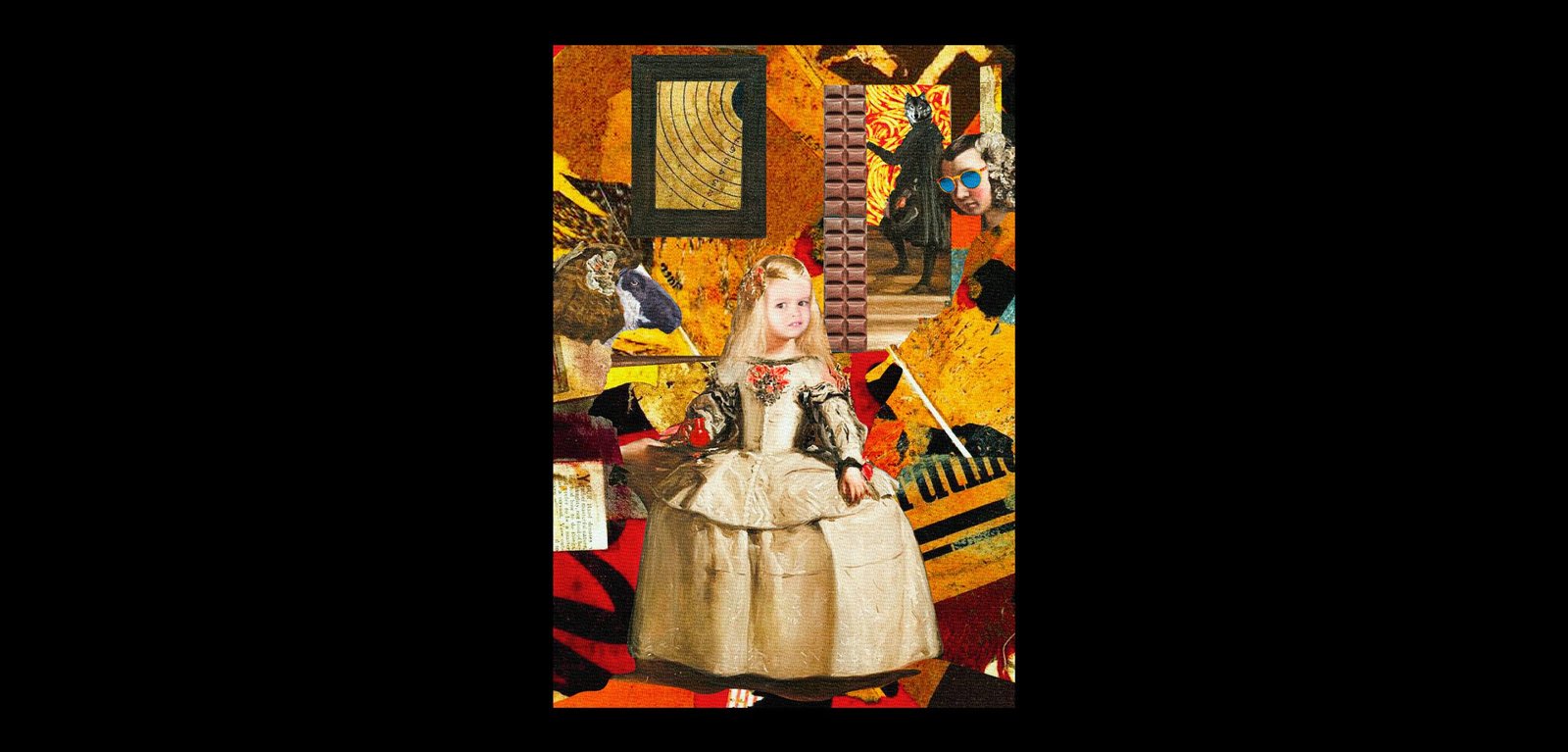
Artistic Memes / Graphic Design
BackArtistic Memes is a project that reinterprets memes based on artistic movements from around the world throughout history, materialised in poster format.
Using purely digital techniques, four posters have been designed with their respective memes that attempt to encompass Neo-Expressionism (Painting: "Trolsquiat"), Post-Impressionism (Painting: "Van Harold"), Cubism (Painting: "Rollasso Safe") and Dadaism (Painting: "Kurt Chloe, on display).
This project will continue when memes and art crash again.
Design: Mauricio Gallegos
Córdoba, Argentina (2020)
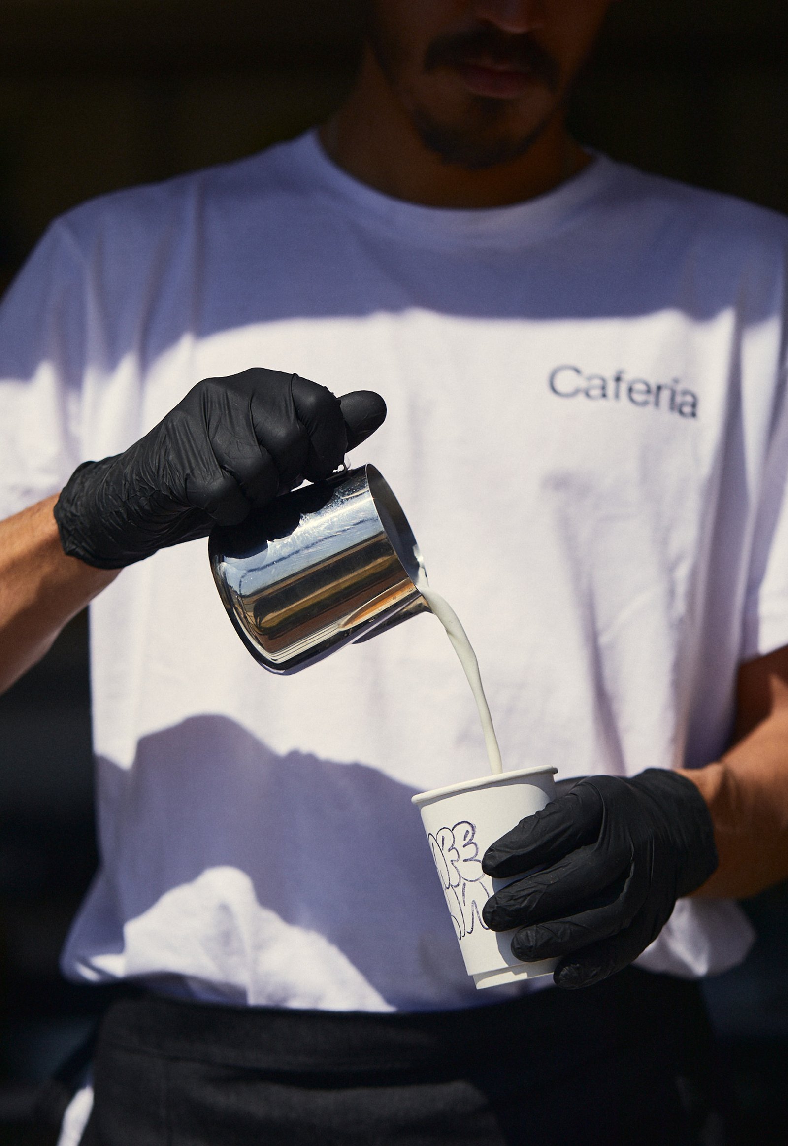
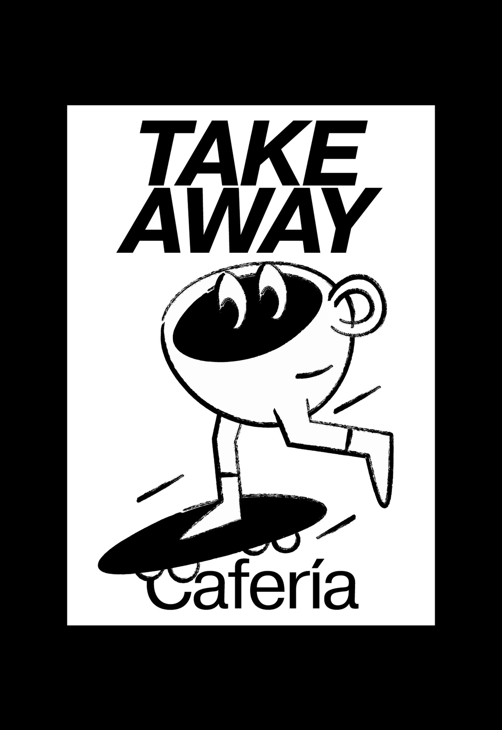
Caferia / Concept Development - Identity - Illustration - Naming
BackCafería is the combination between a specialty coffee shop and a fresh market sale from a local fair, located in Córdoba, Argentina. This identity reflects an urban spirit that represents a happy and relaxed consumer situation.
The graphic identity was inspired by the stamps used on take away cups, using their color and finish details to complete the rest of the design pieces.
A simple and dynamic system, made up of well-contrasted fonts and coffee cups characterized in everyday situations, try to generate a cheerful and easy-to-use brand, with a lot of strength in its name, and all the doors open for possible franchises.
Team: Mauricio Gallegos / Gastón Garcia Aja
Photo: Alvaro Picca
Córdoba, Argentina (2020)
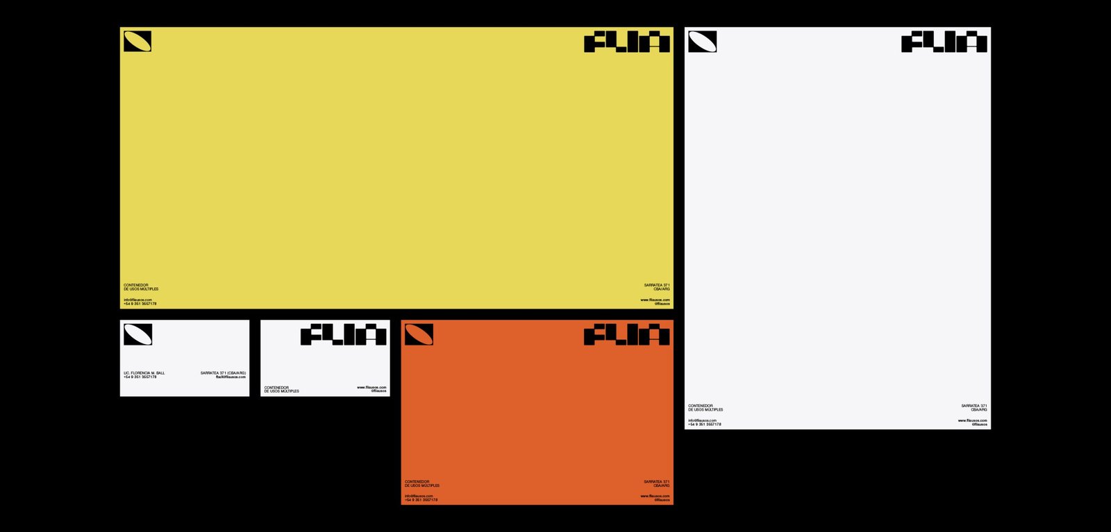
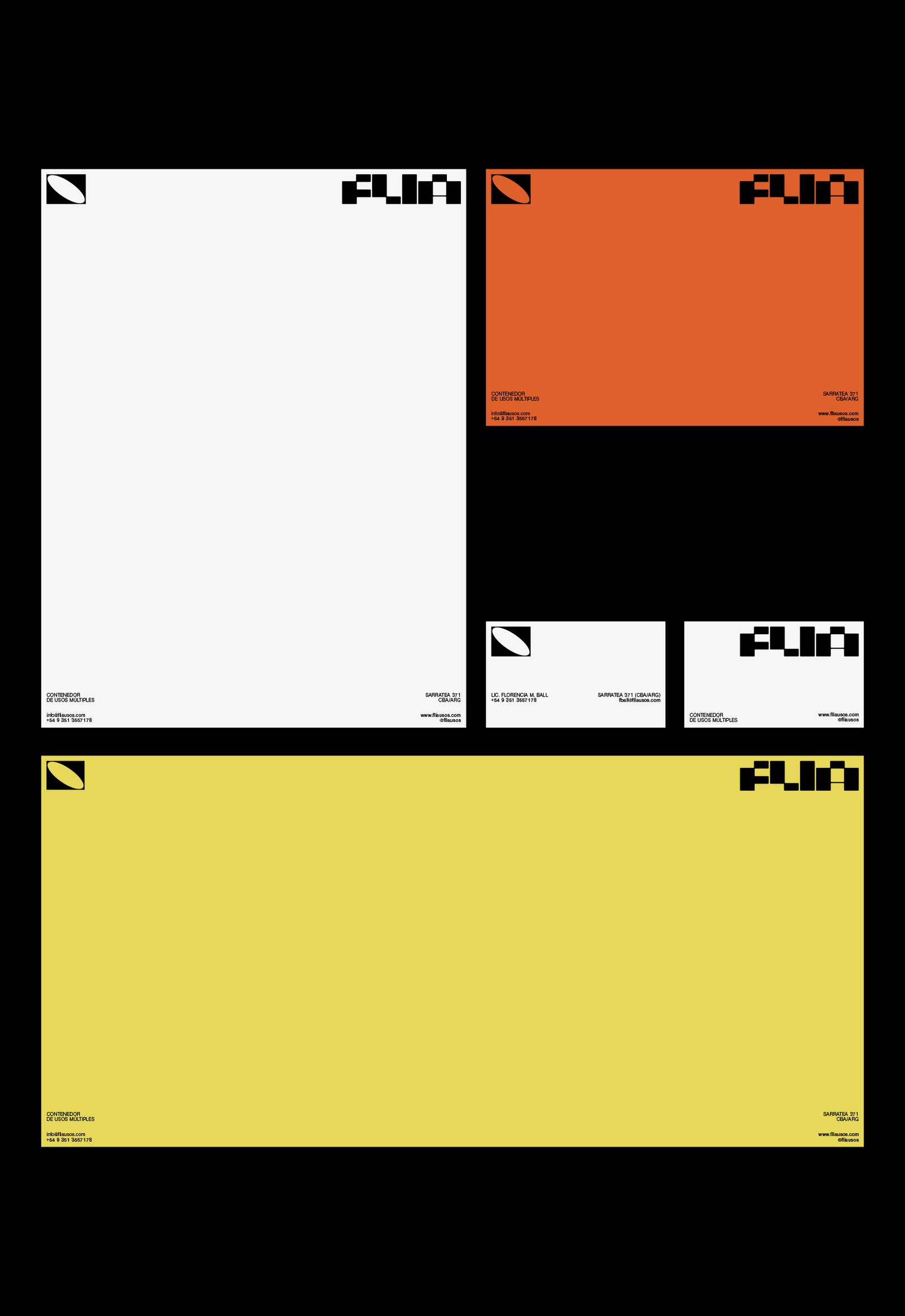
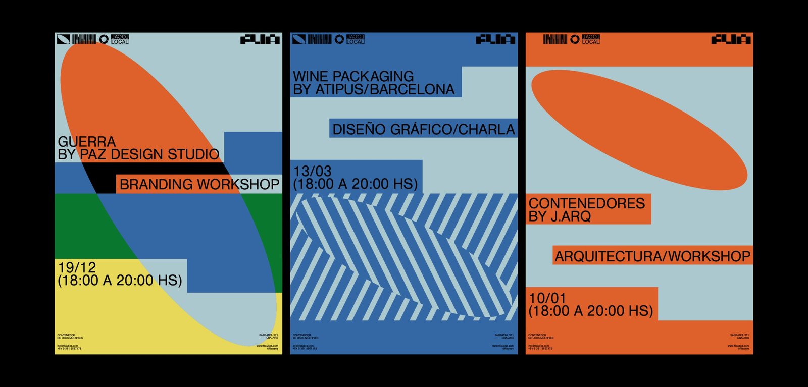
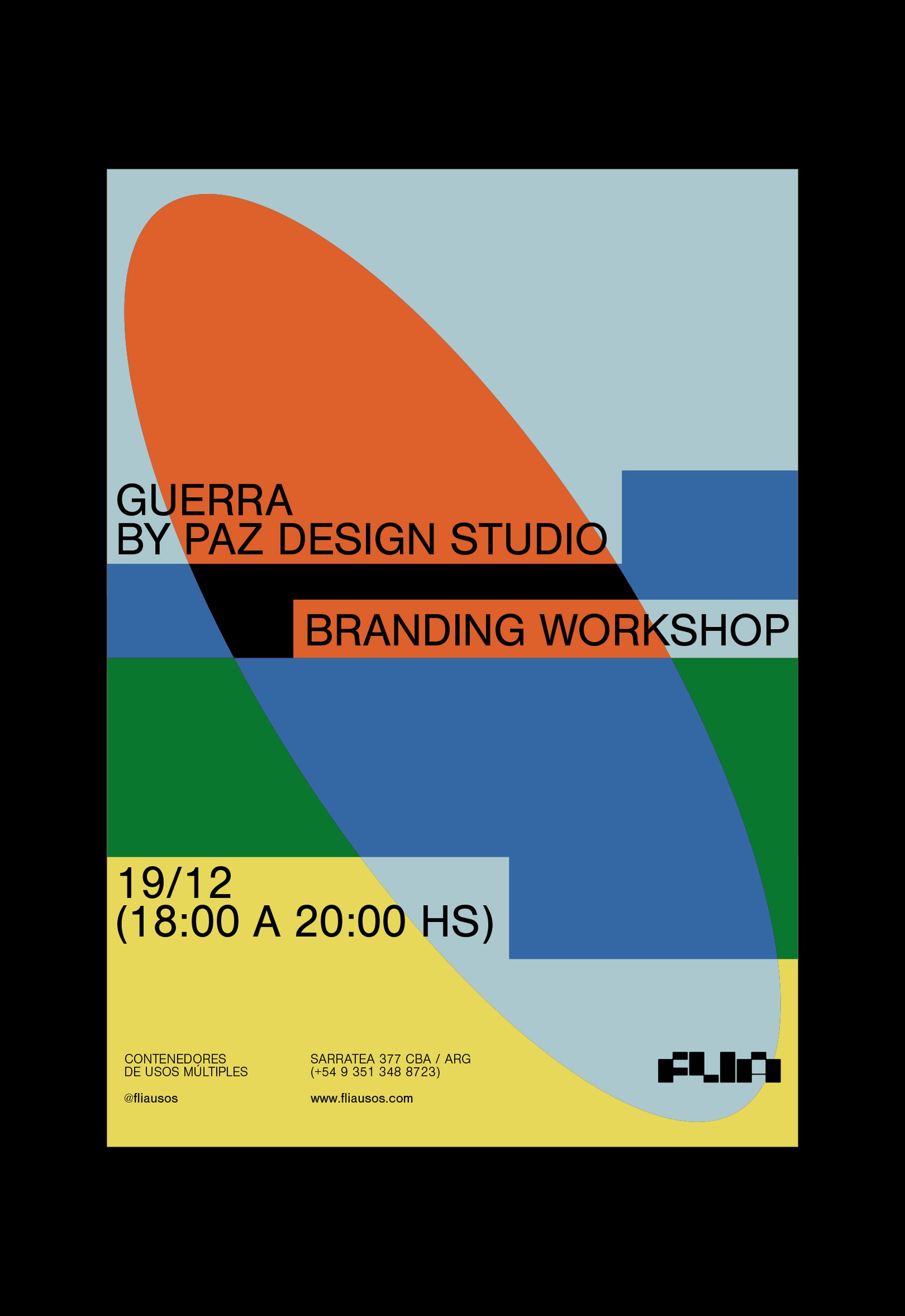
Flia / Concept Development - Identity - Naming
BackFlia is a multi-purpose container open to all kinds of events, training, workshops and talks in different areas, which support local talent and culture and aim at the social development of the city Córdoba, Argentina.
Its identity represents the classic rectangular shape of containers. This idea is found in the formation of the letters of the logo, and in the whole graphic system.
Team: Mauricio Gallegos / Gastón Garcia Aja
Architecture: Jarq
Córdoba, Argentina (2019)
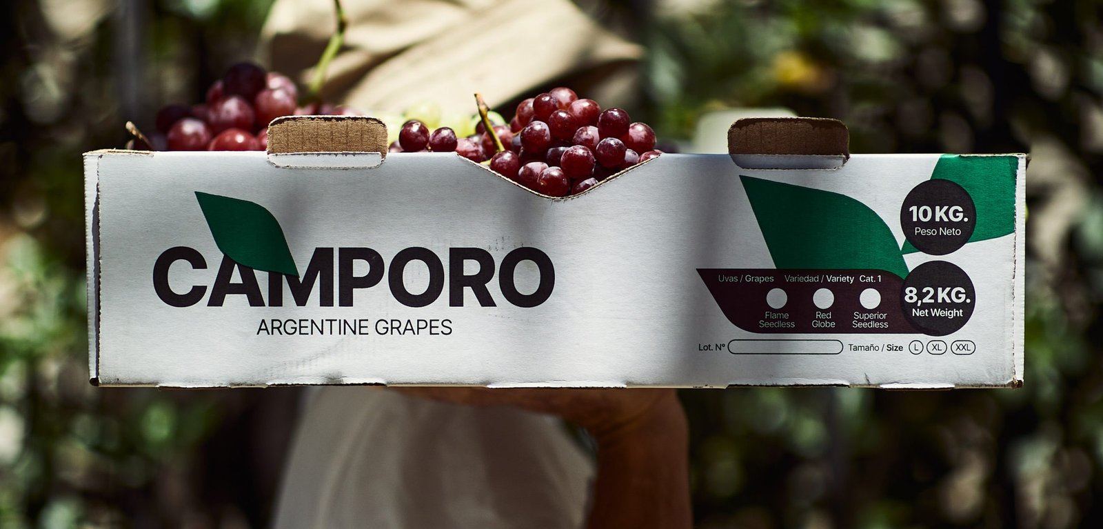
Camporo / Packaging - Revamp
BackCamporo is a grape farm located in San Juan, Argentina, one of the best places to grow grapes in the country. Much of its production is marketed in different parts of the world.
The graphic design focuses on generic images and feelings about the naturalness, freshness and quality of the fruits, so that they can be received even in countries that do not speak the same language.
Team: Mauricio Gallegos / Gastón Garcia Aja
Photo: Alvaro Picca
San Juan, Argentina (2021)
Georo / Graphic Design - Revamp
BackGeoro is a developer and construction company focused on the architecture and design of its projects, based in San Juan, Argentina.
Its main attribute is its versatility when it comes to carrying out projects and works at different levels and scales.
The redesign of its identity represents the evolution of the company, the idea of the future and the versatility to adapt to any context, in a simple and dynamic way, in a modern language prepared for new platforms.
Team: Mauricio Gallegos / Gastón Garcia Aja
San Juan, Argentina (2020)