Rojo / 3D - Animation - Revamp - Type
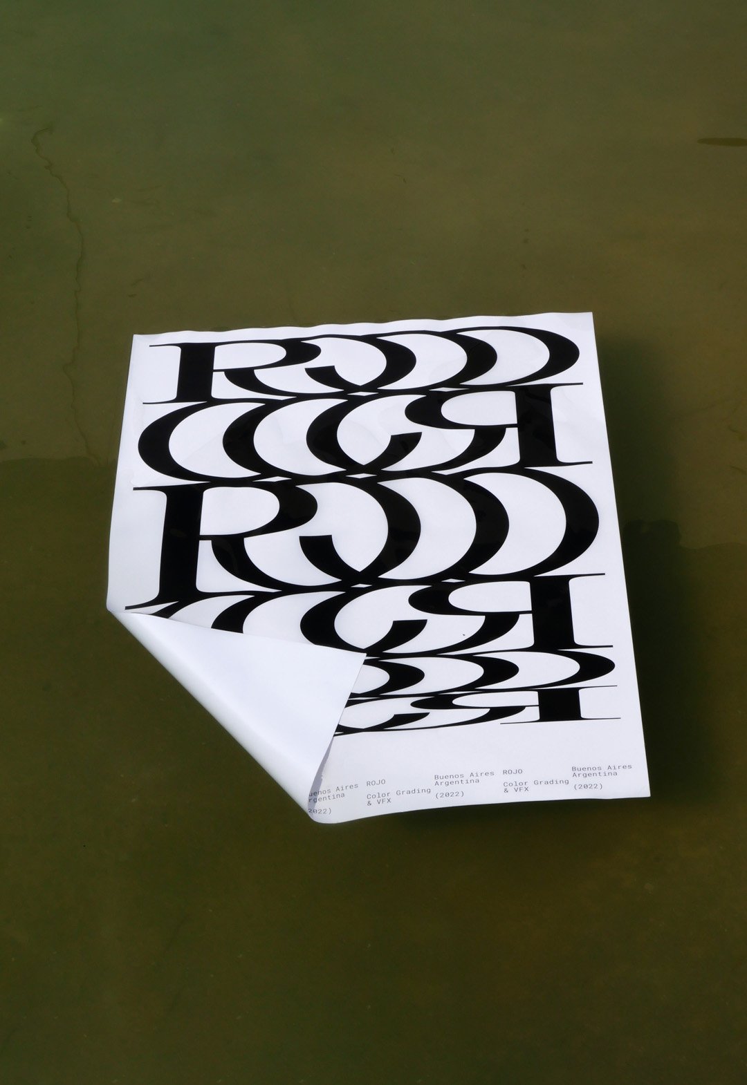
BackROJO is a visual effects, post-production and colour grading studio working for films, TV series and commercials, based in Buenos Aires, working all over the world.
This company works with a large number of studios and collaborators, at different stages of an audiovisual project. In other words, they are always part of a team that is bigger than themselves.
This new logo tries to represent that connection in a very strong and aesthetic way, showing a lot of personality without the need for an elaborate graphic system.
The Rojo logo is big, bold and black. The background colors of the identity change all the time, whether they are video images or textures of real elements.
Buenos Aires, Argentina (2022)
Monocle Type / 3D - Animation - Graphic Design - Type
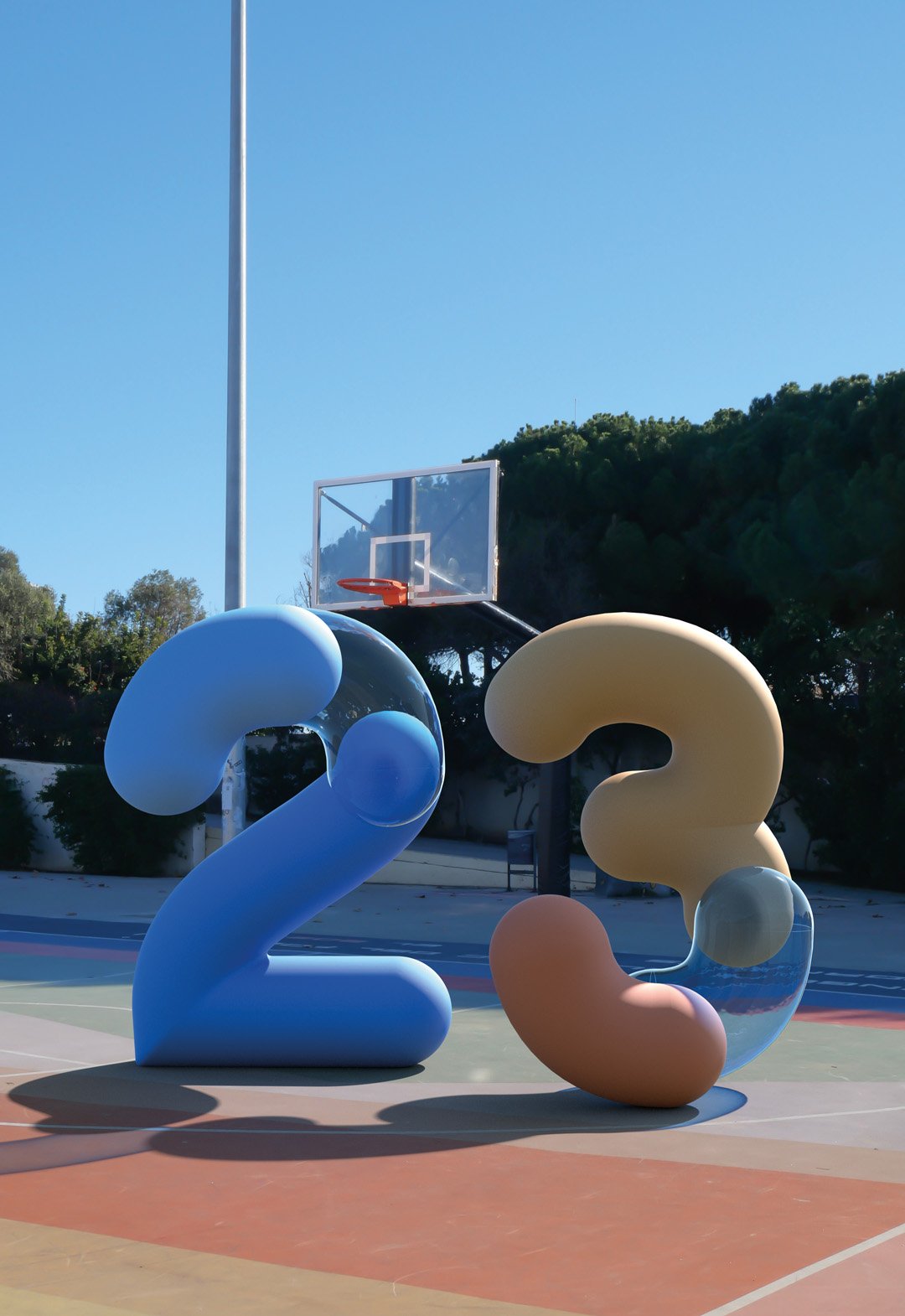
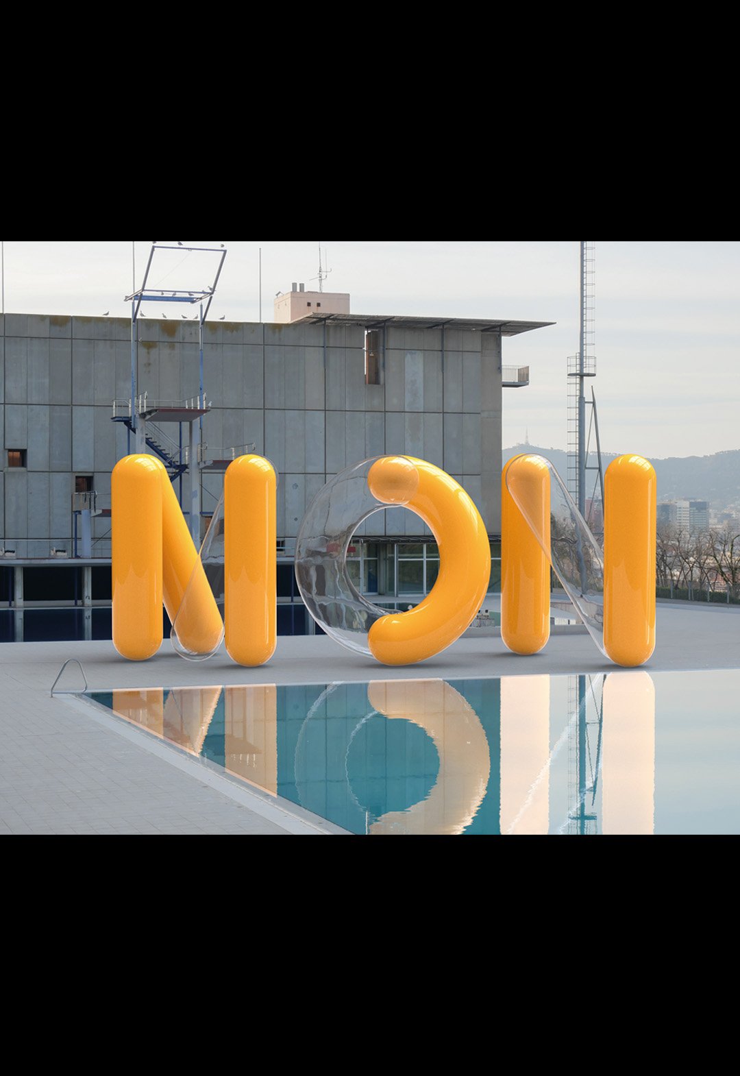
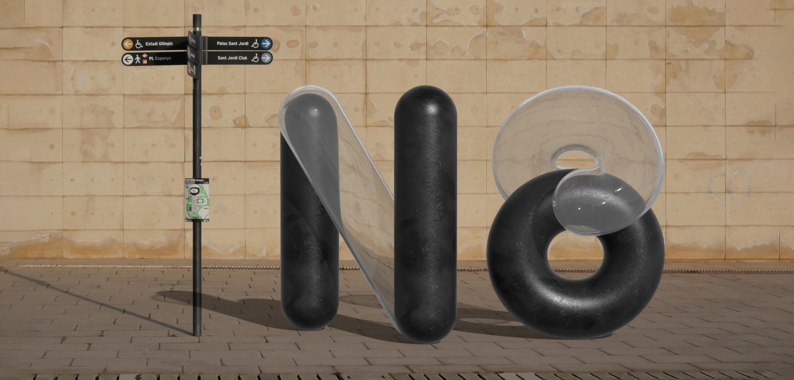
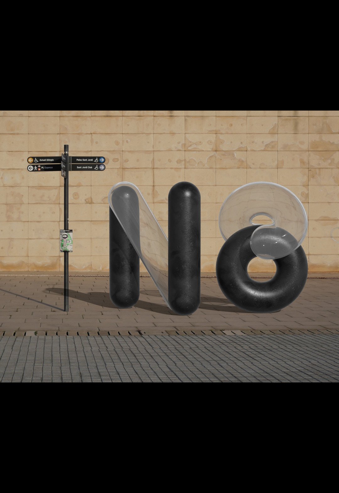
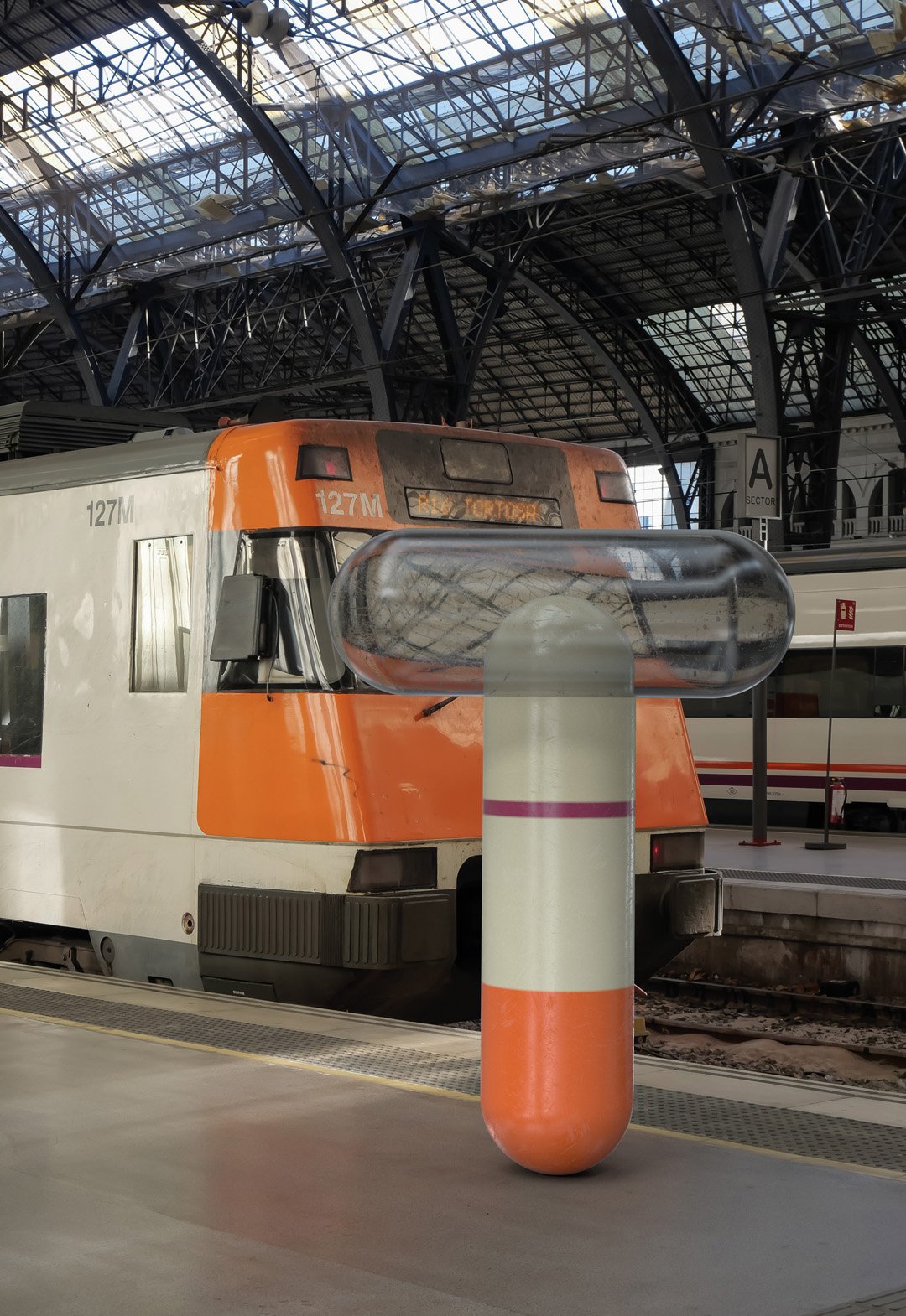
BackMonocle is a visualization typography inspired by ancient monocles, magnifying glasses and their refractive indexes. By passing a magnifying glass over any object, what happens inside changes and gives rise to something new and unpredictable.
The project recreates the shapes and colors of digital environments, mixing 3D development with animation.
The exercise of mixing worlds was done in the streets of Barcelona, recreating random compositions of a real light moving towards a 3D object and back.
The end result looks new and old at the same time, but best of all, it looks real, because it is real.
Team: Mauricio Gallegos / Martín Cañadell / Gastón Garcia Aja
3D: Martín Cañadell
Photo: Gastón Garcia Aja
Barcelona, Spain (2021)
Afecto / Animation - Concept Development - Identity - Naming
BackAfecto is a design brand that creates unique and label-free pieces related to ceramics, glass art, photography, design, clothing and furniture. Just like many other things we experiment and share dairy, the objects can carry stories, personality and expression. Unlike mass-produced brands, Afecto offers special pieces that are redefined by the person who gets them.
Its graphic identity attempts to represent this feeling. Organic forms open to meaning, constantly moving and adapting, ready to tell a countless number of stories.
The logo is a statement, focused on the literal meaning of the word; close to love. The magic hands of the sisters that carry out the creation of each piece are represented in the brand icon. The rest of the system is intended to follow the products in the real world, adding a new digital universe to communicate all the beautiful things happening around this project.
Team: Gastón Garcia Aja / Guadalupe Cáceres / Candelaria Cáceres
Animation: Mauricio Gallegos
Barcelona, Spain (2023)
Obra / 3D - Animation - Identity - Naming
BackObra is a coding and web development partner agency based in Barcelona working worldwide.
Its focus is to provide programming and web development solutions to any kind of digital project, under the premise of materializing the ideas of design studios and clients.
The identity represents connection and versatility from a simple graphic element such as a line. Lines can be transformed into letters and many other things, just as a code can make almost any idea come true.
Digital projects allow things to move, to be interactive and expressive. The 3D development matches that idea.
Team: Gastón Garcia Aja / Mauricio Gallegos
Team: Martín Cañadell
Barcelona, Spain (2024)
Personal Pay / 3D - Animation - Titles
BackThis 3D work and animation was our contribution to the last Personal Pay TV commercial. Personal Pay is the first digital wallet of Personal, a mobile company from Argentina. The main concept of all of this was; if you use this app, you are going to save some Mango, Pasta, or Guita, all different ways to say money in an Argentinian vibe.
These three words had to have the correct feeling within 3 seconds of appearance. We tried to play with the texture of a well-cooked spaghetti, the shapes, and colors of a mango, and the aesthetic, (made from a real photo) of a wad of Argentinian notes.
We work on every detail of the construction of each word for so many hours to finally display it in a very short moment of the commercial, and we love that.
Buenos Aires, Argentina (2022)
Cielo Argentino - Juegos Olímpicos Tokio 2020 / Animation - Graphic Design - Type
BackThere is nothing more important for an athlete than the Olympic Games and there is almost nothing further away from Argentina than Tokyo. The pandemic context made it impossible for people to cheer on the athlete in this edition.
The purpose of this design was to bring that missing ovation to the stadium, converted into something that travels in the plane's luggage and represents the spirit of Argentina.
This T-shirt was designed from real photos of the Argentinean sky, taken by athletes from all the provinces of the country with their phones. The photos were processed to form a pattern that unifies them into a single design, which more than a design, is a breath, which is born in the sky and felt in the chest, and if you get a little closer, it says: ¡Vamos Argentina!
Team: Mauricio Gallegos / Gastón García Aja
Production: Jacana
Client: Confederación Argentina de Atletismo
Film: Fernanda Scarafía
Athlete: Ezequiel Bustamante
Córdoba, Argentina (2020)
Más / Animation - Graphic Design - Revamp
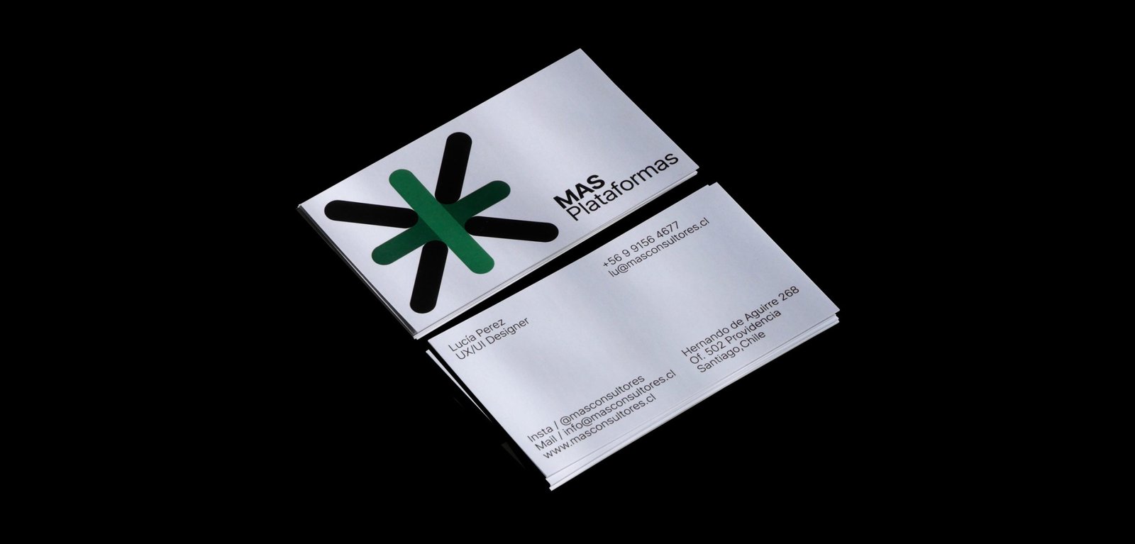
BackThe new narrative, new brand architecture, and new graphic identity for MAS, a human resources consulting firm based in Santiago, Chile.
From autonomous identities for its business units to a power symbol and system that brings back all the importance and exposure to the main group identity. A new icon that represents a multiplication, rather than an evident addition, and a system that allows each unit to be identified while maintaining versatility and autonomy.
The new graphic system of MAS has two different worlds. Full color, white backgrounds, and clean elements go for the main group institutional communication. A limited color palette, grey backgrounds, and out-of-context size of the elements, go with the communication of each business unit. Both systems work together being different. Clean and noisy, simplicity and mess, serious and playful.
Team: Mauricio Gallegos / Gastón Garcia Aja
Animation: Martín Cañadell
Santiago, Chile (2018)
WIP / Animation - Identity - Type
BackWIP is a cultural venue that combines architecture, design, photography and art. Its concept, like its name, has to do with the creative process as a state of continuous search.
Its identity moves representing the before, during and after of a creative process, and also, the interaction of different disciplines in the same place.
Team: Gastón Garcia Aja / Mauricio Gallegos
Córdoba, Argentina (2018)
Taste My Aruba / 3D - Animation - Illustration
BackTaste my Aruba by Mauri's honeymon souvenirs. “During my honeymoon, leaving aside I realized the amount of stimuli and objects saturated with messages that try to tell what happens on a tourist island, compressed into small souvenirs.
The point is that any object, regardless of its functionality, can transform you into a souvenir, and for it to be from here, and not from there, you have to imbue it with some sort of identity. An identity that is a mix of many things. A keychain that represents a swordfish, that can also uncork beers, that also says Aruba, just to start.
This idea was in my mind, and together with the team, as if we had nothing else to do, we tried to give it the form of animated gifs and 3D”.
Team: Mauricio Gallegos / Gastón Garcia Aja
3D & Animation: Martín Cañadell
Buenos Aires, Argentina (2023)

