La Kitchen / Concept Development - Illustration - Packaging - Revamp
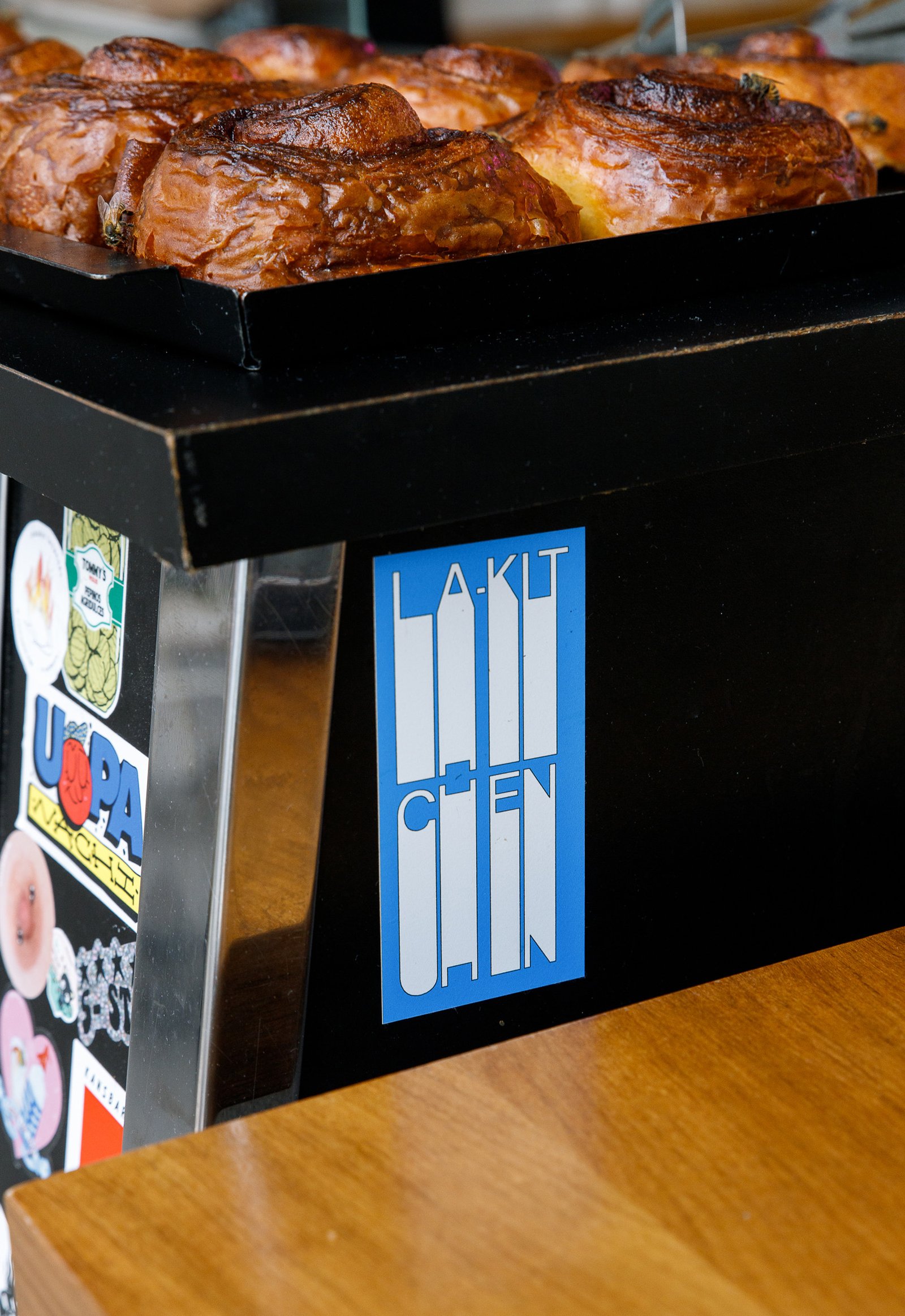
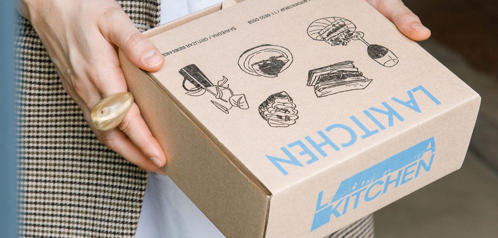
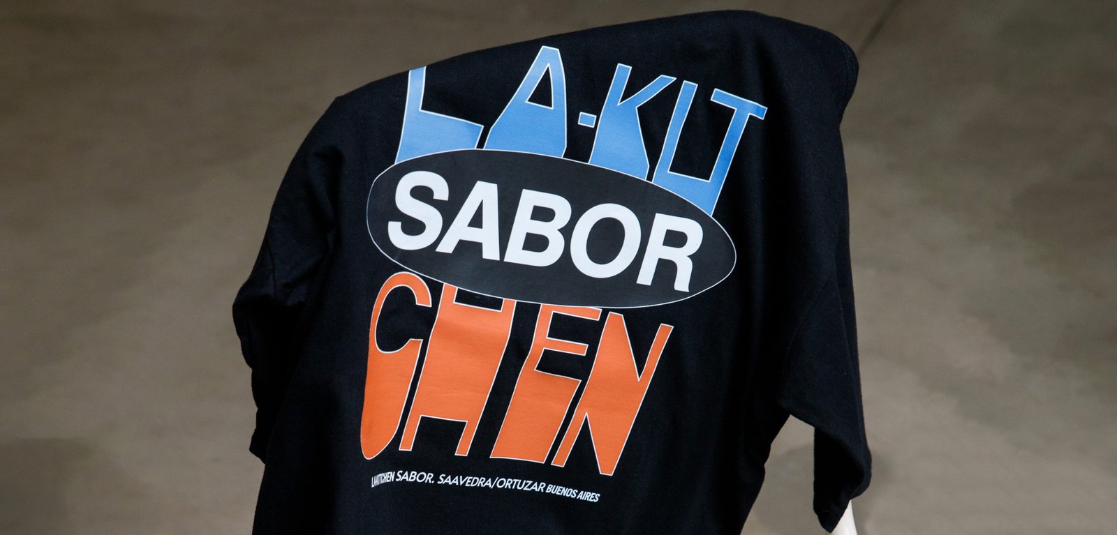
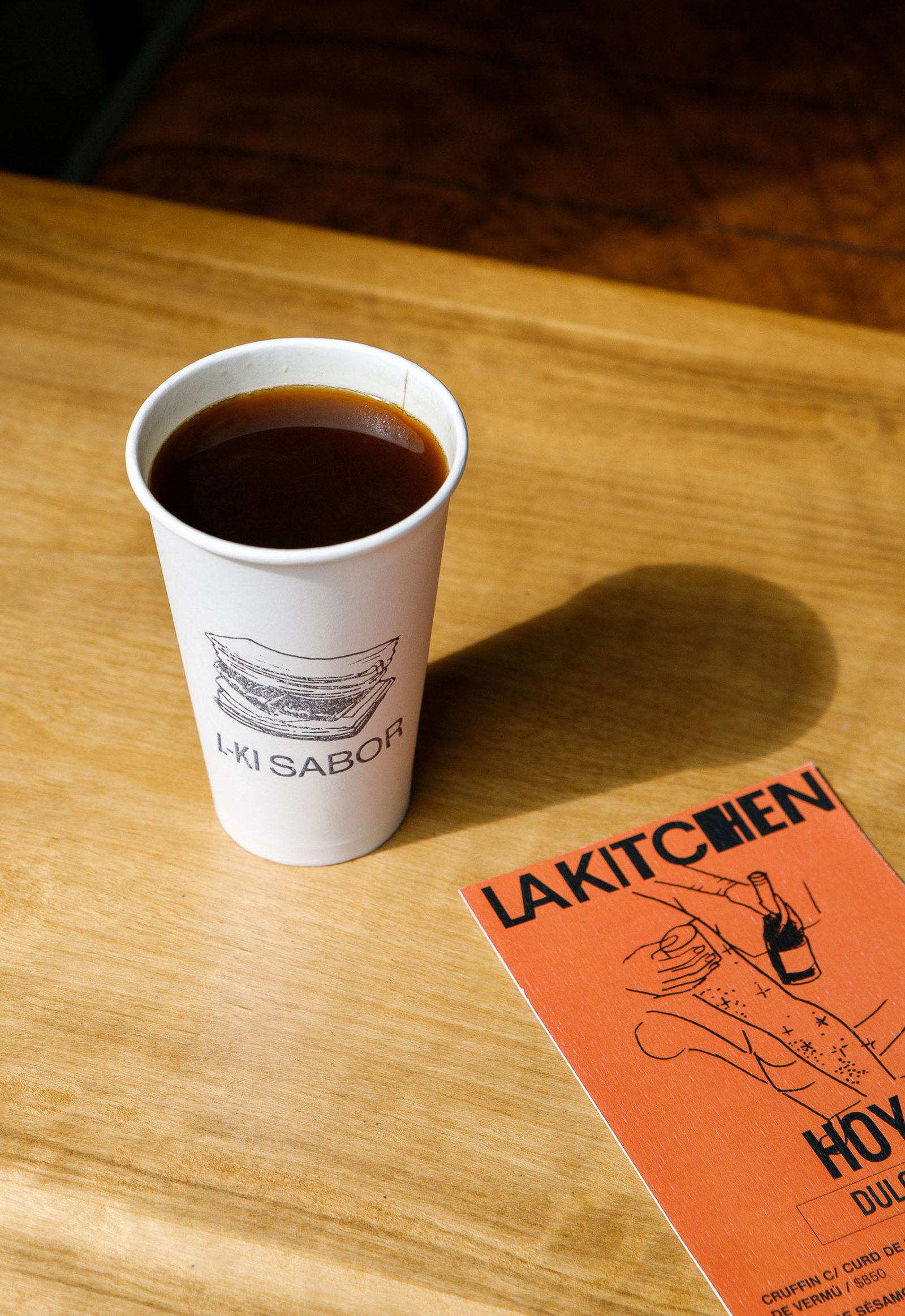
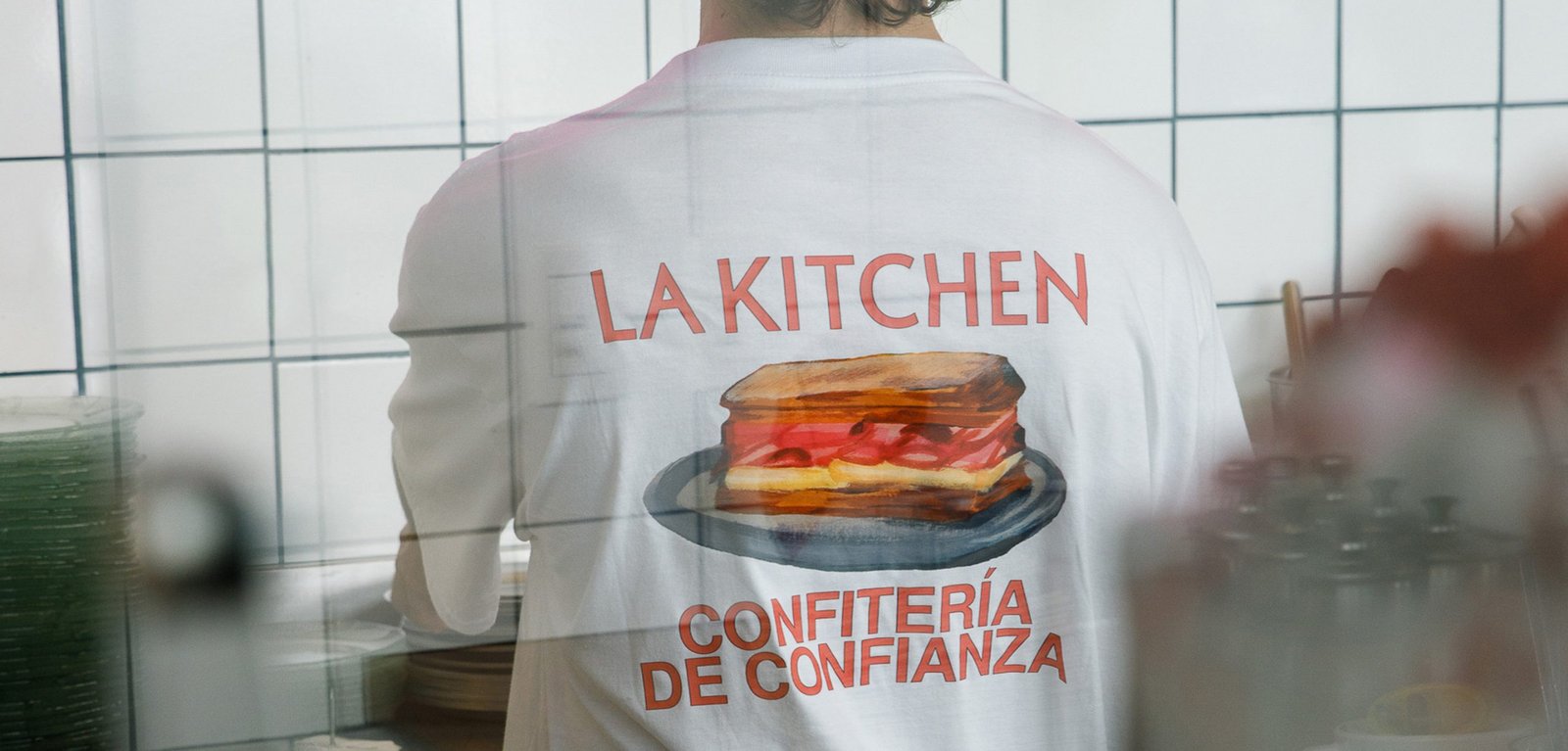
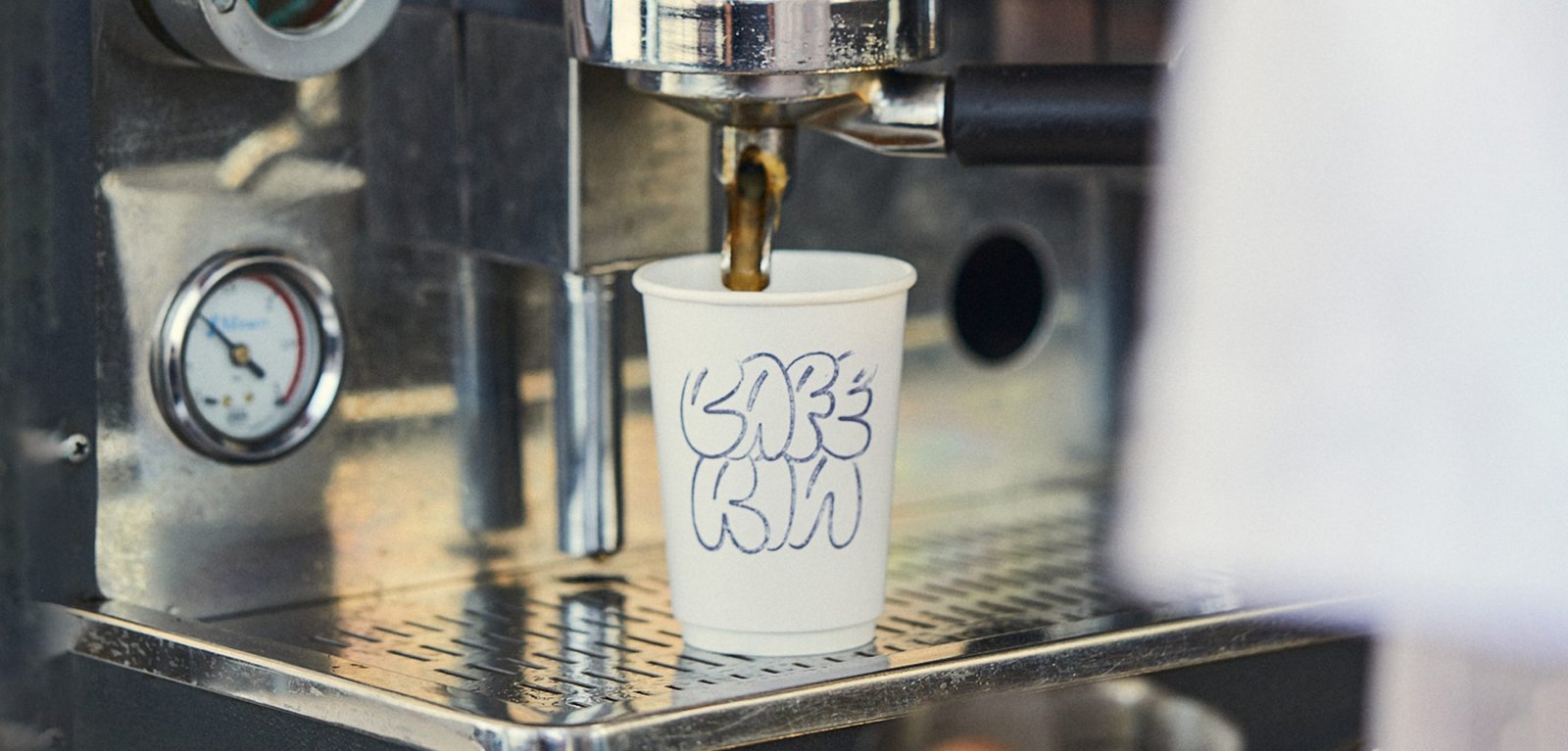
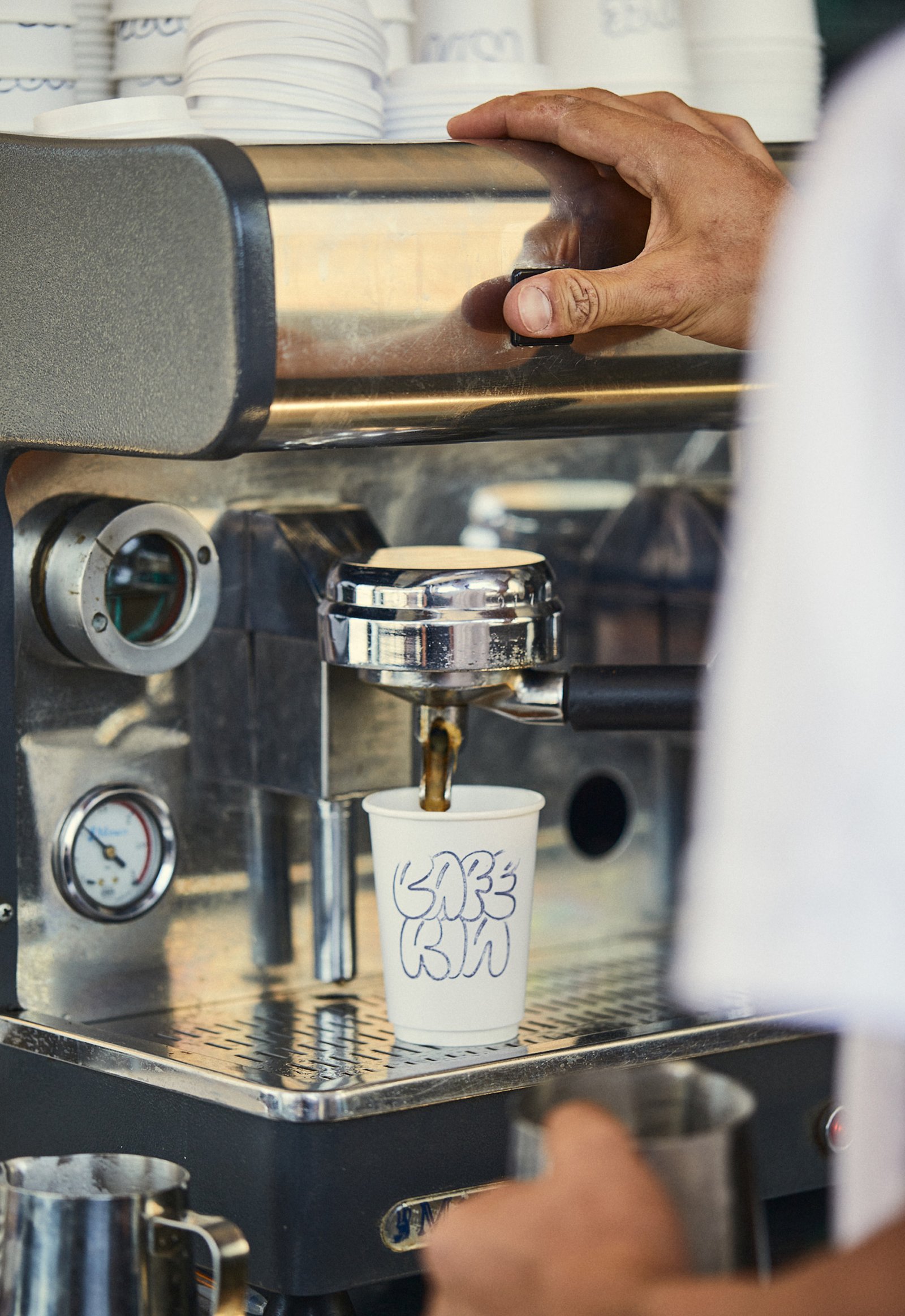
BackInspired by the traditional aesthetics of the Parisian boulangerie, adapted to the particular and beautiful local culture of the neighborhoods of Buenos Aires.
This new identity tries to combine the transparency and honesty that exists in its products and experiences, from a sincere and fun design.
Everything is related to the "mix", to the handmade, to an attitude of disruption against the established, and to a non-graphic identity full of content that makes its public, true fans.
A multi-logo strategy combined with handmade acrylic illustrations by the brilliant Gabriel Sciutto continues the idea of brand expression.
Team: Gastón Garcia Aja / Mauricio Gallegos
Illustration: Gabriel Sciutto
Photo: Malena Fradkin
Buenos Aires, Argentina (2023)
Afecto / Animation - Concept Development - Identity - Naming
BackAfecto is a design brand that creates unique and label-free pieces related to ceramics, glass art, photography, design, clothing and furniture. Just like many other things we experiment and share dairy, the objects can carry stories, personality and expression. Unlike mass-produced brands, Afecto offers special pieces that are redefined by the person who gets them.
Its graphic identity attempts to represent this feeling. Organic forms open to meaning, constantly moving and adapting, ready to tell a countless number of stories.
The logo is a statement, focused on the literal meaning of the word; close to love. The magic hands of the sisters that carry out the creation of each piece are represented in the brand icon. The rest of the system is intended to follow the products in the real world, adding a new digital universe to communicate all the beautiful things happening around this project.
Team: Gastón Garcia Aja / Guadalupe Cáceres / Candelaria Cáceres
Animation: Mauricio Gallegos
Barcelona, Spain (2023)
Media Markt / 3D - Concept Development - Titles
BackThese are some titles and animations we made for the latest Media Markt commercial, directed by Bode Brod Mueller and produced by TPFilm.
Media Markt is a German multinational company that sells electronic products all over Europe. The titles and animations for this project were part of the annual ad directed by Bode Brod Mueller and produced by TPFilm. The exercise "Let's Go" mixes fonts and movements on the range to express power and energy.
Team: Mauricio Gallegos / Martín Cañadell / Gastón Garcia Aja
3D & Animation: Martín Cañadell
Director: Bode Brod Mueller
Production Company: TPFilm
Frankfurt, Germany (2022)
Amateur / Concept Development - Identity - Illustration
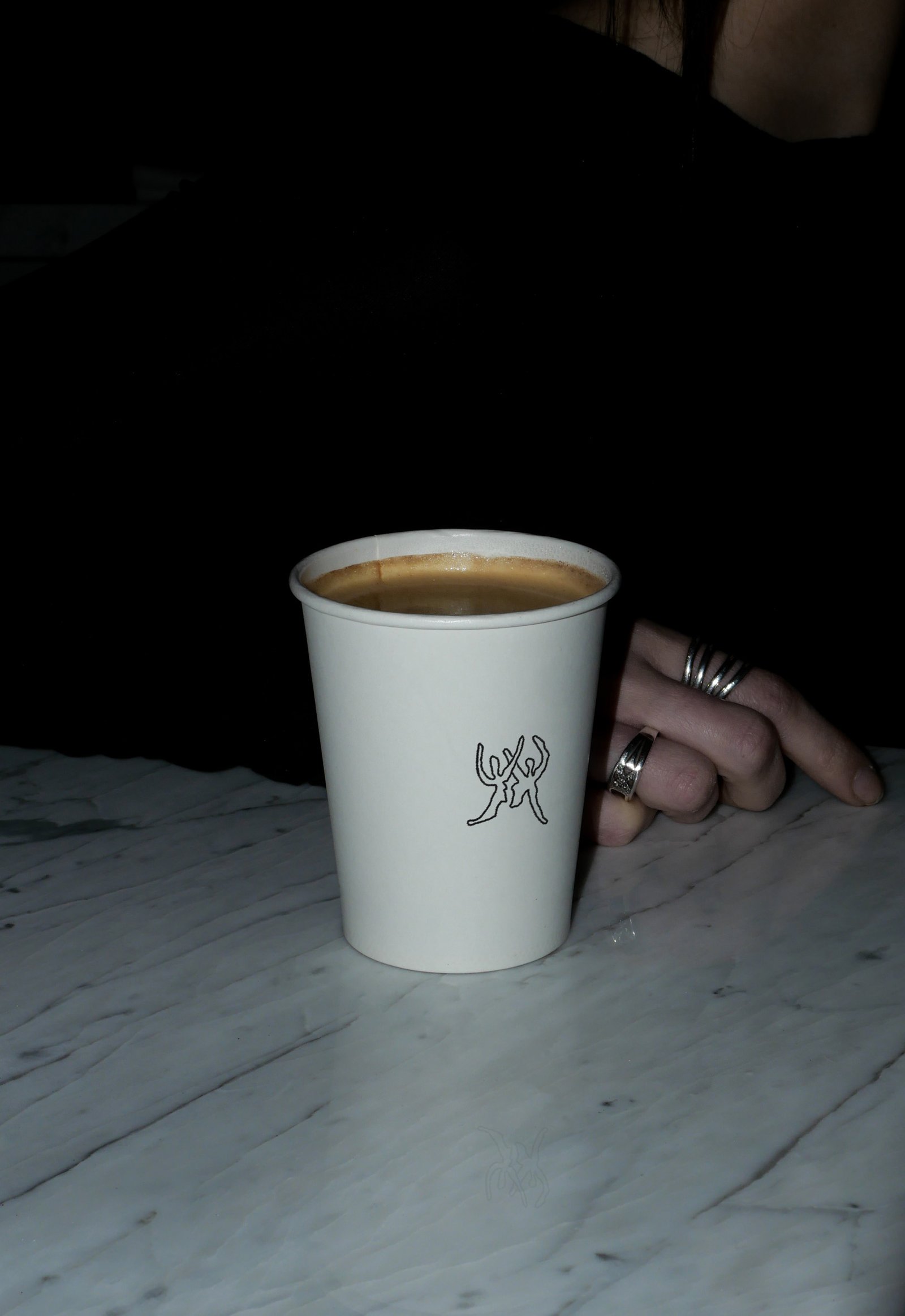
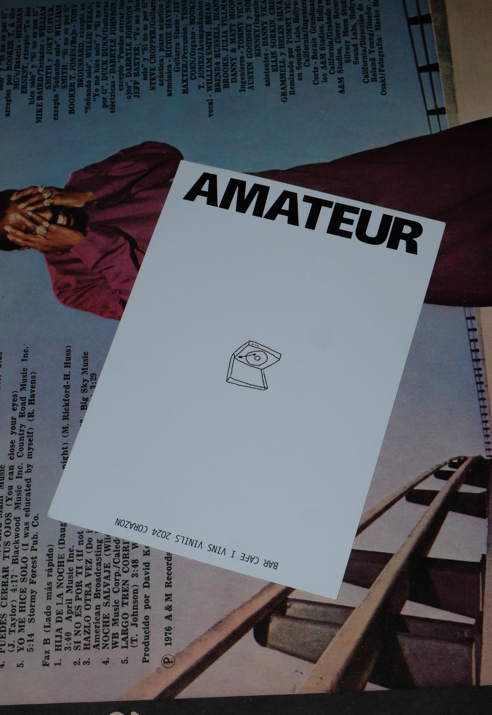
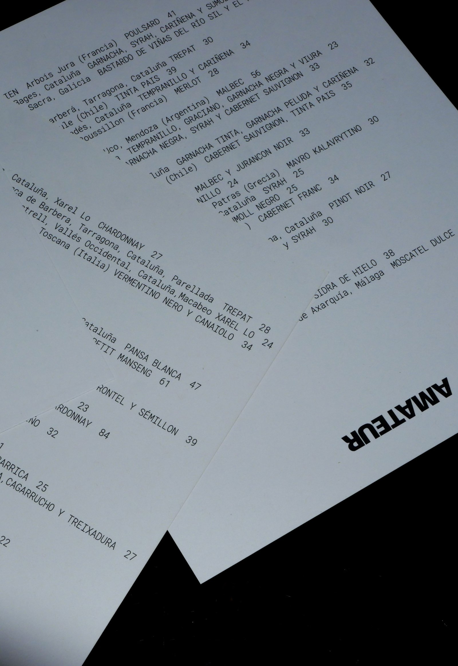
BackAmateur (The ones who love), is a new bar that brings together specialty coffee, natural wines, food to share and vinyl records playing in the heart of Poblenou, Barcelona. This place is a celebration of doing the things you love, passion and the intention to do it at your best.
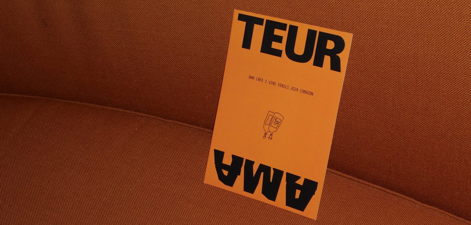
The identity represents the contrast of the brand, matching the seventies vibe of the architecture and aesthetics of the whole project.
Retro typography, clean compositions support the stress free illustrations made by Pegamento, in line to create the graphic universe of the brand. Huge contrast, blank spaces, and details inspired in the vinyls spinning are all across the identity.
Colab: Pegamento
Team: Gastón Garcia Aja / Mauricio Gallegos
Illustration: Pegamento
Barcelona, Spain (2024)
Syra Coffee / Concept Development - Illustration - Packaging - Revamp
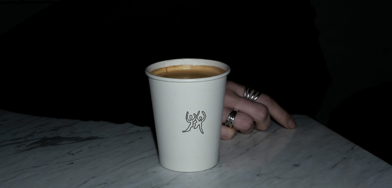
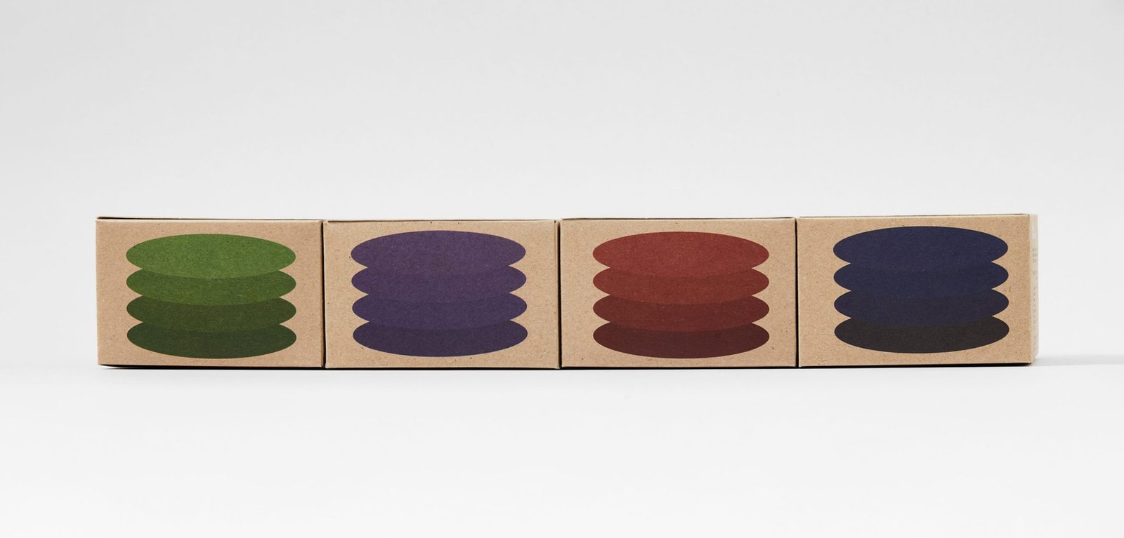
BackSyra Revamp Project. Syra is one of Barcelona's biggest specialty coffee companies, with its own roastery and coffee shops, most in Barcelona and across Spain.
Under the idea of democratizing specialty coffee, and betting on small takeaway coffee shops in different neighborhoods of the city, Syra brings coffee closer to many people, offering a more inclusive product.
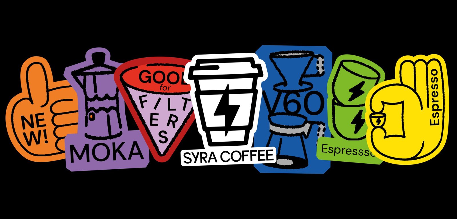
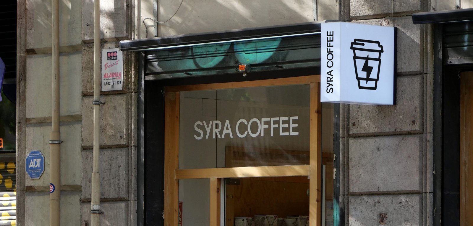
This new identity aims to modernize the brand's image, bringing it closer to a diverse public, from the design to the narrative. The change of logo allows for a better use and longevity of the icon, while the new typography brings a younger, bolder, and more fun main feeling. It also improves its performance in graphic compositions.
The new look is more colorful, bigger, and easier to use. New graphic resources such as illustrations and stickers help to generate more coherent layouts across platforms and content levels. These design and strategic gestures help the brand to adapt to the new digital era it is going through, where e-commerce, smartphone application, and social media content are at the forefront.
Team: Gastón Garcia Aja / Mauricio Gallegos / Maher M. Mansour
Motion: Martín Cañadell
Special Thanks: Maria Amaro
Barcelona, Spain (2022)
Bemvindas / Concept Development - Editorial - Identity
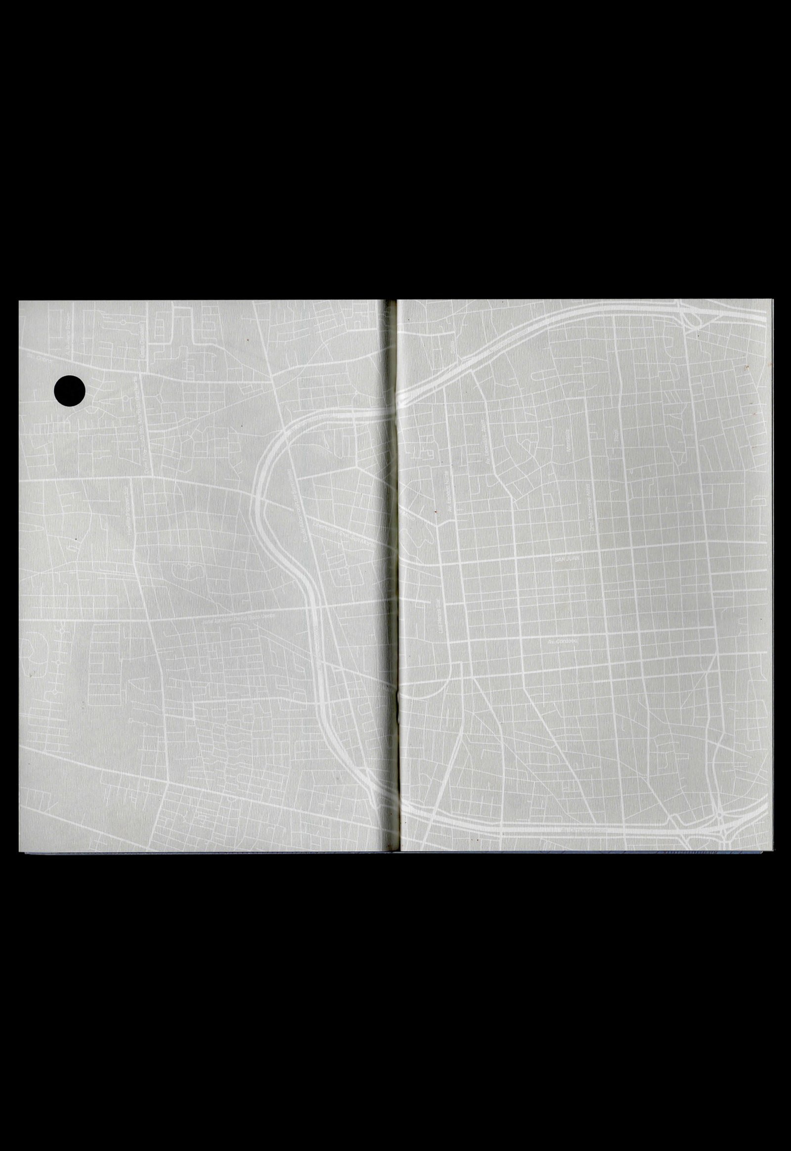
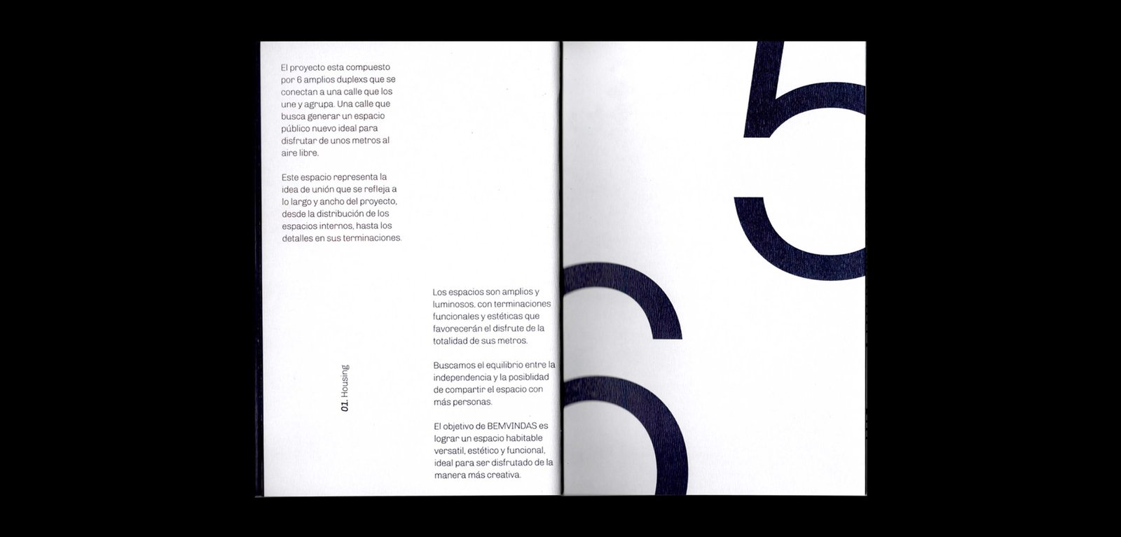
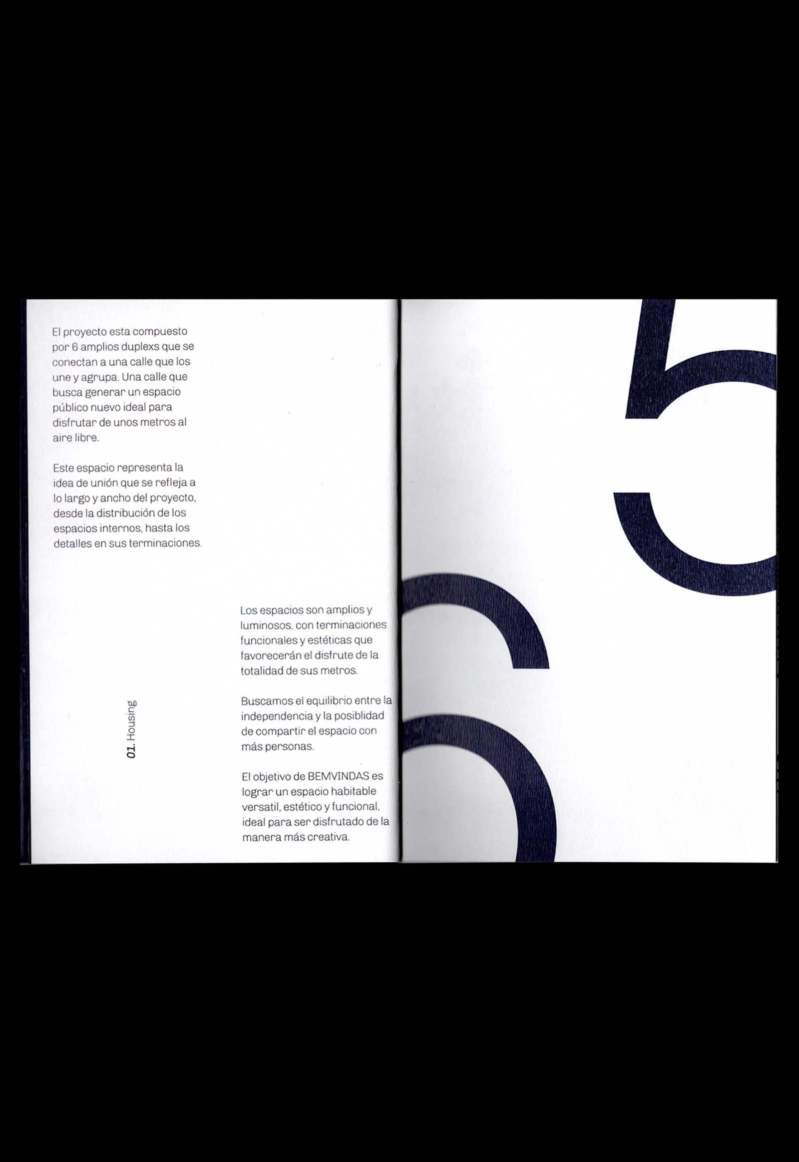
BackBemvindas is a housing project located in San Juan, Argentina. Beyond its architectural quality, the six duplexs are connected to each other from one street that becomes a public space, increasing the meters and the private garden of each house; a “welcome / bemvindo” space, especially for the category of homes to which Bemvindas belongs.
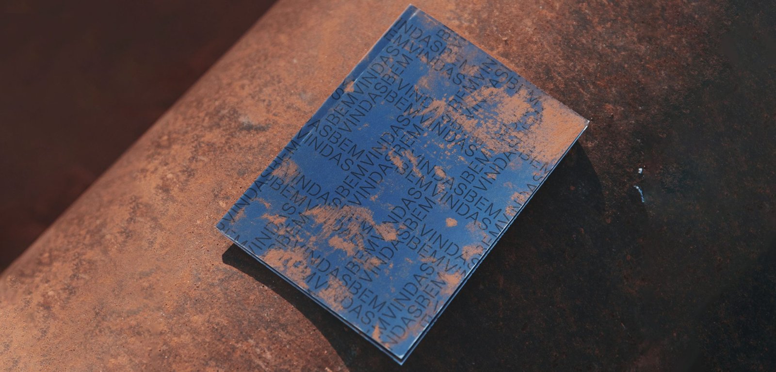
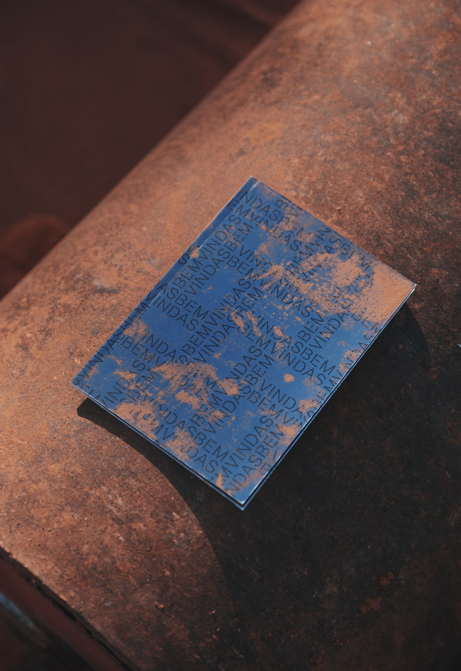
The application of the logo in pattern is a direct reference to the visible brick screening that the whole project looks like. This identity seeks to highlight the materials and the general idea of the project from sincerity and details.
Team: Mauricio Gallegos / Gastón Garcia Aja
Photo: Derio Ilari
Architecture: Estudio Montevideo
San Juan, Argentina (2019)
Plantario / Concept Development - Identity - Naming - Packaging
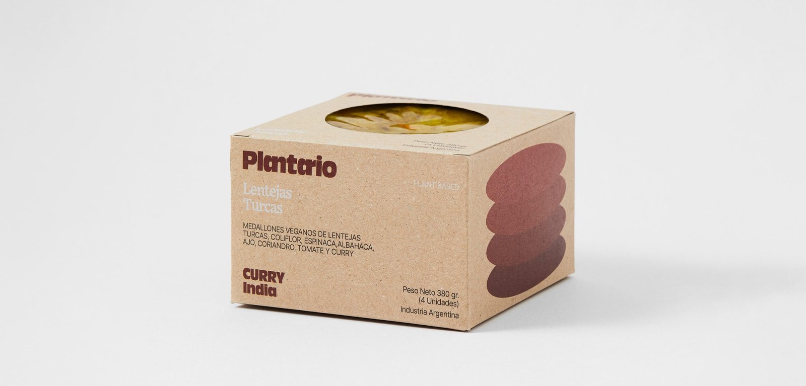
BackPlantario is a plant-based brand that makes burgers with local ingredients and recipes inspired by different parts of the world. The name is a combination of Spanish words meaning; a planet full of plants.
The narrative is around the concept of responsible consumption. It is impossible to save the world by making vegan burgers, but it could be the first step in a series of changes that could help keep the planet alive a little longer.
The packaging tries to be as environmentally friendly as possible, taking into account the nature of the product.
"PLANTARIO is an idea that respects the planet, from the food we eat to the small habits that contribute to the cause. Moving to the right side is the main idea, the side that helps the planet. It's not perfect and it's not going to happen tomorrow, it's going to take time, but we have to start at some point and if a vegan burger is given a chance it's going to be a starting ceremony or a historical event, all the work will have been worth it.
Team: Gastón Garcia Aja / Mauricio Gallegos
Photo: Alvaro Picca
Córdoba, Argentina (2020)
Koyan Hotel / Concept Development - Identity
BackKoyan is a hotel located in Panguipulli, Chile, that seeks to connect people with nature in a pure and simple way, taking advantage of the majestic surroundings of the region.
The isologo results from the combination of a square, which represents the systemic life of people in the city, and a circle, which represents the flow of things in nature. Ideally, the Koyan experience is located between these elements, with balance as the main value.
This intermediate form gave rise to the typography terminations, giving personality and distinction to the logo without losing simplicity.
Team: Mauricio Gallegos / Gastón Garcia Aja
Santiago, Chile (2018)
Natal Perú / Concept Development - Identity - Naming
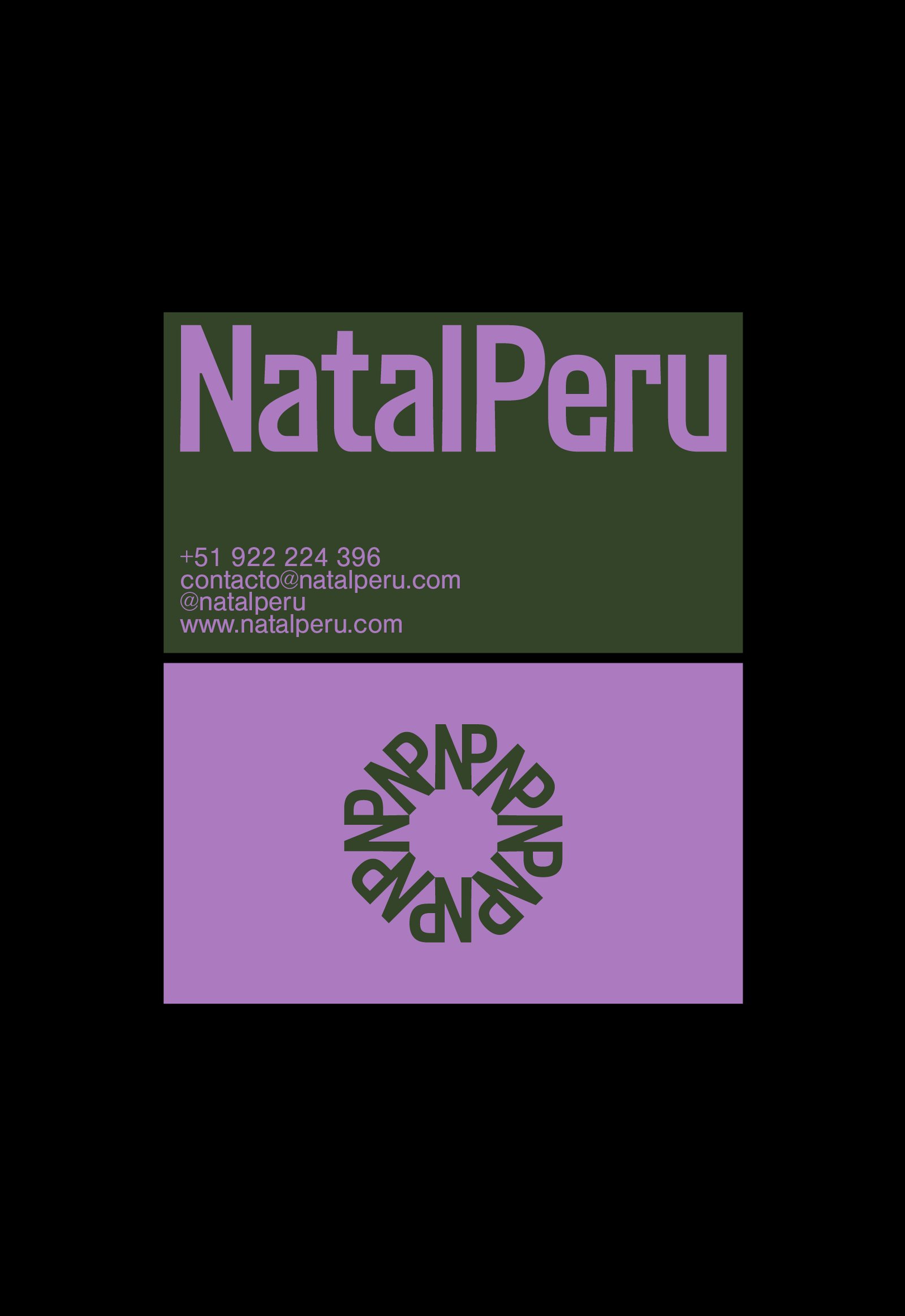
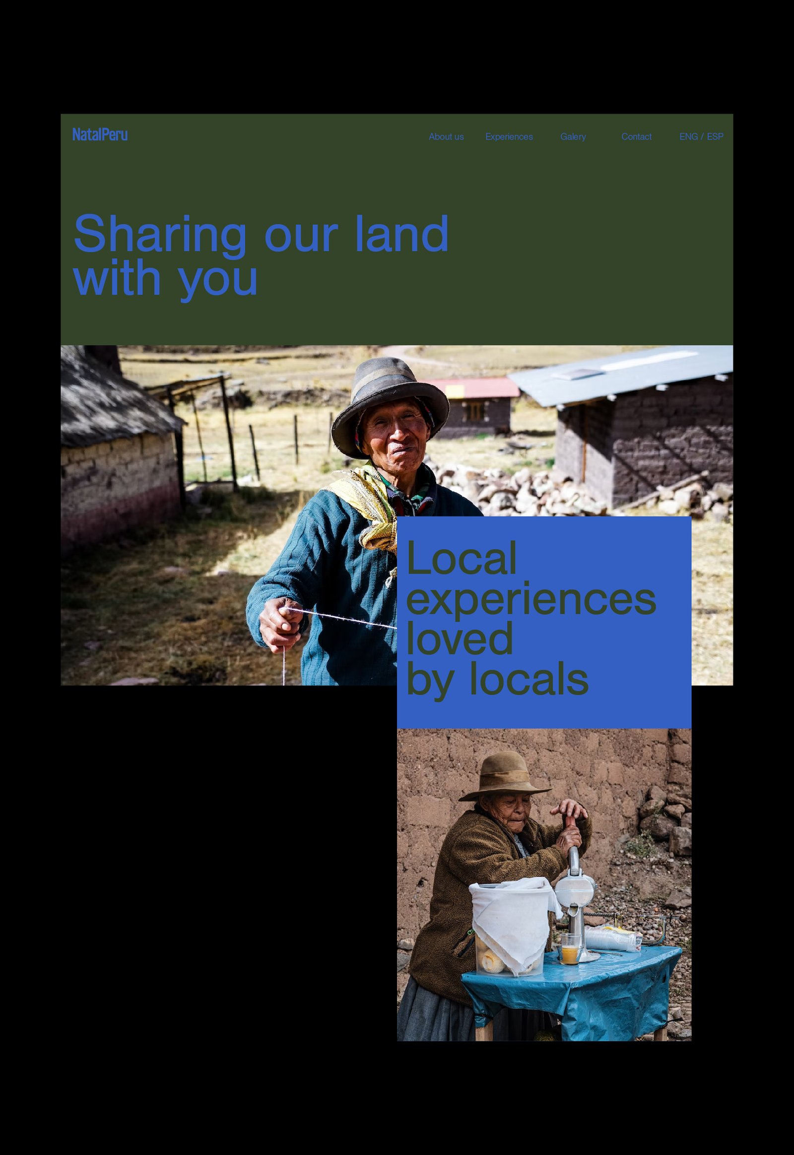
BackNatal Peru is a travel agency focused on generating real experiences for all those who want to get to know Peru. Customized travel agendas based on the tastes of the tourist, combined with experiences verified by locals, generate a unique travel opportunity in the Andean country.
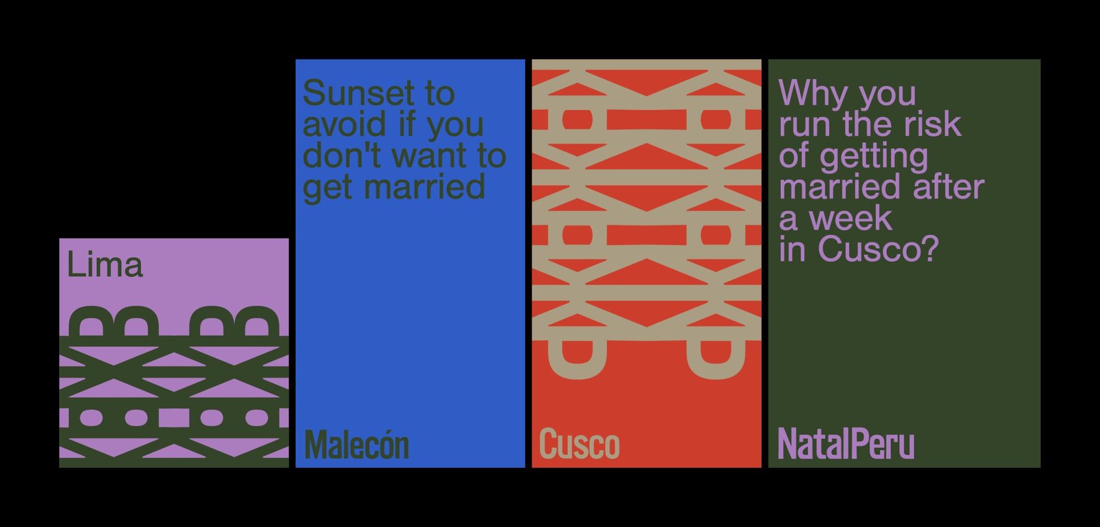
The identity tries to reflect in a simple way the Peruvian spirit, using European codes and aesthetics, in relation to the origin of the target audience. The use of color, patterns from the logo and details in the narrative complete this identity.
Collaboration with: Fibra
Team: Gastón Garcia Aja / Mauricio Gallegos / Andrea Gálvez
Lima, Perú (2022)
Caferia / Concept Development - Identity - Illustration - Naming
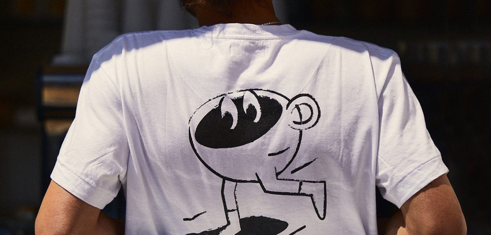
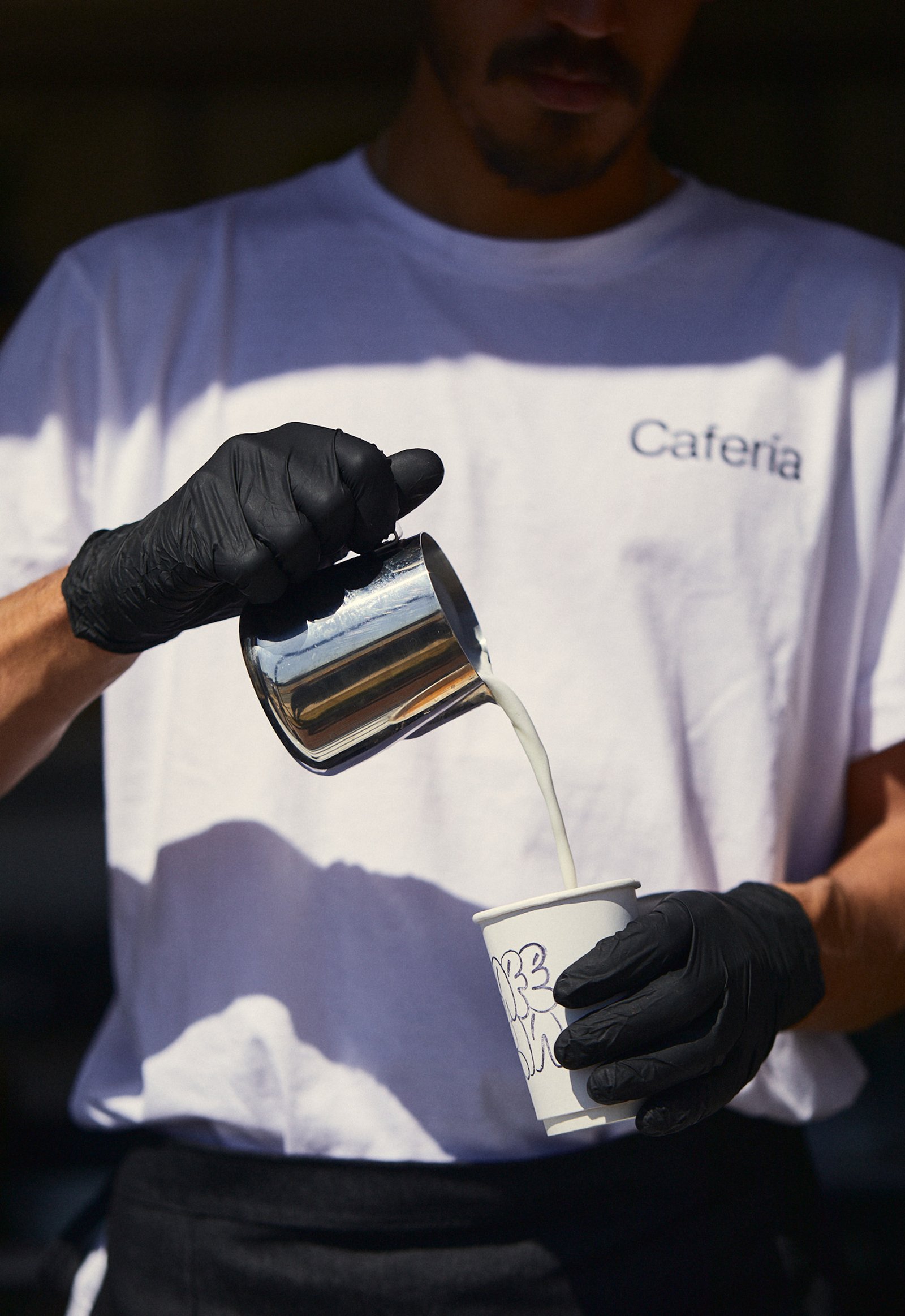
BackCafería is the combination between a specialty coffee shop and a fresh market sale from a local fair, located in Córdoba, Argentina. This identity reflects an urban spirit that represents a happy and relaxed consumer situation.
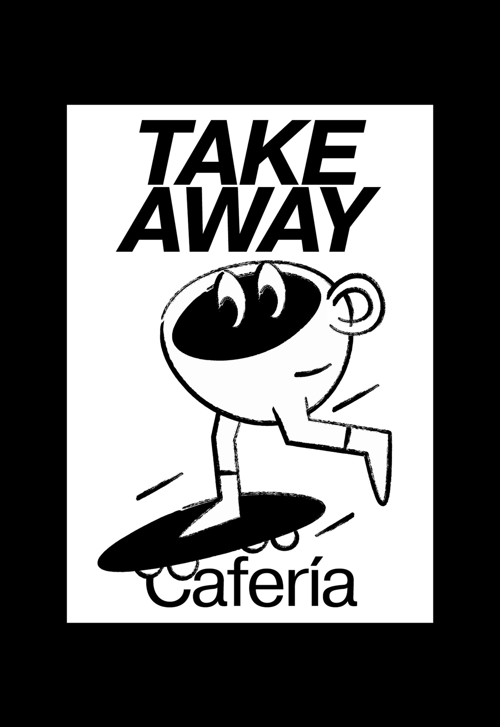
The graphic identity was inspired by the stamps used on take away cups, using their color and finish details to complete the rest of the design pieces.
A simple and dynamic system, made up of well-contrasted fonts and coffee cups characterized in everyday situations, try to generate a cheerful and easy-to-use brand, with a lot of strength in its name, and all the doors open for possible franchises.
Team: Mauricio Gallegos / Gastón Garcia Aja
Photo: Alvaro Picca
Córdoba, Argentina (2020)
Flia / Concept Development - Identity - Naming
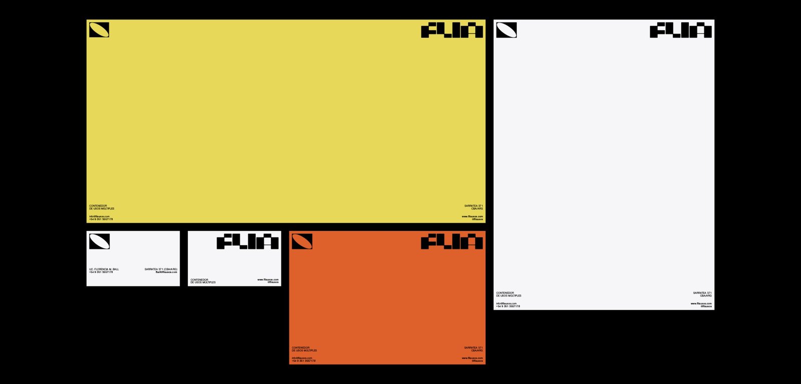
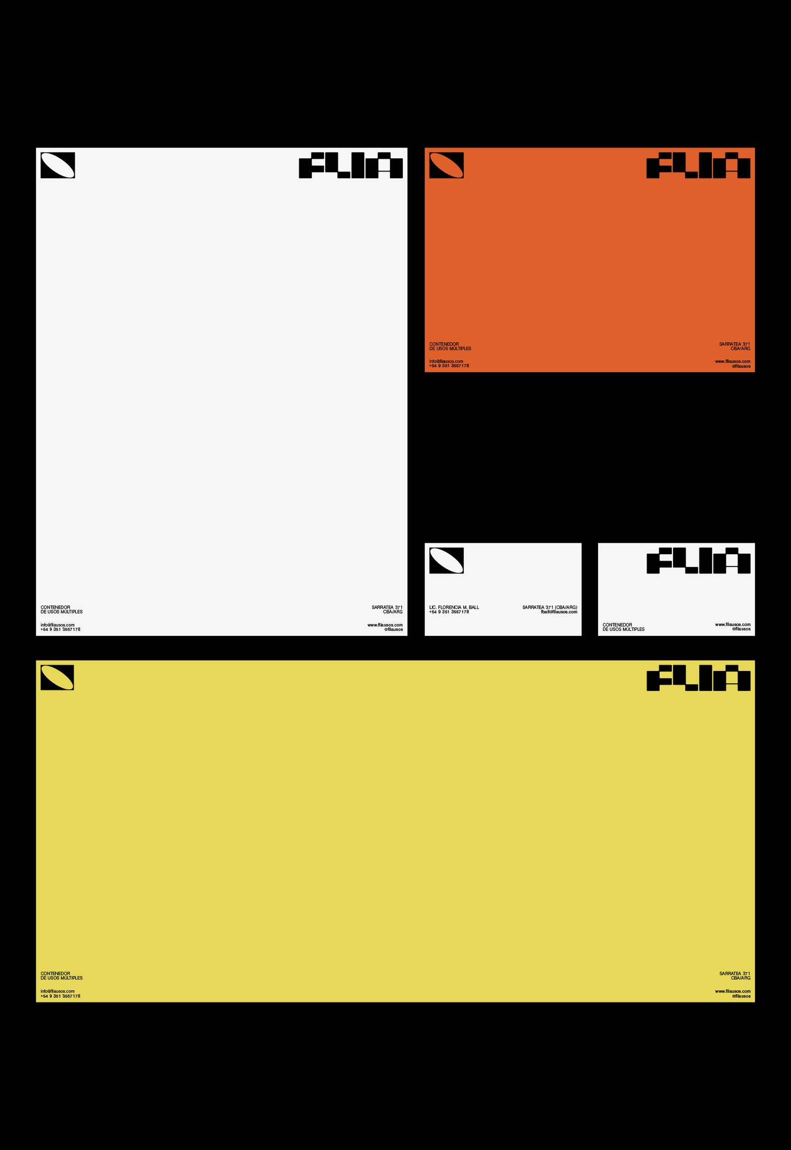
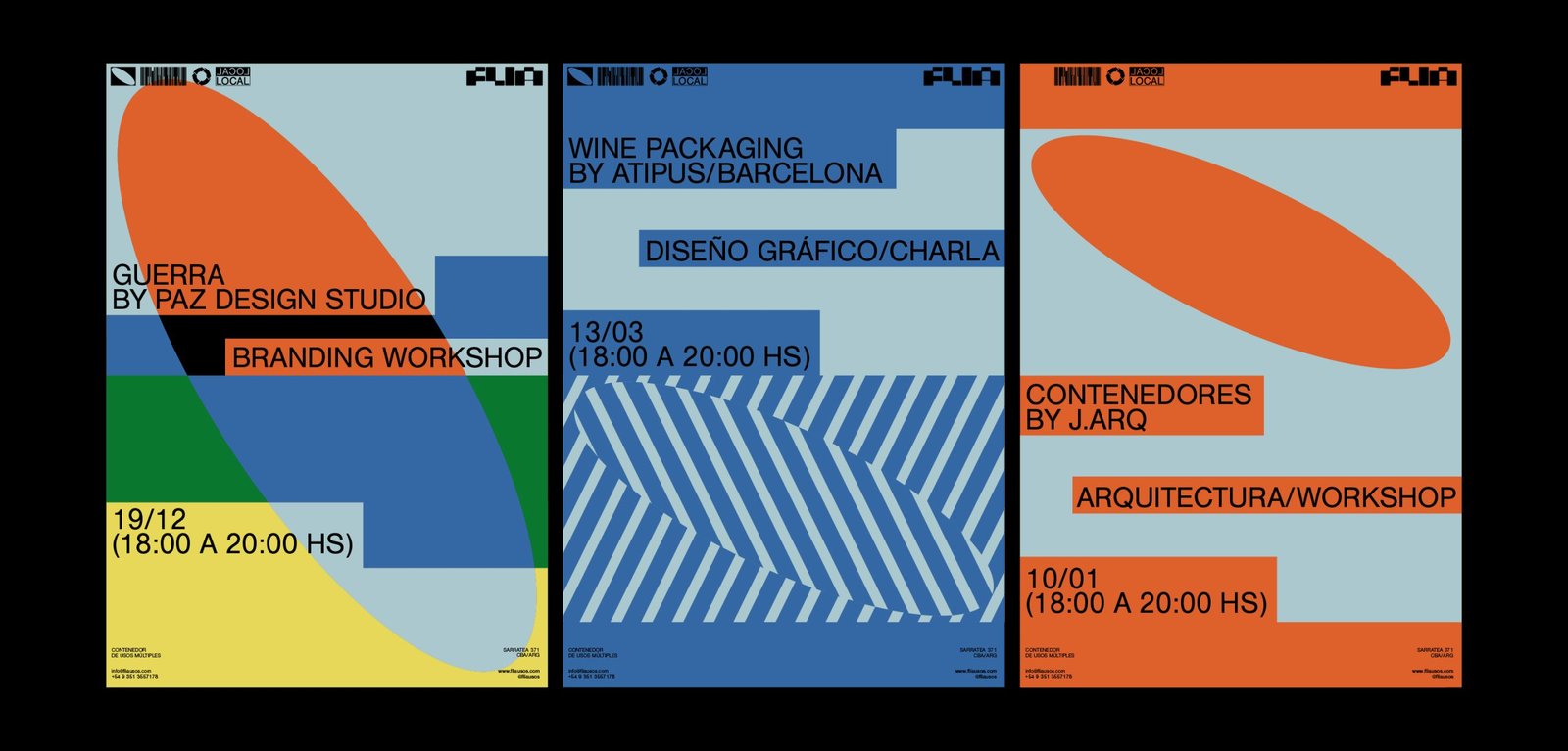
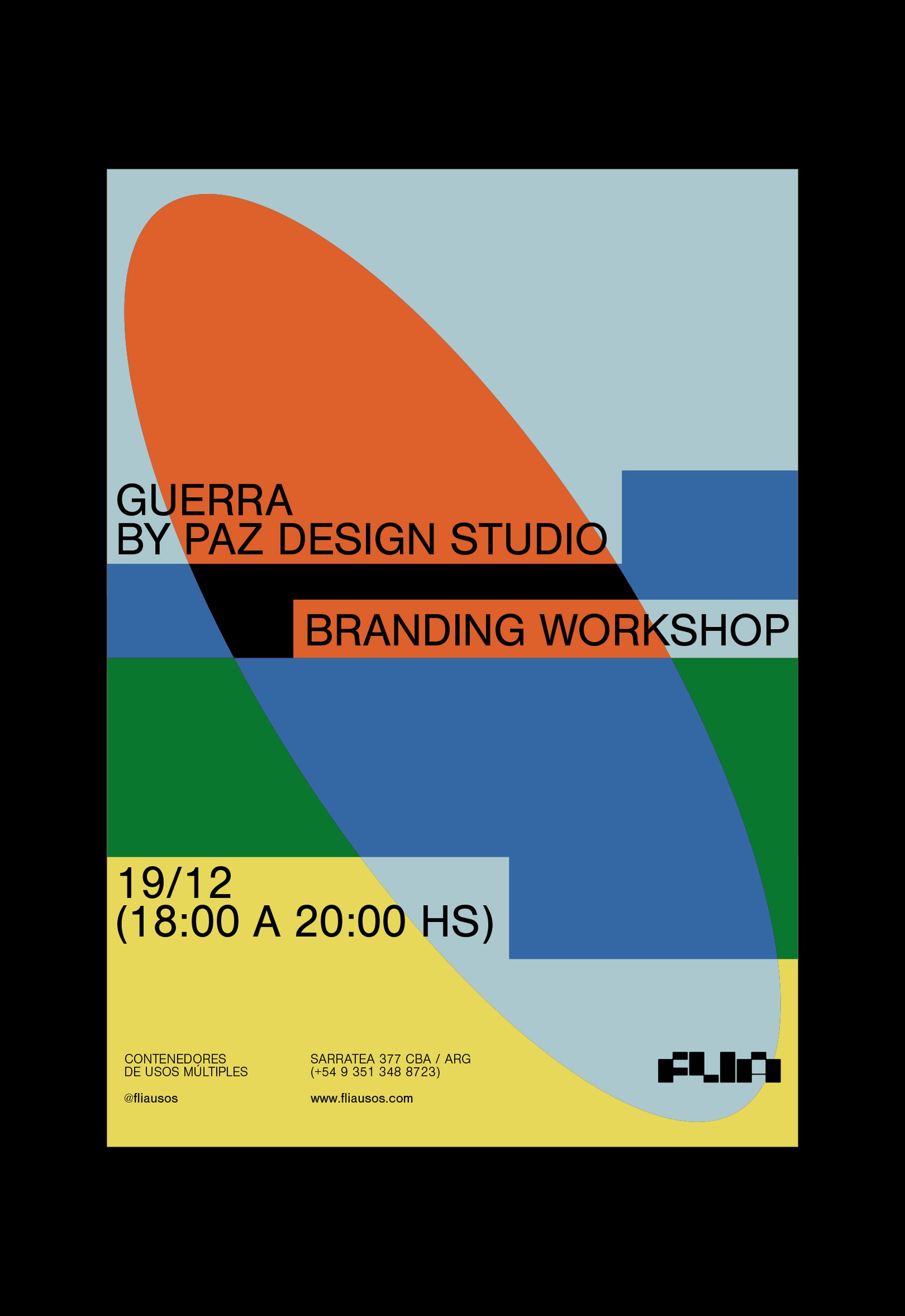
BackFlia is a multi-purpose container open to all kinds of events, training, workshops and talks in different areas, which support local talent and culture and aim at the social development of the city Córdoba, Argentina.
Its identity represents the classic rectangular shape of containers. This idea is found in the formation of the letters of the logo, and in the whole graphic system.
Team: Mauricio Gallegos / Gastón Garcia Aja
Architecture: Jarq
Córdoba, Argentina (2019)

