El Mensaje / Graphic Design - Packaging
BackSometimes it's not about front or back labels, or the size of the logo (if it has one) or the aesthetics. Sometimes it's about emotions.
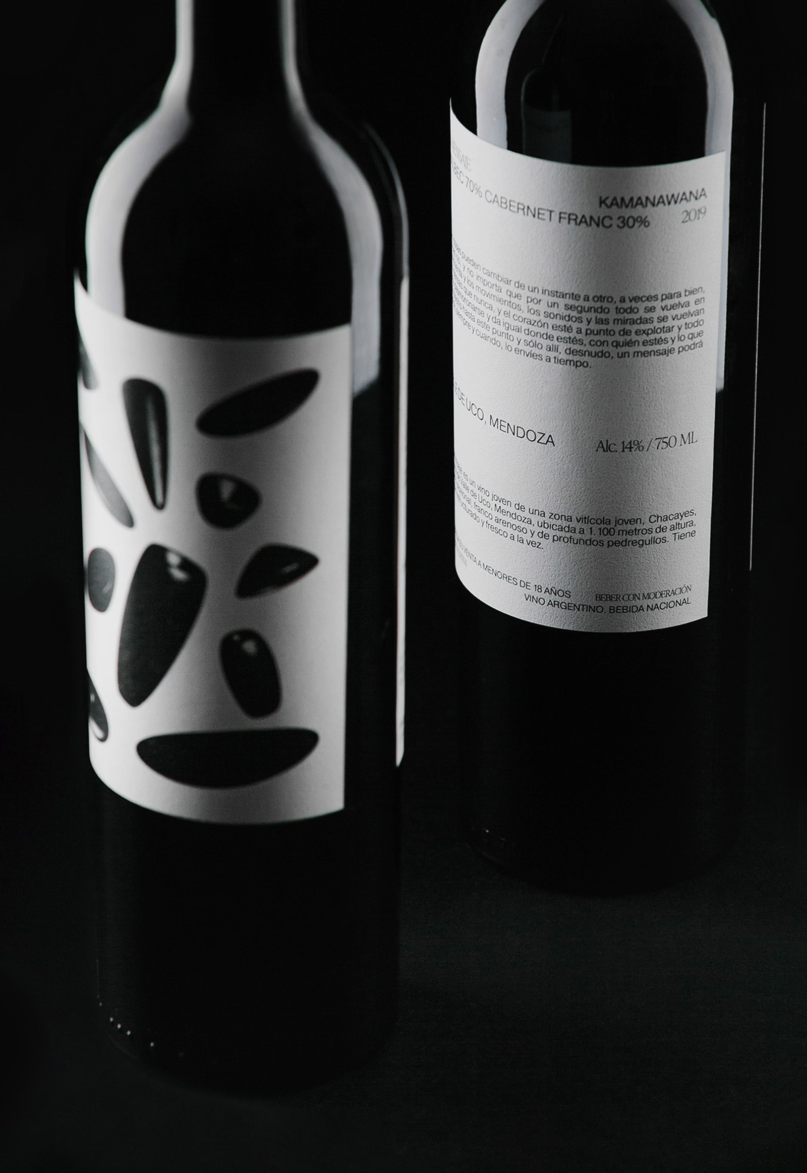
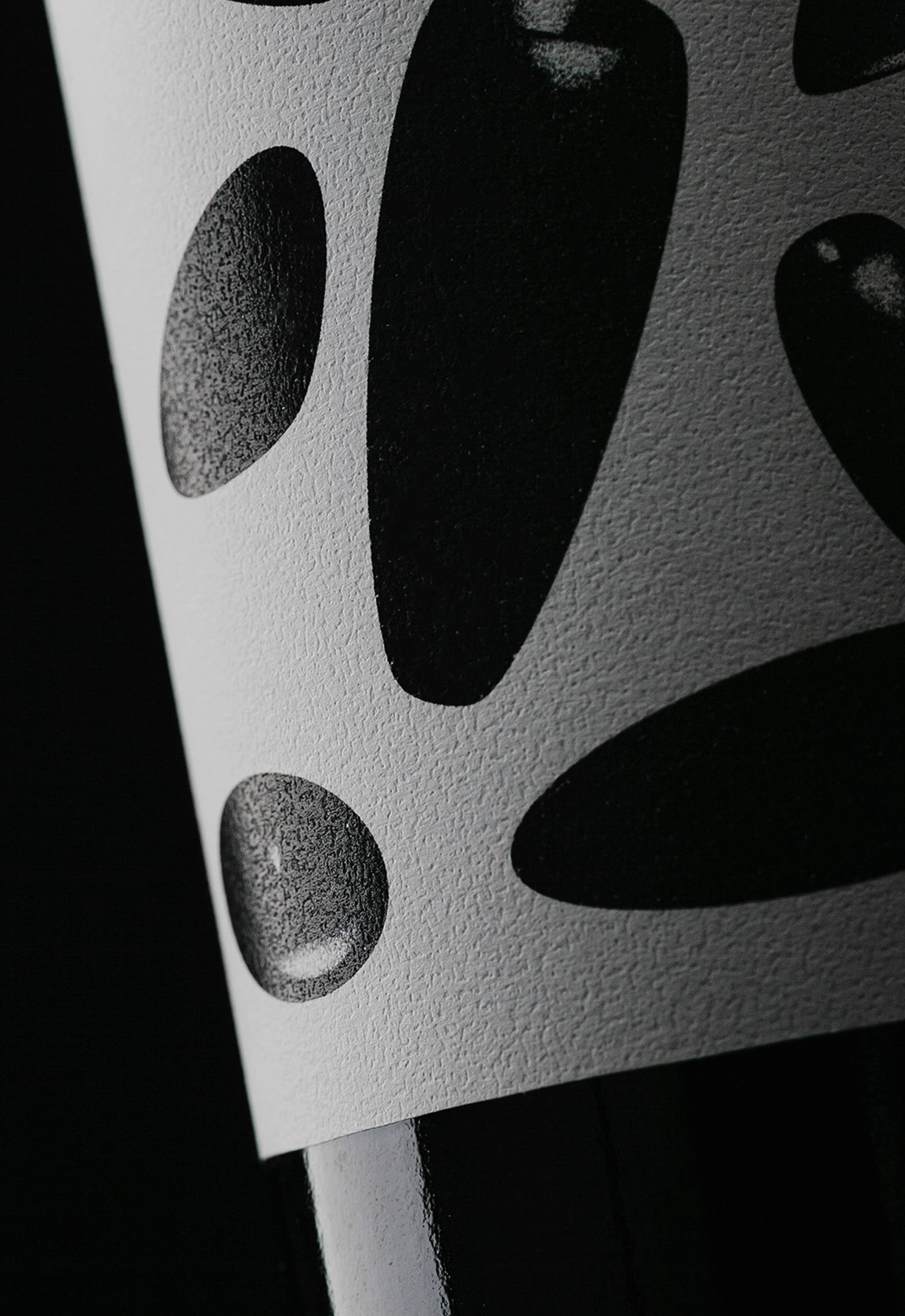
"El Mensaje" is a limited edition of 80 bottles of a high rated blend wine produced in Mendoza, Argentina, in a special (maybe dramatic) harvest.
During the night, after a day of harvesting, the group in charge of the project suffered an armed robbery, the movie kind of robbery if you are asking. One of the members managed to send a Whatsapp message, warning his friends who were not in the farm about what was happening. Thanks to this message, the police were on the scene and only material losses were reported.
The design tries to represent the whole story in a single image: that moment when everything falls apart, plates, food and glasses fly through the air, and it seems to happen in slow motion. The copy of one of the labels keeps the way of speaking that we usually use to describe a bad situation.
Team: Gastón Garcia Aja / Mauricio Gallegos
Photo: Pablo Gasparini / Stefanía Paz
Mendoza, Argentina (2021)
Siempre Sale El Sol / Graphic Design - Illustration
BackSiempre Sale el Sol en Barcelona is a single from Luisa y el Mar's first album. The flower is an element that represents the band and that accompanied Mauro Meloni, Delfina Mancardo and Ola Wagner in their journey from their first concerts to the recording of the album.
This design piece was part of the merch for Luisa y el Mar's London tour, an update of the previous artwork from the live session at the Xefo Gallery, in Poblenou, Barcelona.
Team: Gastón Garcia Aja / Mauricio Gallegos / Delfina Mancardo
Barcelona, Spain (2024)
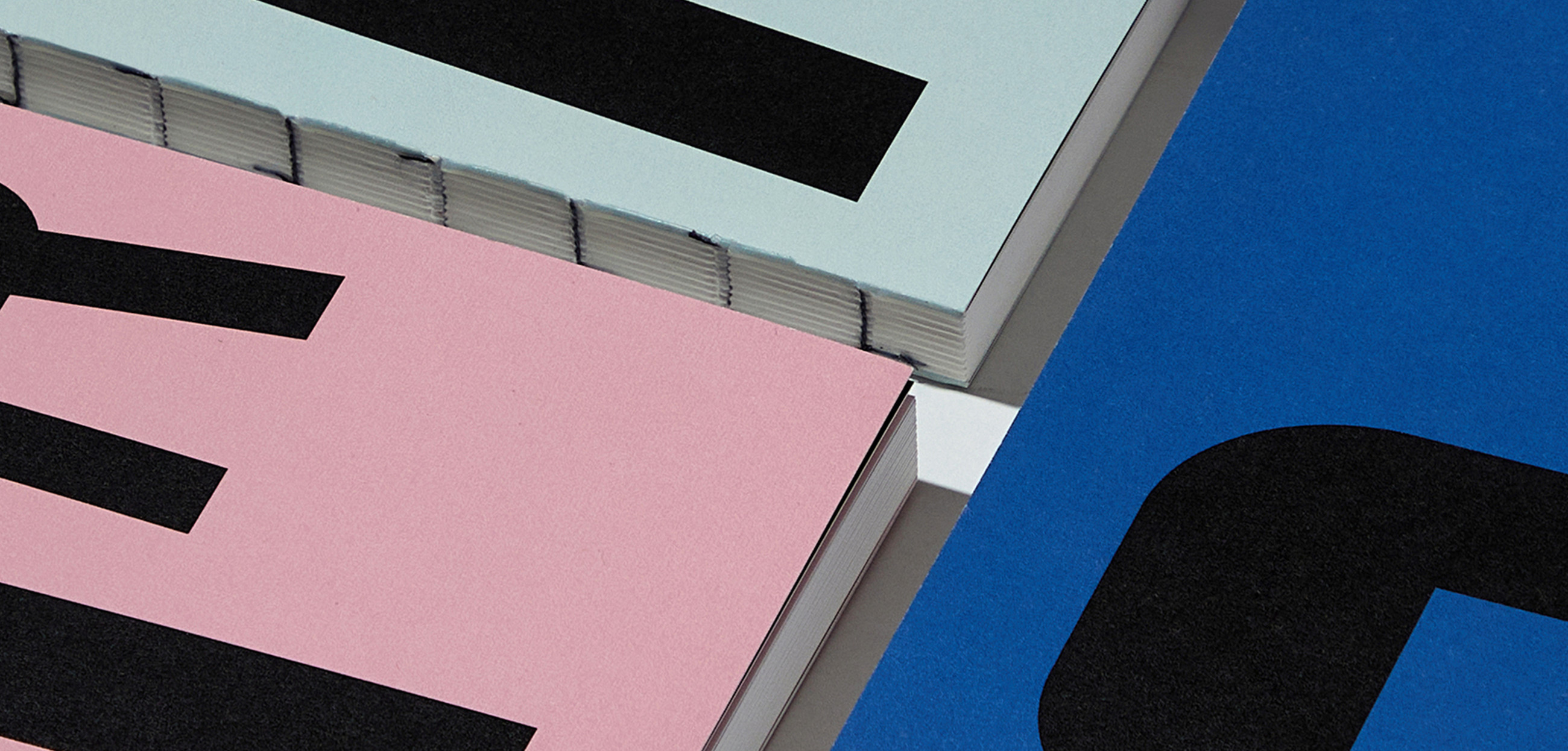
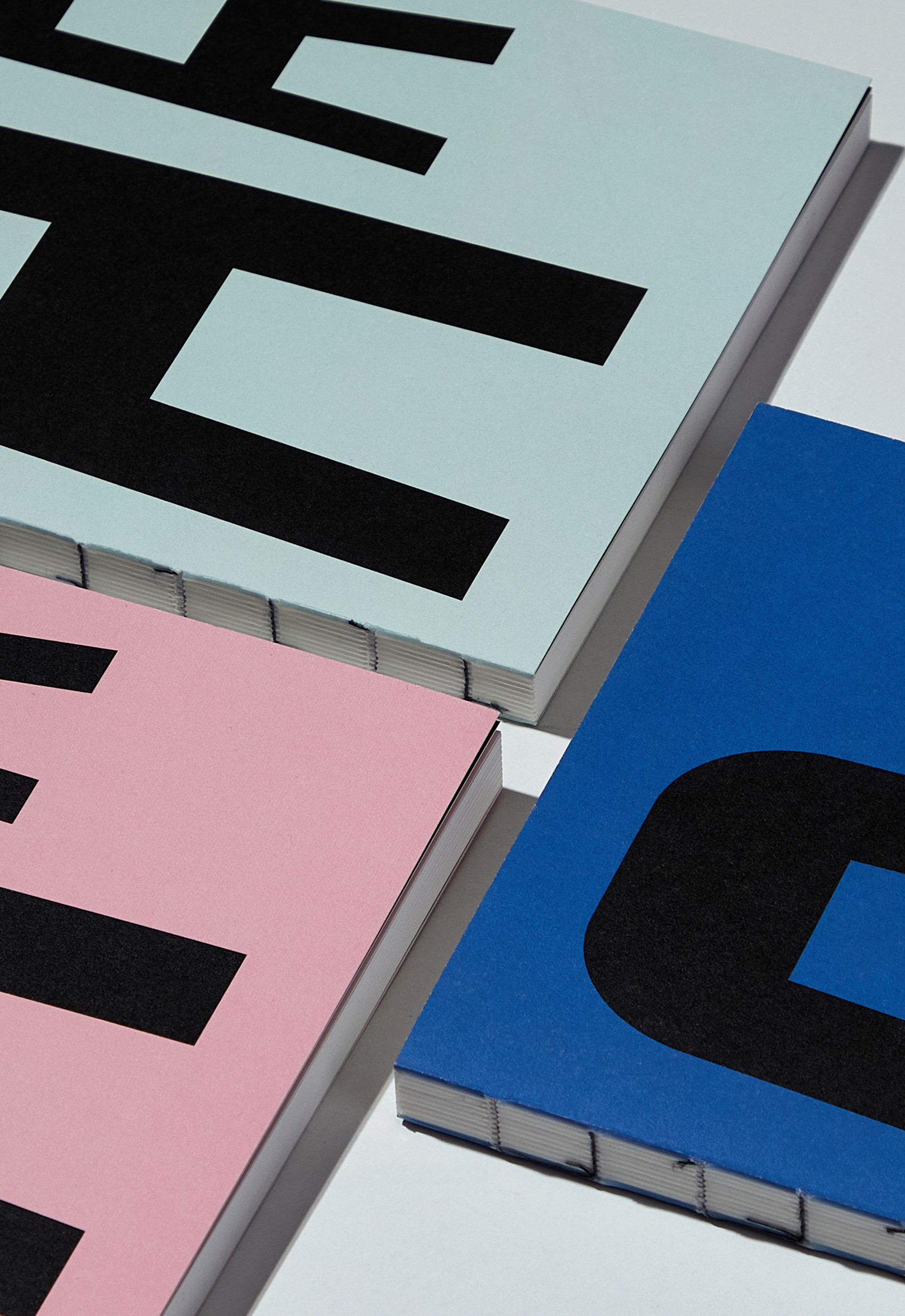
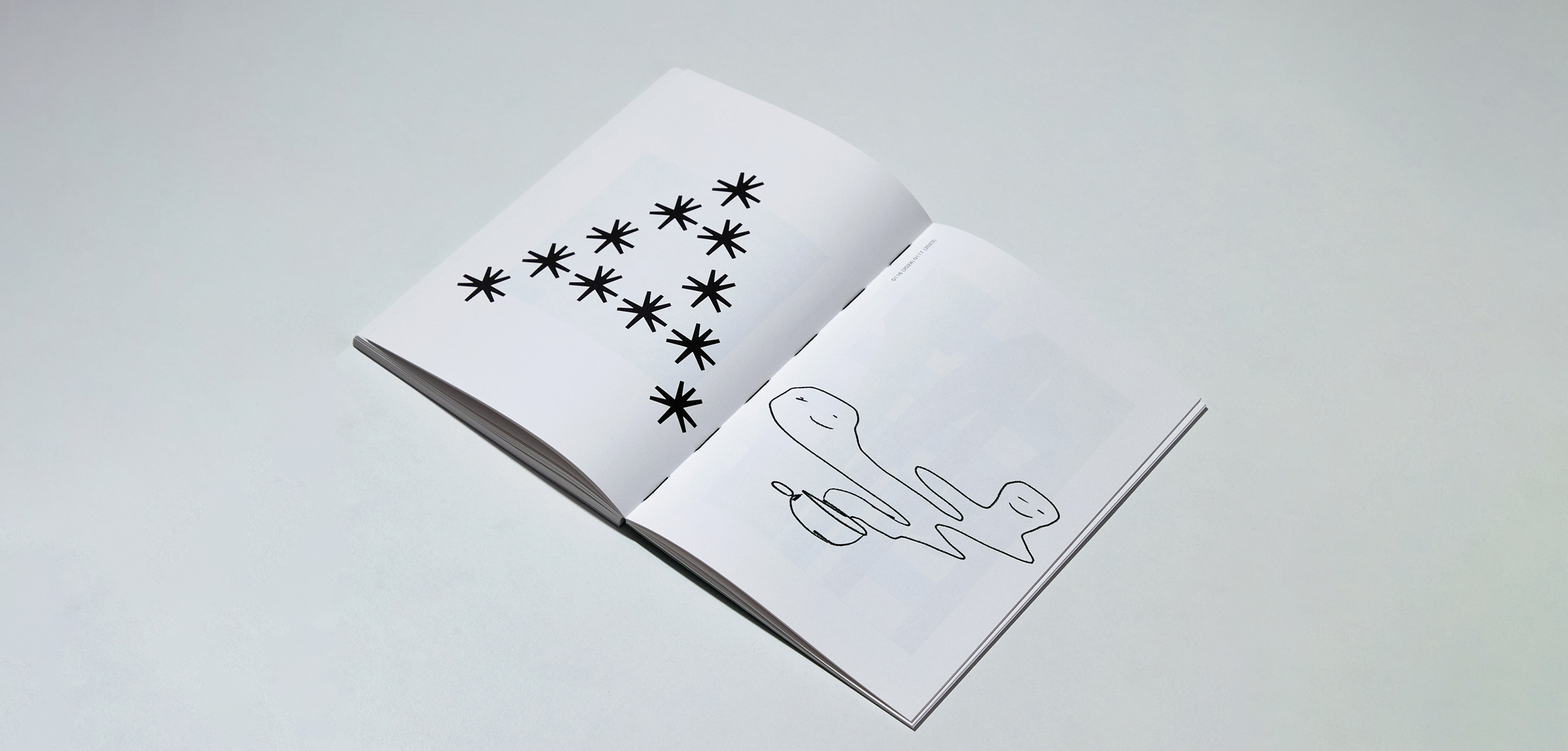
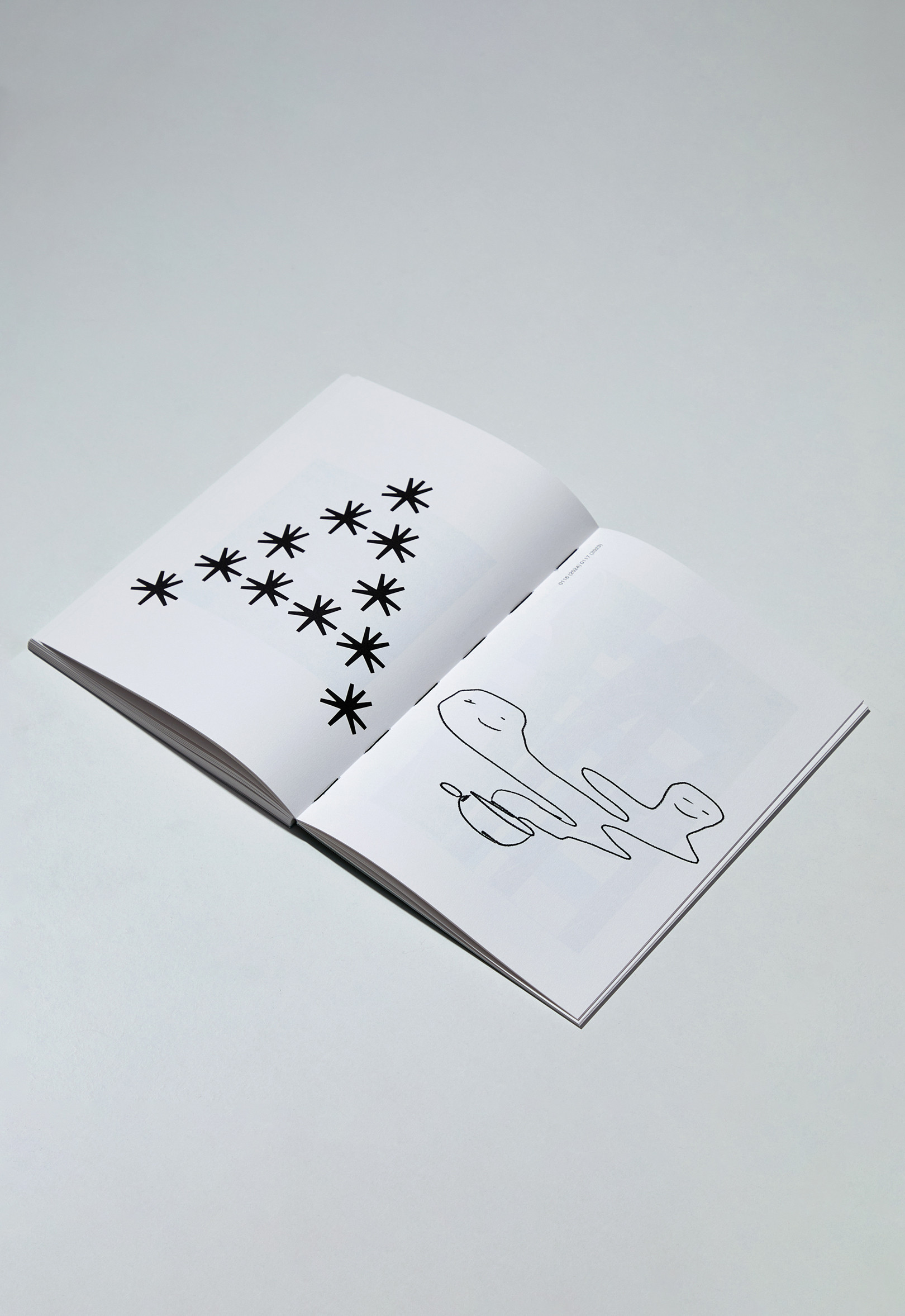
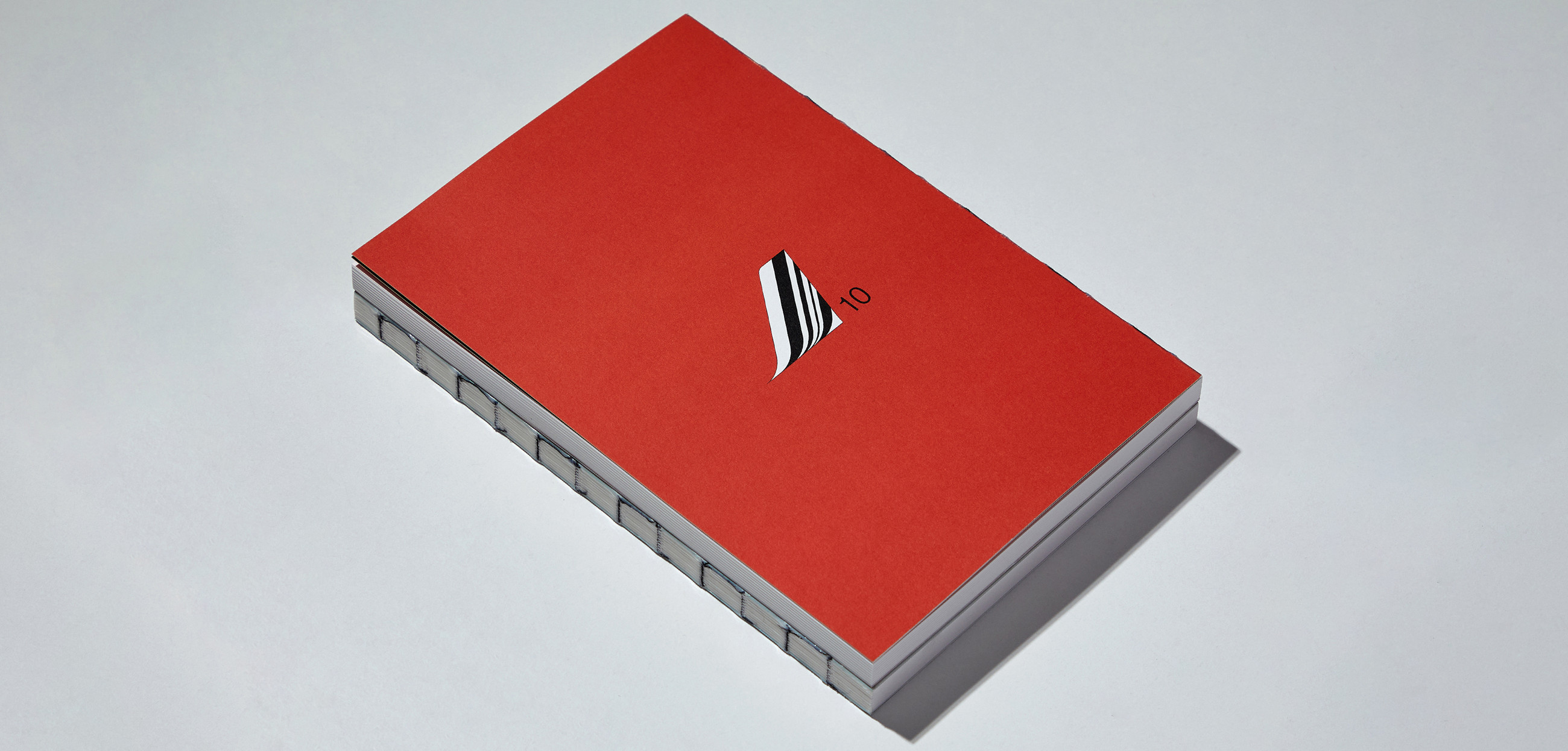
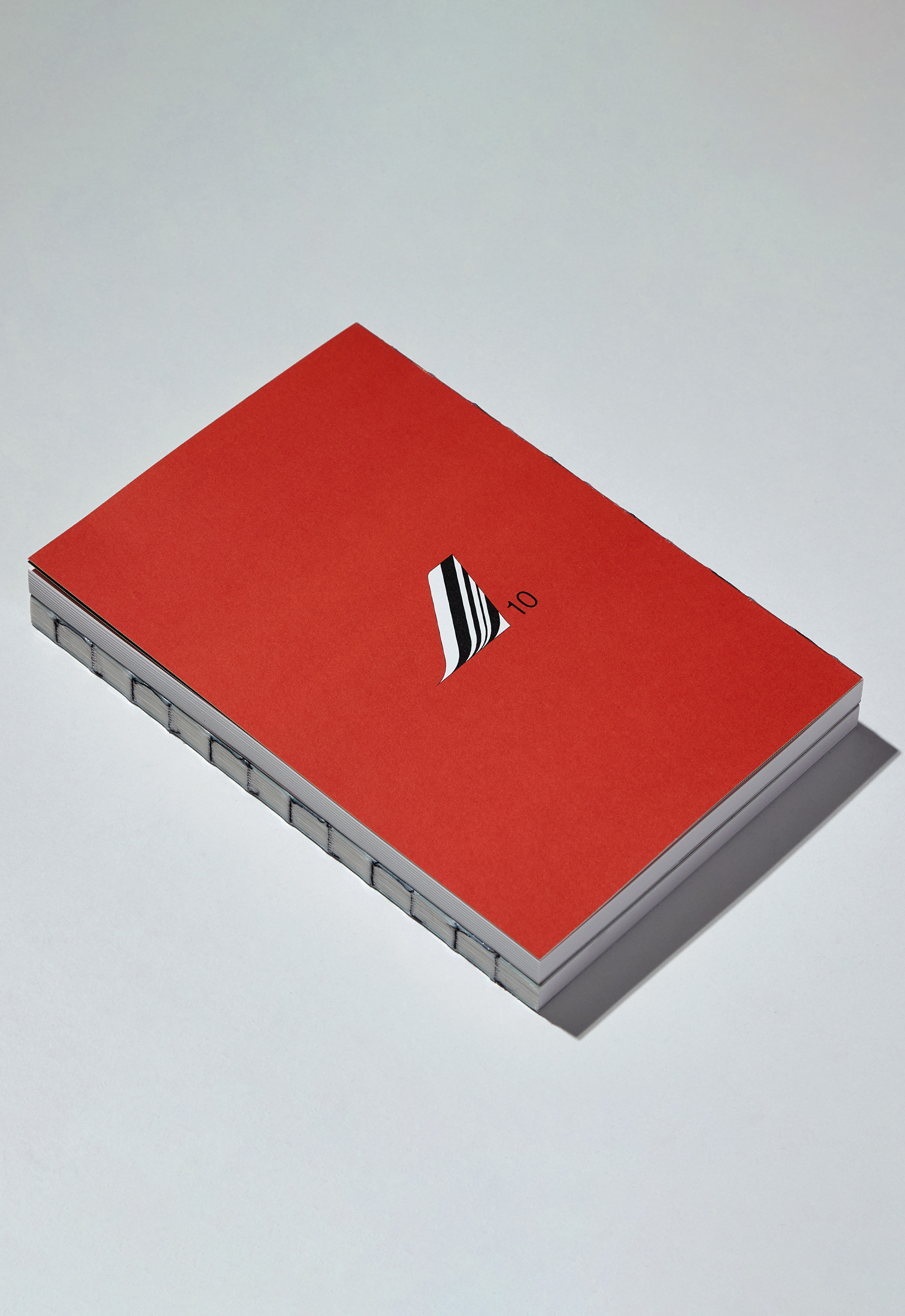
AR20142014PM / Editorial - Graphic Design
BackPM’s Archivos Recuperados (AR) is a compilation of graphic explorations made in the studio from 2014 to 2024. These works were neither selected for final projects nor officially published, until now.
This project highlights the value of process, of graphic and creative exploration, and of the exercises behind the projects that did make it through.
AR20142024PM is not simply a retrospective of the studio’s past, nor just a celebration of its 10th anniversary. At best, it is the print record of a confused, ambiguous and unplanned search for identity.
Team: Gastón Garcia Aja / Mauricio Gallegos
Print: AGPO Graf
Photo: Alvaro Picca
Barcelona, Spain (2025)
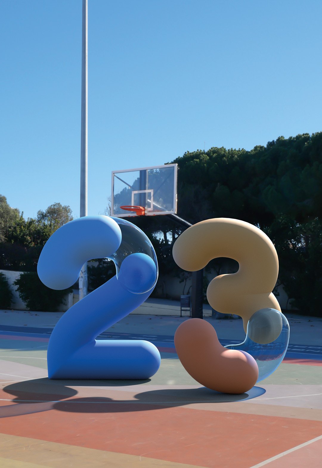
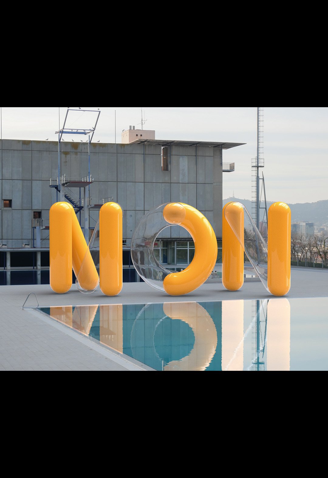
Monocle Type / 3D - Animation - Graphic Design - Type
BackMonocle is a visualization typography inspired by ancient monocles, magnifying glasses and their refractive indexes. By passing a magnifying glass over any object, what happens inside changes and gives rise to something new and unpredictable.
The project recreates the shapes and colors of digital environments, mixing 3D development with animation.
The exercise of mixing worlds was done in the streets of Barcelona, recreating random compositions of a real light moving towards a 3D object and back.
The end result looks new and old at the same time, but best of all, it looks real, because it is real.
Team: Mauricio Gallegos / Martín Cañadell / Gastón Garcia Aja
3D: Martín Cañadell
Photo: Gastón Garcia Aja
Barcelona, Spain (2021)
Bondis Porteños / Editorial - Graphic Design - Illustration
BackBondis Porteños is an illustration project based on the synthesis and graphic interpretation of the public transportation system of the City of Buenos Aires.
Like a constant show of colors, patterns and typographies, these huge rectangular canvases generate a landscape where diversity reigns in a medium where normally the opposite happens, turning the streets into a public event of a very particular and "Porteño" design, which brings together styles and graphics from many different periods and contexts in a single moment.
A variety difficult to explain and normalize that deserves to be contemplated in each corner, like a painting in movement, an unfinished work that for some reason represents the chaotic and the beautiful that things can be in such a special city.
Team: Gastón Garcia Aja
Photo: Alvaro Picca
Buenos Aires, Argentina (2019)
Cielo Argentino - Juegos Olímpicos Tokio 2020 / Animation - Graphic Design - Type
BackThere is nothing more important for an athlete than the Olympic Games and there is almost nothing further away from Argentina than Tokyo. The pandemic context made it impossible for people to cheer on the athlete in this edition.
The purpose of this design was to bring that missing ovation to the stadium, converted into something that travels in the plane's luggage and represents the spirit of Argentina.
This T-shirt was designed from real photos of the Argentinean sky, taken by athletes from all the provinces of the country with their phones. The photos were processed to form a pattern that unifies them into a single design, which more than a design, is a breath, which is born in the sky and felt in the chest, and if you get a little closer, it says: ¡Vamos Argentina!
Team: Mauricio Gallegos / Gastón García Aja
Production: Jacana
Client: Confederación Argentina de Atletismo
Film: Fernanda Scarafía
Athlete: Ezequiel Bustamante
Córdoba, Argentina (2020)
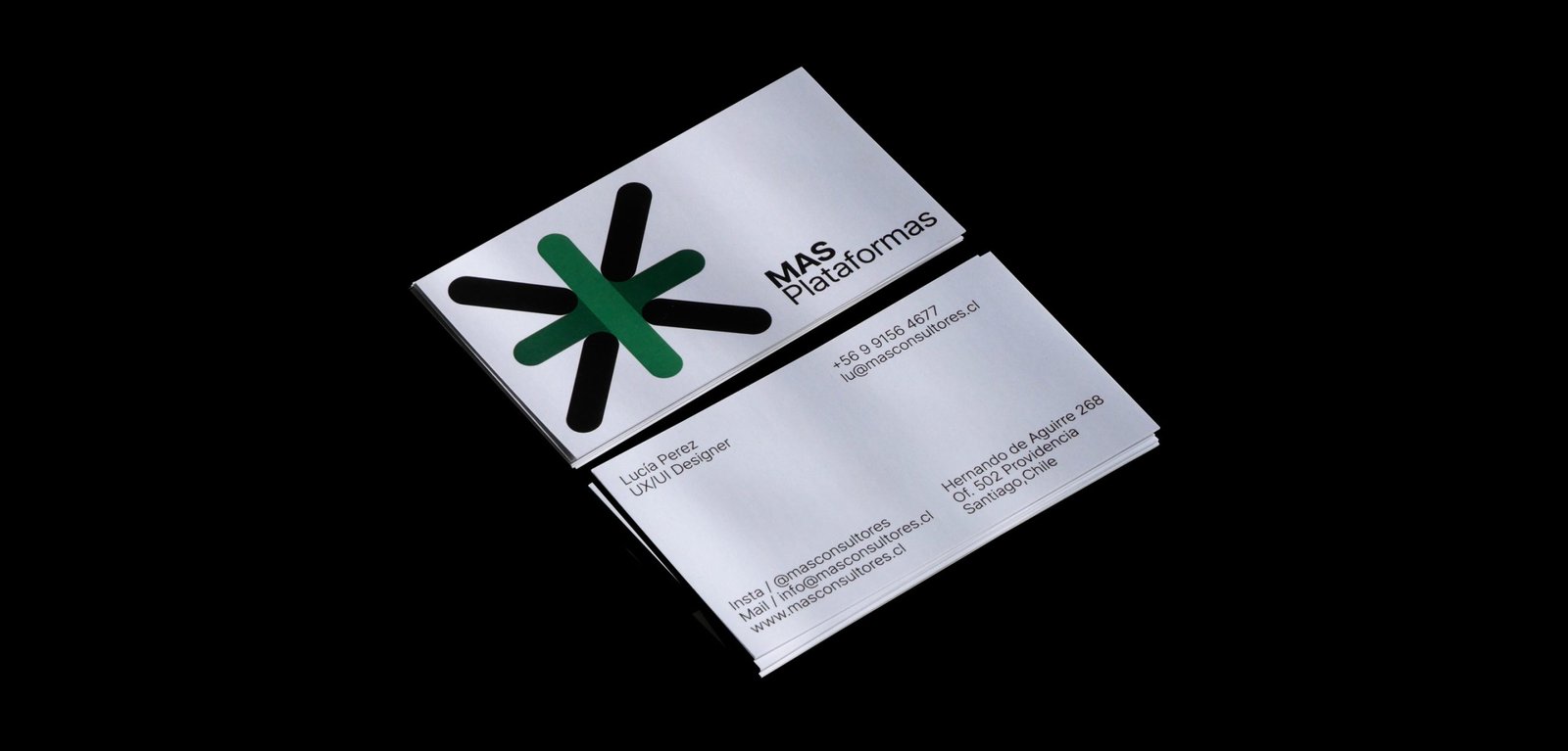
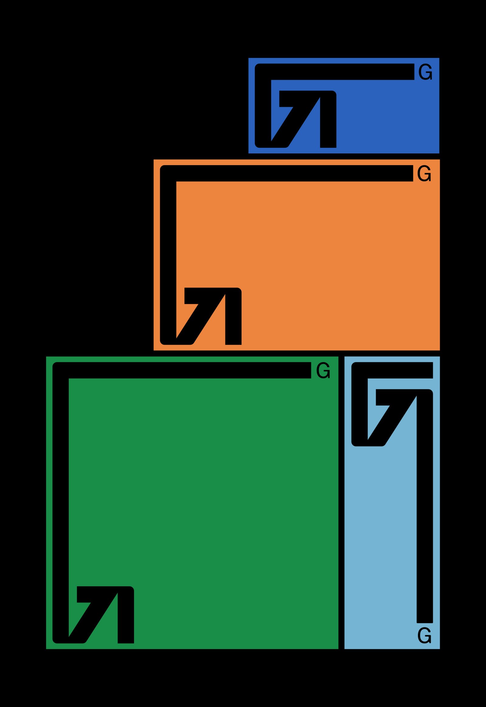
Más / Animation - Graphic Design - Revamp
BackThe new narrative, new brand architecture, and new graphic identity for MAS, a human resources consulting firm based in Santiago, Chile.
From autonomous identities for its business units to a power symbol and system that brings back all the importance and exposure to the main group identity. A new icon that represents a multiplication, rather than an evident addition, and a system that allows each unit to be identified while maintaining versatility and autonomy.
The new graphic system of MAS has two different worlds. Full color, white backgrounds, and clean elements go for the main group institutional communication. A limited color palette, grey backgrounds, and out-of-context size of the elements, go with the communication of each business unit. Both systems work together being different. Clean and noisy, simplicity and mess, serious and playful.
Team: Mauricio Gallegos / Gastón Garcia Aja
Animation: Martín Cañadell
Santiago, Chile (2018)
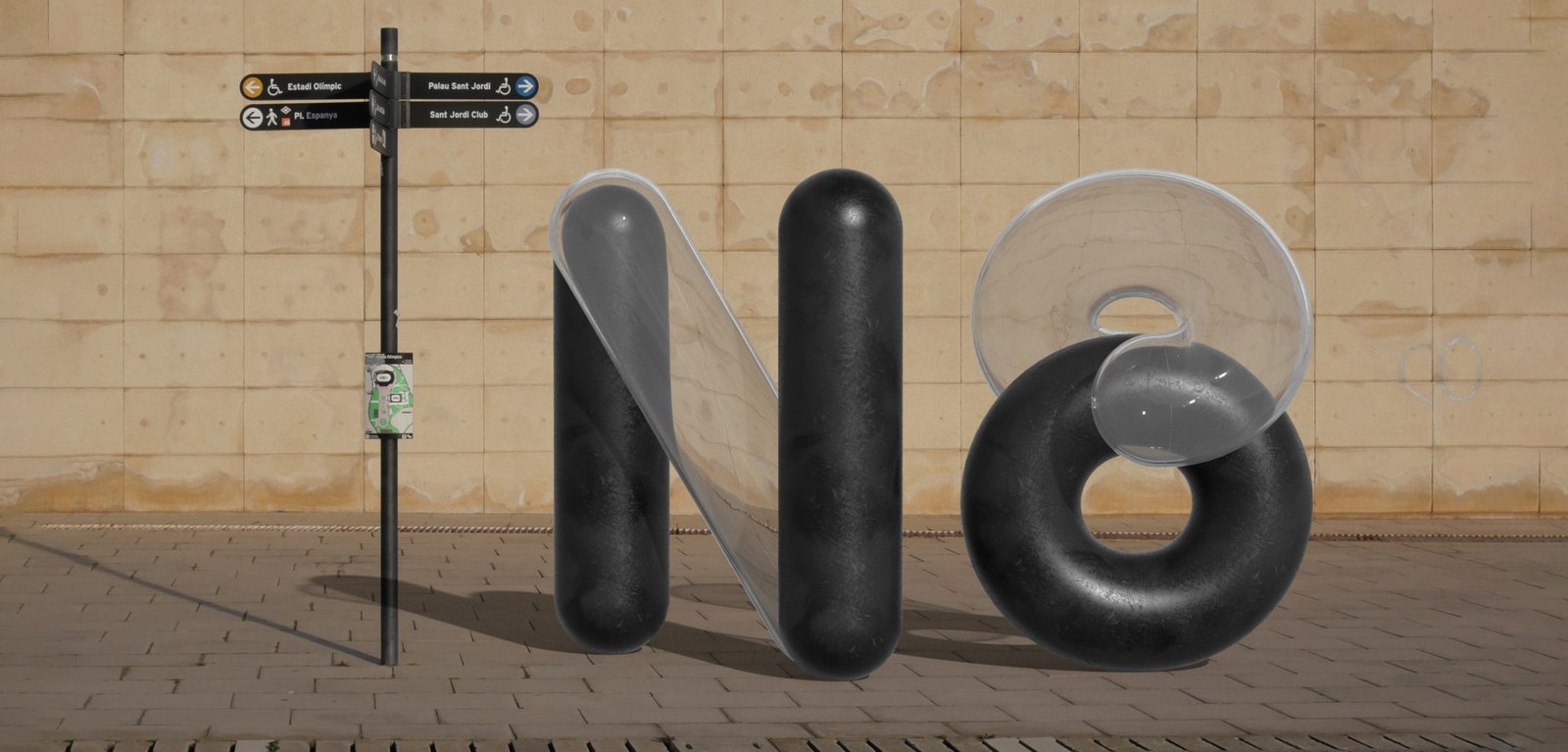
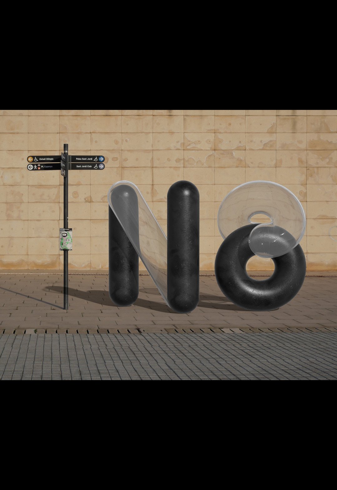
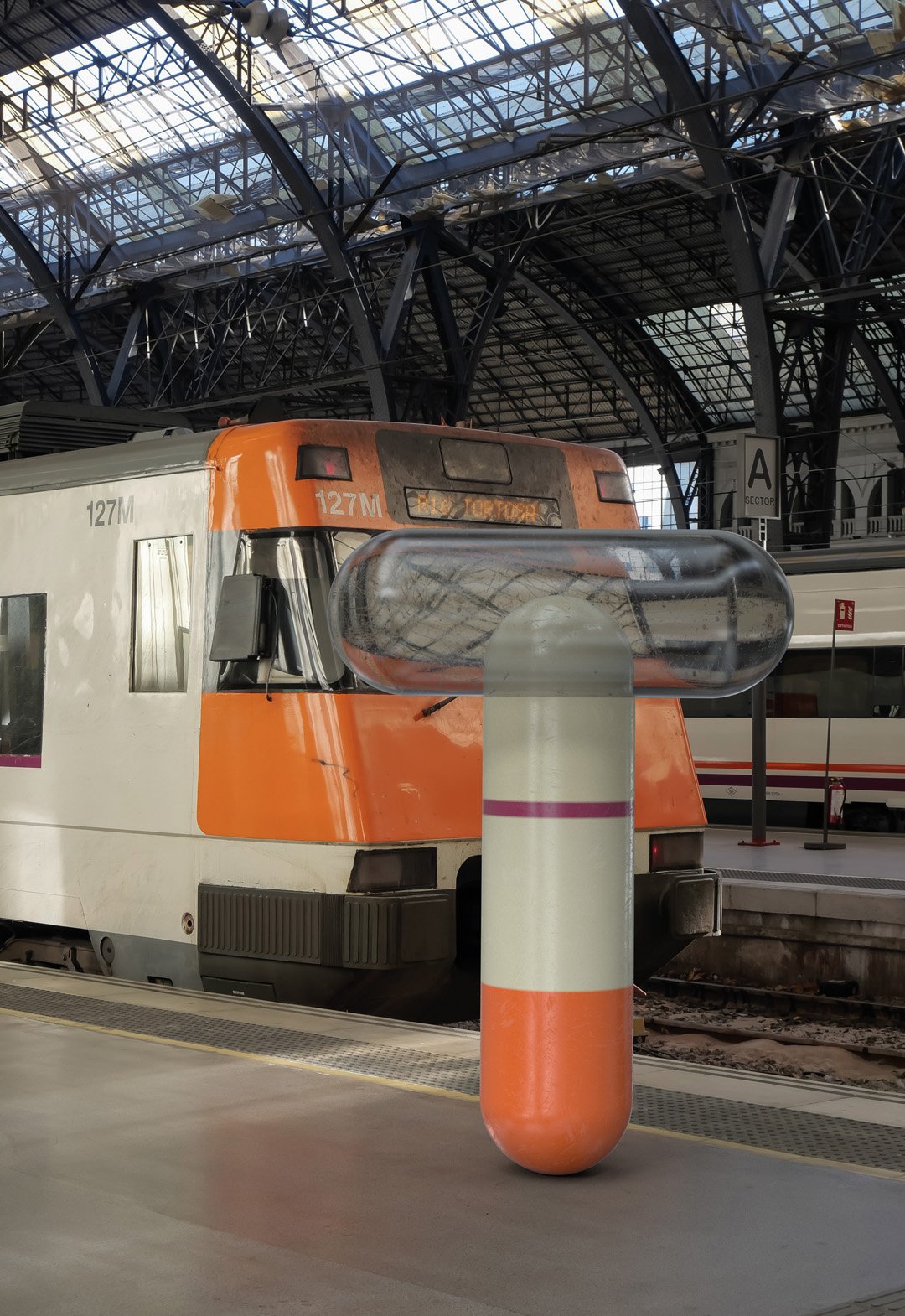
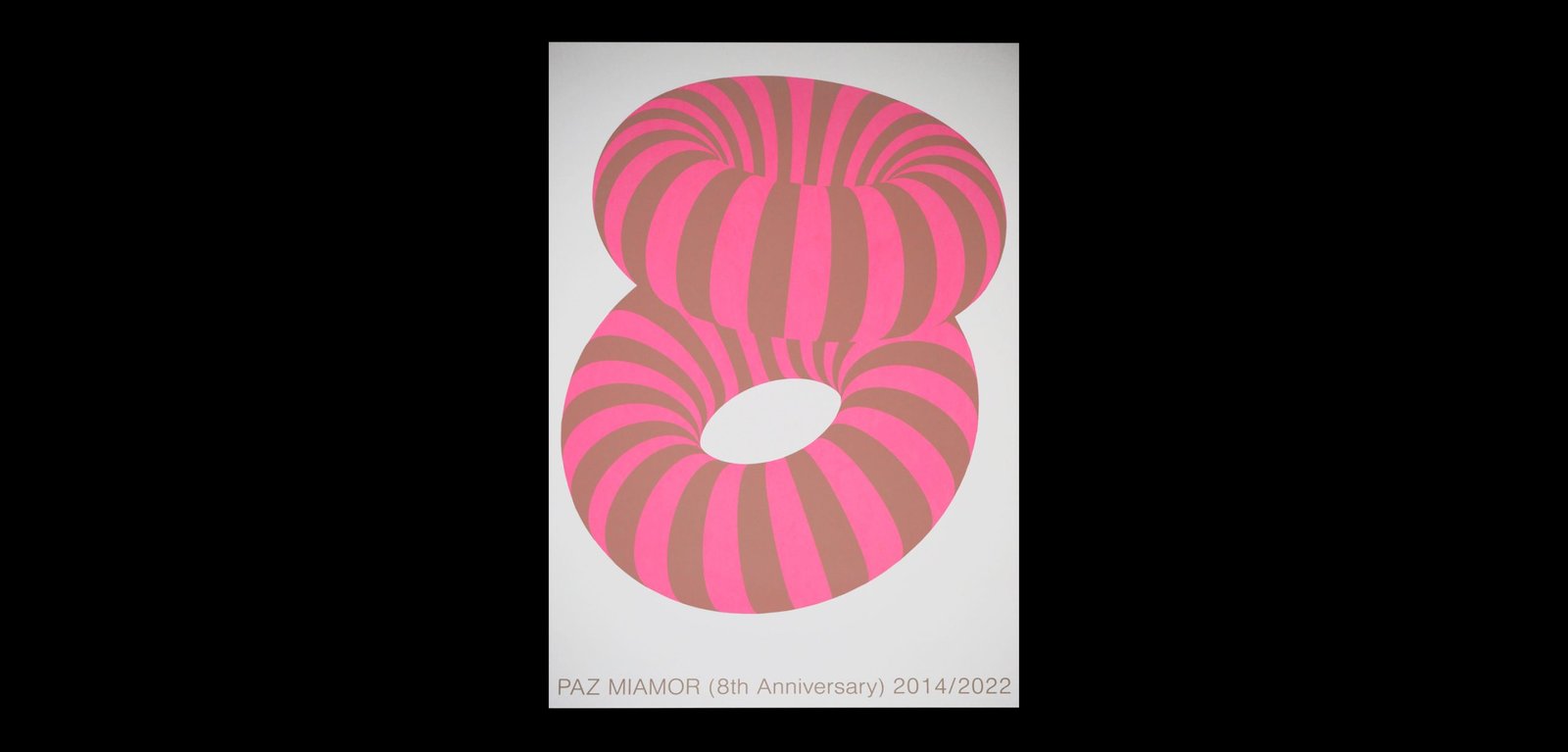
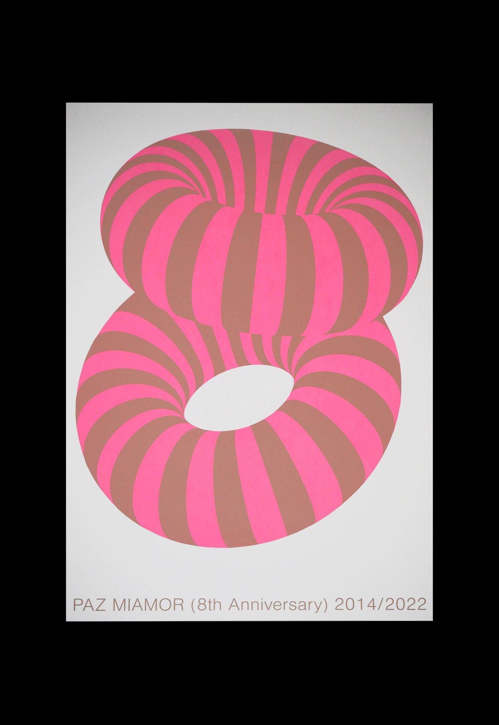
PM 8th Anniversary / Graphic Design
BackPAZ MIAMOR 8th Anniversary. This celebratory poster represents the number 8 using a design in keeping with the studio's actual moment.
The graphic experimentation with different graphic styles and universes, mixing clean and minimalist design with 3D compositions and photos; a kind of synthesis of PM's the 2022 aesthetics.
An old reference comes up to capture those feelings, that's why some can see in this poster the "Cheshire Cat from Alice in Wonderland". Magical, simple, only two colours and fun.
Team: Gastón Garcia Aja / Mauricio Gallegos
Silk/Screen Print: House of Prints
Barcelona, Spain (2022)
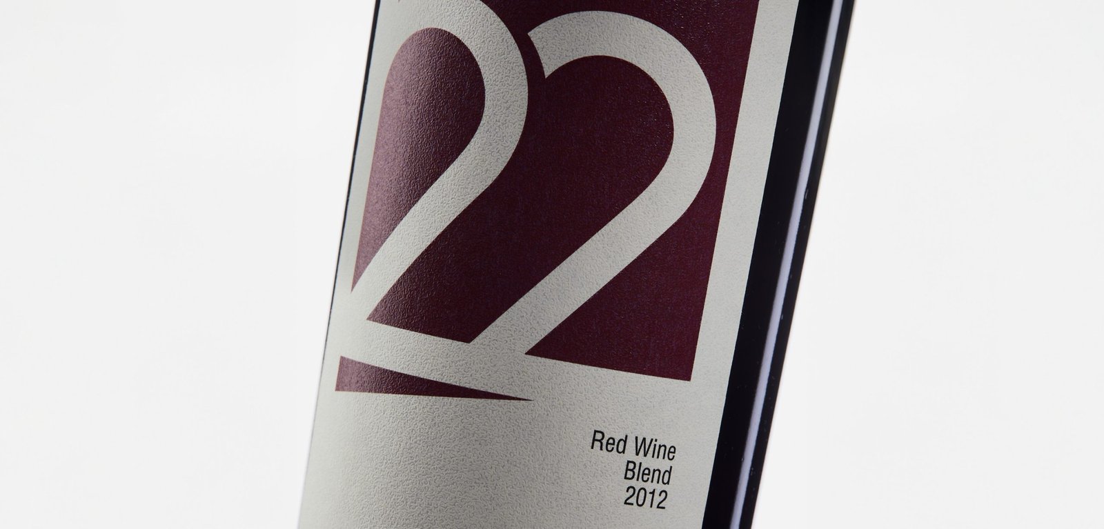
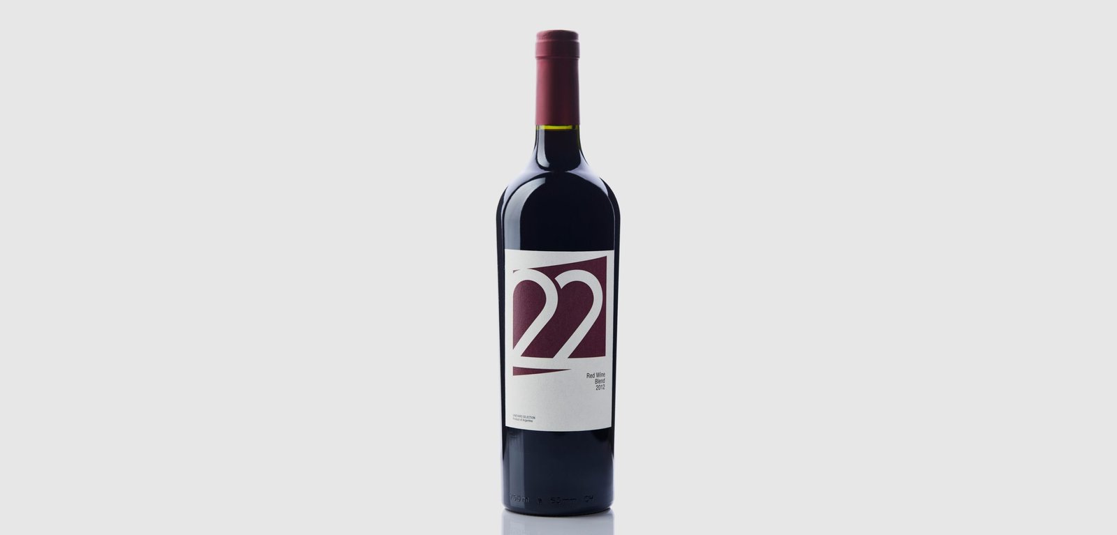
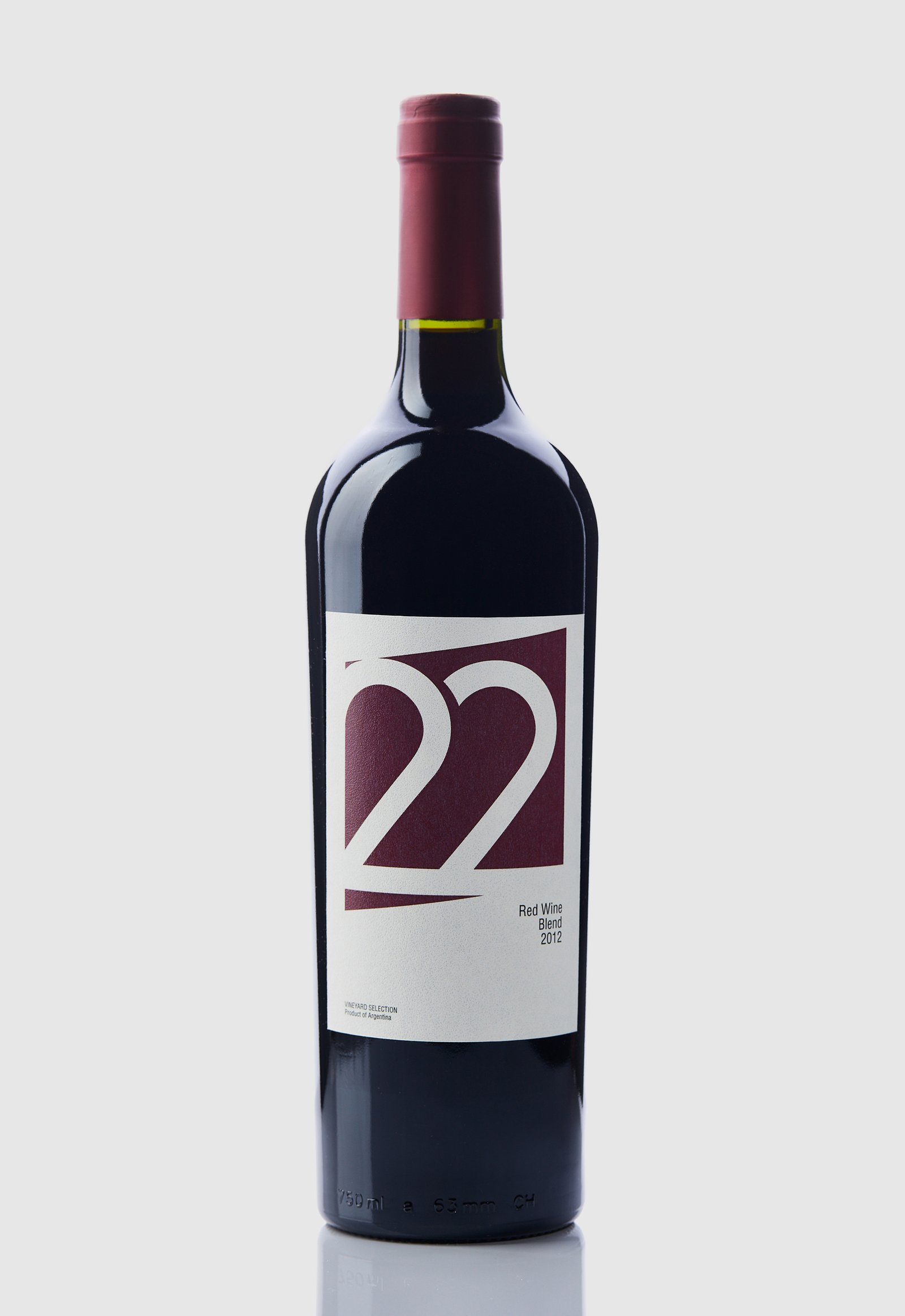
22 Tañidos / Graphic Design - Packaging
Back22 Tañidos is a Blend Red Wine brand that belongs to the Las Cañitas vineyard, located in the Sierras de Calamuchita, Córdoba, Argentina. This specific brand was developed with the aim of exporting its entire production to Turkey.
Being a new and developing region for the cultivation of vines, it does not have the positioning that other provinces of the country have in the category. Therefore, in the design we chose to show a more European and minimalist image without representing the roots or personality of the product.
The number 22 was used as the logo and main element of the label, considering that numbers are more legible than letters, especially in such different languages.
The colour of the label represents the product, and the shade was matched to the only capsule colour (top label) available on the local market at the time of project development.
Team: Mauricio Gallegos / Gastón Garcia Aja
Photo: Alvaro Picca
Istanbul, Turkey (2014)
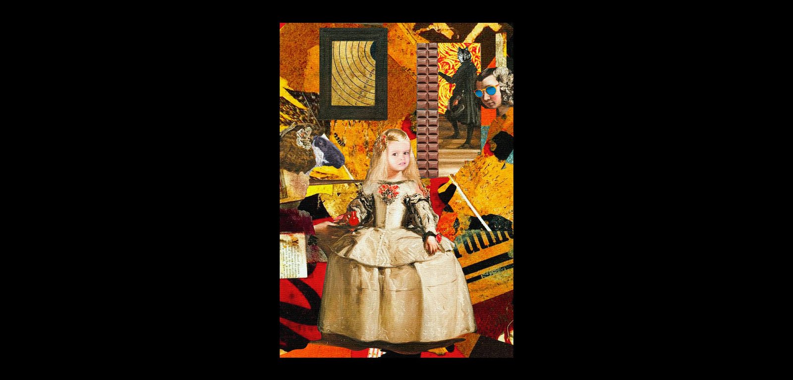
Artistic Memes / Graphic Design
BackArtistic Memes is a project that reinterprets memes based on artistic movements from around the world throughout history, materialised in poster format.
Using purely digital techniques, four posters have been designed with their respective memes that attempt to encompass Neo-Expressionism (Painting: "Trolsquiat"), Post-Impressionism (Painting: "Van Harold"), Cubism (Painting: "Rollasso Safe") and Dadaism (Painting: "Kurt Chloe, on display).
This project will continue when memes and art crash again.
Design: Mauricio Gallegos
Córdoba, Argentina (2020)
Georo / Graphic Design - Revamp
BackGeoro is a developer and construction company focused on the architecture and design of its projects, based in San Juan, Argentina.
Its main attribute is its versatility when it comes to carrying out projects and works at different levels and scales.
The redesign of its identity represents the evolution of the company, the idea of the future and the versatility to adapt to any context, in a simple and dynamic way, in a modern language prepared for new platforms.
Team: Mauricio Gallegos / Gastón Garcia Aja
San Juan, Argentina (2020)