Juliette Foxtrot / Identity - Packaging
BackJuliette Foxtrot is a craft beer produced in Córdoba, Argentina, which is part of the Bravante family of craft beers.
Each beer style represents a fictional character related to maritime codes and the sea. In this case, Juliette represents a mermaid, with a French style of illustration and composition, directly related to the feelings of its flavour.
Team: Mauricio Gallegos / Gastón Garcia Aja
Photo: Alvaro Picca
Córdoba, Argentina (2017)
Tallo / Identity - Packaging - Type
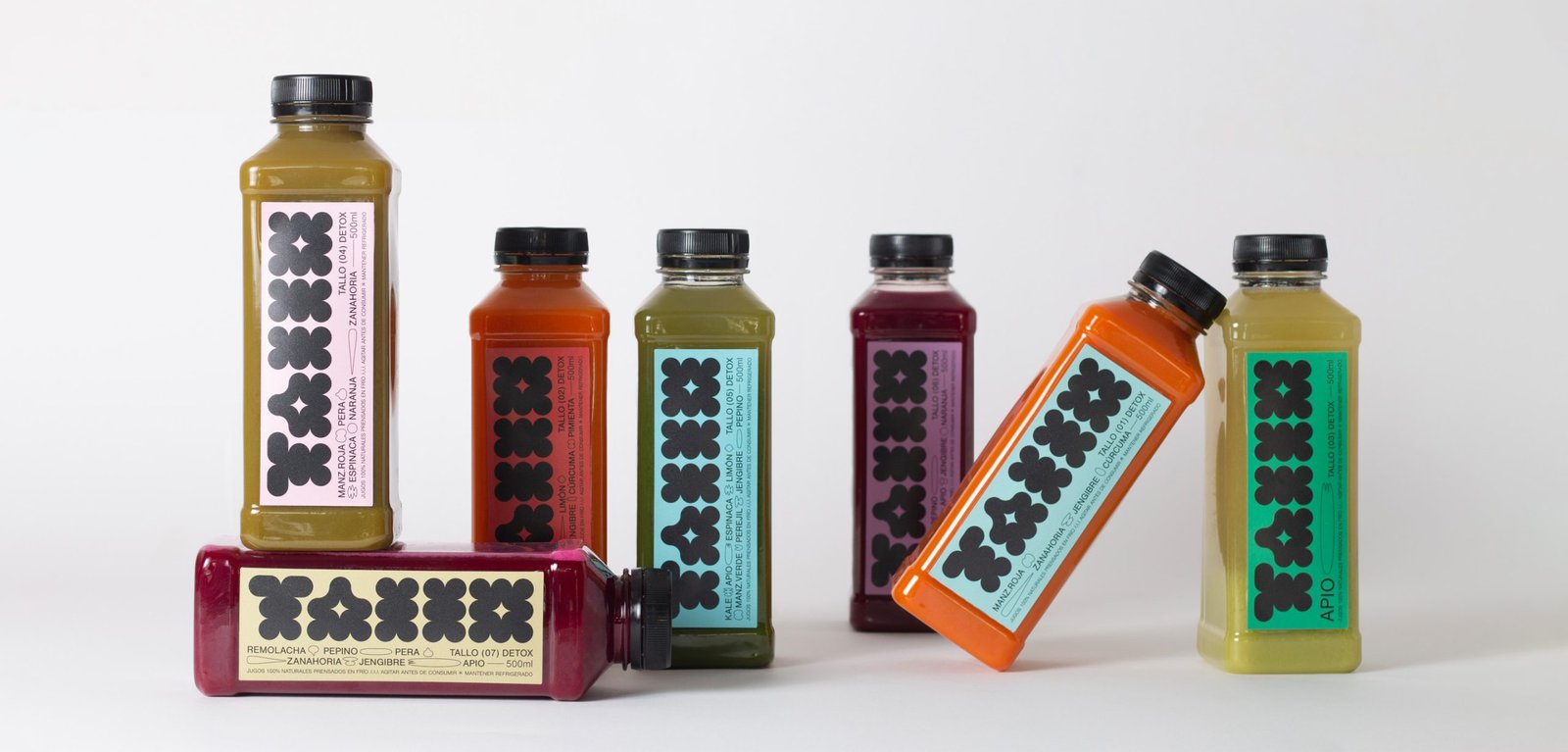
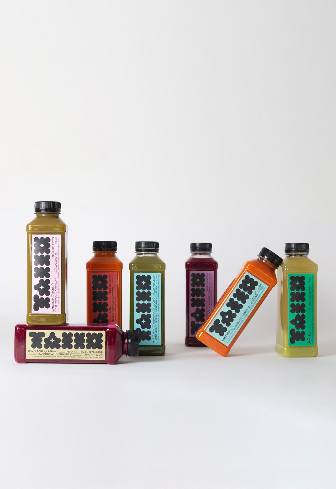
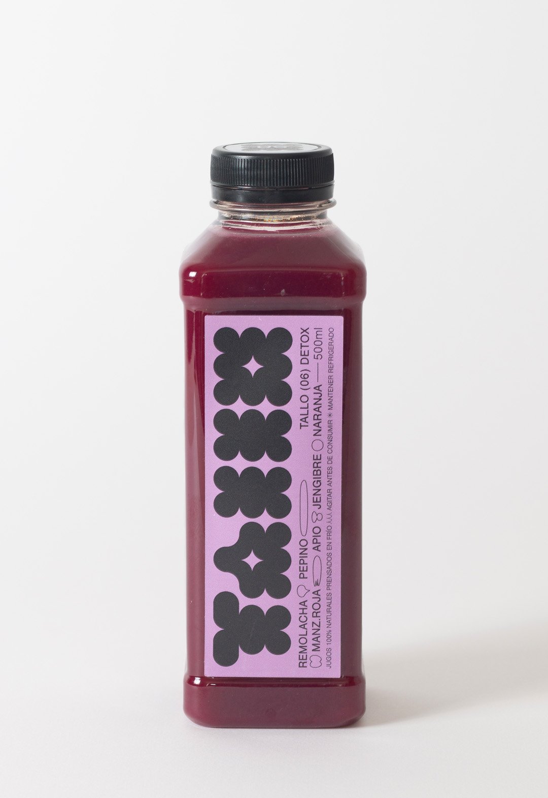
BackTallo is a local brand of cold-pressed juices produced in Buenos Aires, Argentina. The graphic idea represents a flower or a fruit instead of the stem itself (Tallo), which brings naturalness to the brand.
The colors of these juices are vibrant and pastel at the same time. The labeling palette vibrates in both directions, to create a fun environment focused on highlighting the main color of the juice.
In addition to a bold geometric logo, the design contains small lineal illustrations to represent the ingredients. This aesthetic is a reference to the drawing of the daughters of the brand's creators.
Team: Gastón Garcia Aja / Mauricio Gallegos
Photo: Rocío Fernandez Charro
Buenos Aires, Argentina (2022)
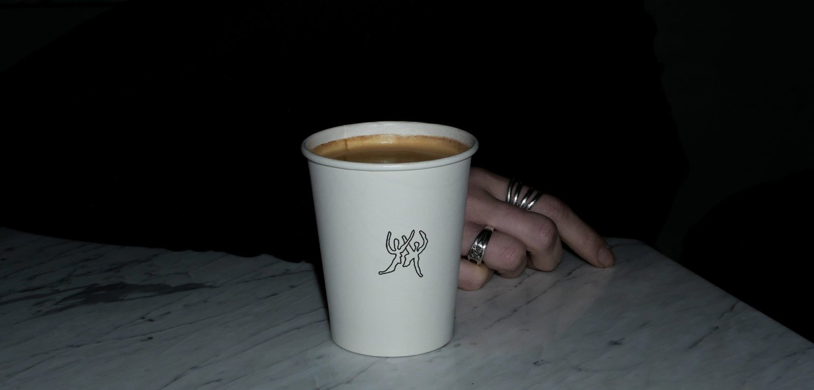
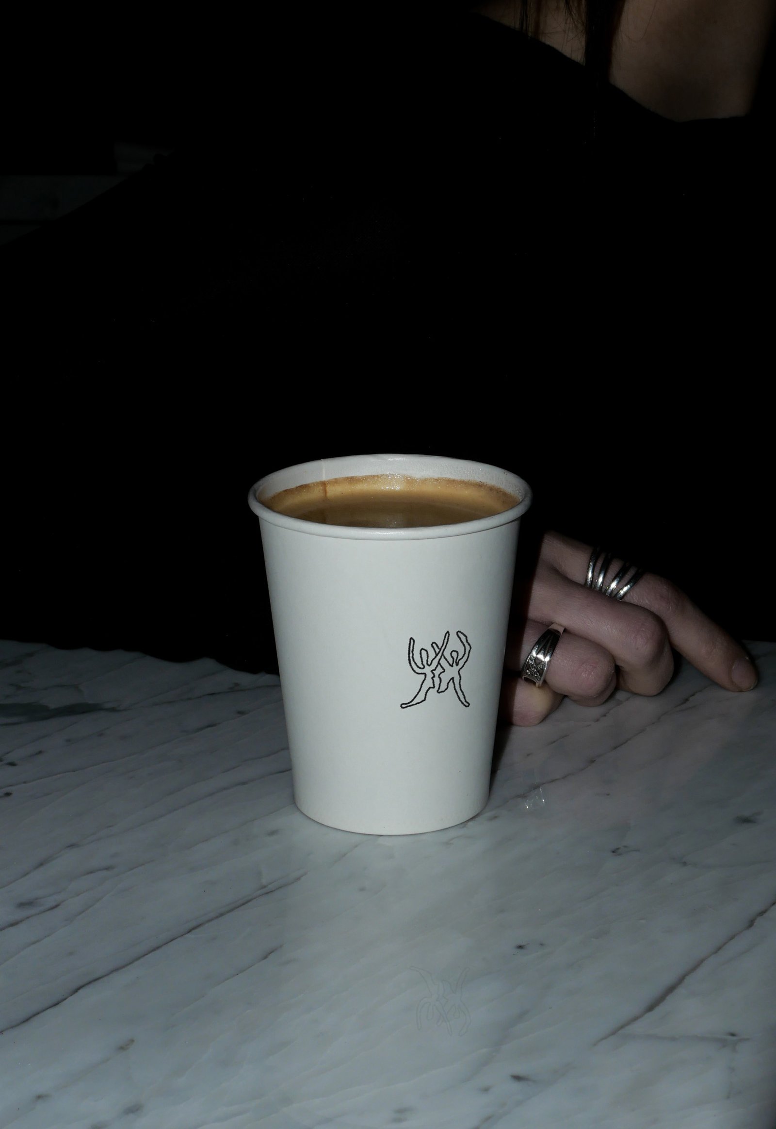
Afecto / Animation - Concept Development - Identity - Naming
BackAfecto is a design brand that creates unique and label-free pieces related to ceramics, glass art, photography, design, clothing and furniture. Just like many other things we experiment and share dairy, the objects can carry stories, personality and expression. Unlike mass-produced brands, Afecto offers special pieces that are redefined by the person who gets them.
Its graphic identity attempts to represent this feeling. Organic forms open to meaning, constantly moving and adapting, ready to tell a countless number of stories.
The logo is a statement, focused on the literal meaning of the word; close to love. The magic hands of the sisters that carry out the creation of each piece are represented in the brand icon. The rest of the system is intended to follow the products in the real world, adding a new digital universe to communicate all the beautiful things happening around this project.
Team: Gastón Garcia Aja / Guadalupe Cáceres / Candelaria Cáceres
Animation: Mauricio Gallegos
Barcelona, Spain (2023)
Obra / 3D - Animation - Identity - Naming
BackObra is a coding and web development partner agency based in Barcelona working worldwide.
Its focus is to provide programming and web development solutions to any kind of digital project, under the premise of materializing the ideas of design studios and clients.
The identity represents connection and versatility from a simple graphic element such as a line. Lines can be transformed into letters and many other things, just as a code can make almost any idea come true.
Digital projects allow things to move, to be interactive and expressive. The 3D development matches that idea.
Team: Gastón Garcia Aja / Mauricio Gallegos
Team: Martín Cañadell
Barcelona, Spain (2024)
Amateur / Concept Development - Identity - Illustration
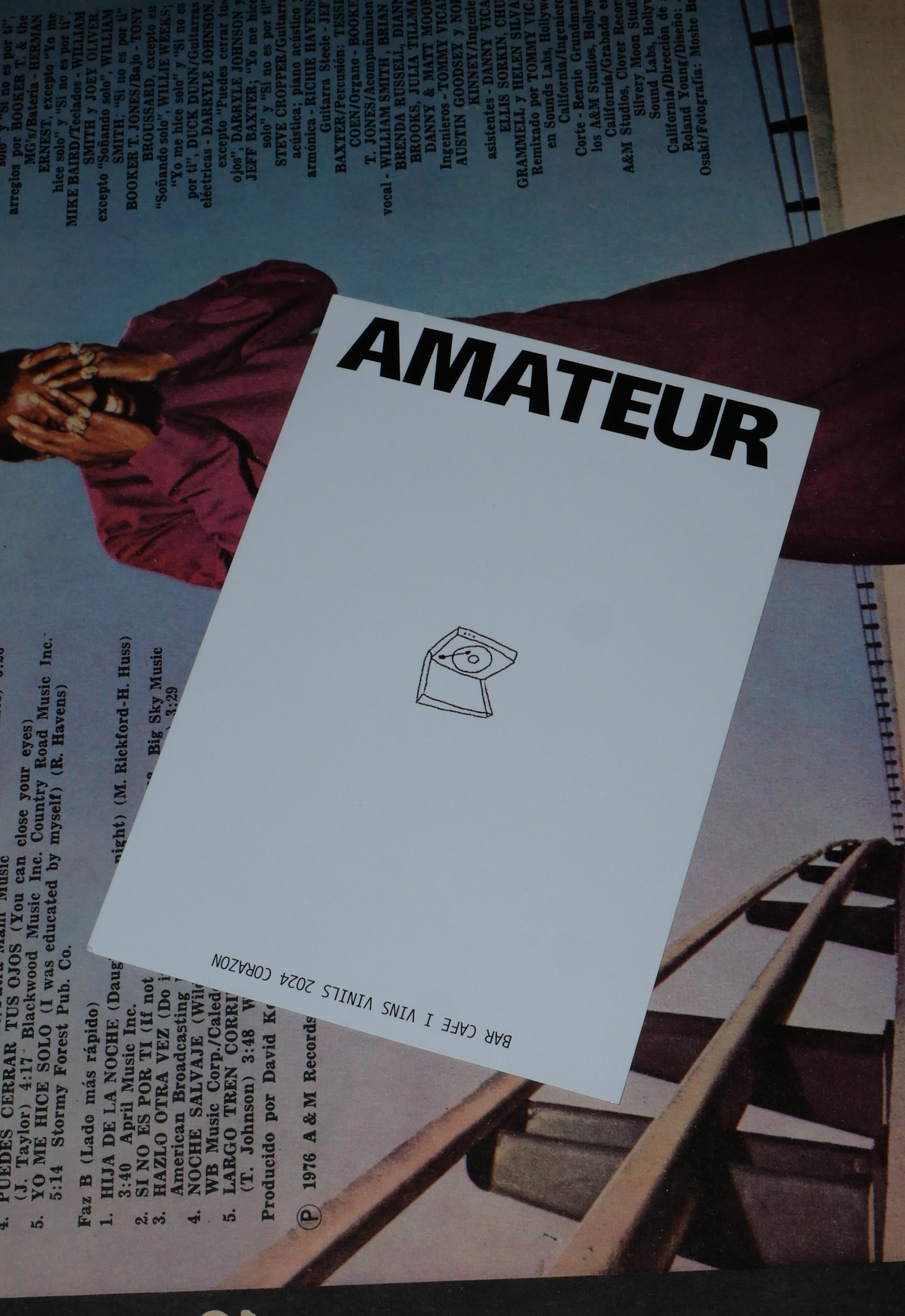
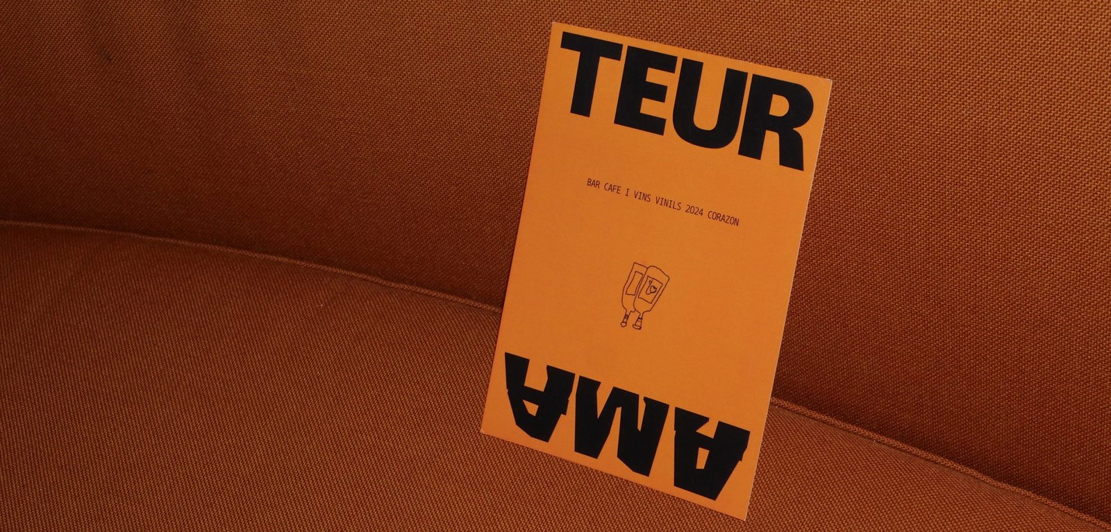
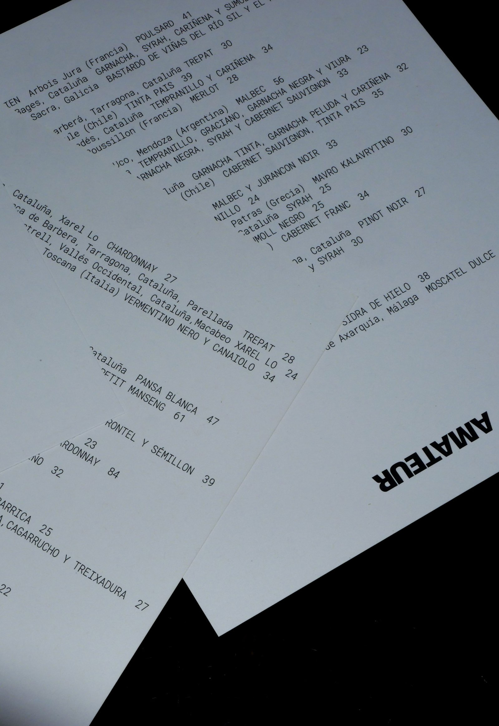
BackAmateur (The ones who love), is a new bar that brings together specialty coffee, natural wines, food to share and vinyl records playing in the heart of Poblenou, Barcelona. This place is a celebration of doing the things you love, passion and the intention to do it at your best.
The identity represents the contrast of the brand, matching the seventies vibe of the architecture and aesthetics of the whole project.
Retro typography, clean compositions support the stress free illustrations made by Pegamento, in line to create the graphic universe of the brand. Huge contrast, blank spaces, and details inspired in the vinyls spinning are all across the identity.
Colab: Pegamento
Team: Gastón Garcia Aja / Mauricio Gallegos
Illustration: Pegamento
Barcelona, Spain (2024)
Apelie / Identity - Type
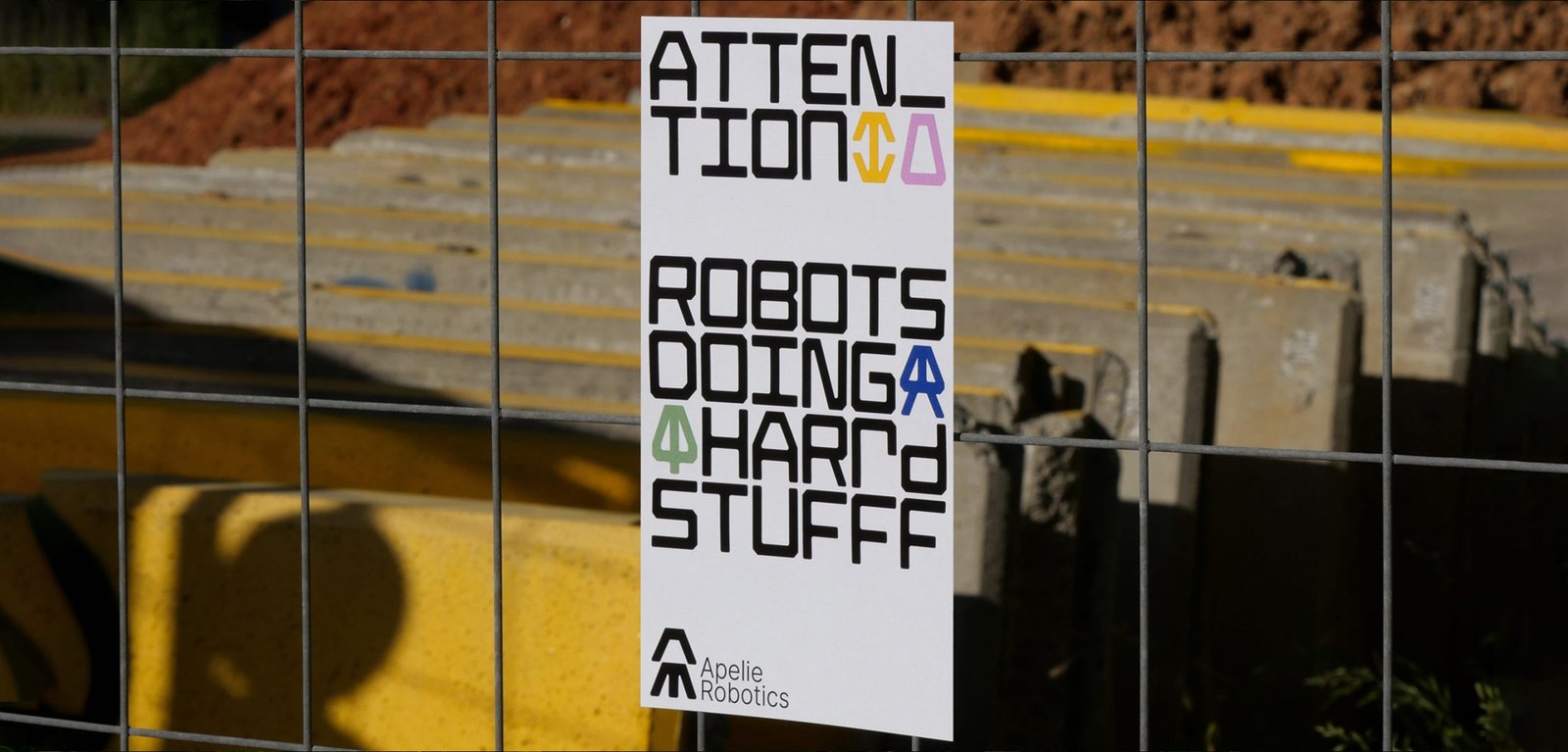
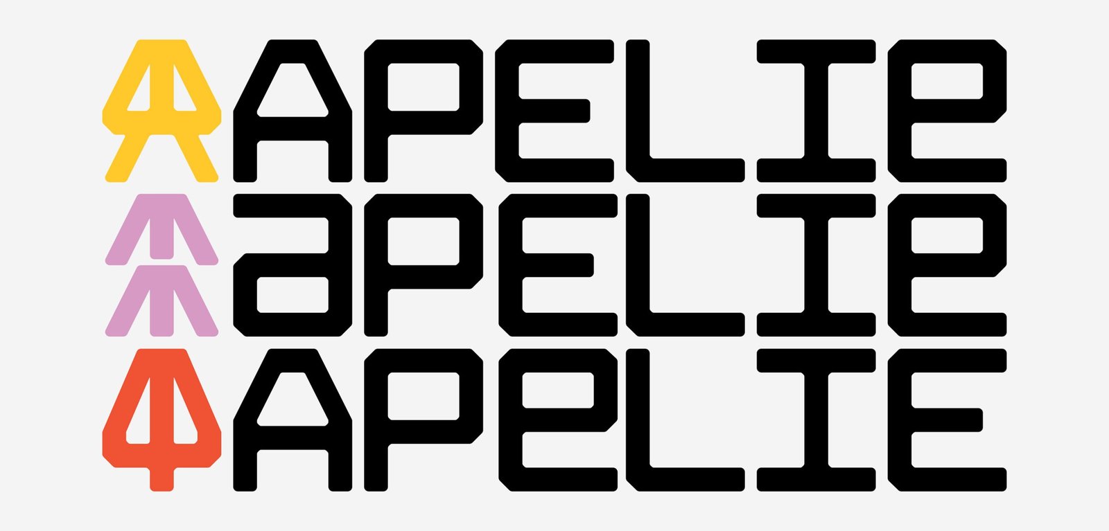
BackApelie is a new company that builds robots that help to solve multi-area problems. The team has the ideas, the tech, and the knowledge to create new robots for custom problems.
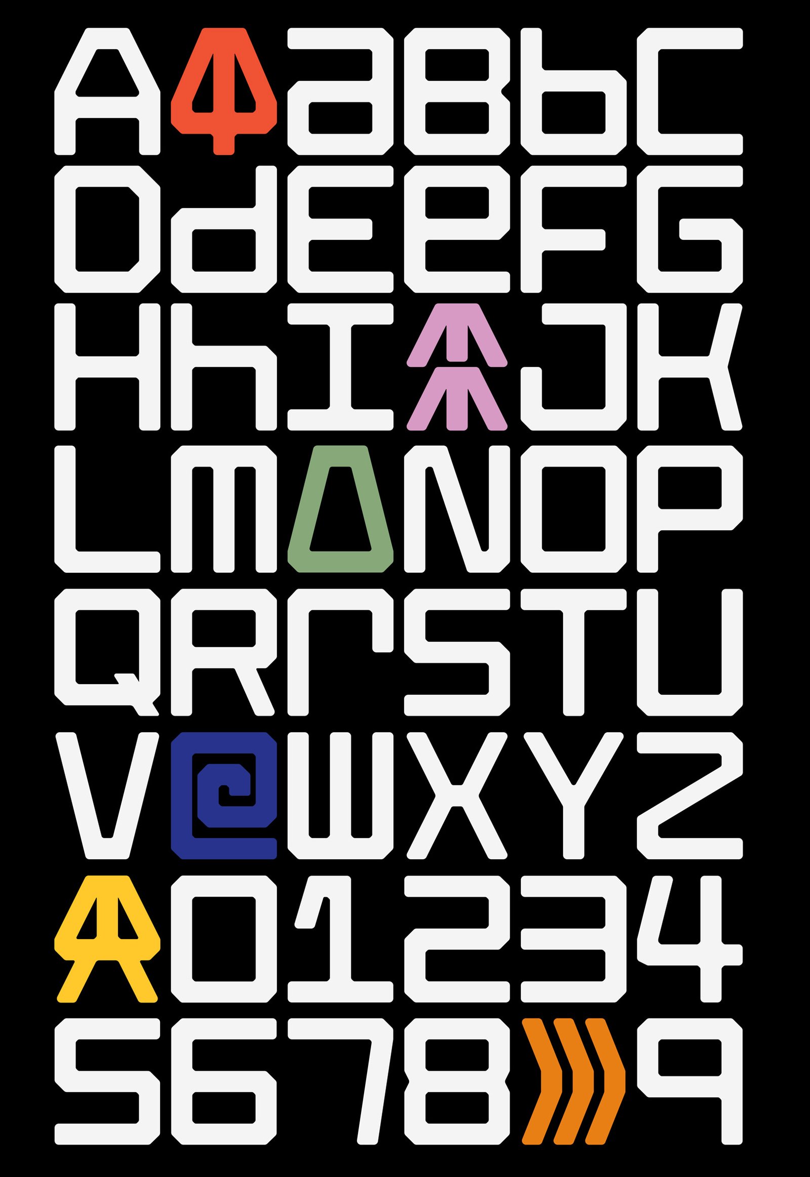
Inspired by the car brands that put an icon in front of the vehicle and the name on the back the project starts with the development of an entire typography, using the same main shapes to do the icon and the logotype. The rest of the system is based on grids that let the brand create many communication parts, digital, and print.
Part of this design project work on the final art of the aesthetic of the robots with 3D design and direction.
The identity navigates between old and new feelings, some nostalgia, binary language and symbols, and new ways to show it up. The inspiration for those feelings were Nasa, Nintendo, Star Wars, that kind of sensations summed up in this last thought; "let's make robots fun again, like when we were kids"
Team: Gastón Garcia Aja / Mauricio Gallegos
Animation: Martín Cañadell
Córdoba, Argentina (2022)
Giordana / Identity - Packaging
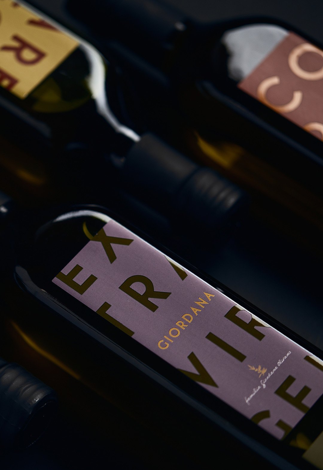
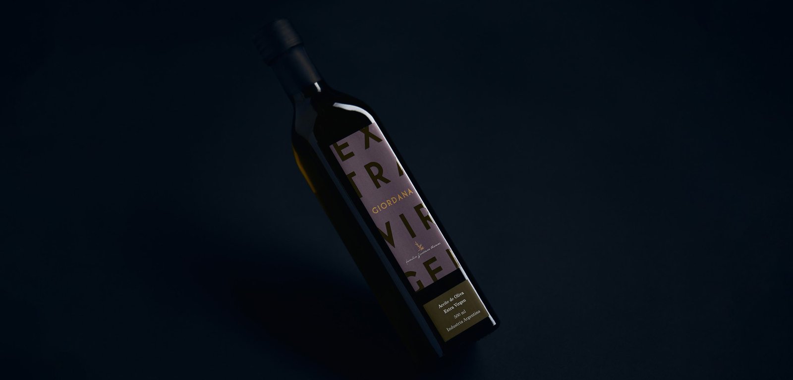
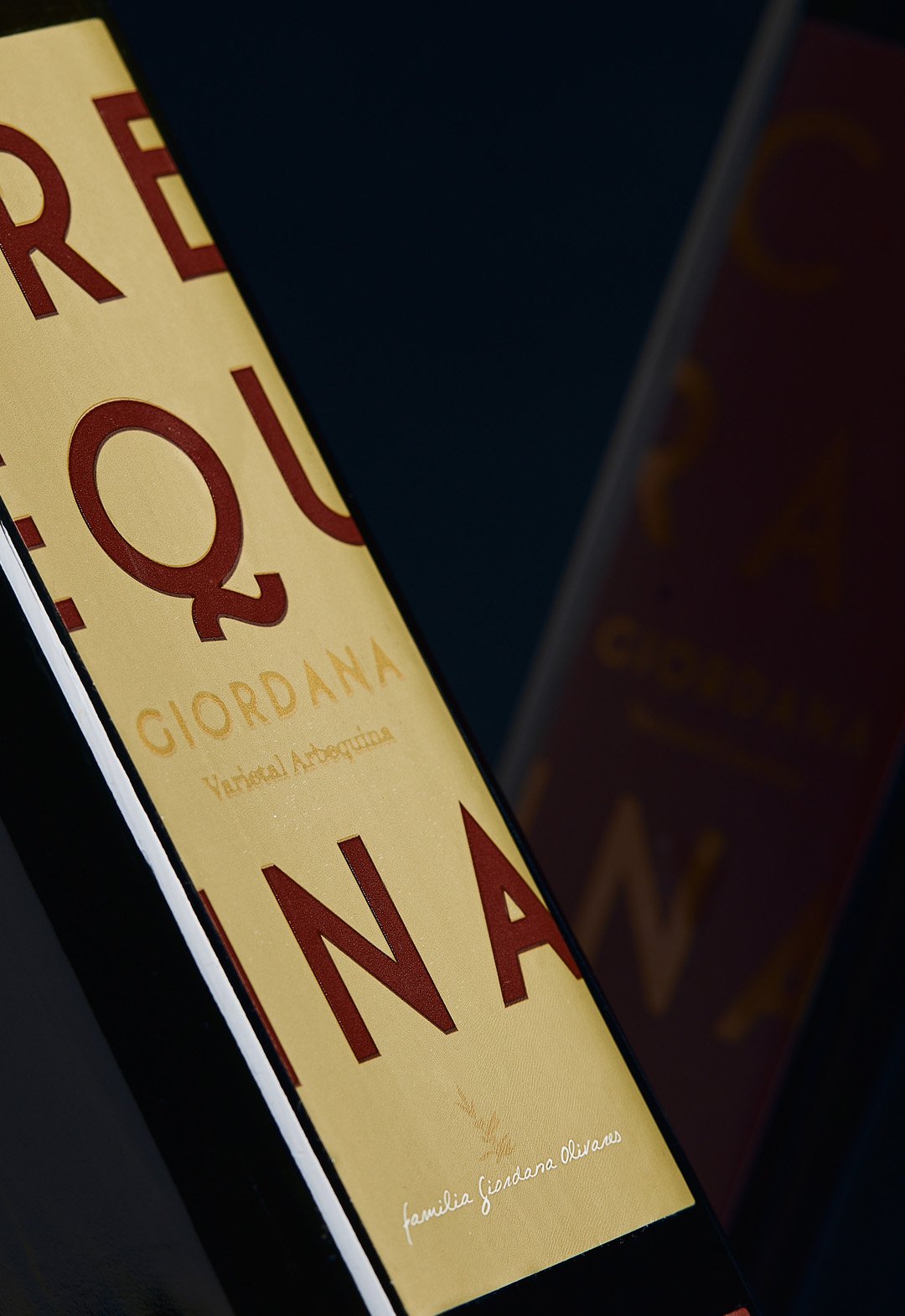
BackGiordana is an olive oil brand located in La Rioja, Argentina. The aim was to highlight the product on the store shelf with a color palette and a modern design based on typography.
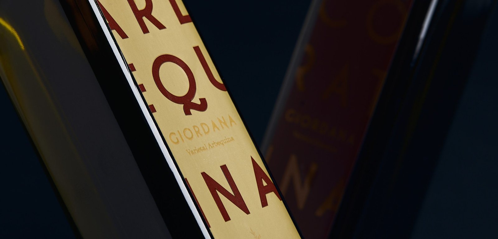
The label prioritized the type of varietal over the brand, due to the positioning of the word Extra Virgin in the category. This was done by means of a two-color typographic game that highlights the added value of the product.
Giordana currently sells it in the Argentinean market and in some Mercosur countries, without undergoing any modification to the original design from 2014.
Team: Gastón Garcia Aja / Mauricio Gallegos
Photo: Alvaro Picca
La Rioja, Argentina (2014)
Kaapeh / Identity
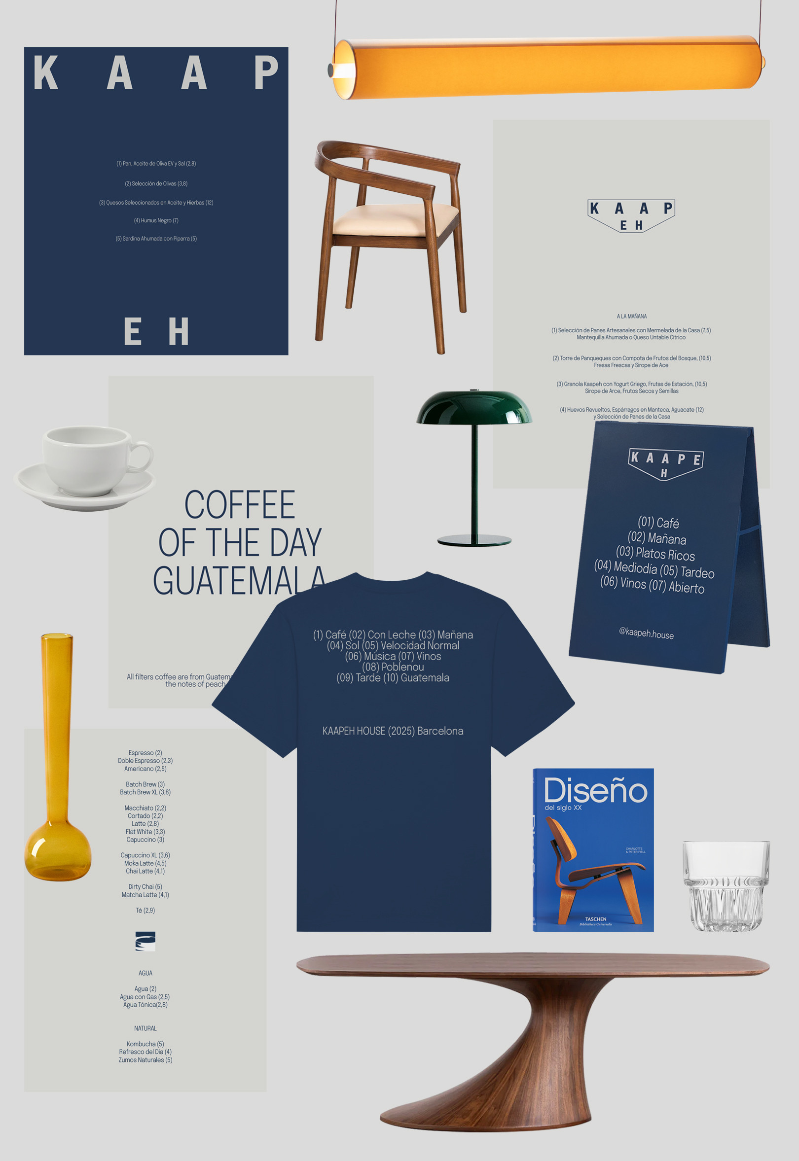
BackKaapeh is a café-resto located in Poblenou, Barcelona, featuring specialty coffee and tasty dishes throughout the day. Under the premise of a relaxed and aspirational brand, Kaapeh tries to bring out a full experience balanced between products, service and ambiance.
At its core, the identity evokes homey vibes, good company, and a no-rush attitude. The evolving logo system represents the ever-changing mix of people and moments that bring the space to life, contained by it.
The visual world mixes inspiration of mid-century architecture and design with cultural insights from Guatemala and Argentina.
Architecture: Candelaria Cáceres
Producer: Guadalupe Cáceres / Chasgracias Studio
Design: Mauricio Gallegos / Gastón Garcia Aja
Barcelona, Spain (2025)
Haizea / Identity - Type
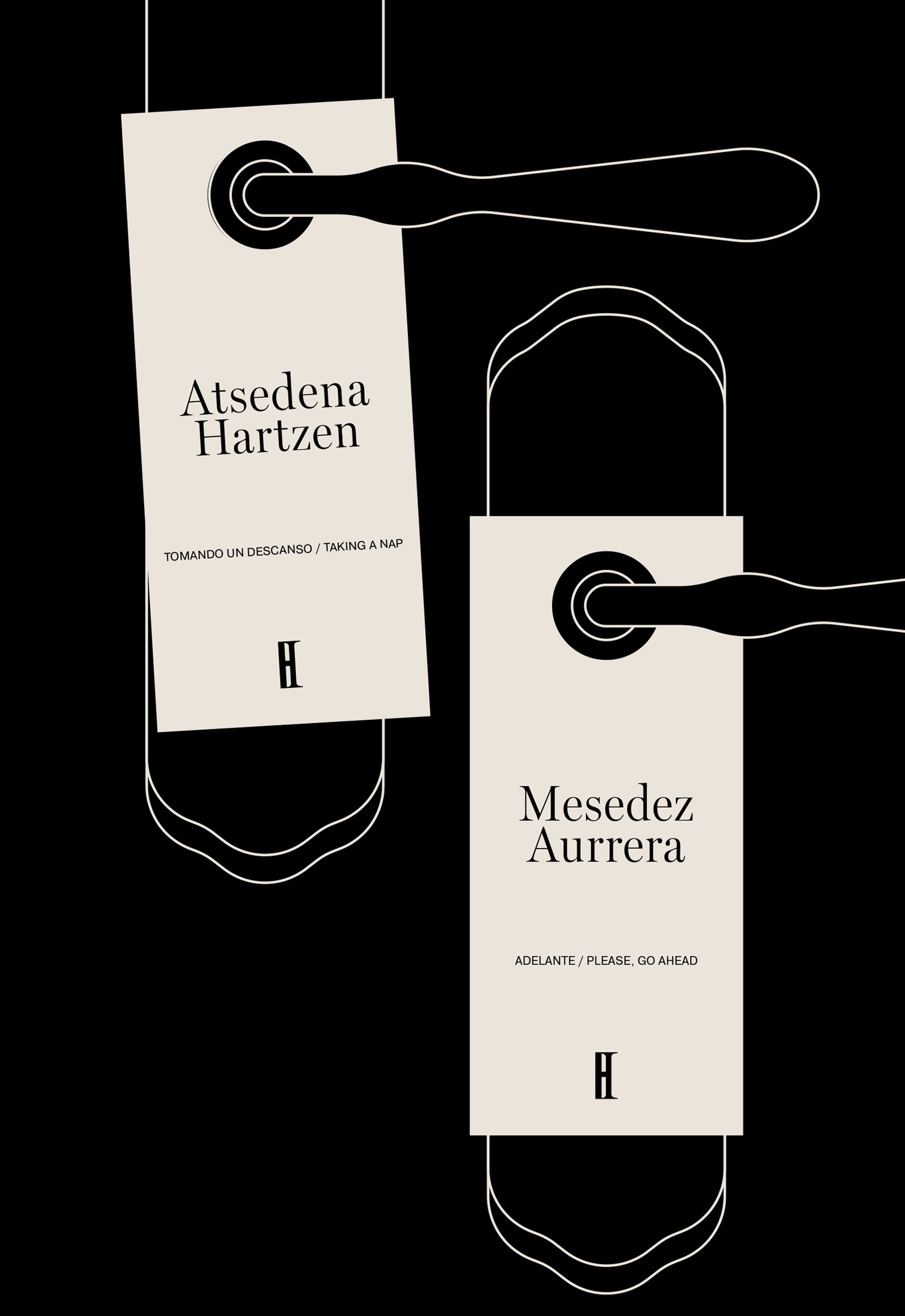
BackHaizea is a hotel located in the beautiful town of Bakio, Basque Country. The identity tries to represent the cultural mix of a project that counts with Argentinians and Basques, keeping the regional aesthetics of the place overall.
The combination of typographies evidences the mixture, the classic and the new, together. The changes in the formation of the word Haizea, go with its meaning; wind in Euskera; never static.
The icon development and the minimal graphic system try to maintain the identity under a classic, regional, and sincere feeling of a small hotel, aligned to the general concept of the brand to promote not only the hotel itself but also the surrounding environment.
Colab: Foguel Studio
Team: Mauricio Gallegos / Gastón Garcia Aja / Eugenia Foguel / Josefina Barbero
Animation: Martín Cañadelll
Bakio, Basque Country (2023)
Hol Management / Identity - Type
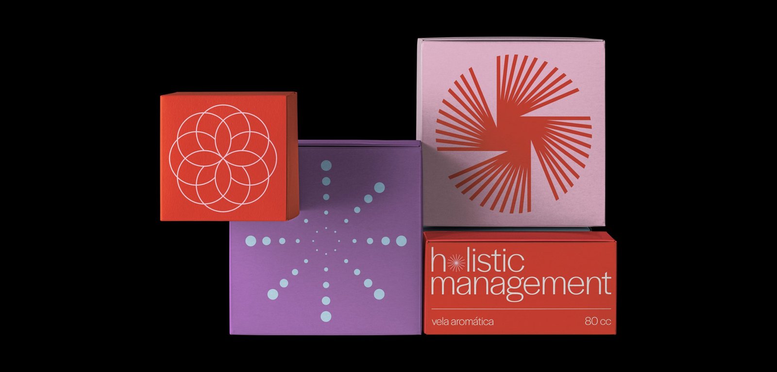
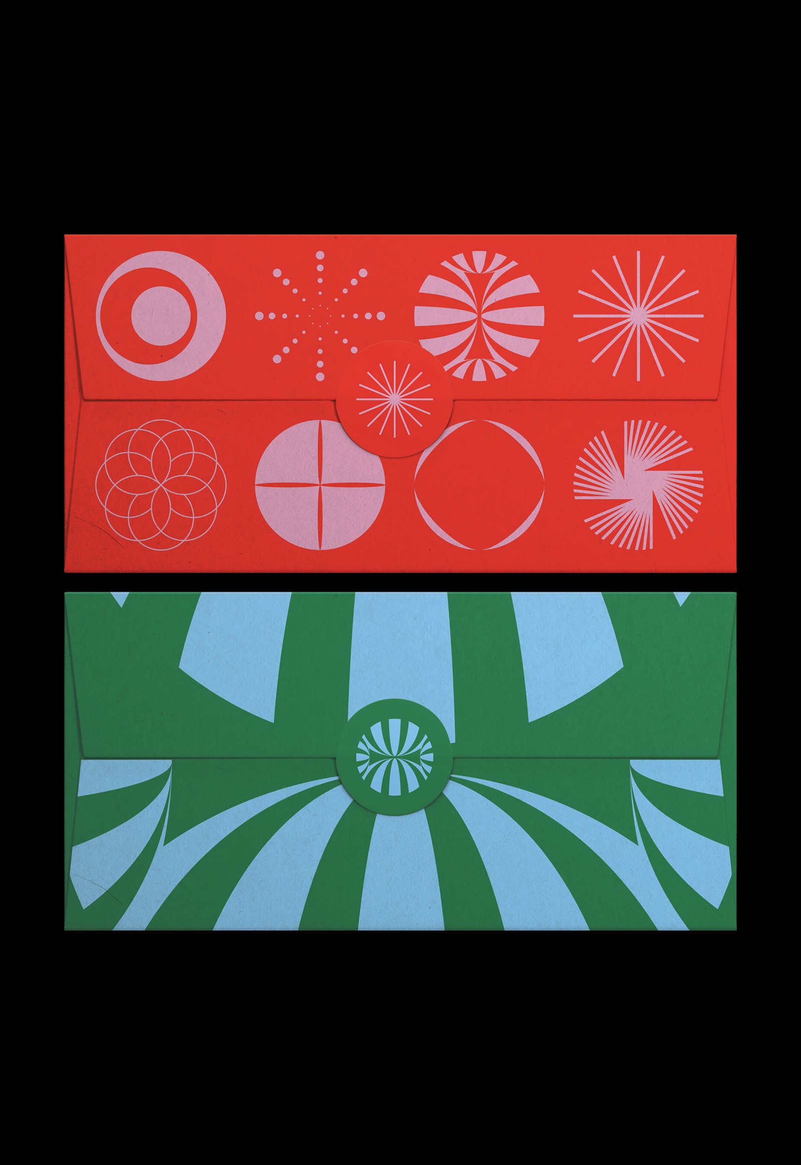
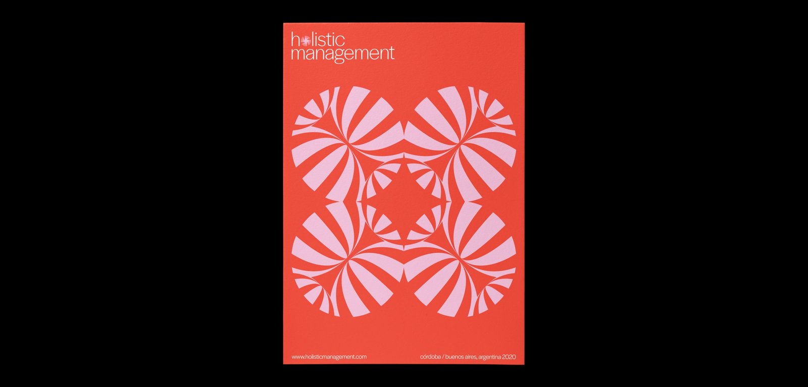
BackHol Management is a company that provides wellness tools to companies and individuals based on astrology as the main pillar and other holistic techniques such as meditation, mindfulness, yoga, constellations, among others.
The dynamic identity represents the different areas of the brand through portals that open to a new world of energy and information that can help people and companies to be better. Each icon is a portal, and together, they create a super dynamic system that prepares this new brand for any possible scenario.
Team: Mauricio Gallegos / Gastón Garcia Aja
Córdoba, Argentina (2018)
WIP / Animation - Identity - Type
BackWIP is a cultural venue that combines architecture, design, photography and art. Its concept, like its name, has to do with the creative process as a state of continuous search.
Its identity moves representing the before, during and after of a creative process, and also, the interaction of different disciplines in the same place.
Team: Gastón Garcia Aja / Mauricio Gallegos
Córdoba, Argentina (2018)
Bemvindas / Concept Development - Editorial - Identity
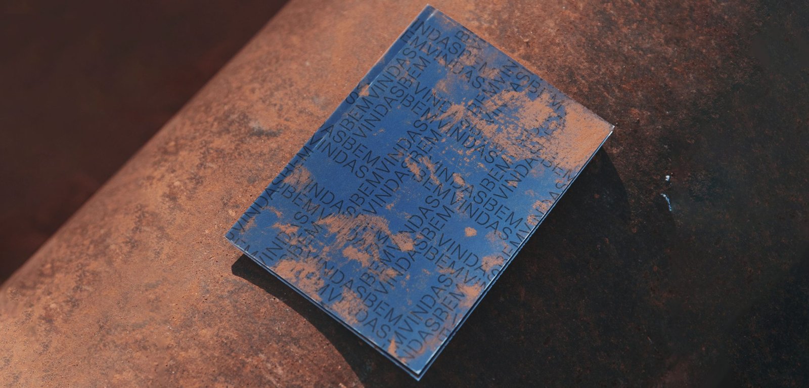
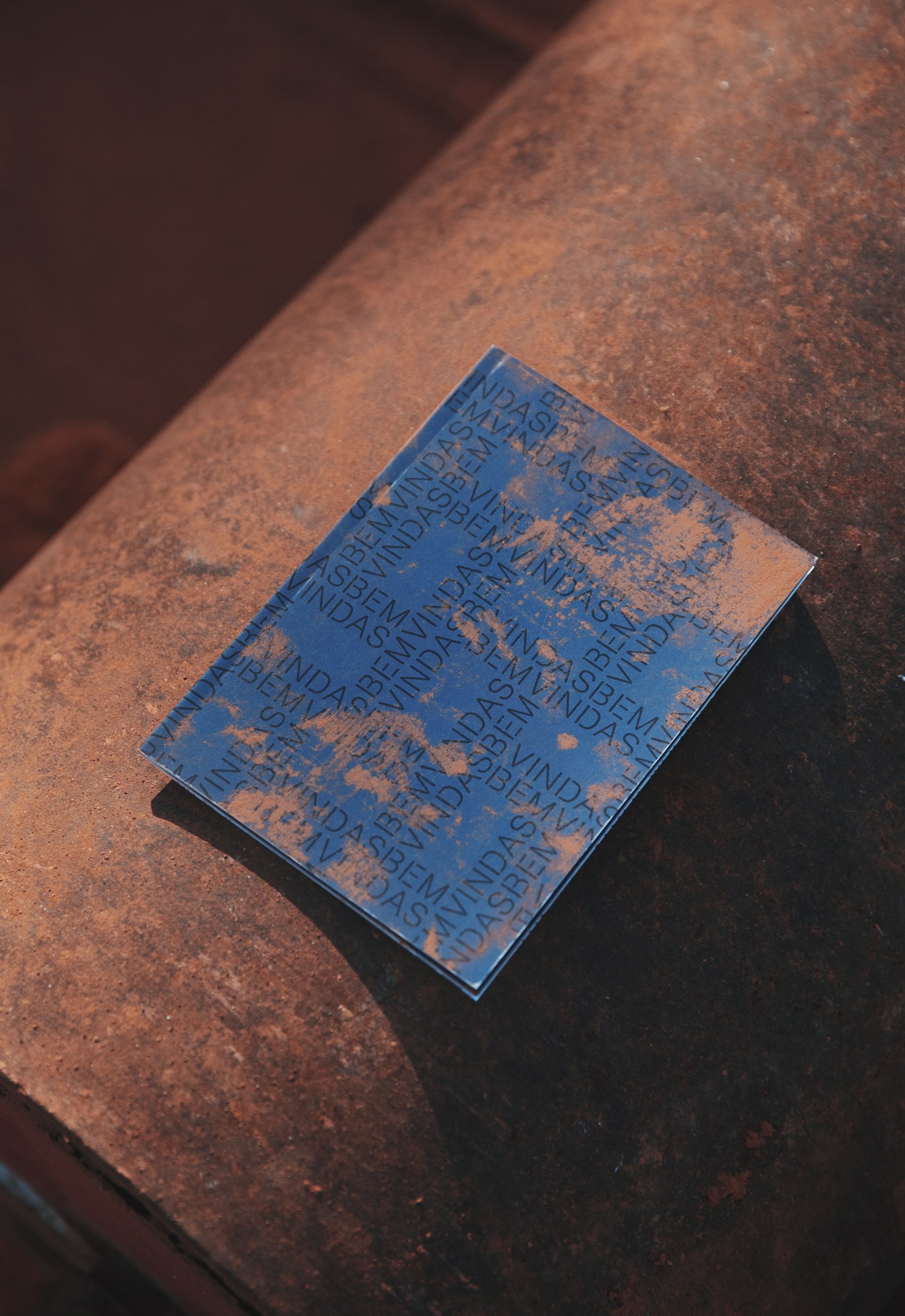
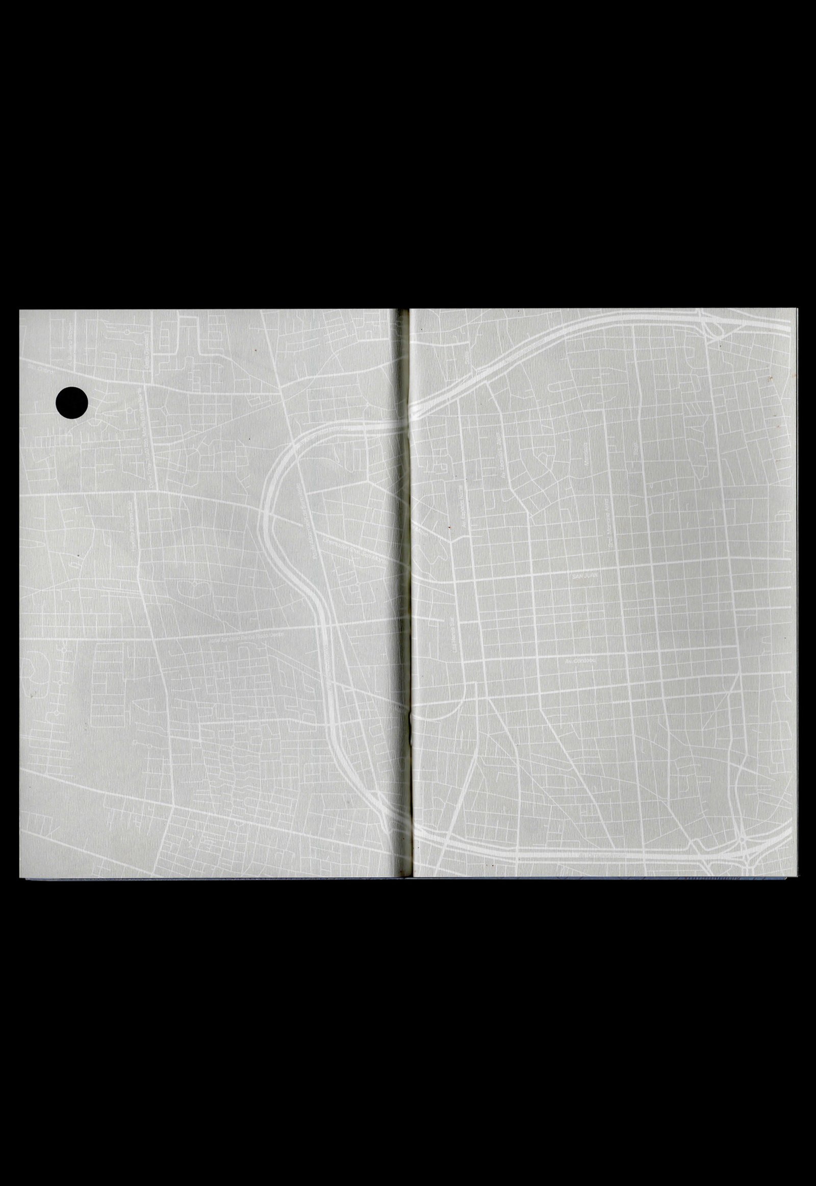
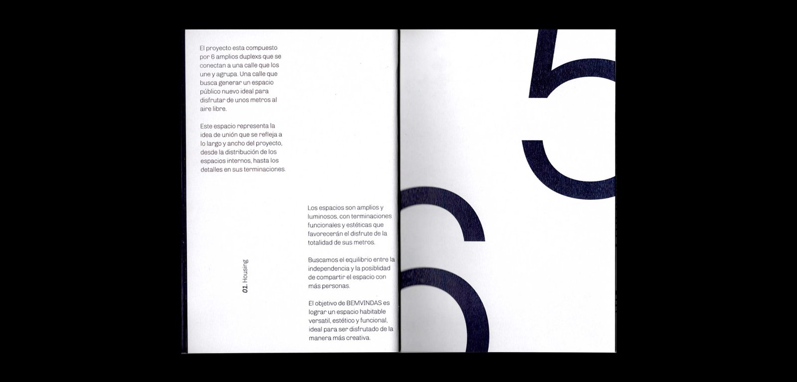
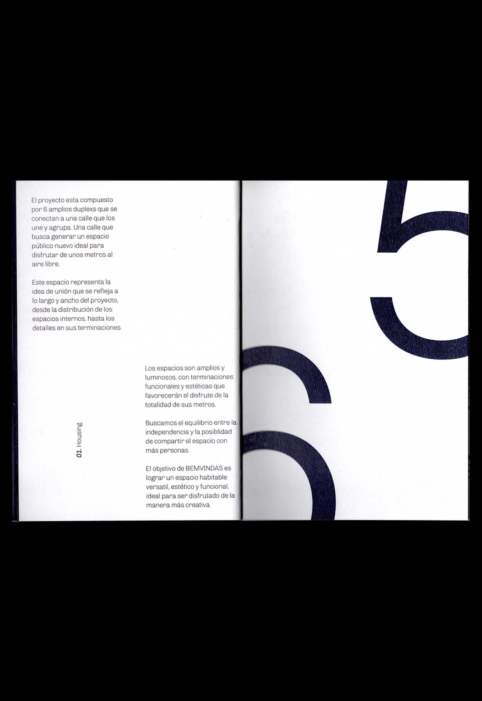
BackBemvindas is a housing project located in San Juan, Argentina. Beyond its architectural quality, the six duplexs are connected to each other from one street that becomes a public space, increasing the meters and the private garden of each house; a “welcome / bemvindo” space, especially for the category of homes to which Bemvindas belongs.
The application of the logo in pattern is a direct reference to the visible brick screening that the whole project looks like. This identity seeks to highlight the materials and the general idea of the project from sincerity and details.
Team: Mauricio Gallegos / Gastón Garcia Aja
Photo: Derio Ilari
Architecture: Estudio Montevideo
San Juan, Argentina (2019)
Yema / Identity - Naming
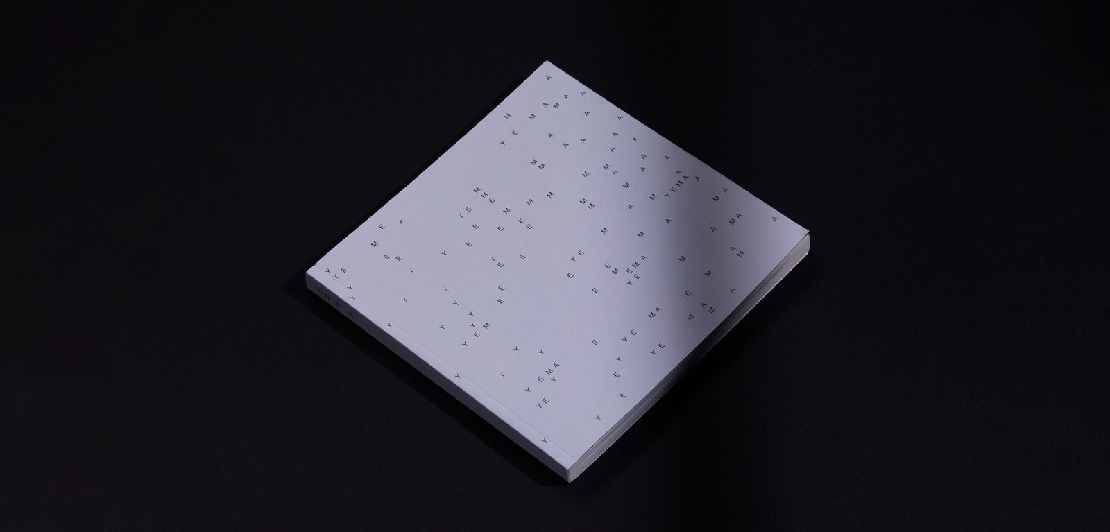
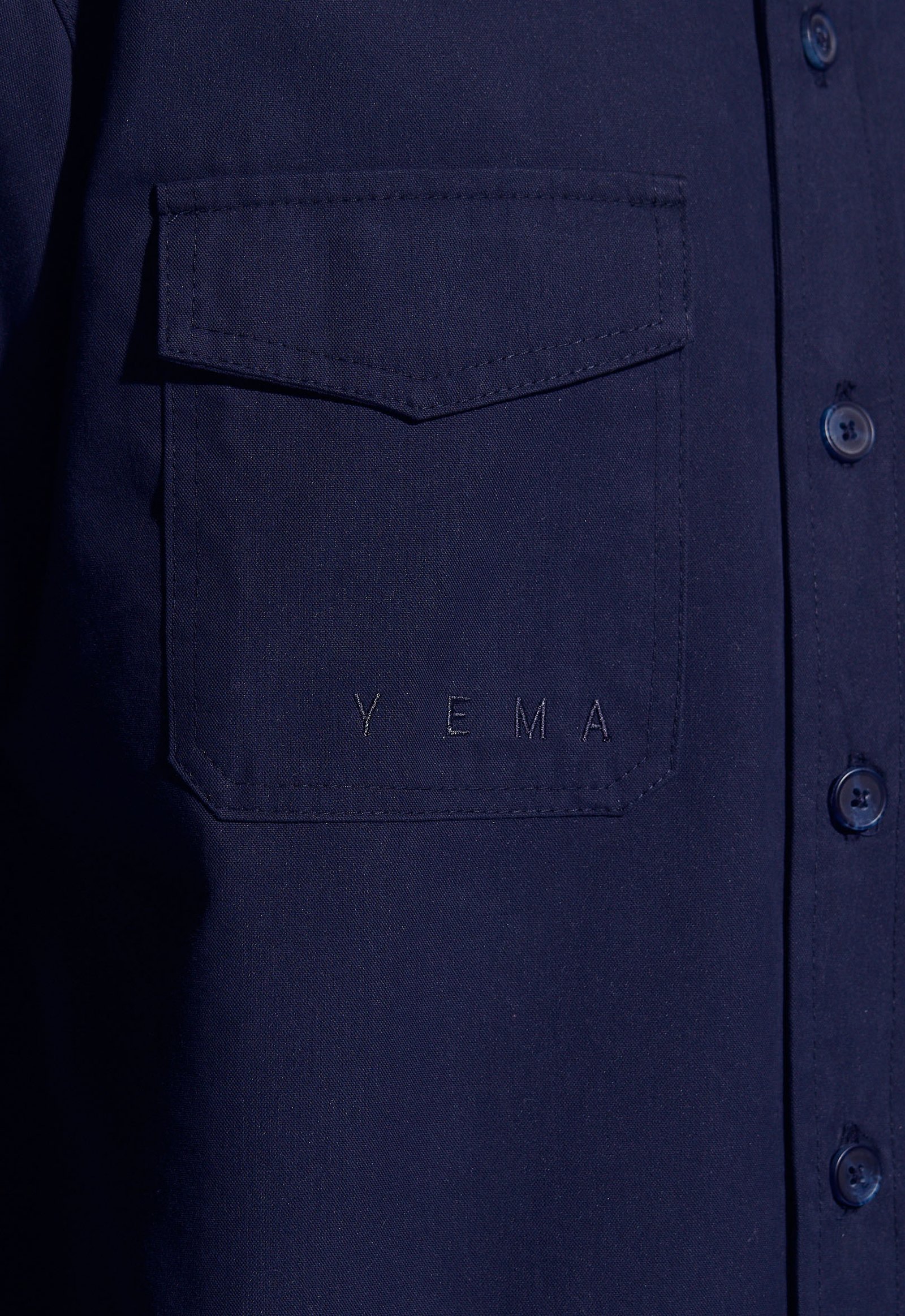
BackYema is an experimental clothing project based on expression as the main concept. Expression consists of two parts, a visible and an invisible side. The name is an adaptation of an Argentinian terminology that means "to have courage".
This concept runs through the whole brand. Graphically, the idea of crossing out elements allows to generate varied pieces with a double reading, narrative and aesthetically.
Team: Mauricio Gallegos / Gastón Garcia Aja
Córdoba, Argentina (2017)
Plantario / Concept Development - Identity - Naming - Packaging
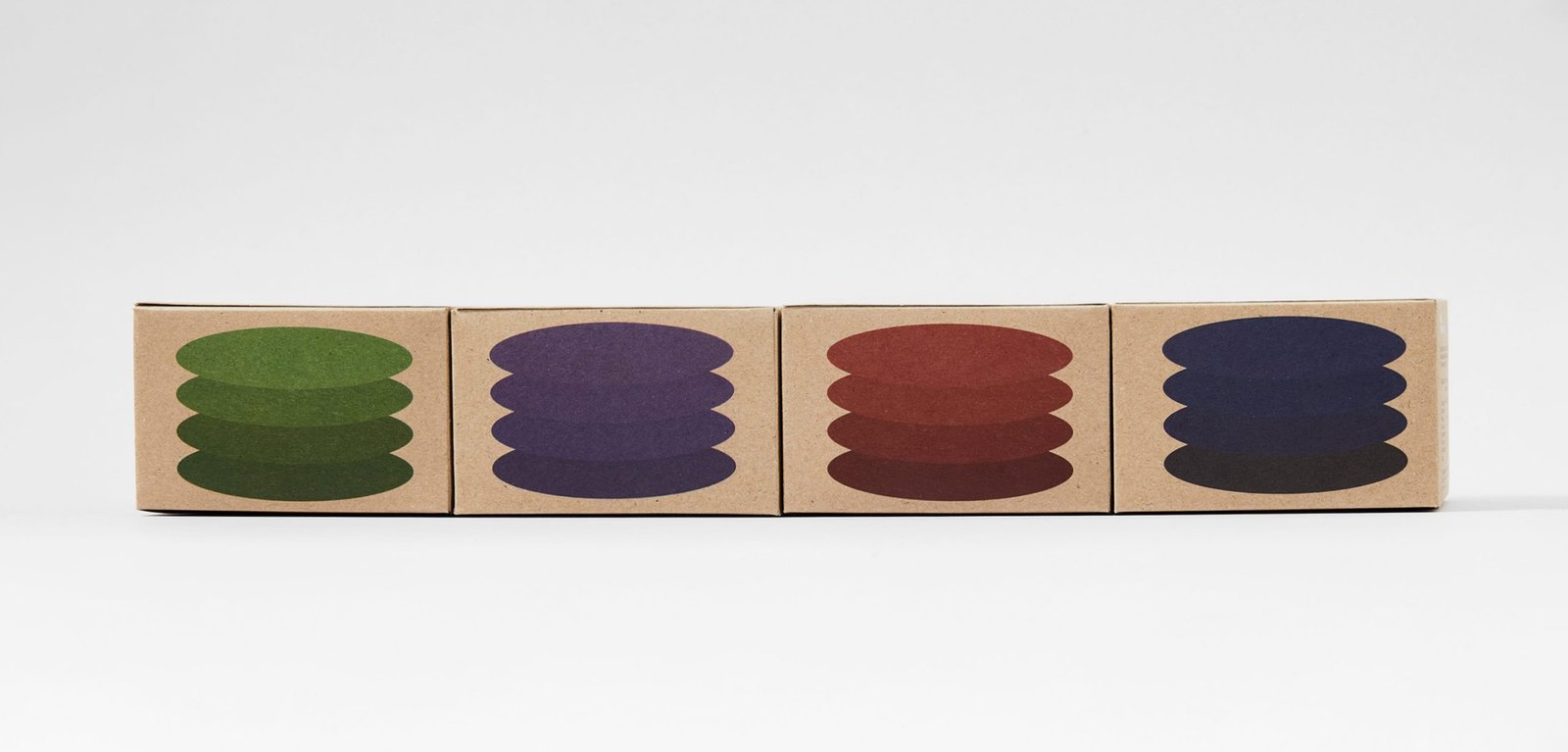
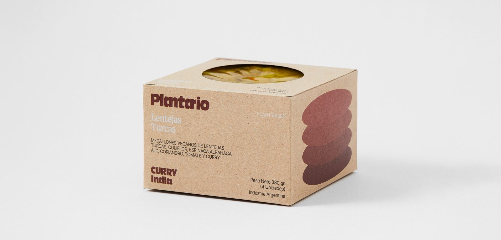
BackPlantario is a plant-based brand that makes burgers with local ingredients and recipes inspired by different parts of the world. The name is a combination of Spanish words meaning; a planet full of plants.
The narrative is around the concept of responsible consumption. It is impossible to save the world by making vegan burgers, but it could be the first step in a series of changes that could help keep the planet alive a little longer.
The packaging tries to be as environmentally friendly as possible, taking into account the nature of the product.
"PLANTARIO is an idea that respects the planet, from the food we eat to the small habits that contribute to the cause. Moving to the right side is the main idea, the side that helps the planet. It's not perfect and it's not going to happen tomorrow, it's going to take time, but we have to start at some point and if a vegan burger is given a chance it's going to be a starting ceremony or a historical event, all the work will have been worth it.
Team: Gastón Garcia Aja / Mauricio Gallegos
Photo: Alvaro Picca
Córdoba, Argentina (2020)
Koyan Hotel / Concept Development - Identity
BackKoyan is a hotel located in Panguipulli, Chile, that seeks to connect people with nature in a pure and simple way, taking advantage of the majestic surroundings of the region.
The isologo results from the combination of a square, which represents the systemic life of people in the city, and a circle, which represents the flow of things in nature. Ideally, the Koyan experience is located between these elements, with balance as the main value.
This intermediate form gave rise to the typography terminations, giving personality and distinction to the logo without losing simplicity.
Team: Mauricio Gallegos / Gastón Garcia Aja
Santiago, Chile (2018)
Natal Perú / Concept Development - Identity - Naming
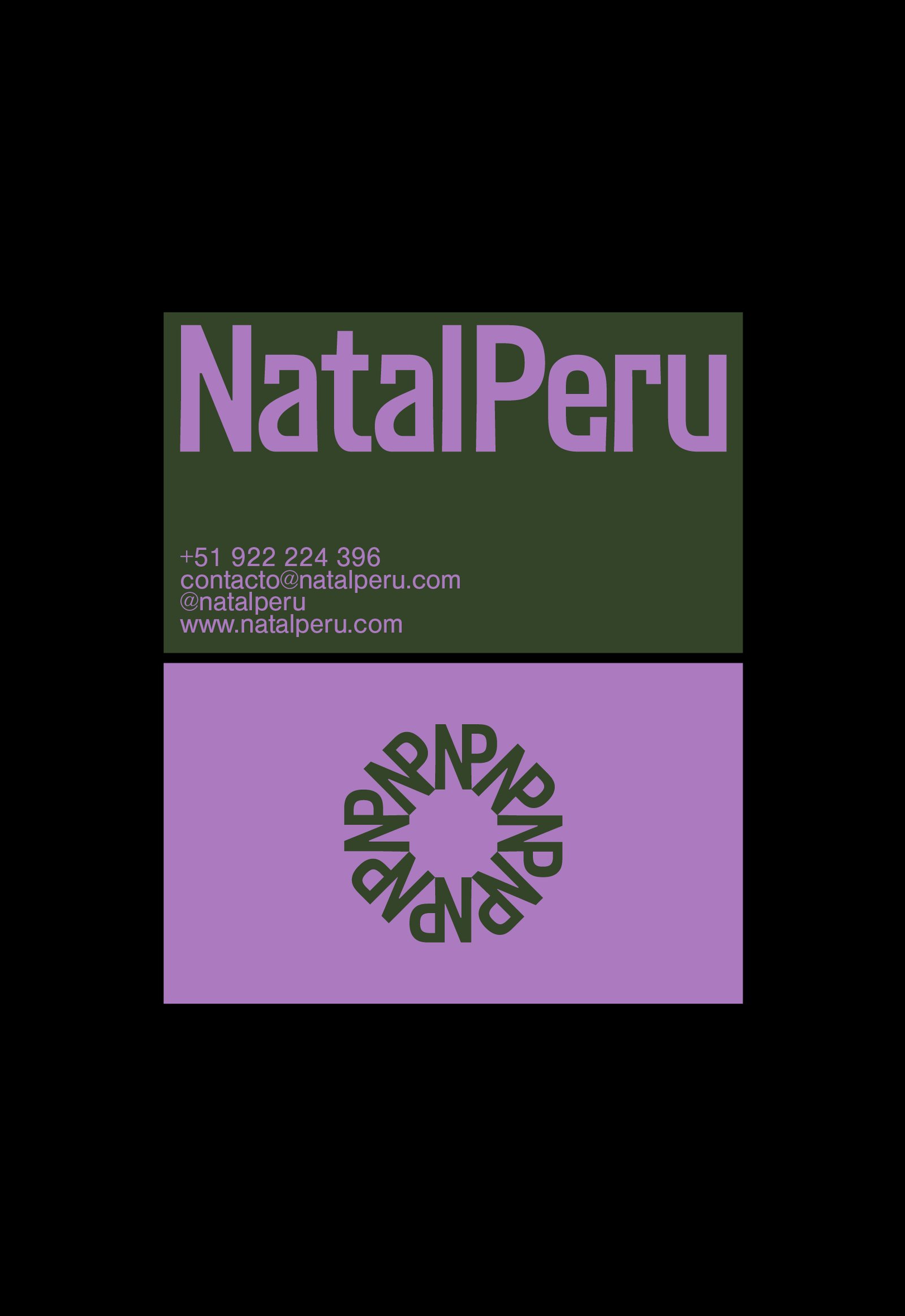
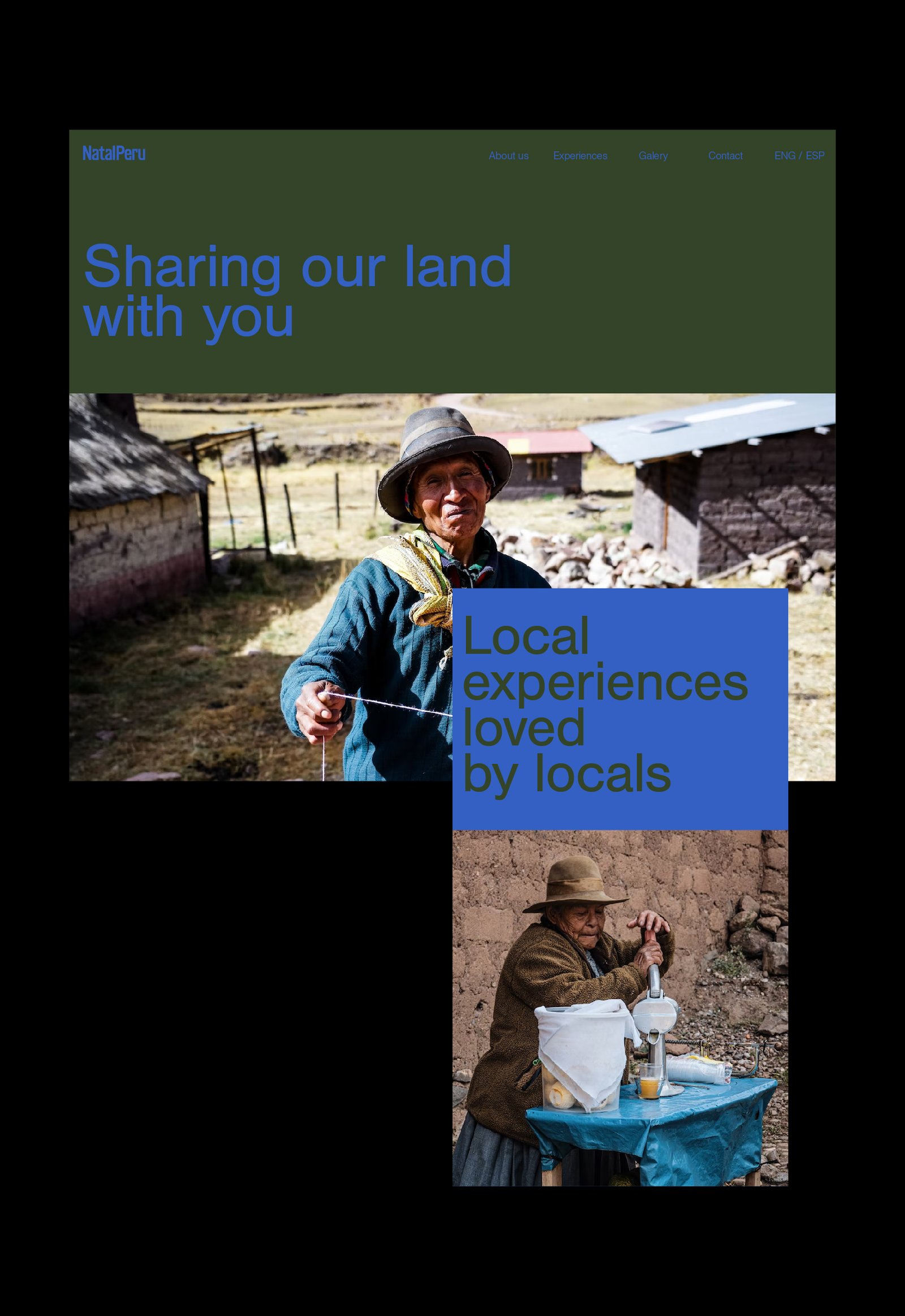
BackNatal Peru is a travel agency focused on generating real experiences for all those who want to get to know Peru. Customized travel agendas based on the tastes of the tourist, combined with experiences verified by locals, generate a unique travel opportunity in the Andean country.
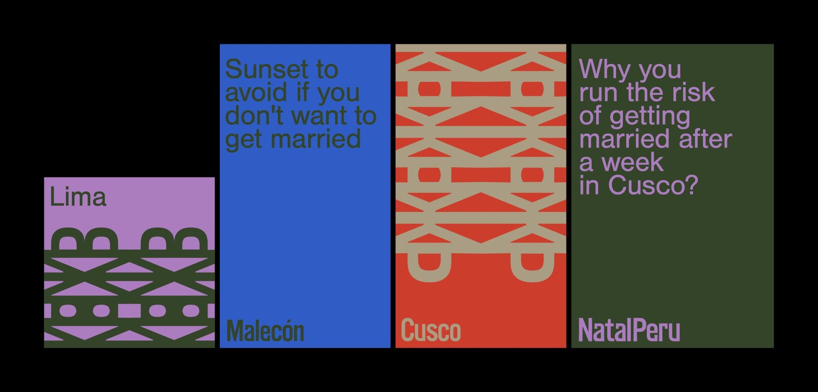
The identity tries to reflect in a simple way the Peruvian spirit, using European codes and aesthetics, in relation to the origin of the target audience. The use of color, patterns from the logo and details in the narrative complete this identity.
Collaboration with: Fibra
Team: Gastón Garcia Aja / Mauricio Gallegos / Andrea Gálvez
Lima, Perú (2022)
Caferia / Concept Development - Identity - Illustration - Naming
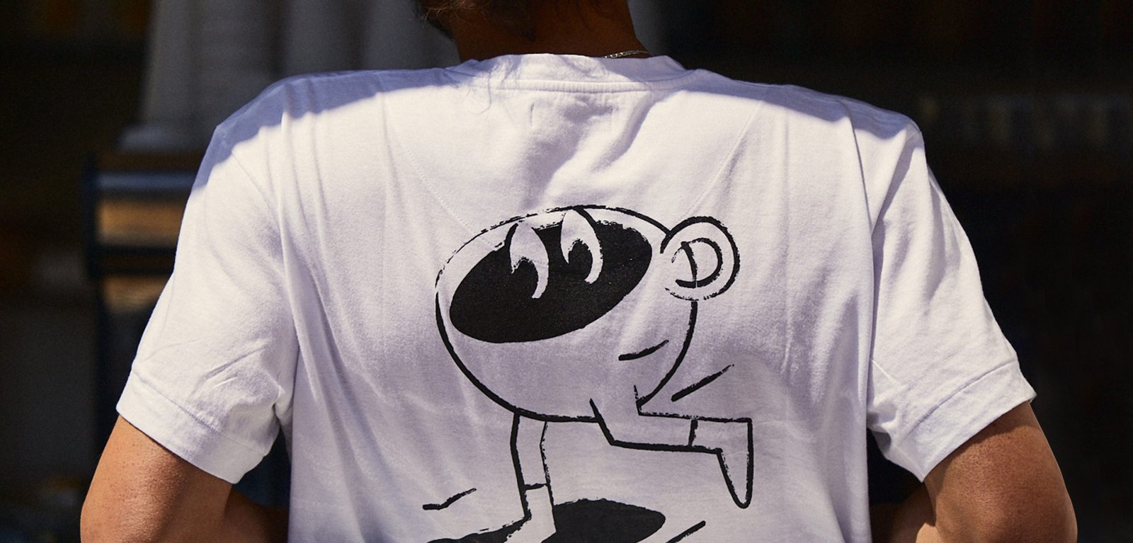
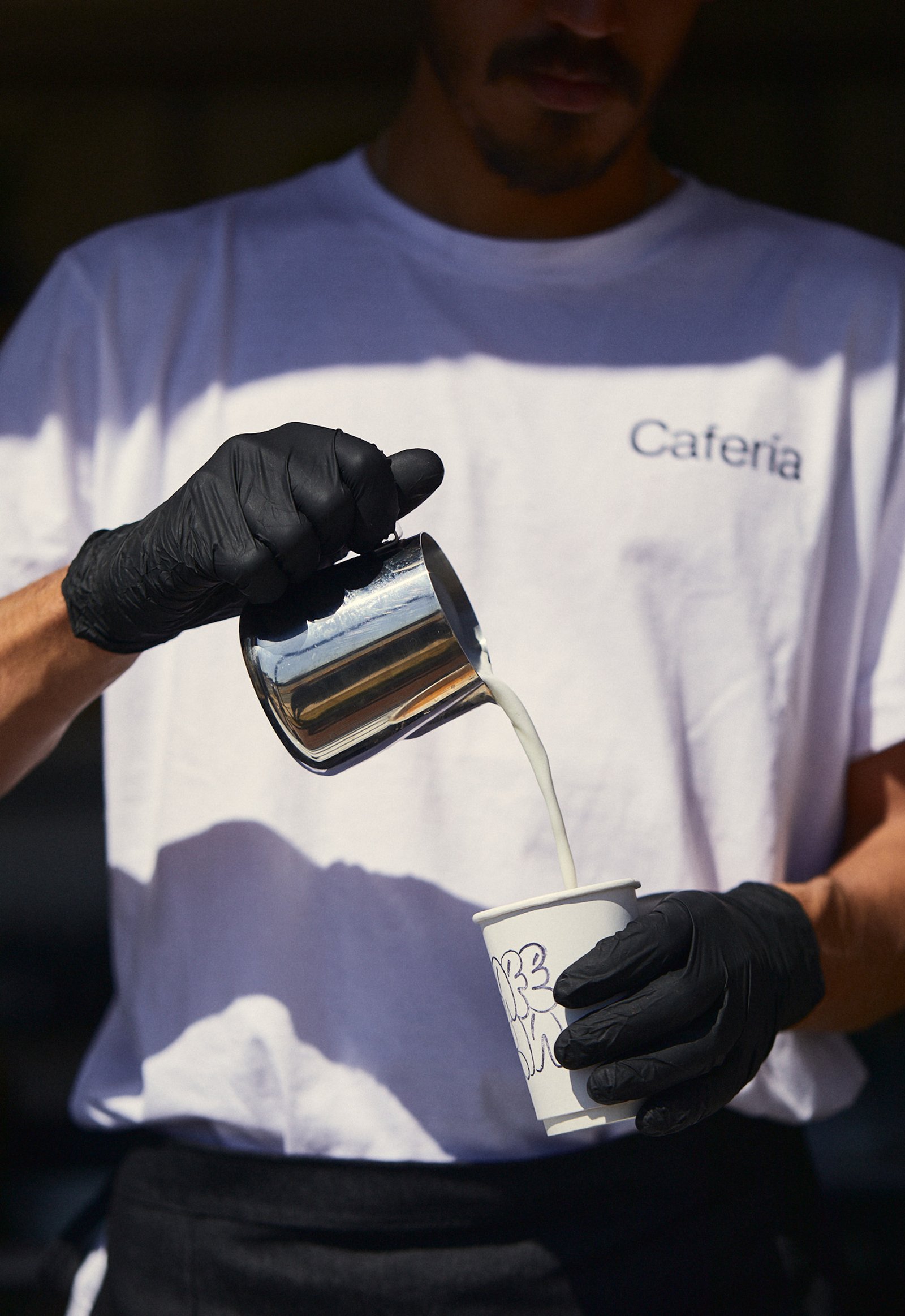
BackCafería is the combination between a specialty coffee shop and a fresh market sale from a local fair, located in Córdoba, Argentina. This identity reflects an urban spirit that represents a happy and relaxed consumer situation.
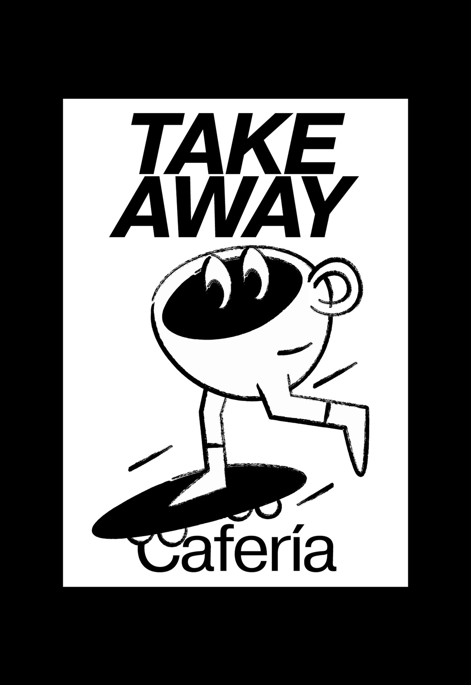
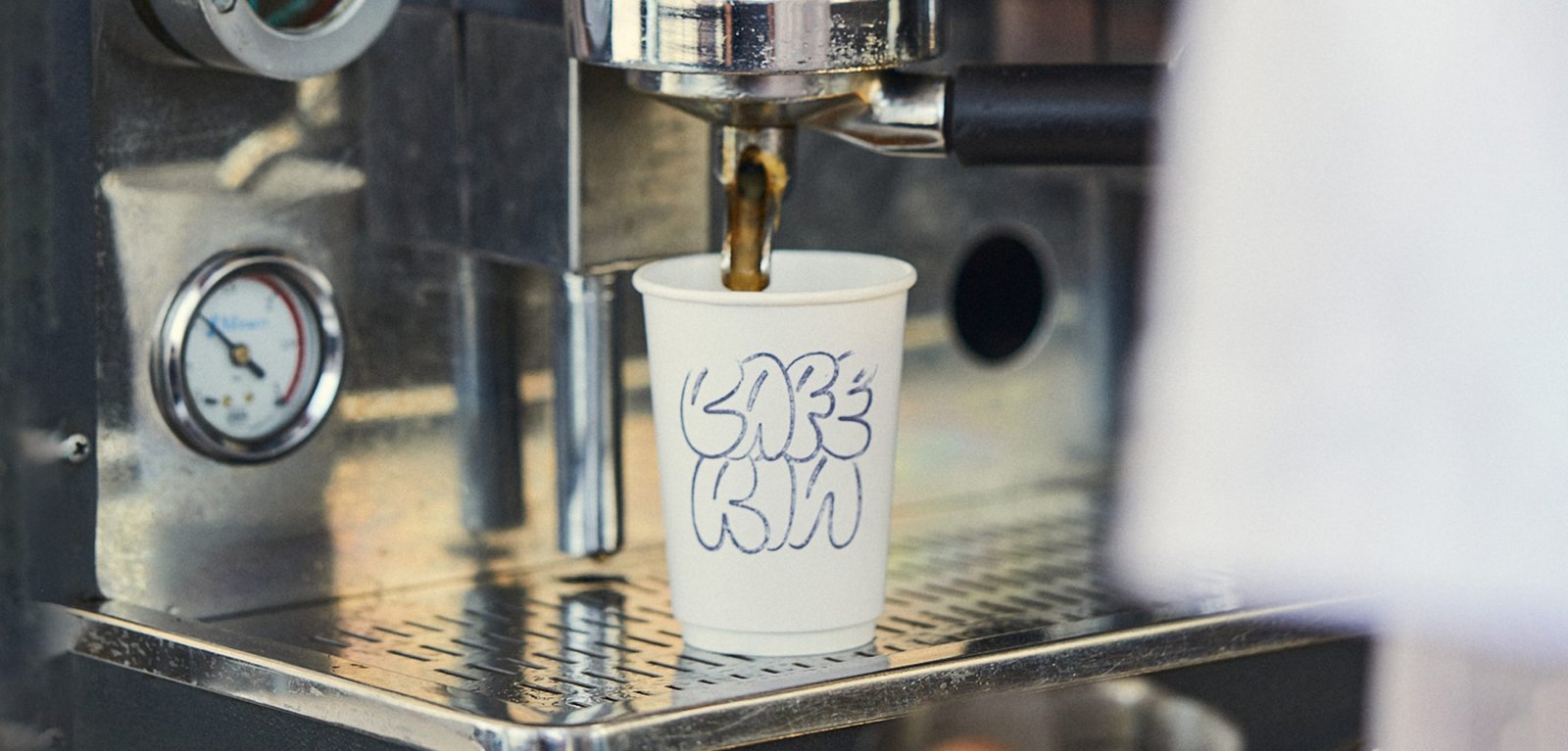
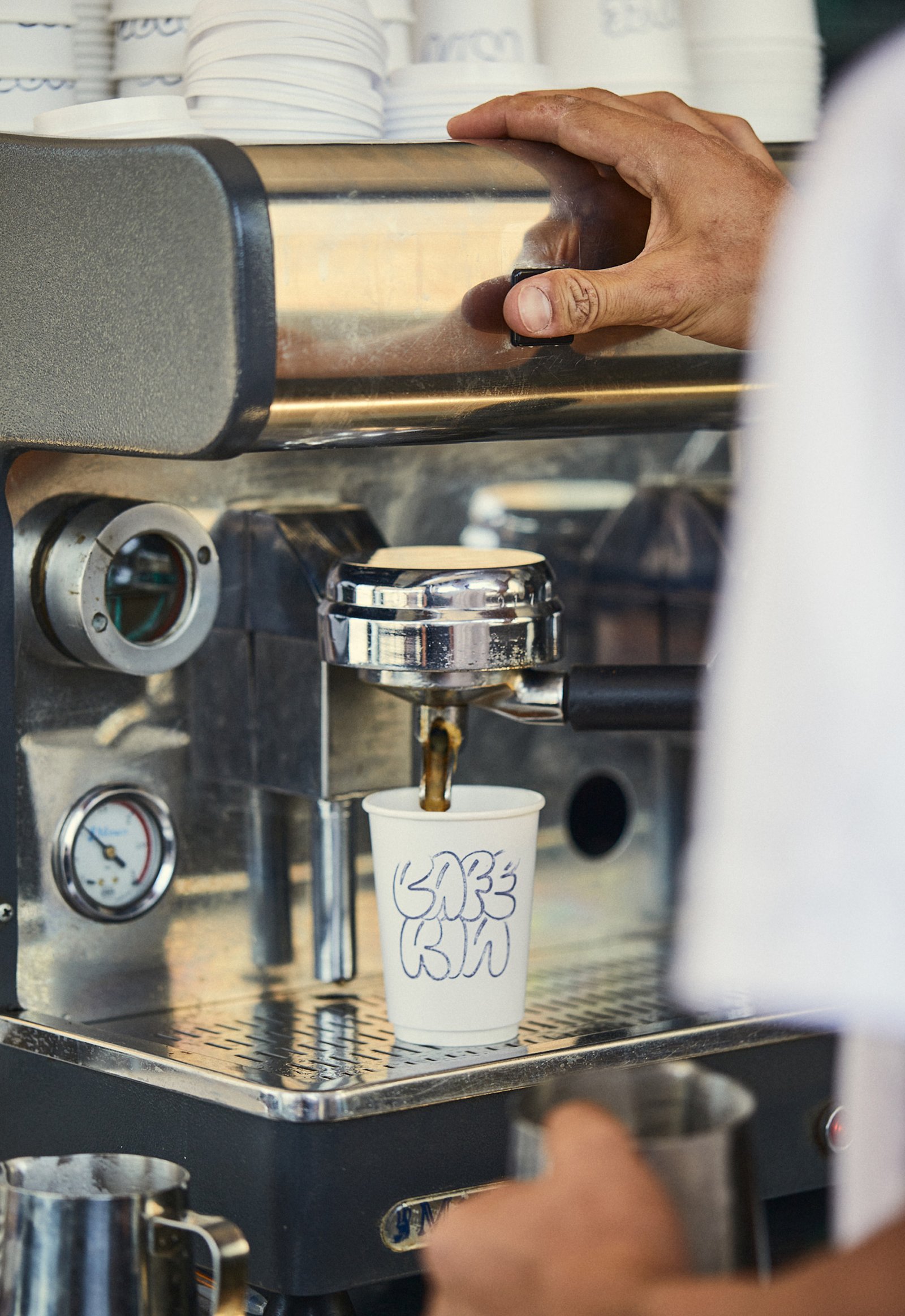
The graphic identity was inspired by the stamps used on take away cups, using their color and finish details to complete the rest of the design pieces.
A simple and dynamic system, made up of well-contrasted fonts and coffee cups characterized in everyday situations, try to generate a cheerful and easy-to-use brand, with a lot of strength in its name, and all the doors open for possible franchises.
Team: Mauricio Gallegos / Gastón Garcia Aja
Photo: Alvaro Picca
Córdoba, Argentina (2020)
Flia / Concept Development - Identity - Naming
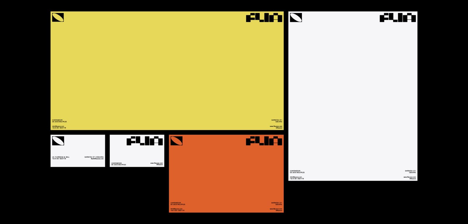
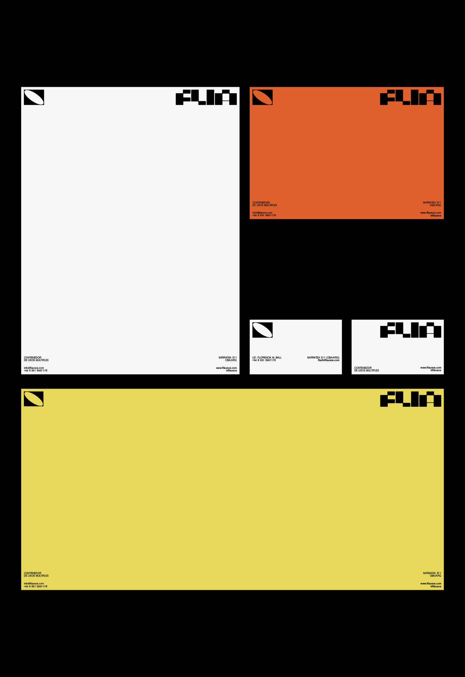
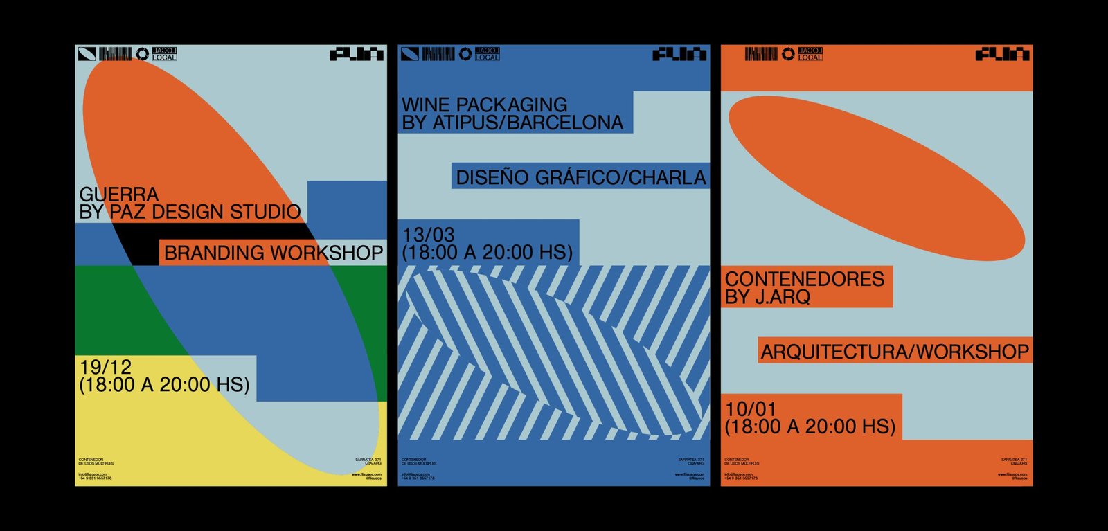
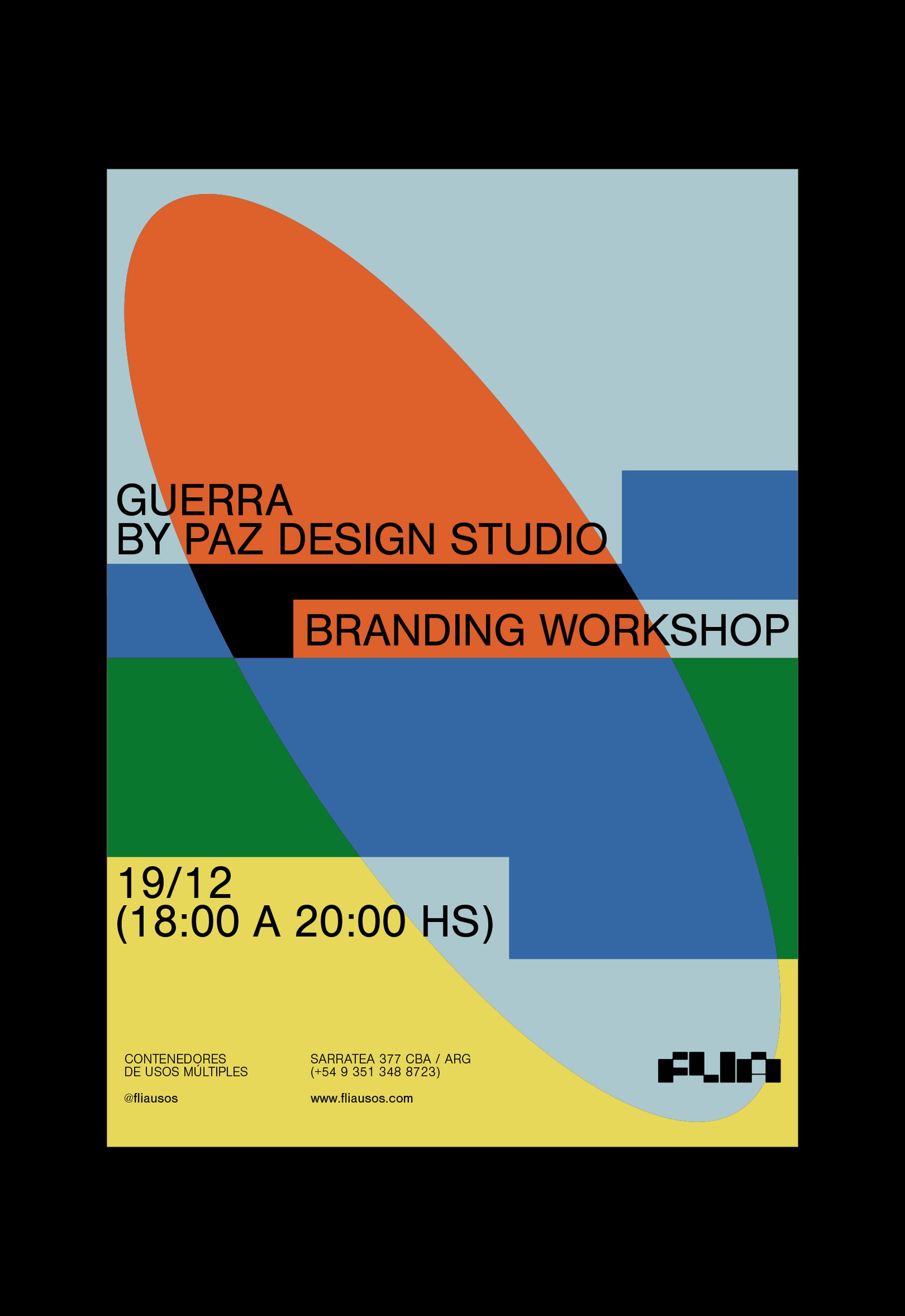
BackFlia is a multi-purpose container open to all kinds of events, training, workshops and talks in different areas, which support local talent and culture and aim at the social development of the city Córdoba, Argentina.
Its identity represents the classic rectangular shape of containers. This idea is found in the formation of the letters of the logo, and in the whole graphic system.
Team: Mauricio Gallegos / Gastón Garcia Aja
Architecture: Jarq
Córdoba, Argentina (2019)


