Juliette Foxtrot / Identity - Packaging
BackJuliette Foxtrot is a craft beer produced in Córdoba, Argentina, which is part of the Bravante family of craft beers.
Each beer style represents a fictional character related to maritime codes and the sea. In this case, Juliette represents a mermaid, with a French style of illustration and composition, directly related to the feelings of its flavour.
Team: Mauricio Gallegos / Gastón Garcia Aja
Photo: Alvaro Picca
Córdoba, Argentina (2017)
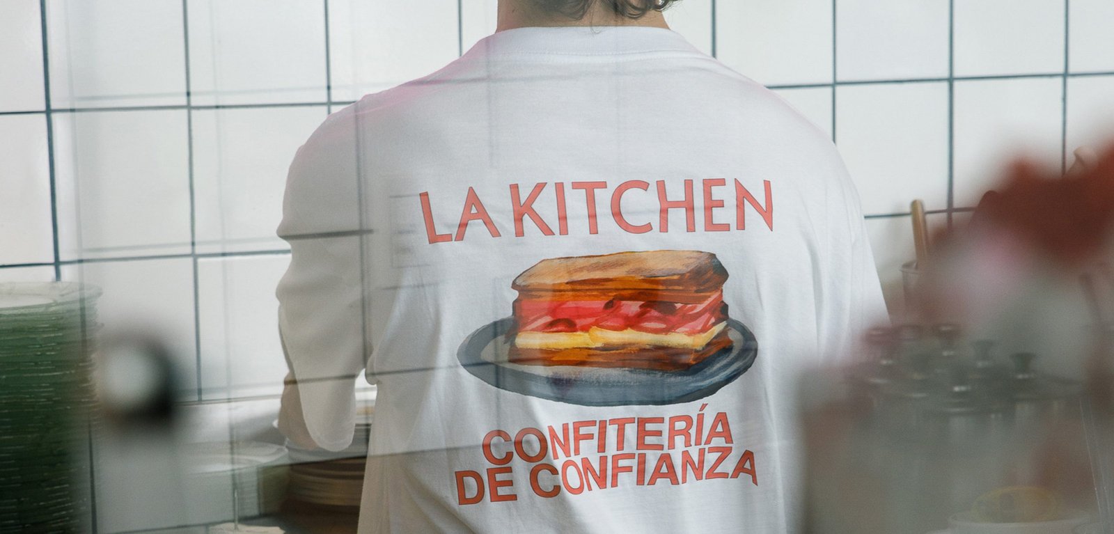
La Kitchen / Concept Development - Illustration - Packaging - Revamp
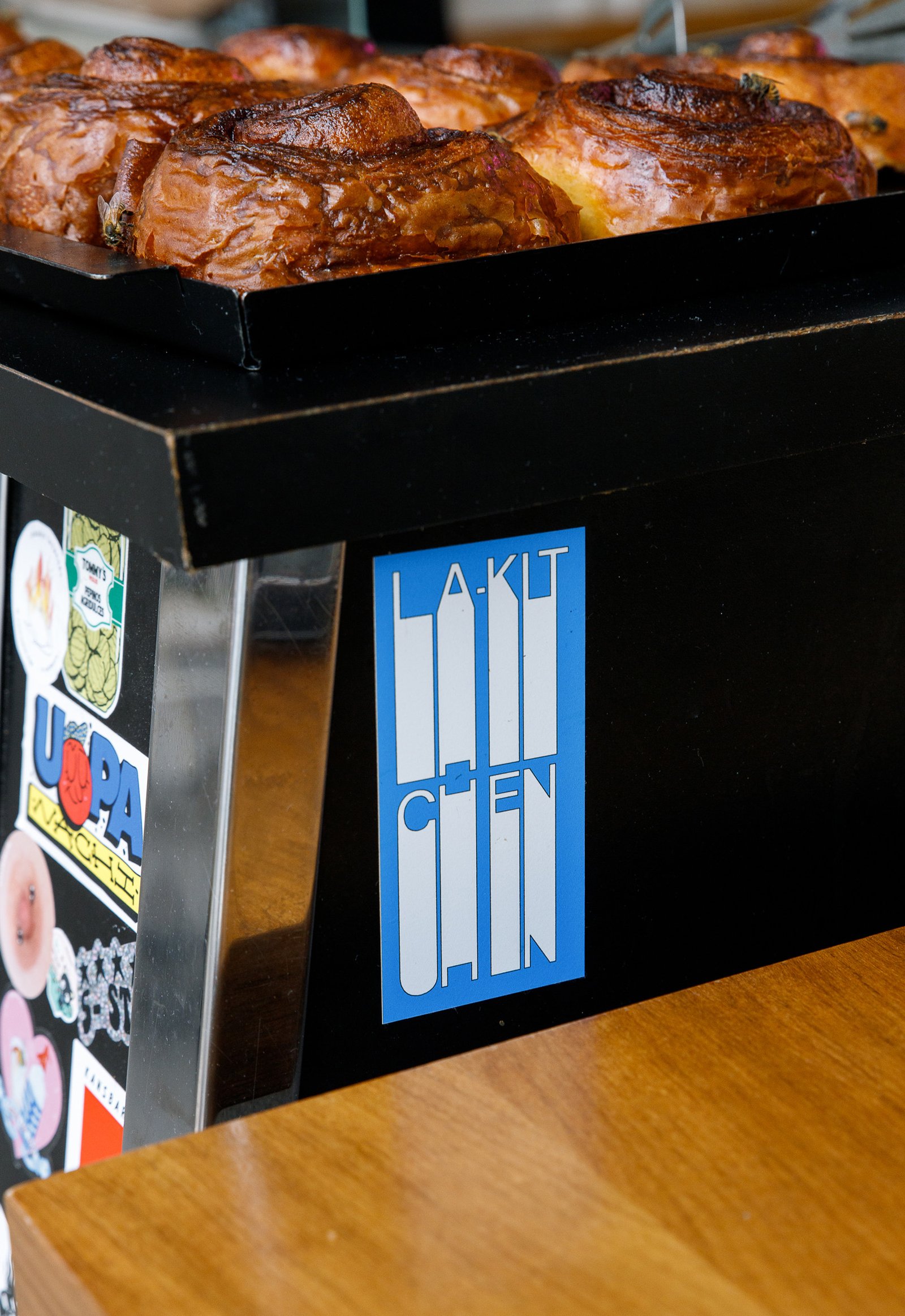
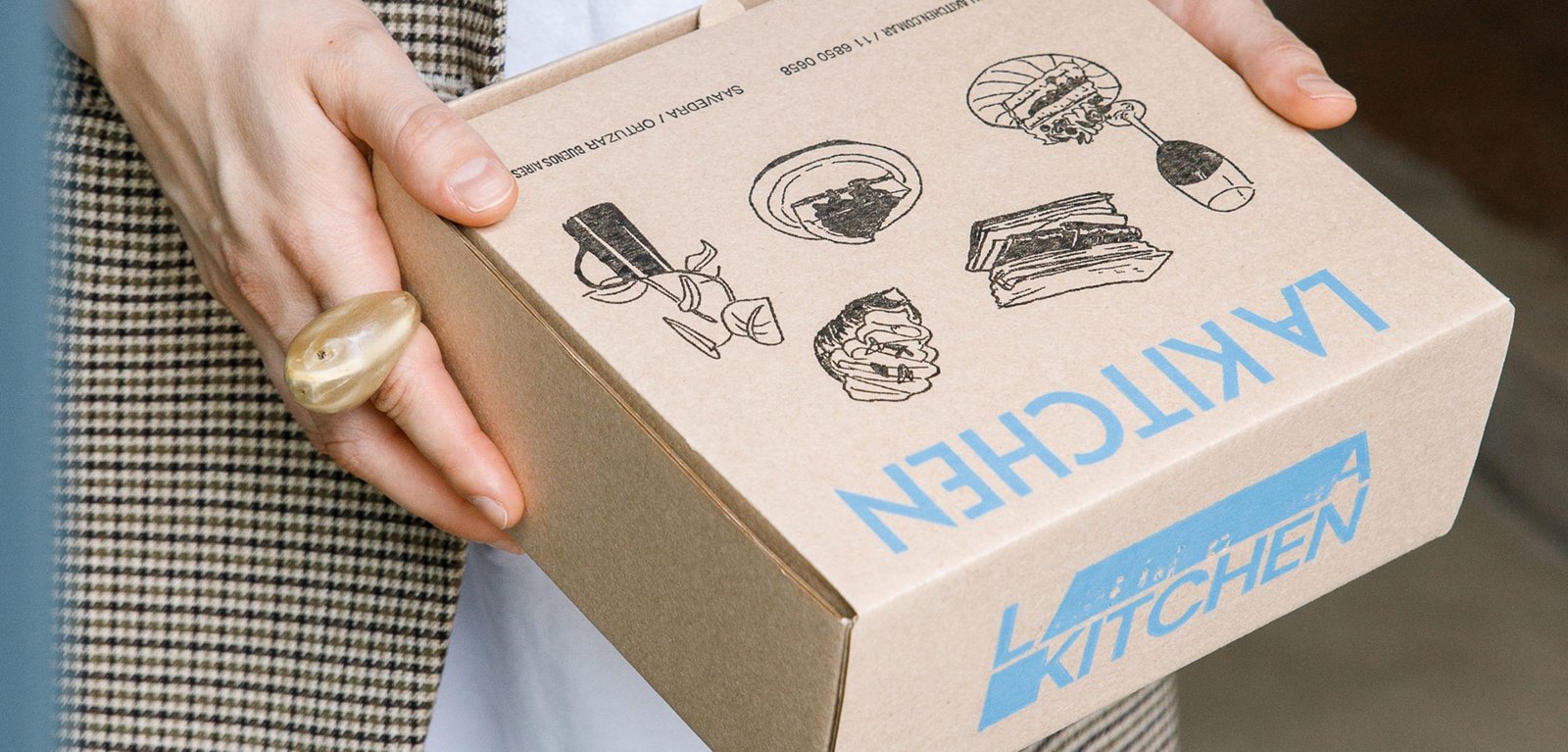
BackInspired by the traditional aesthetics of the Parisian boulangerie, adapted to the particular and beautiful local culture of the neighborhoods of Buenos Aires.
This new identity tries to combine the transparency and honesty that exists in its products and experiences, from a sincere and fun design.
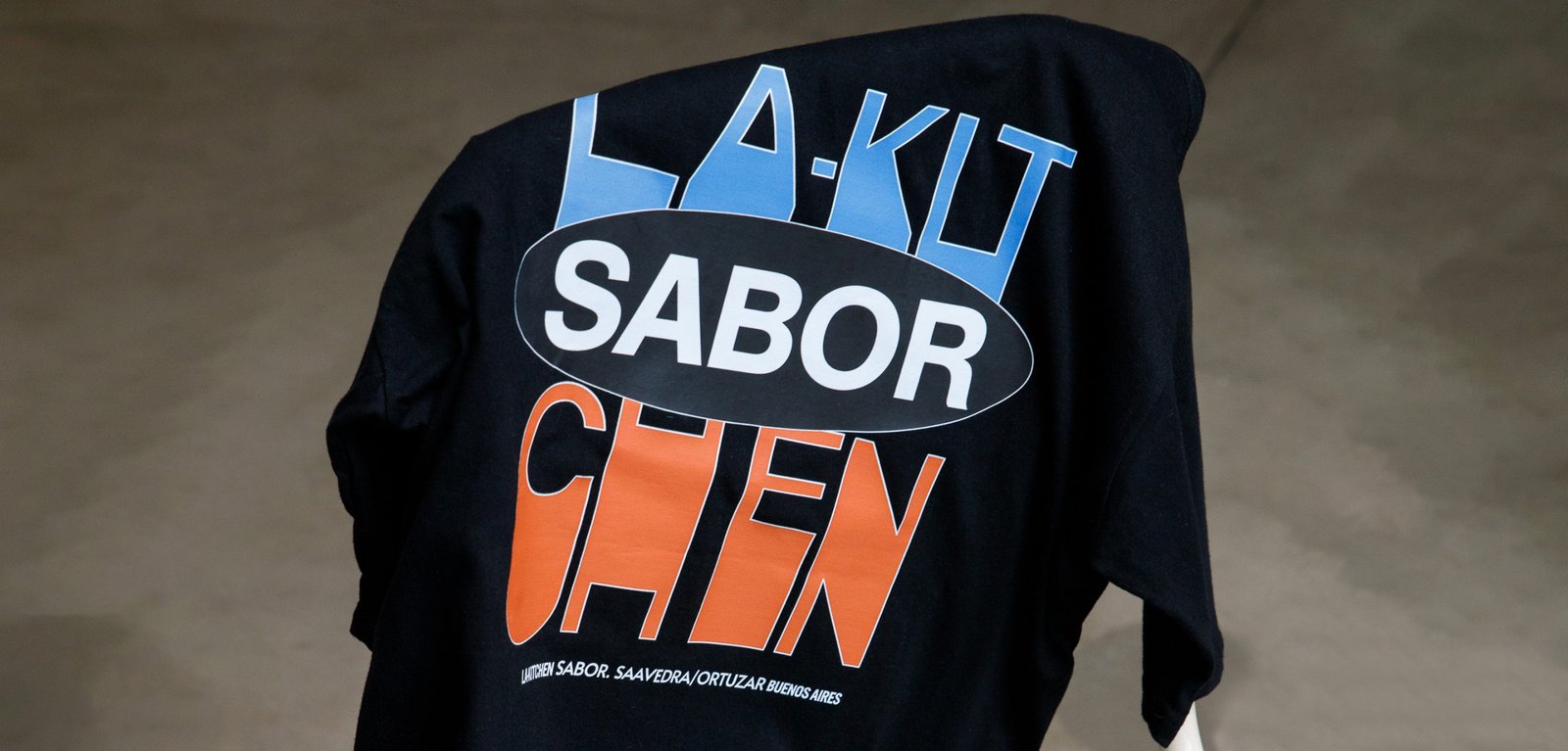
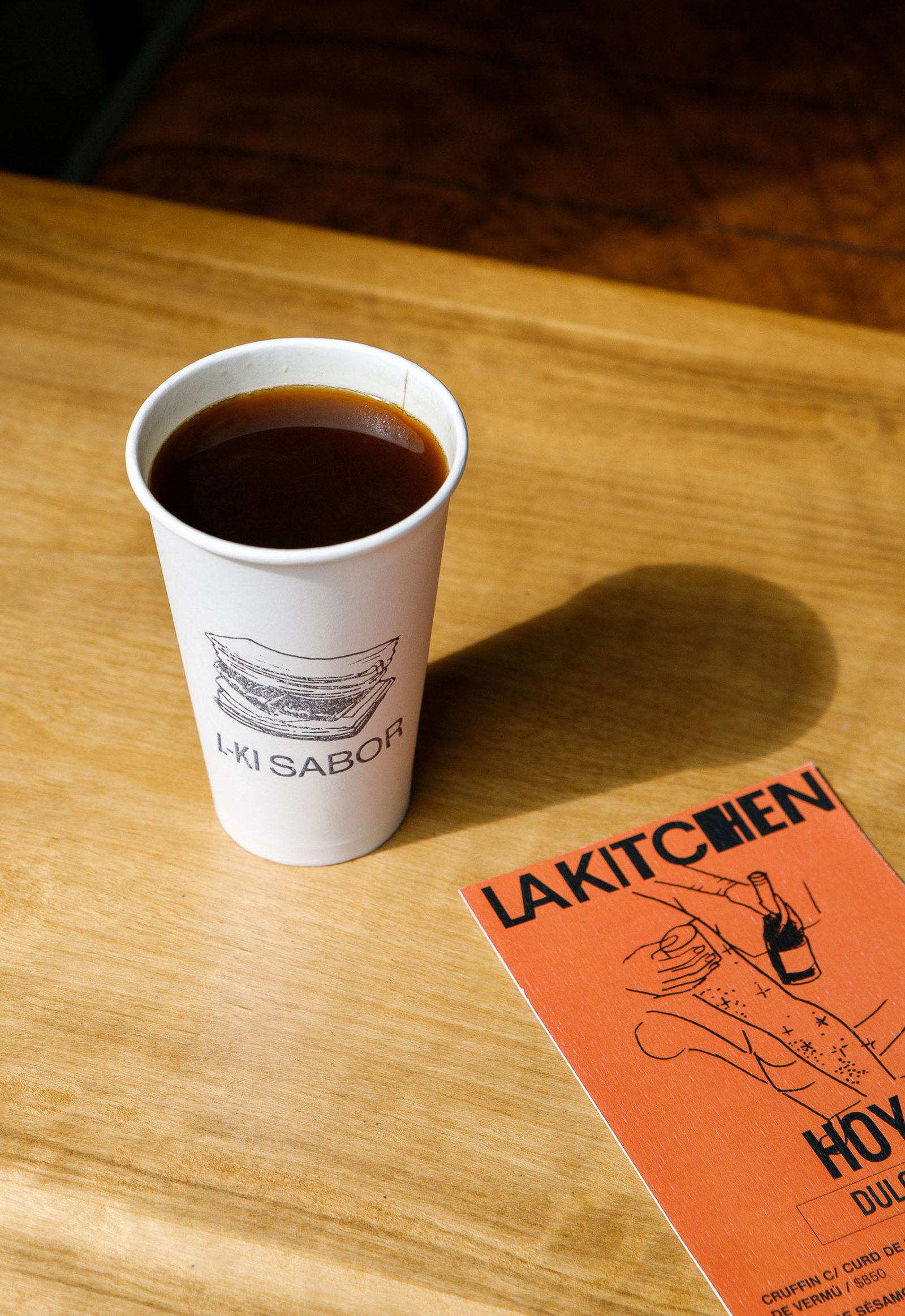
Everything is related to the "mix", to the handmade, to an attitude of disruption against the established, and to a non-graphic identity full of content that makes its public, true fans.
A multi-logo strategy combined with handmade acrylic illustrations by the brilliant Gabriel Sciutto continues the idea of brand expression.
Team: Gastón Garcia Aja / Mauricio Gallegos
Illustration: Gabriel Sciutto
Photo: Malena Fradkin
Buenos Aires, Argentina (2023)
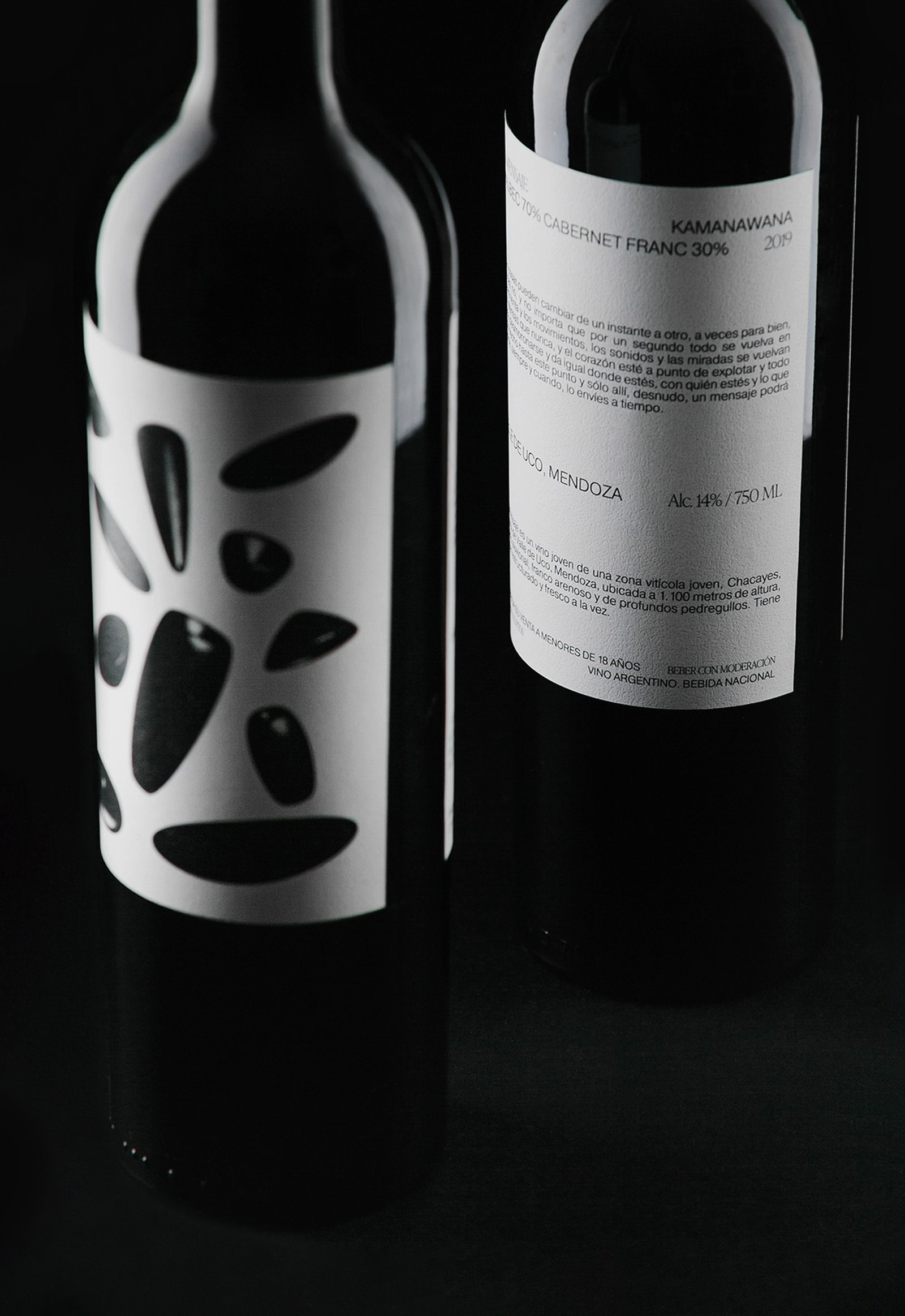
El Mensaje / Graphic Design - Packaging
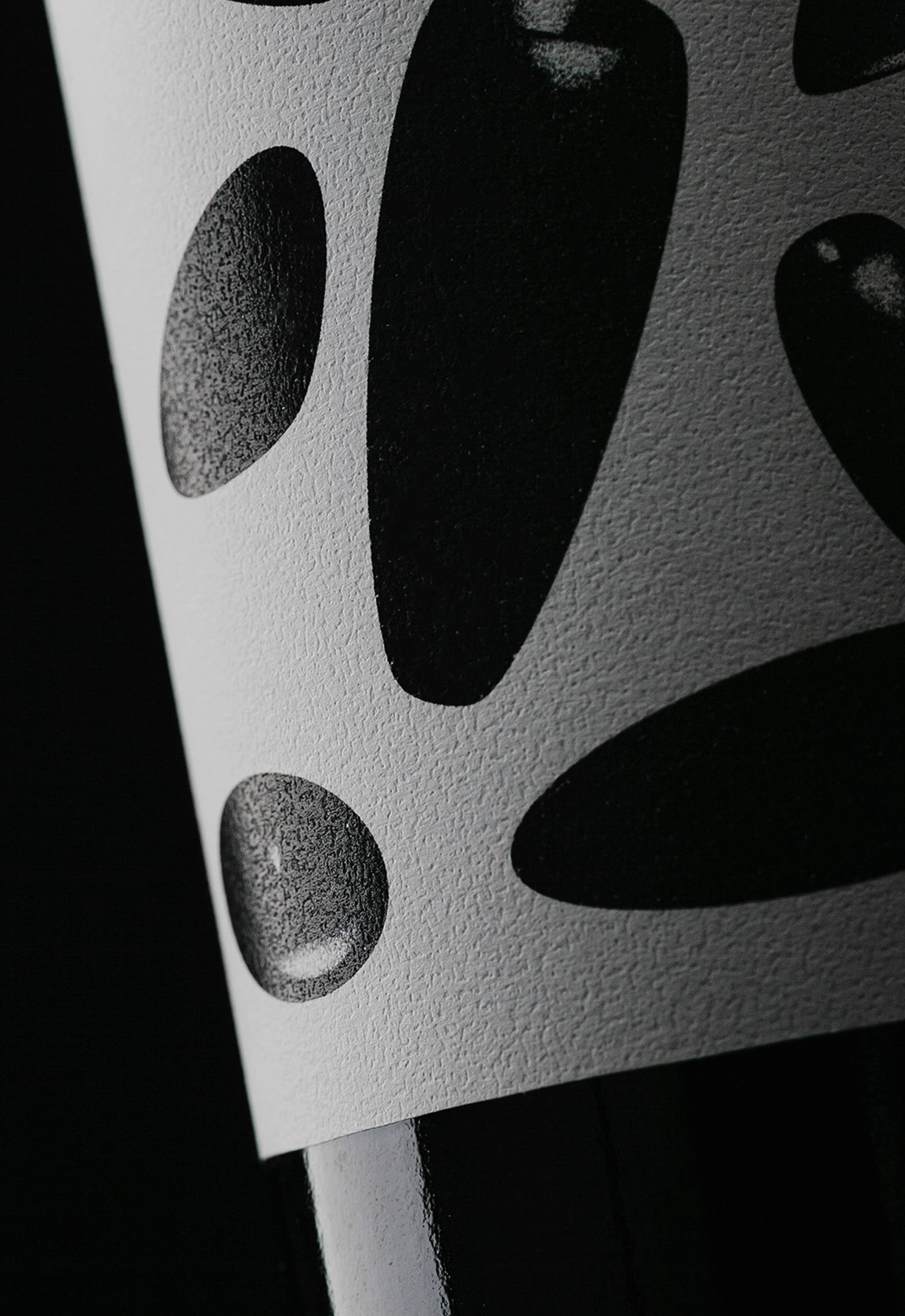
BackSometimes it's not about front or back labels, or the size of the logo (if it has one) or the aesthetics. Sometimes it's about emotions.
"El Mensaje" is a limited edition of 80 bottles of a high rated blend wine produced in Mendoza, Argentina, in a special (maybe dramatic) harvest.
During the night, after a day of harvesting, the group in charge of the project suffered an armed robbery, the movie kind of robbery if you are asking. One of the members managed to send a Whatsapp message, warning his friends who were not in the farm about what was happening. Thanks to this message, the police were on the scene and only material losses were reported.
The design tries to represent the whole story in a single image: that moment when everything falls apart, plates, food and glasses fly through the air, and it seems to happen in slow motion. The copy of one of the labels keeps the way of speaking that we usually use to describe a bad situation.
Team: Gastón Garcia Aja / Mauricio Gallegos
Photo: Pablo Gasparini / Stefanía Paz
Mendoza, Argentina (2021)
Feria / Illustration - Packaging
BackFeria juices are part of a sub-brand of market products and food produced by Cafería. Feria keeps the main elements of Cafería's identity, with the particularity that the characters show urban situations representing the brand concept without referring to the product. This graphic system allows labeling any type of products preparing the sub-brand to be marketed in other shops.
The intention of Feria is to bring local and healthy products to a new audience, inside and outside the coffee shop, adding value to the main brand.
Team: Mauricio Gallegos / Gastón Garcia Aja
Photo: Derio Ilari
Córdoba, Argentina (2021)
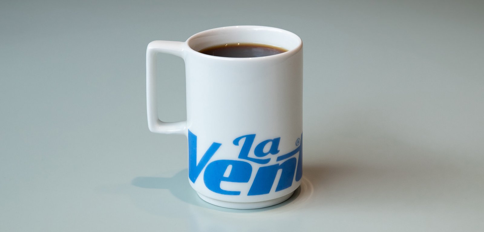
La Ventana / Packaging - Revamp - Type
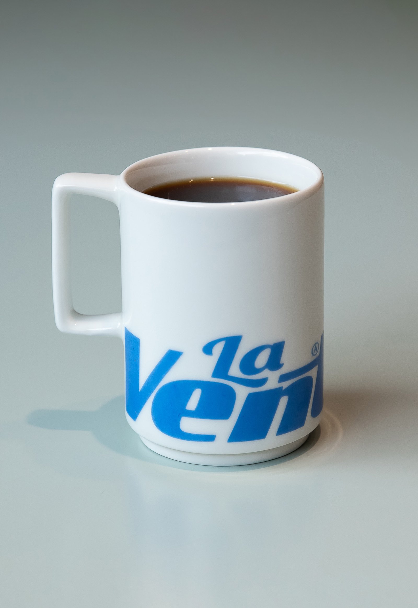
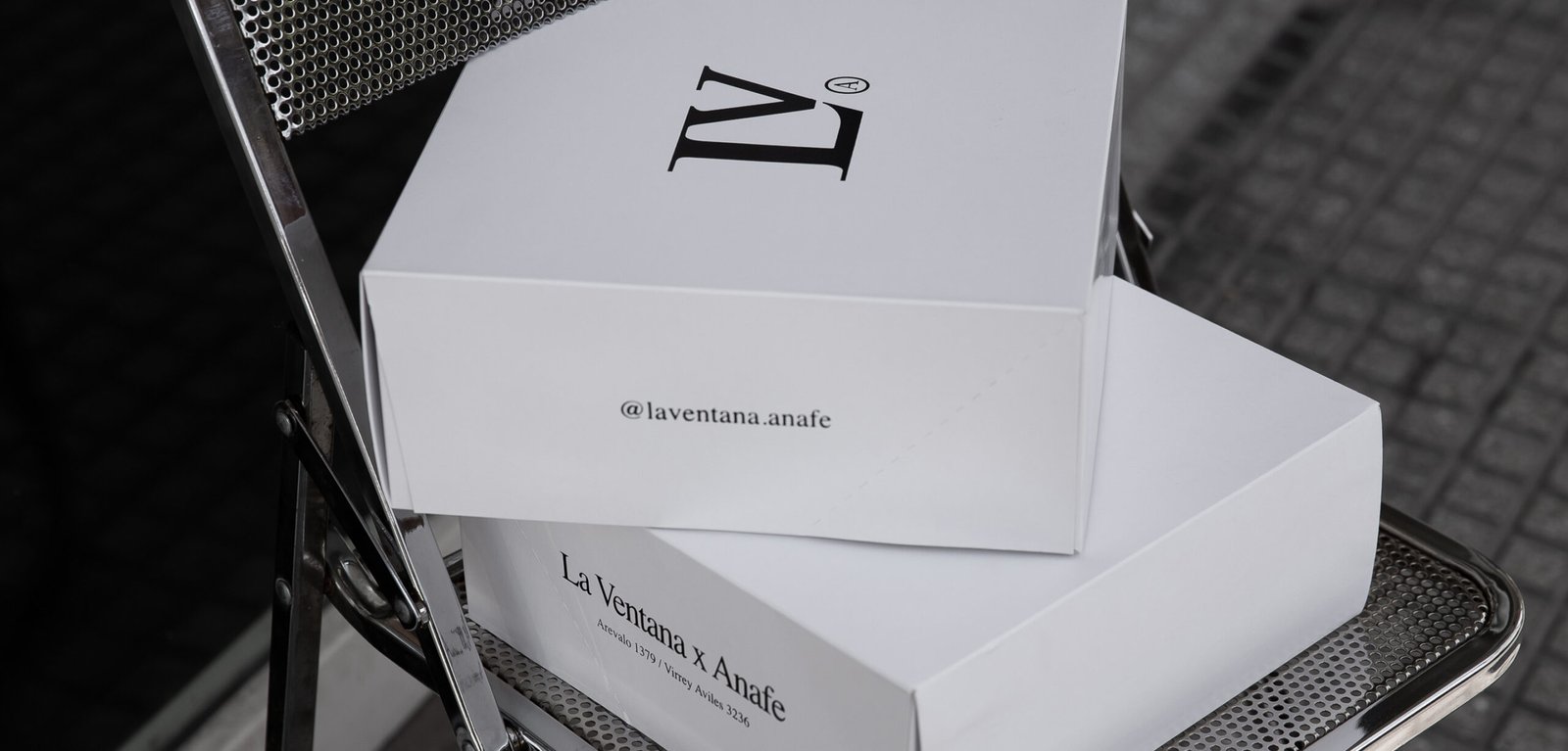
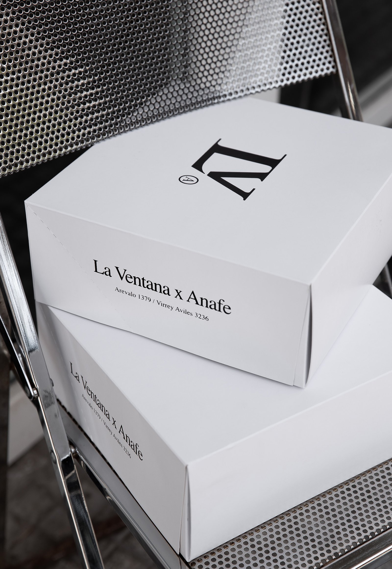
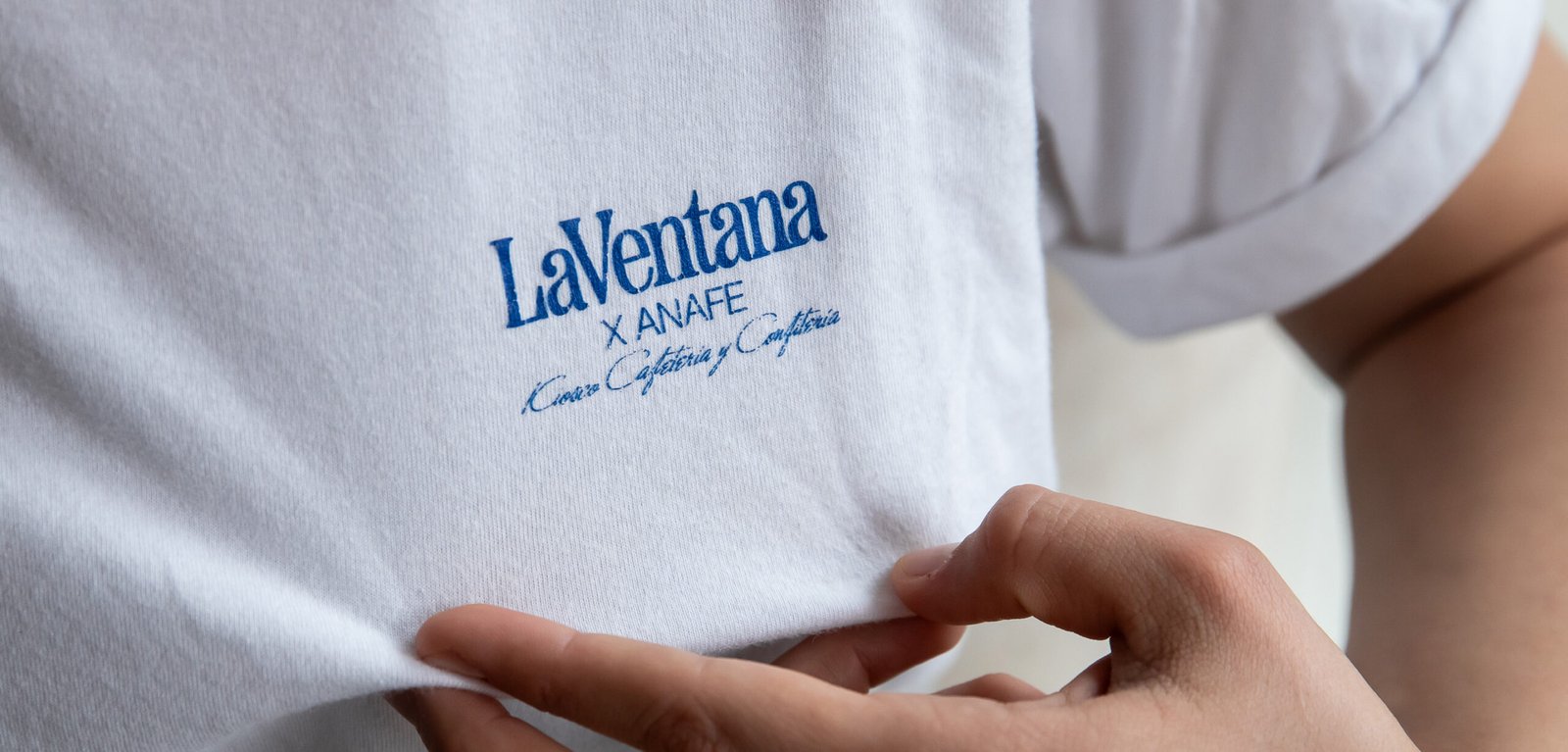
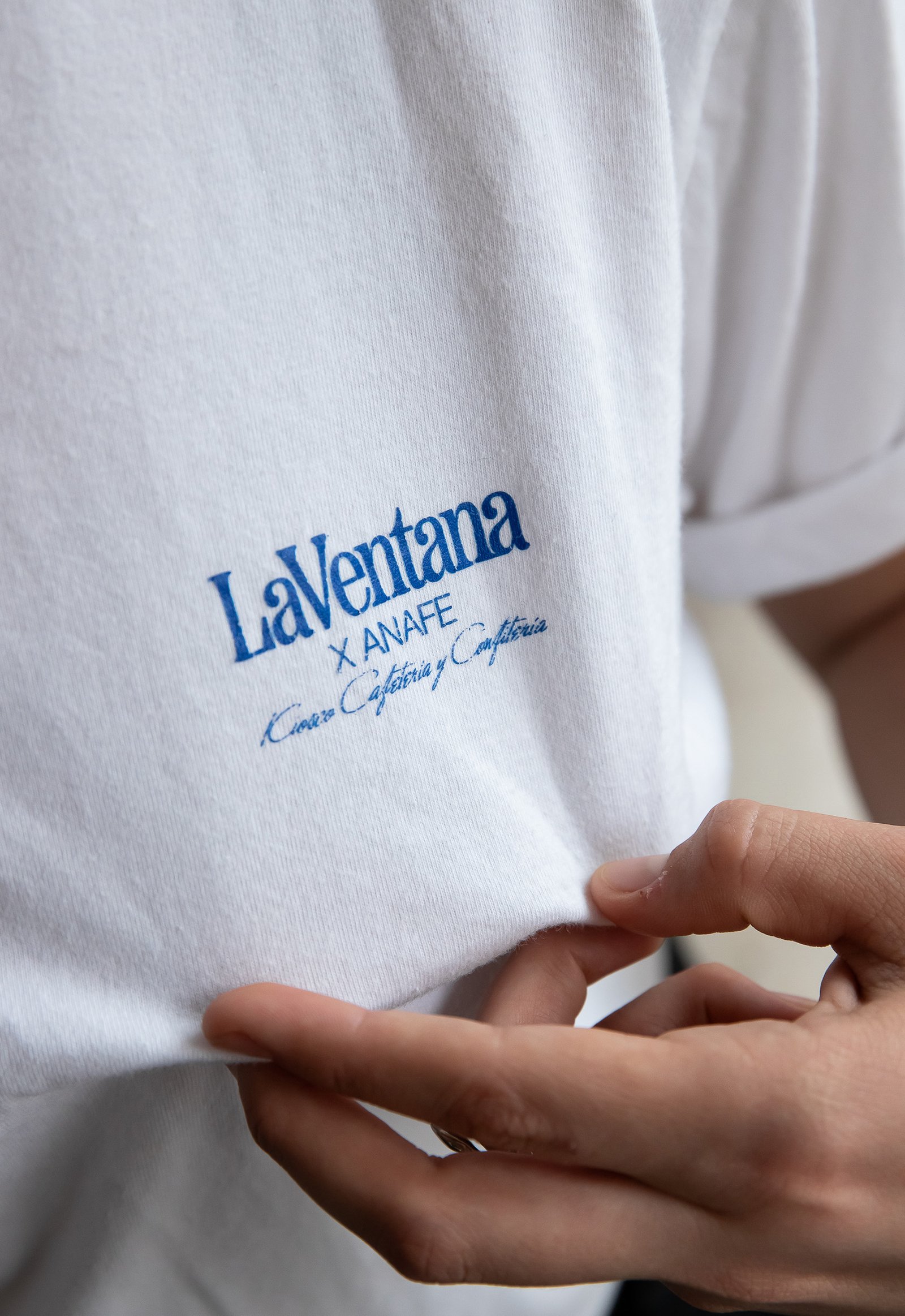
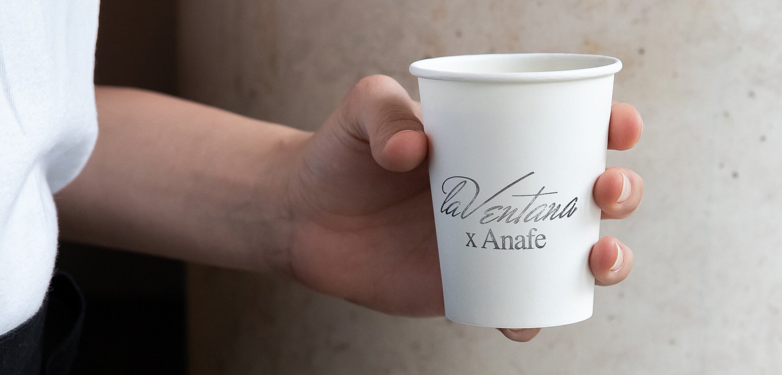
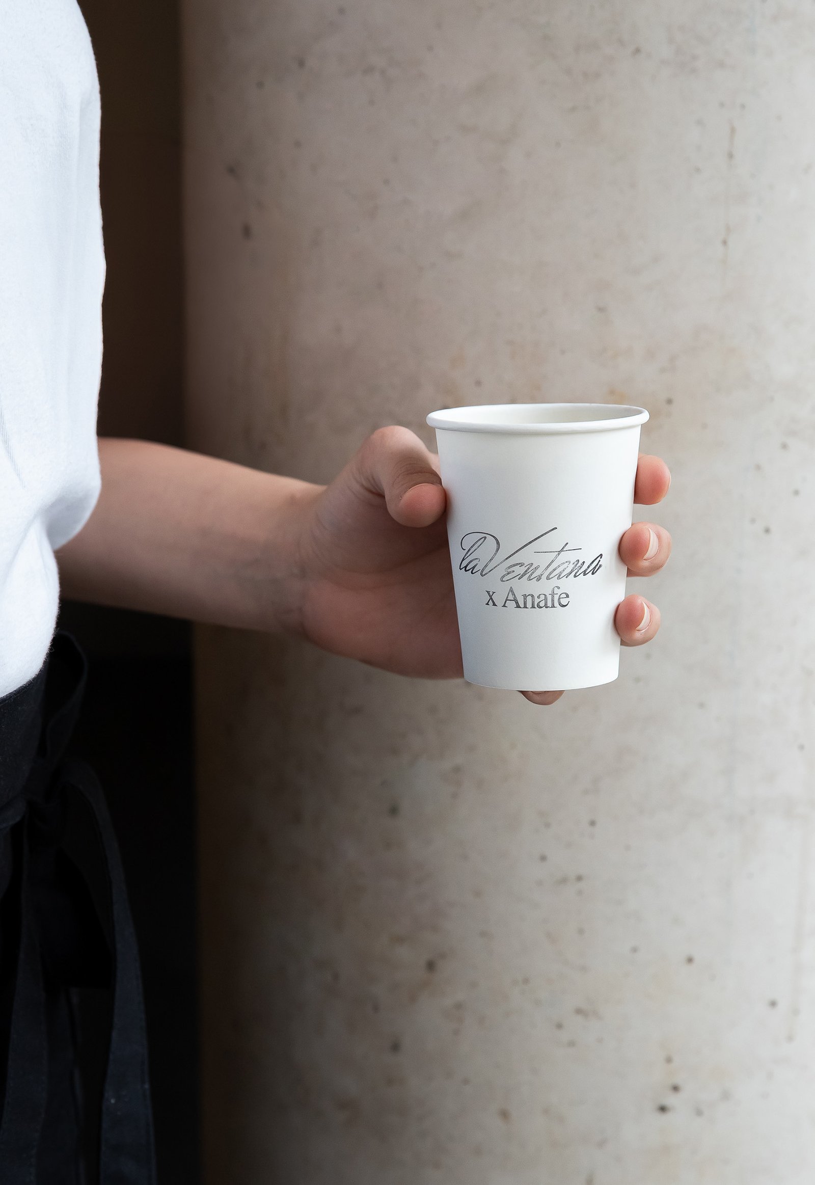
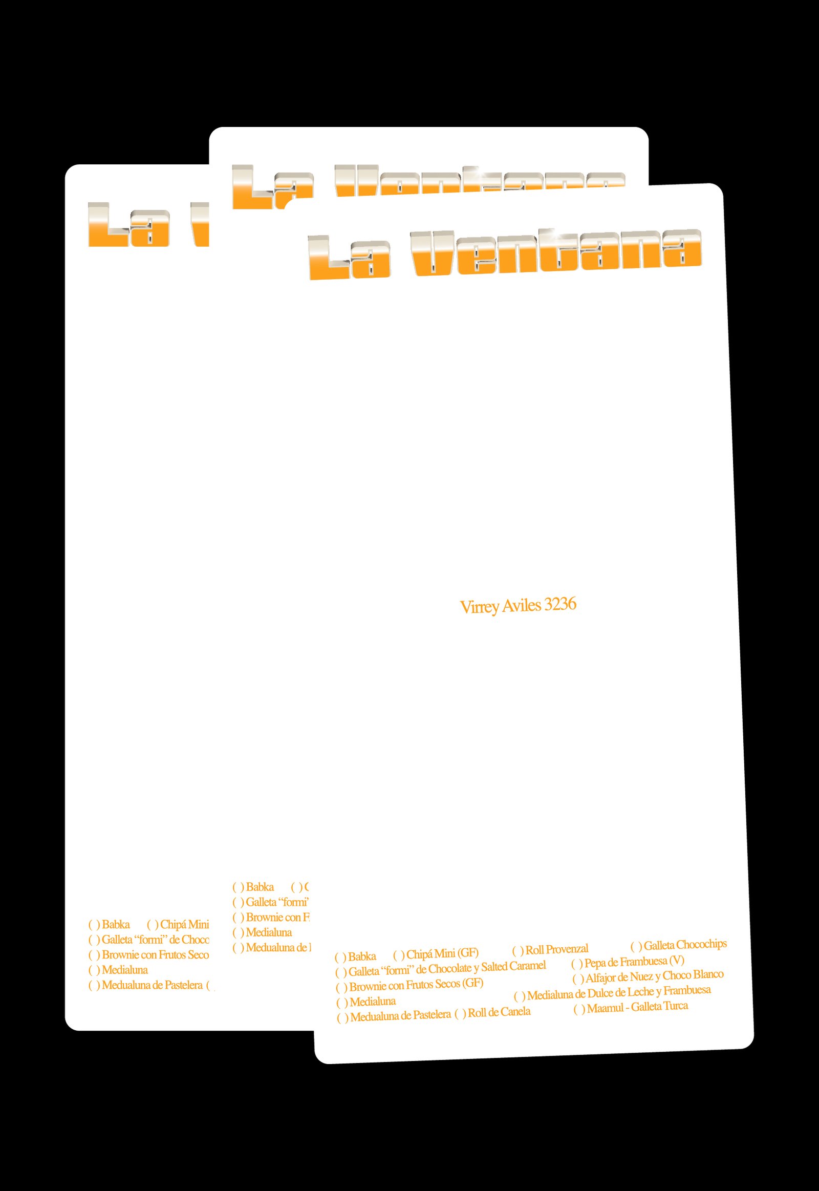
BackLa Ventana is a specialty coffee shop located in the heart of Buenos Aires. Its new graphic identity seeks to celebrate not only the aesthetics, but also the spirit and emotions of the traditional cafés and confiterías found in the city’s iconic neighborhoods.
In recent years, many specialty coffee shops in the city have aimed to differentiate themselves from traditional establishments, both in terms of product and visual identity, often leaving aside the rich heritage of Buenos Aires’ café culture.
La Ventana strives to offer the best possible product and service meanwhile seeking the feeling of nostalgia and character of everyday local restaurants and cafés.
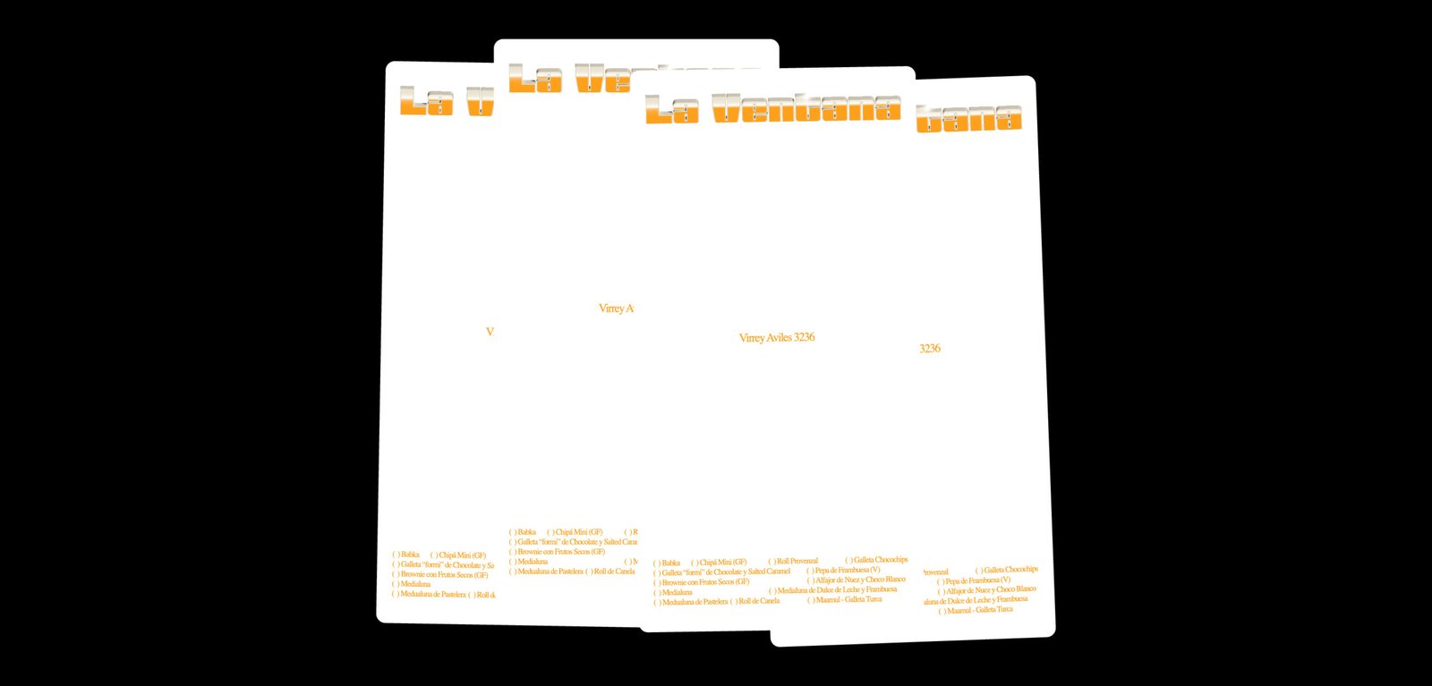
The new identity draws inspiration from the traditional graphic styles of Buenos Aires’ neighborhood gastronomic venues. Not from the large, well-known brands, but from the authentic local spots—those with intricate logos, dense typography, and a few artistic liberties. This visual approach seeks to capture the charm of these places, blending them into a design that feels both authentic and contemporary.
The new graphic identity not only represents La Ventana itself, but also pays tribute to traditional venues, conveying the idea that new influences can embrace the existing culture to create something unique.
Team: Mauricio Gallegos / Gastón Garcia Aja
Animation: Mauricio Gallegos / Martín Cañadell
3D Development: Martín Cañadell
Photo: Malena Fradkin
Buenos Aires, Argentina (2024)
Syra / Packaging
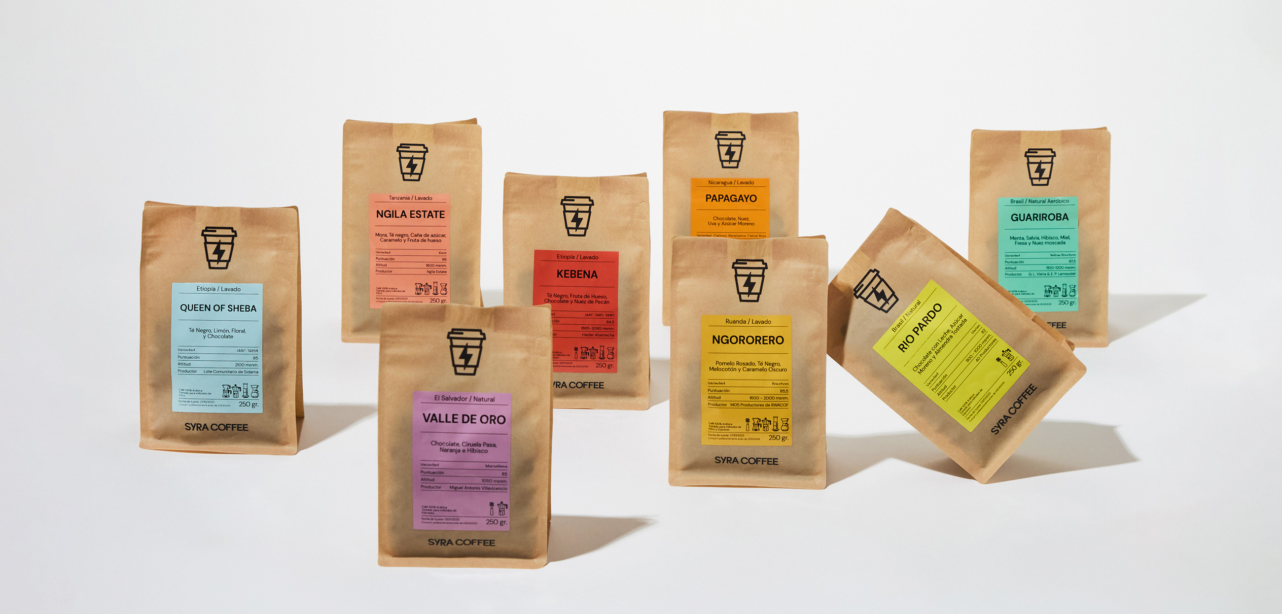
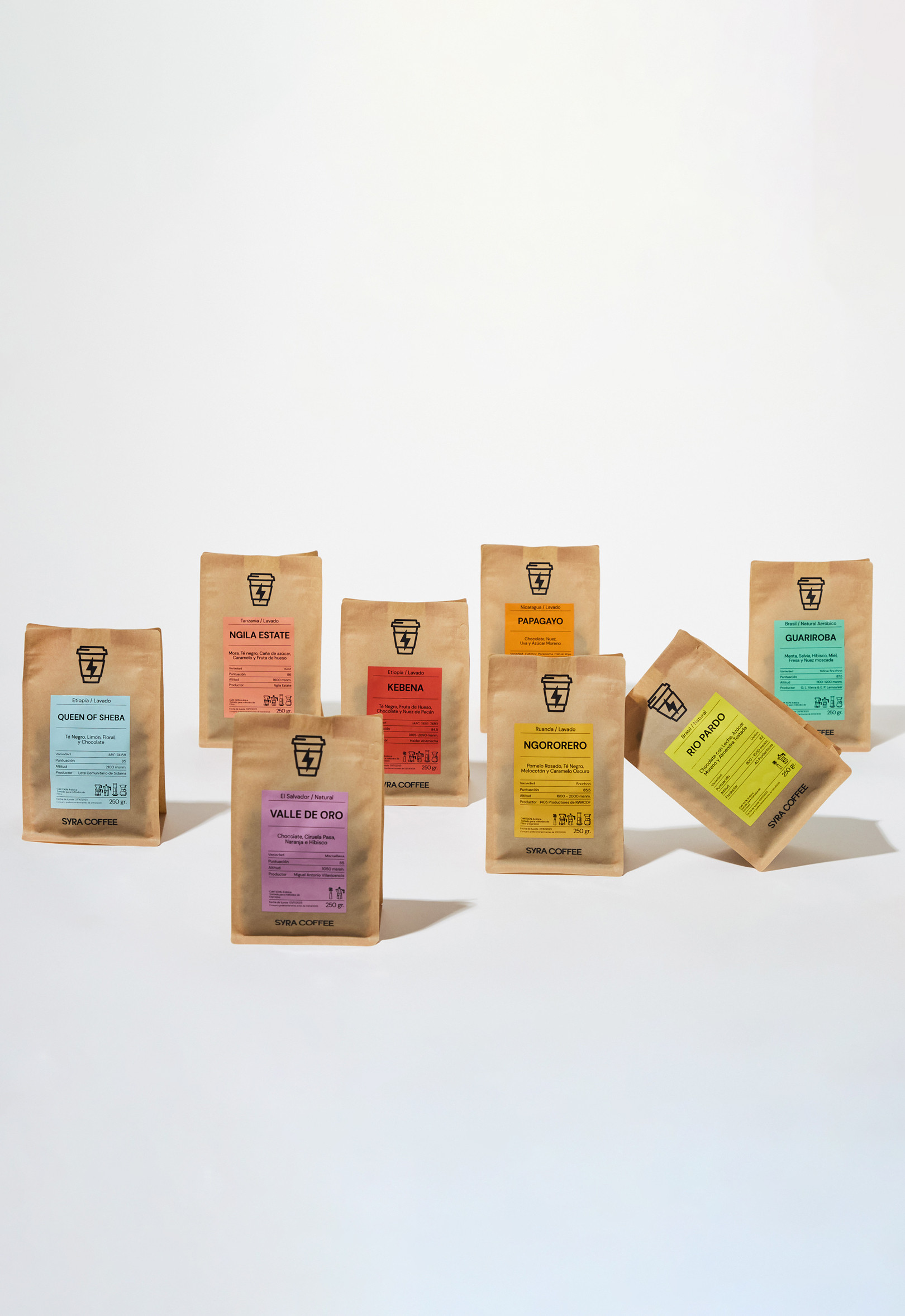
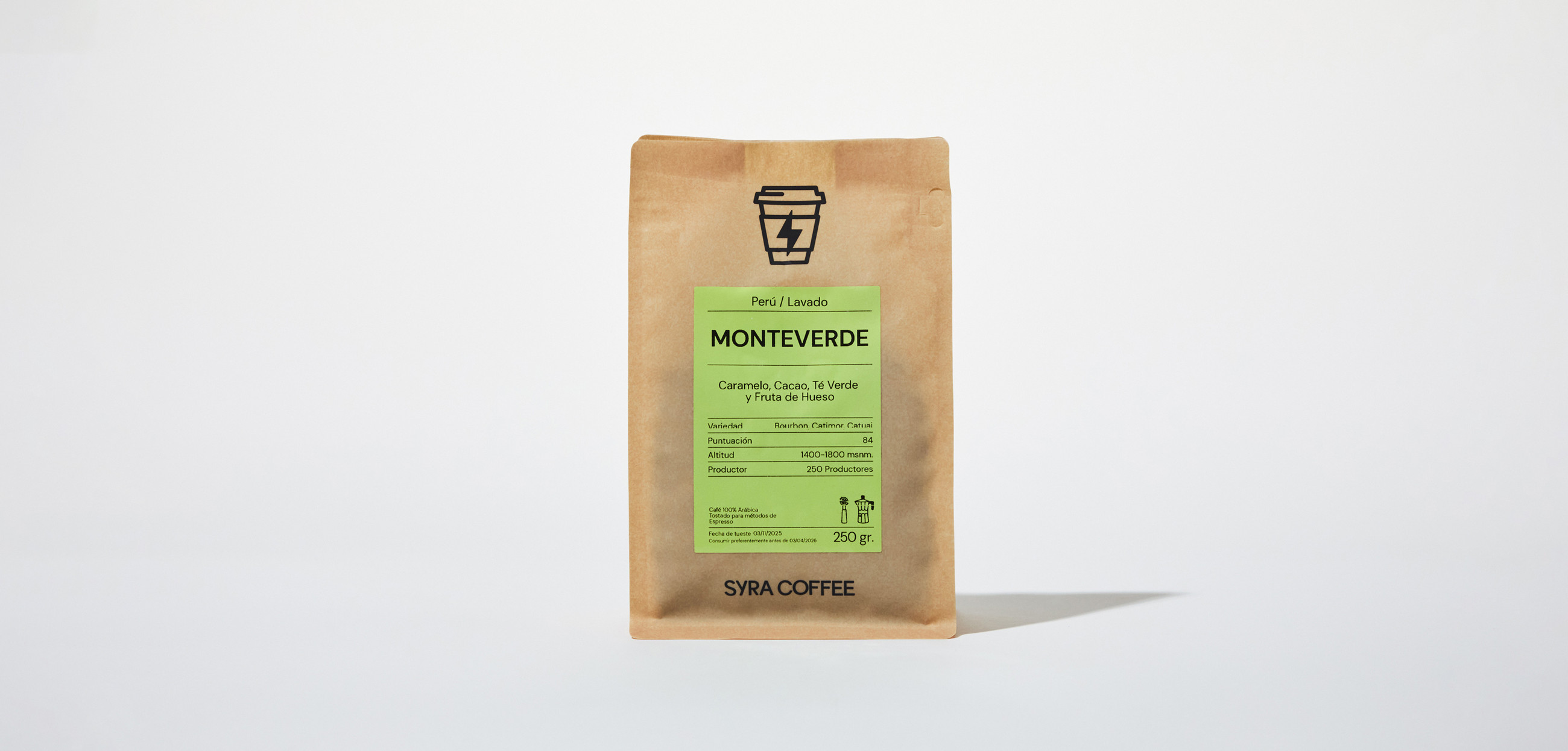
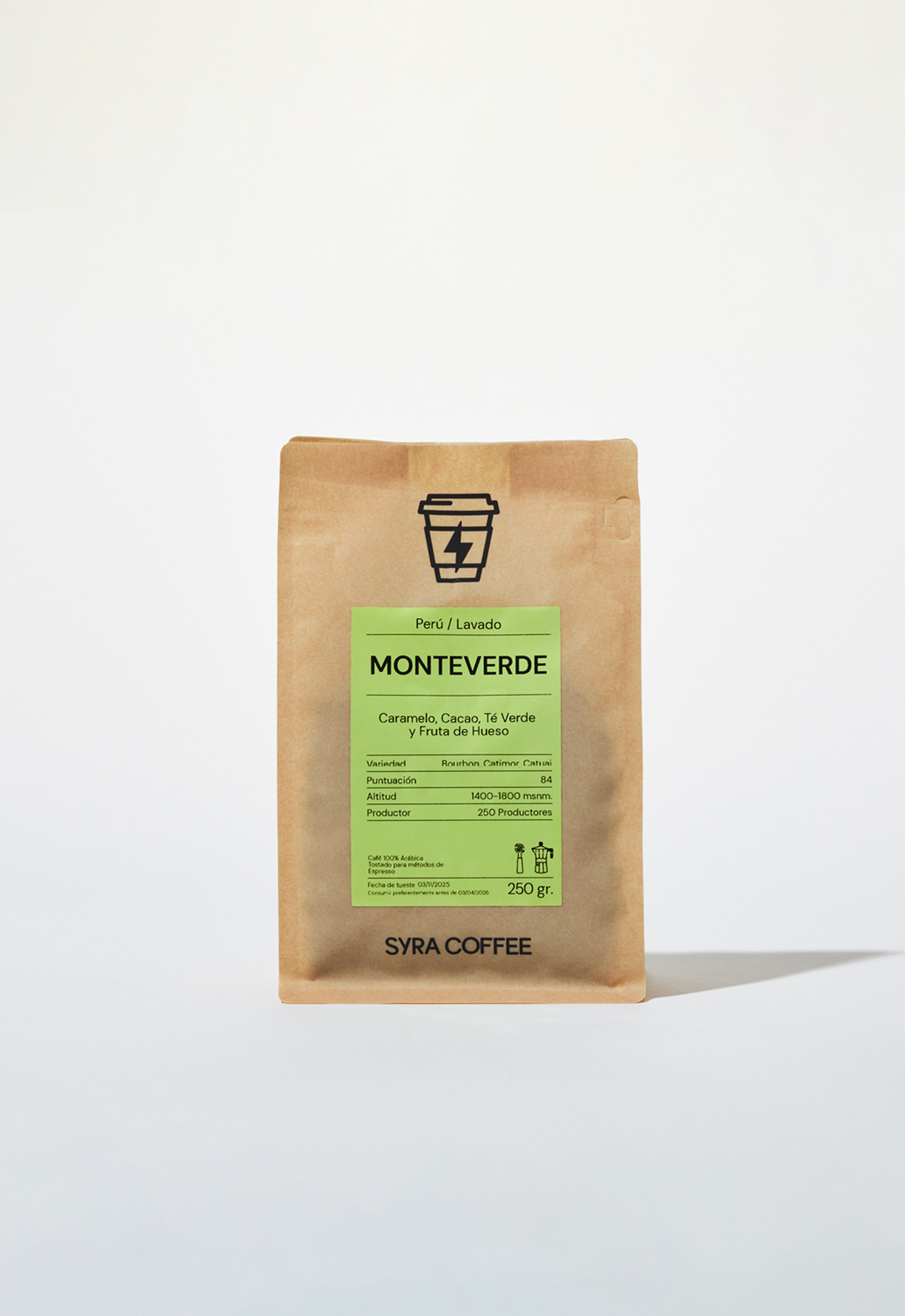
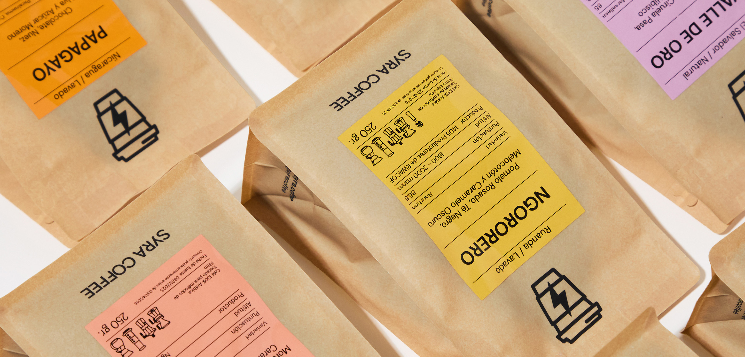
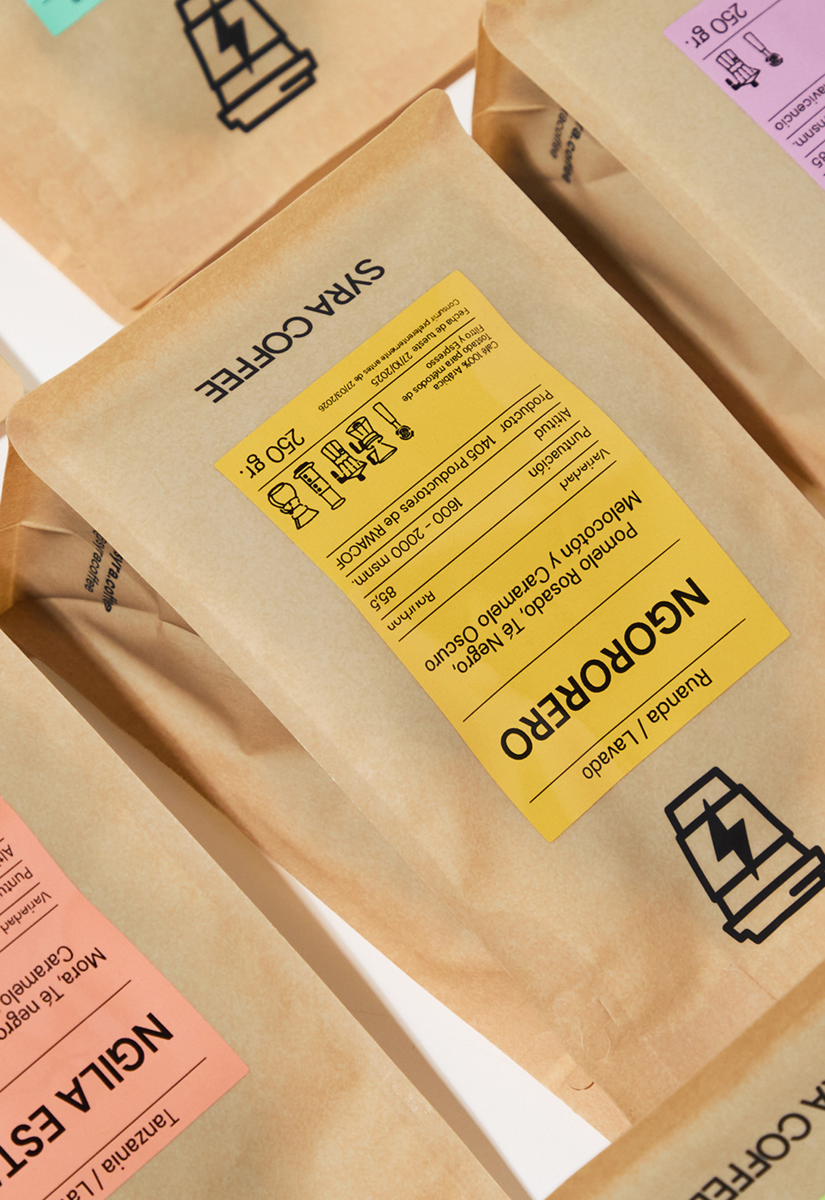
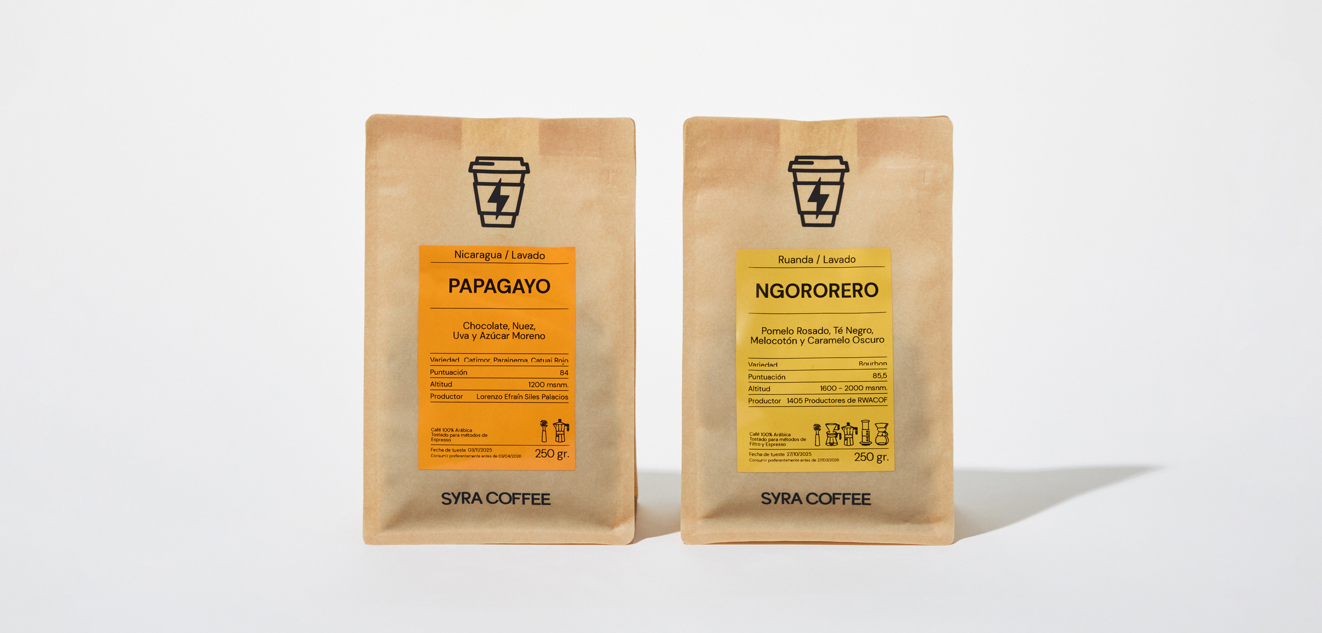
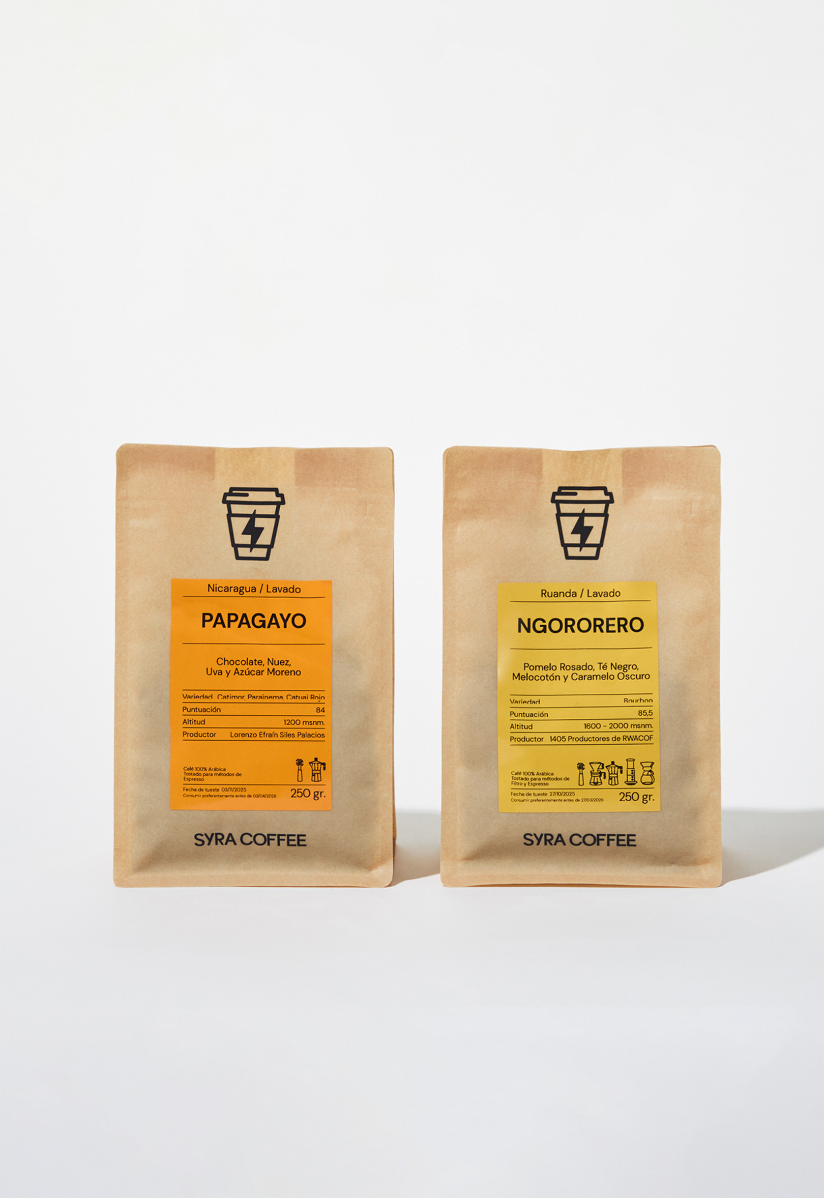
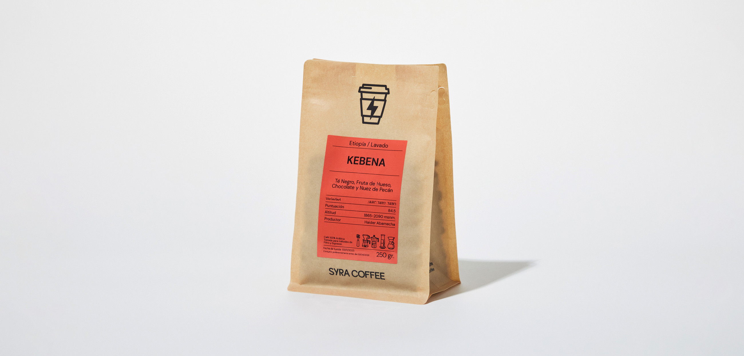
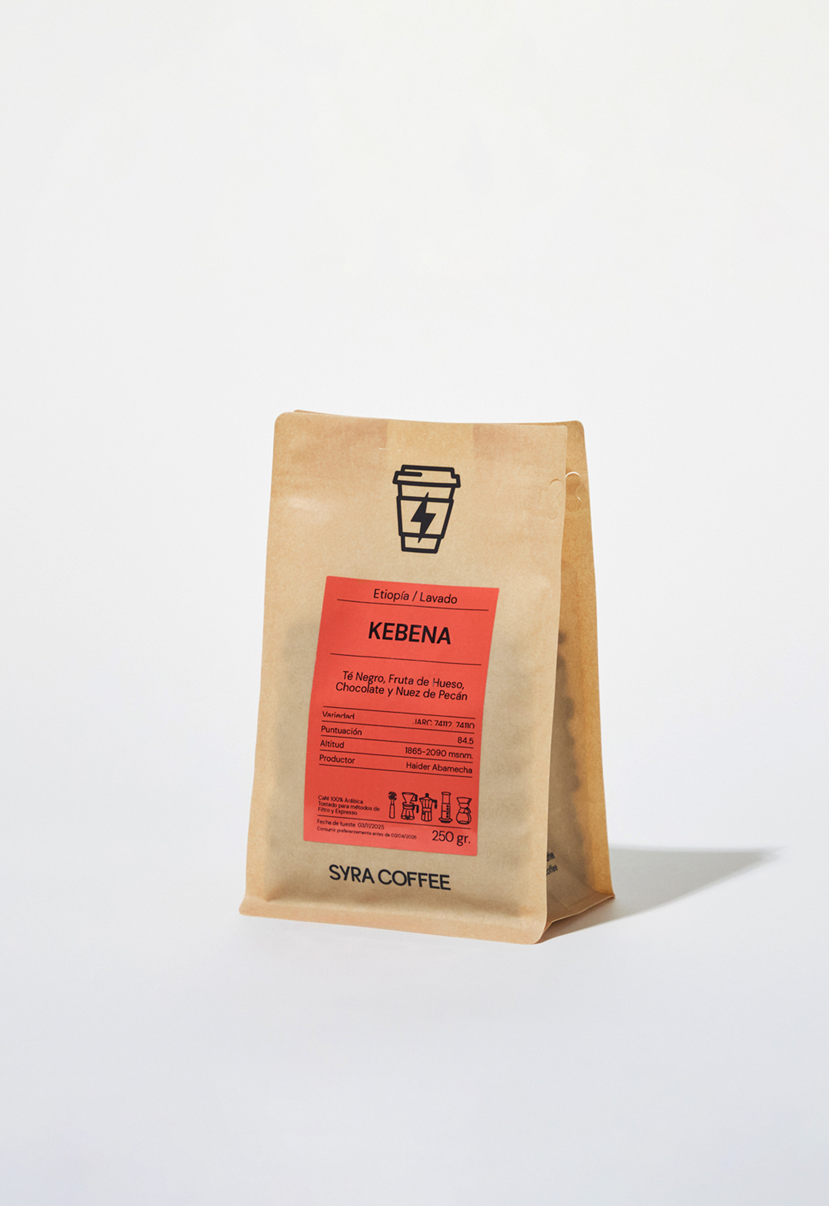
BackThe new pack system as part of the revamp of Syra Coffee’s new identity, 2022. The packaging update was based of a new layout design, more, and new colours, new typography set and iconic illustrations.
These components and the new logo, aim to update the brand, bringing it closer to more people and improving its performance, in local retail situations and in digital and communication scenarios as well.
Photo: Alvaro Picca /
Barcelona, Spain (2022)
Tallo / Identity - Packaging - Type
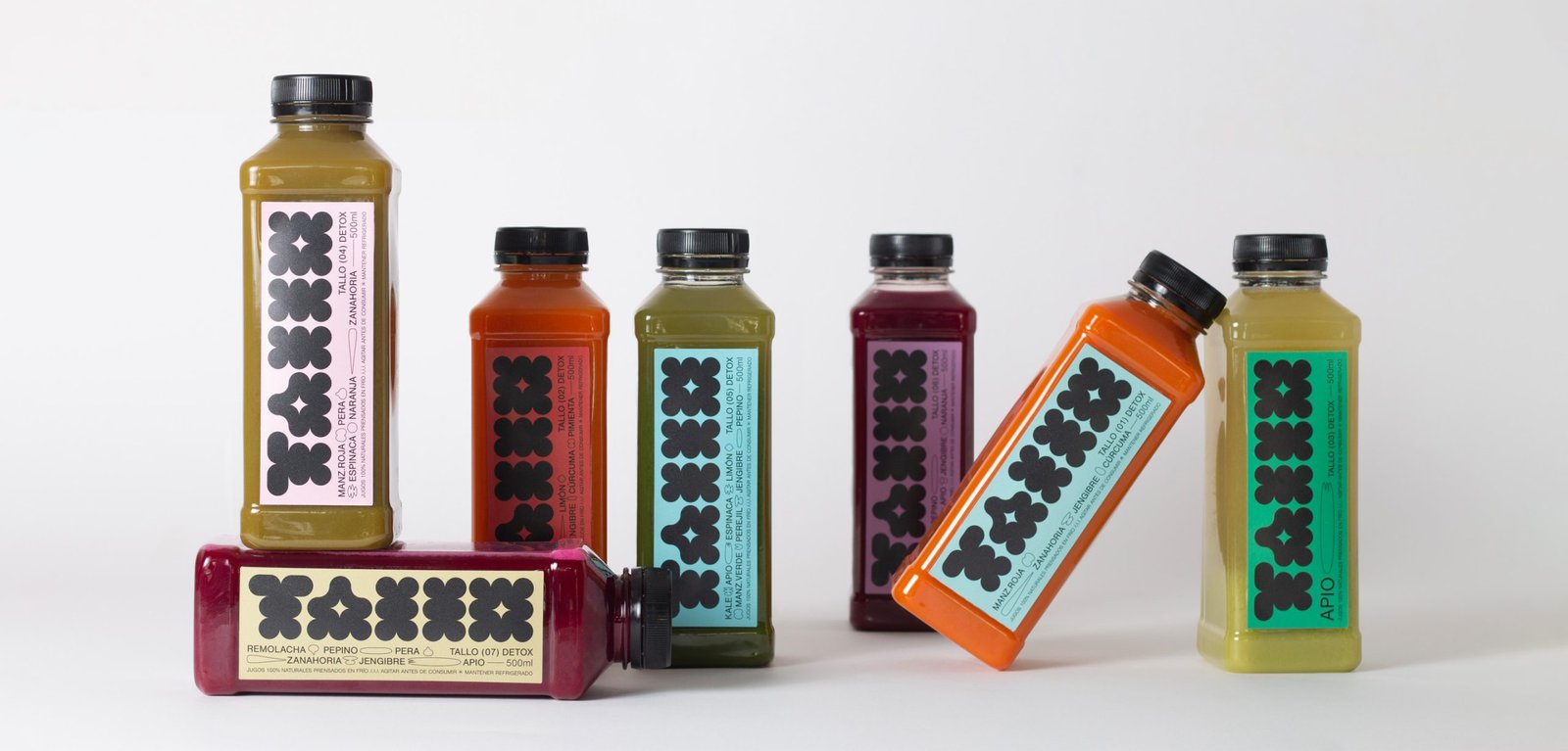
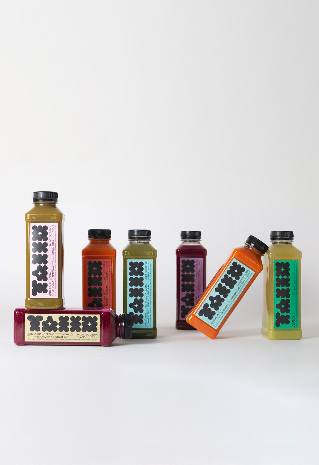
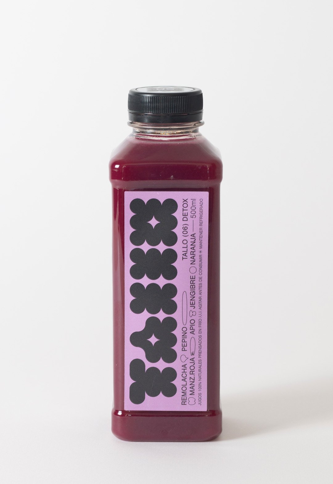
BackTallo is a local brand of cold-pressed juices produced in Buenos Aires, Argentina. The graphic idea represents a flower or a fruit instead of the stem itself (Tallo), which brings naturalness to the brand.
The colors of these juices are vibrant and pastel at the same time. The labeling palette vibrates in both directions, to create a fun environment focused on highlighting the main color of the juice.
In addition to a bold geometric logo, the design contains small lineal illustrations to represent the ingredients. This aesthetic is a reference to the drawing of the daughters of the brand's creators.
Team: Gastón Garcia Aja / Mauricio Gallegos
Photo: Rocío Fernandez Charro
Buenos Aires, Argentina (2022)
Giordana / Identity - Packaging
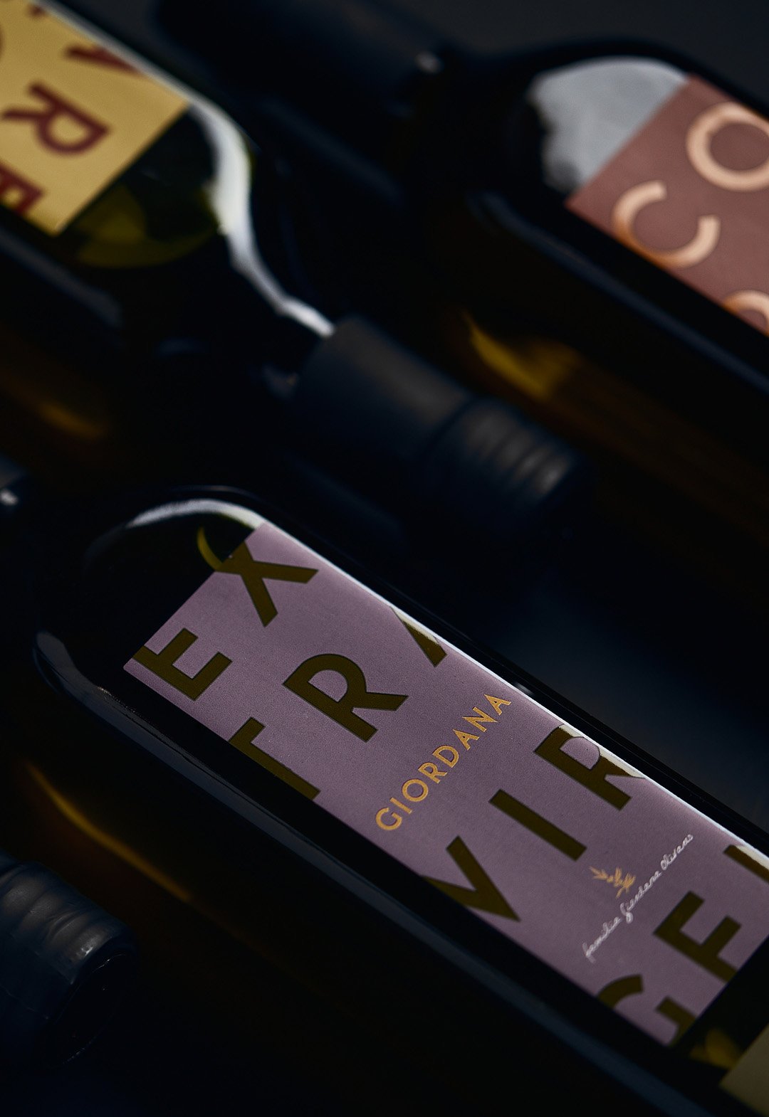
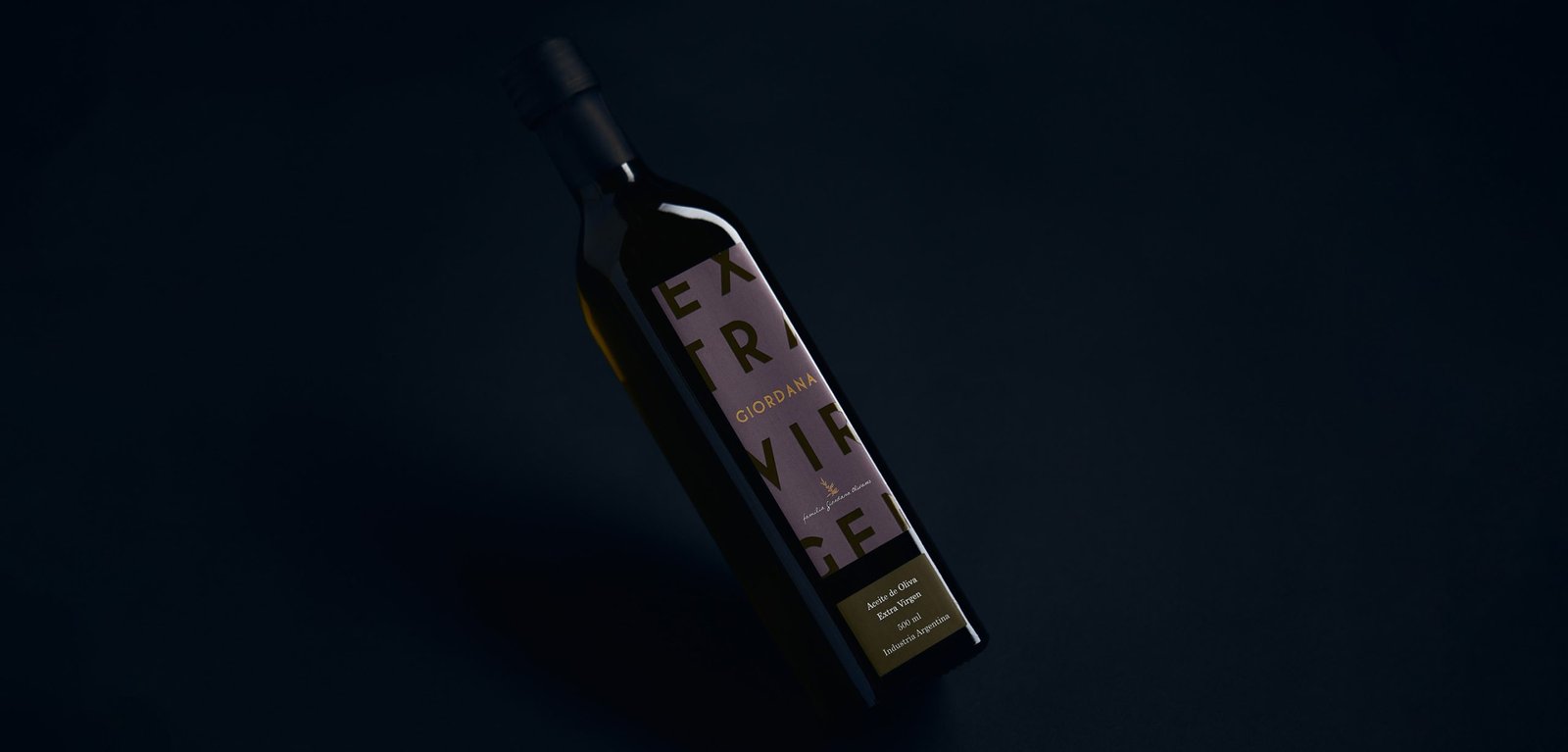
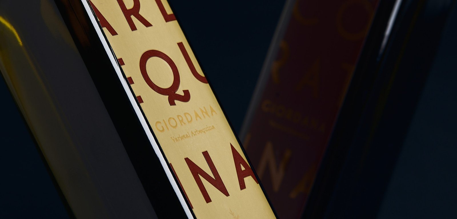
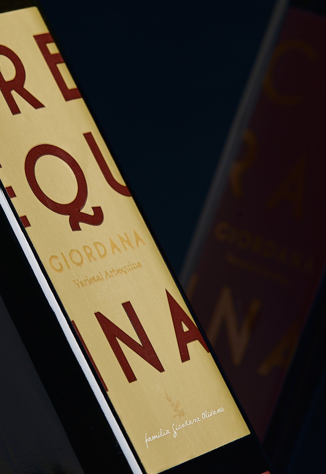
BackGiordana is an olive oil brand located in La Rioja, Argentina. The aim was to highlight the product on the store shelf with a color palette and a modern design based on typography.
The label prioritized the type of varietal over the brand, due to the positioning of the word Extra Virgin in the category. This was done by means of a two-color typographic game that highlights the added value of the product.
Giordana currently sells it in the Argentinean market and in some Mercosur countries, without undergoing any modification to the original design from 2014.
Team: Gastón Garcia Aja / Mauricio Gallegos
Photo: Alvaro Picca
La Rioja, Argentina (2014)
Syra Coffee / Concept Development - Illustration - Packaging - Revamp
BackSyra Revamp Project. Syra is one of Barcelona's biggest specialty coffee companies, with its own roastery and coffee shops, most in Barcelona and across Spain.
Under the idea of democratizing specialty coffee, and betting on small takeaway coffee shops in different neighborhoods of the city, Syra brings coffee closer to many people, offering a more inclusive product.
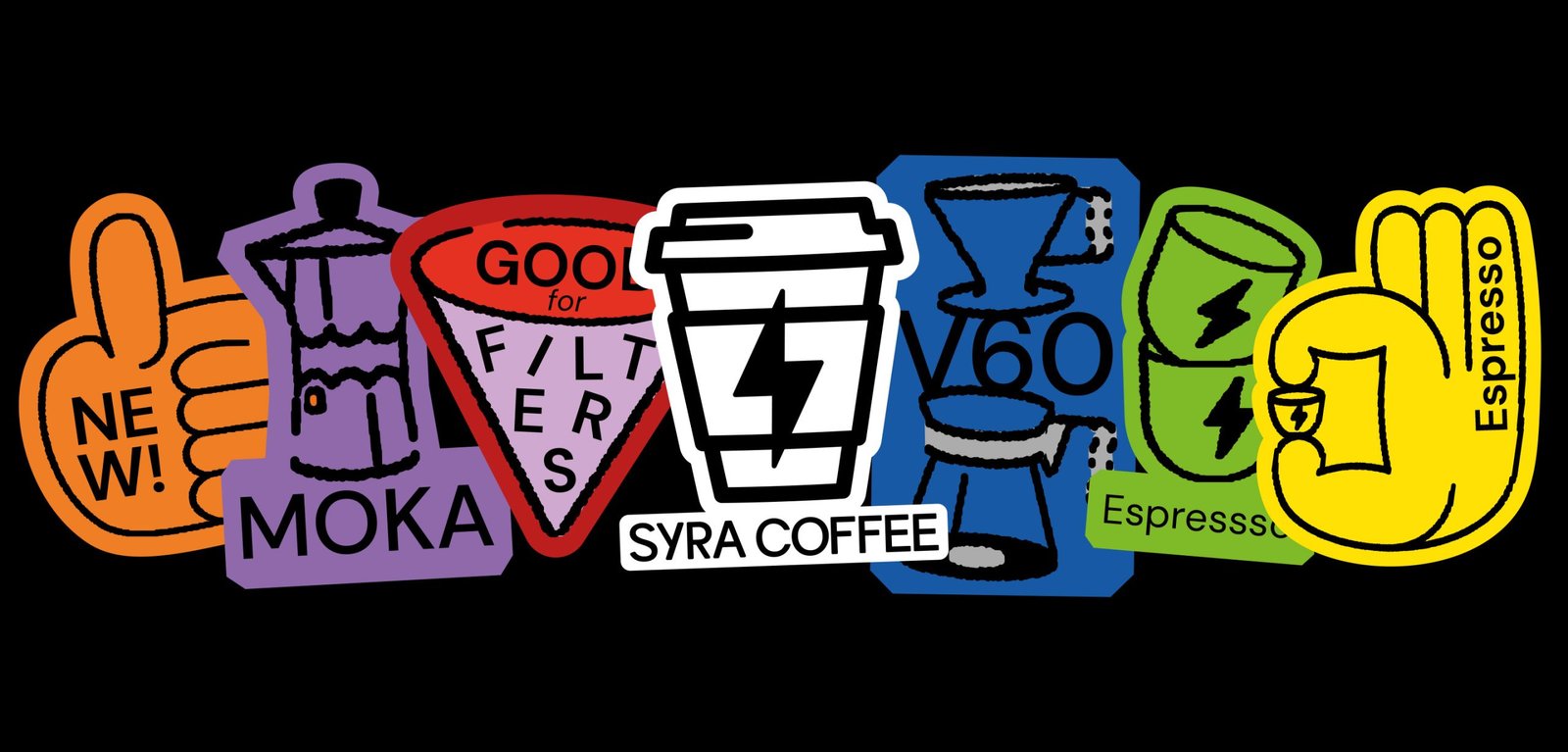
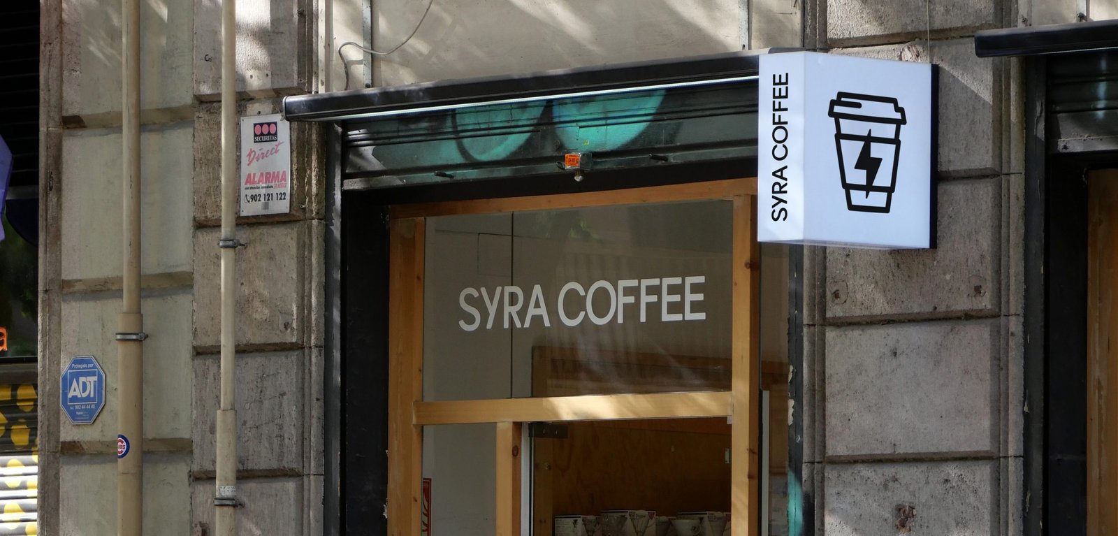
This new identity aims to modernize the brand's image, bringing it closer to a diverse public, from the design to the narrative. The change of logo allows for a better use and longevity of the icon, while the new typography brings a younger, bolder, and more fun main feeling. It also improves its performance in graphic compositions.
The new look is more colorful, bigger, and easier to use. New graphic resources such as illustrations and stickers help to generate more coherent layouts across platforms and content levels. These design and strategic gestures help the brand to adapt to the new digital era it is going through, where e-commerce, smartphone application, and social media content are at the forefront.
Team: Gastón Garcia Aja / Mauricio Gallegos / Maher M. Mansour
Motion: Martín Cañadell
Special Thanks: Maria Amaro
Barcelona, Spain (2022)
Plantario / Concept Development - Identity - Naming - Packaging
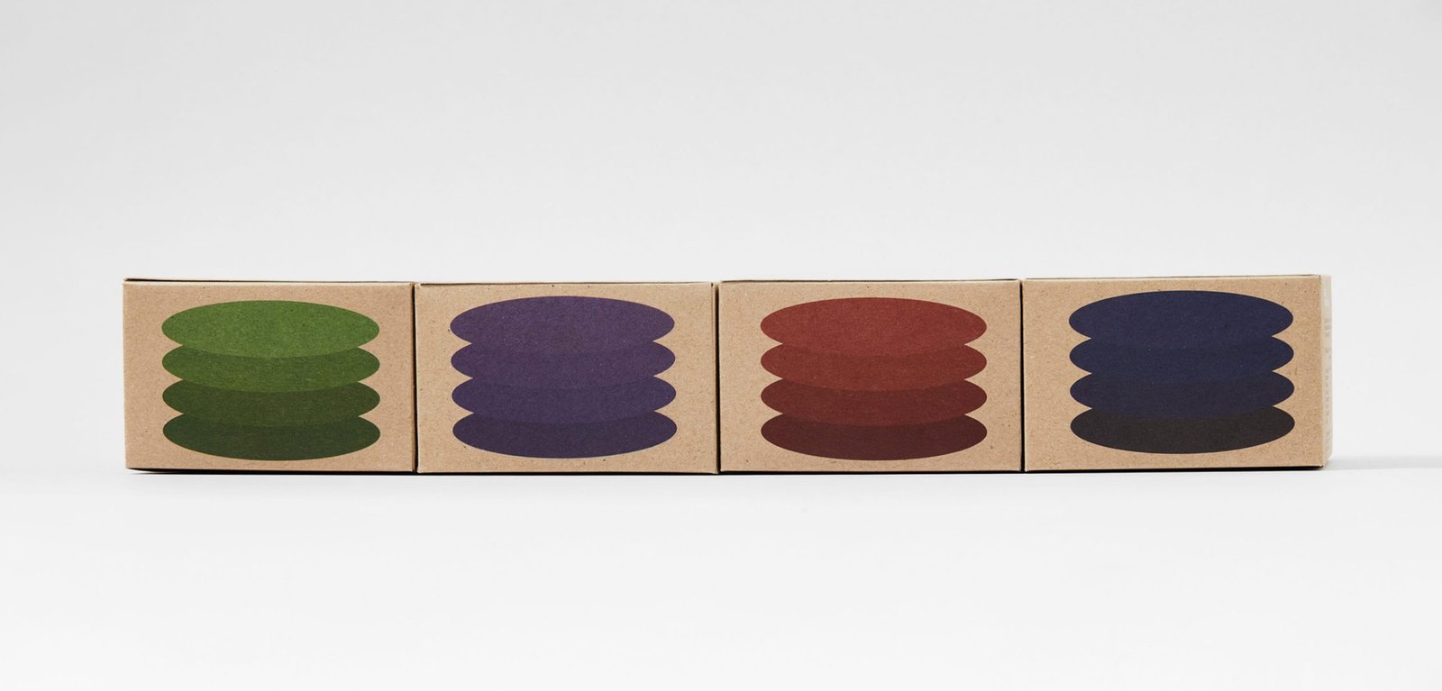
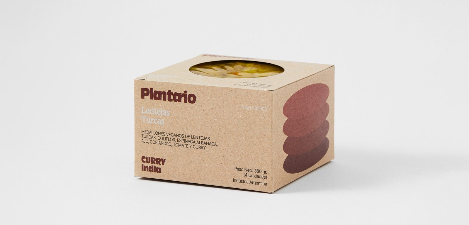
BackPlantario is a plant-based brand that makes burgers with local ingredients and recipes inspired by different parts of the world. The name is a combination of Spanish words meaning; a planet full of plants.
The narrative is around the concept of responsible consumption. It is impossible to save the world by making vegan burgers, but it could be the first step in a series of changes that could help keep the planet alive a little longer.
The packaging tries to be as environmentally friendly as possible, taking into account the nature of the product.
"PLANTARIO is an idea that respects the planet, from the food we eat to the small habits that contribute to the cause. Moving to the right side is the main idea, the side that helps the planet. It's not perfect and it's not going to happen tomorrow, it's going to take time, but we have to start at some point and if a vegan burger is given a chance it's going to be a starting ceremony or a historical event, all the work will have been worth it.
Team: Gastón Garcia Aja / Mauricio Gallegos
Photo: Alvaro Picca
Córdoba, Argentina (2020)
Bravante / Illustration - Packaging
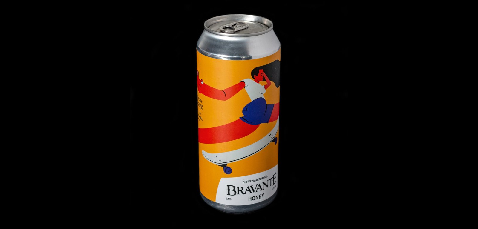
BackBravante is one of the rising craft beer brands of Córdoba, Argentina. After selling on draught to bars, it decided to market its beers in cans at different points of sale such as supermarkets and wine shops.
The idea tries to represent the personalities of each beer with a character, in a modern and fun way, differentiating the aesthetics of these packs from the rest of the main identity.
The brand had a classic and rustic feel to it. In these new labels, a system and a graphic code show around to turn things down and display a whole new world of possibilities, ready to use for these, and the next beers.
Team: Mauricio Gallegos / Gastón Garcia Aja
Photo: Rocío Fernandez Charro
Córdoba, Argentina (2016)
22 Tañidos / Graphic Design - Packaging
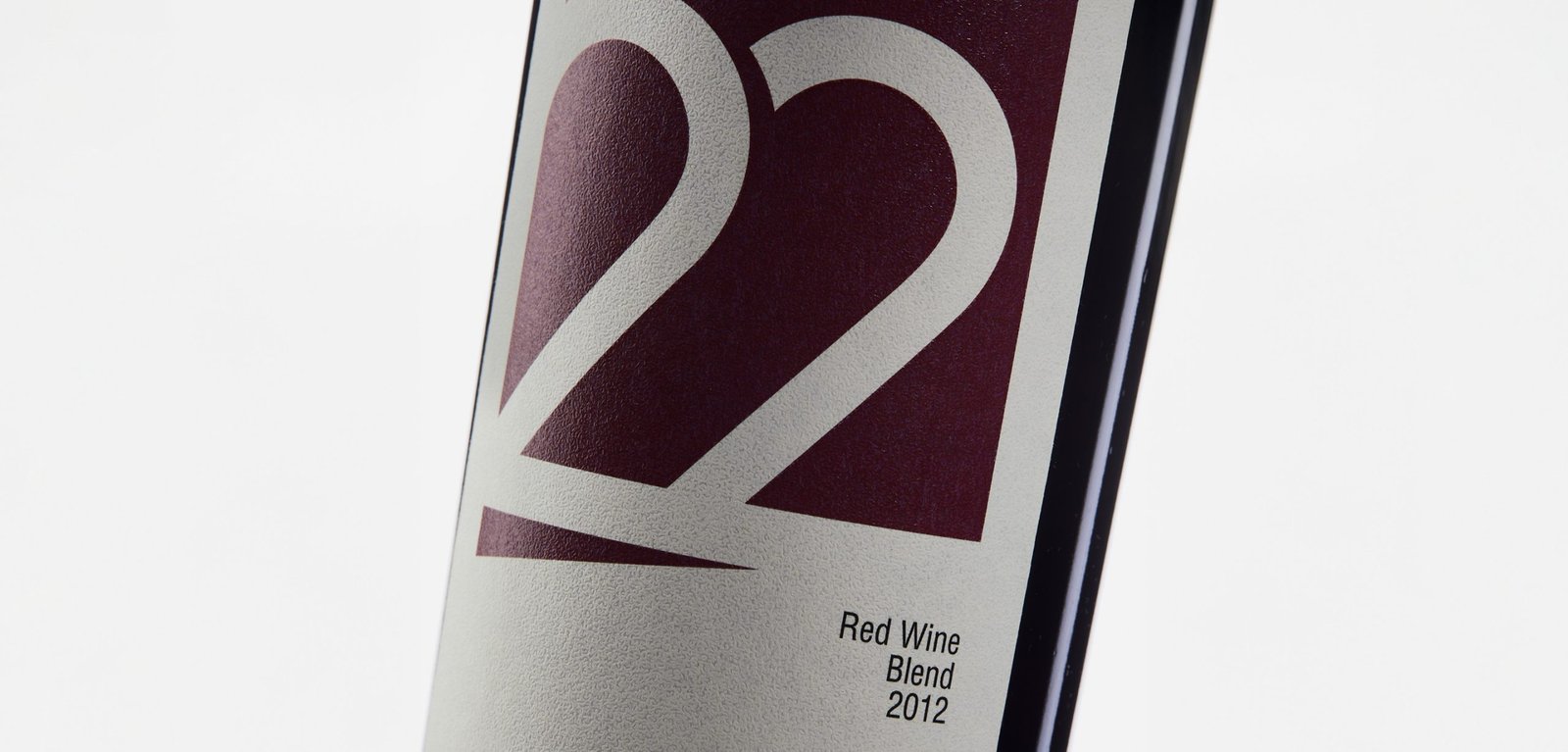
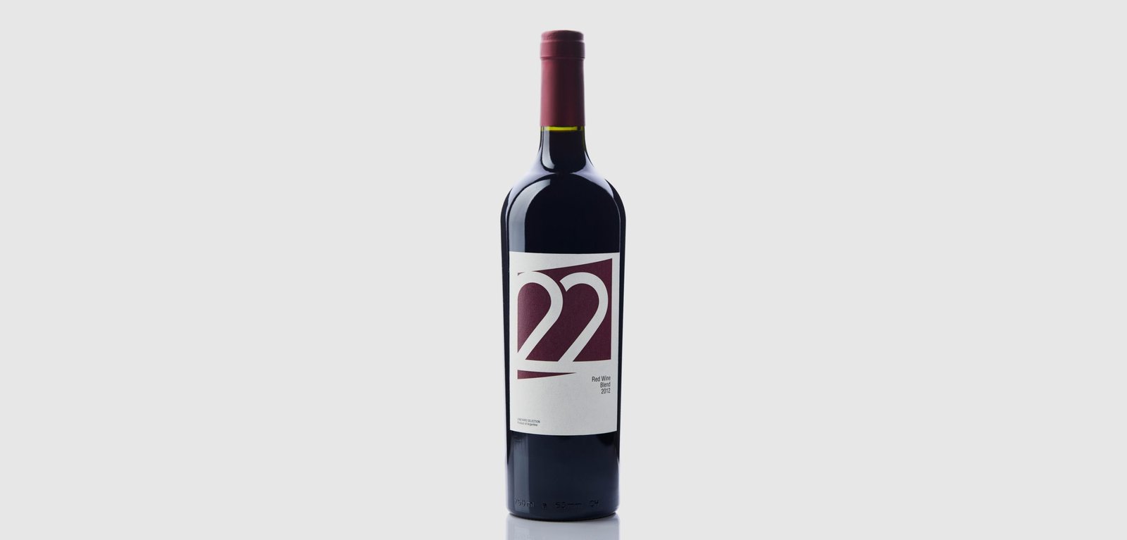
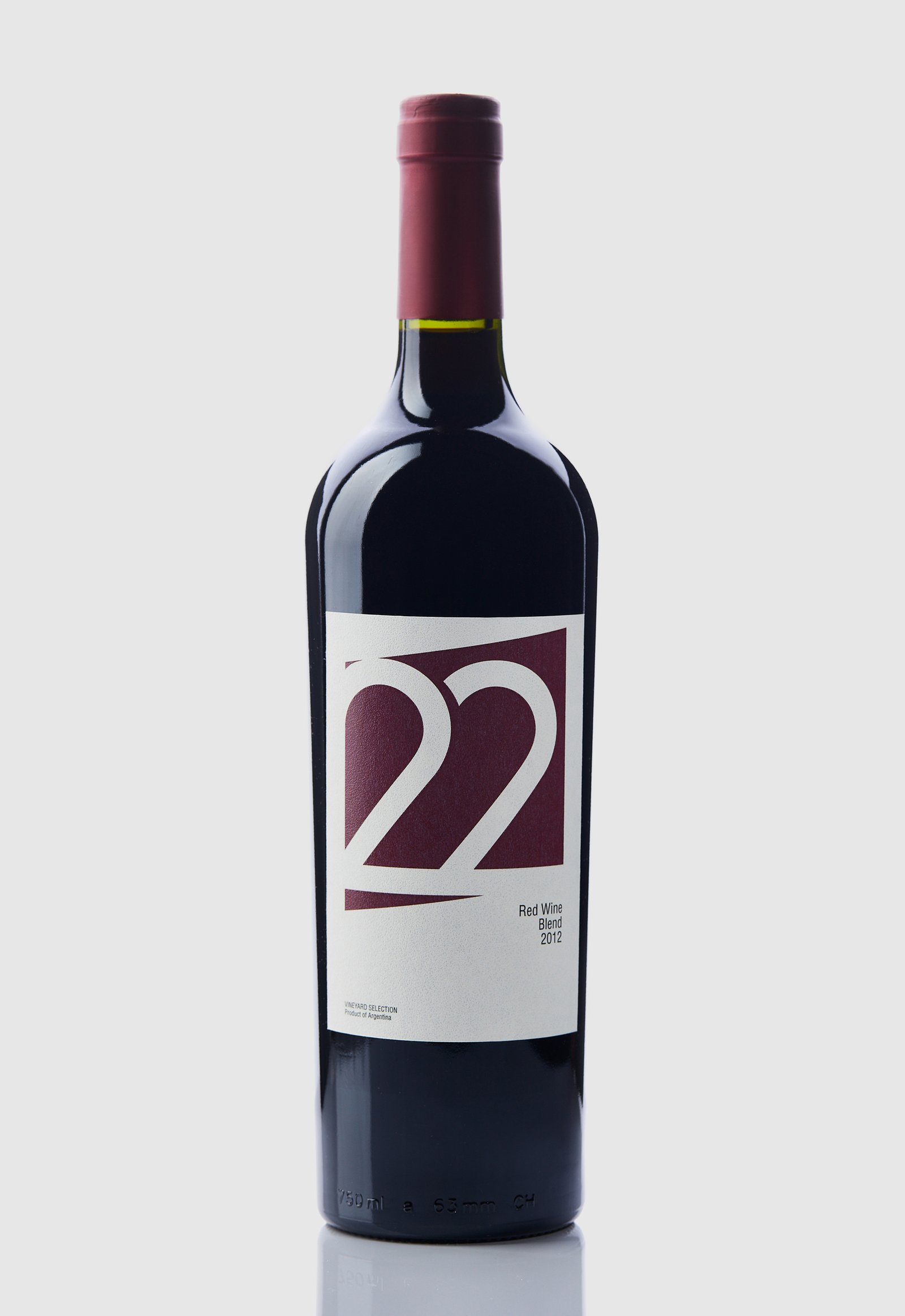
Back22 Tañidos is a Blend Red Wine brand that belongs to the Las Cañitas vineyard, located in the Sierras de Calamuchita, Córdoba, Argentina. This specific brand was developed with the aim of exporting its entire production to Turkey.
Being a new and developing region for the cultivation of vines, it does not have the positioning that other provinces of the country have in the category. Therefore, in the design we chose to show a more European and minimalist image without representing the roots or personality of the product.
The number 22 was used as the logo and main element of the label, considering that numbers are more legible than letters, especially in such different languages.
The colour of the label represents the product, and the shade was matched to the only capsule colour (top label) available on the local market at the time of project development.
Team: Mauricio Gallegos / Gastón Garcia Aja
Photo: Alvaro Picca
Istanbul, Turkey (2014)
Camporo / Packaging - Revamp
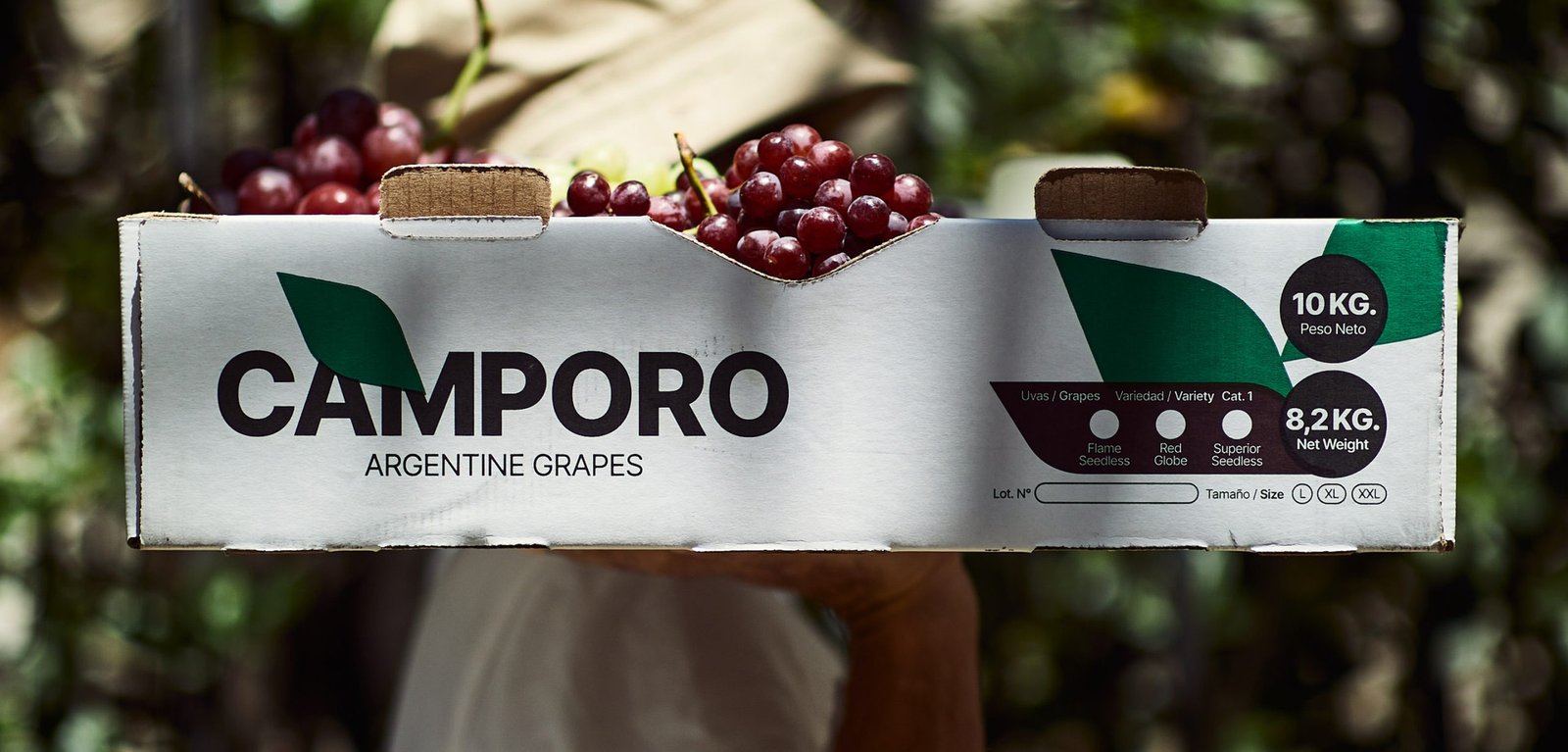
BackCamporo is a grape farm located in San Juan, Argentina, one of the best places to grow grapes in the country. Much of its production is marketed in different parts of the world.
The graphic design focuses on generic images and feelings about the naturalness, freshness and quality of the fruits, so that they can be received even in countries that do not speak the same language.
Team: Mauricio Gallegos / Gastón Garcia Aja
Photo: Alvaro Picca
San Juan, Argentina (2021)


