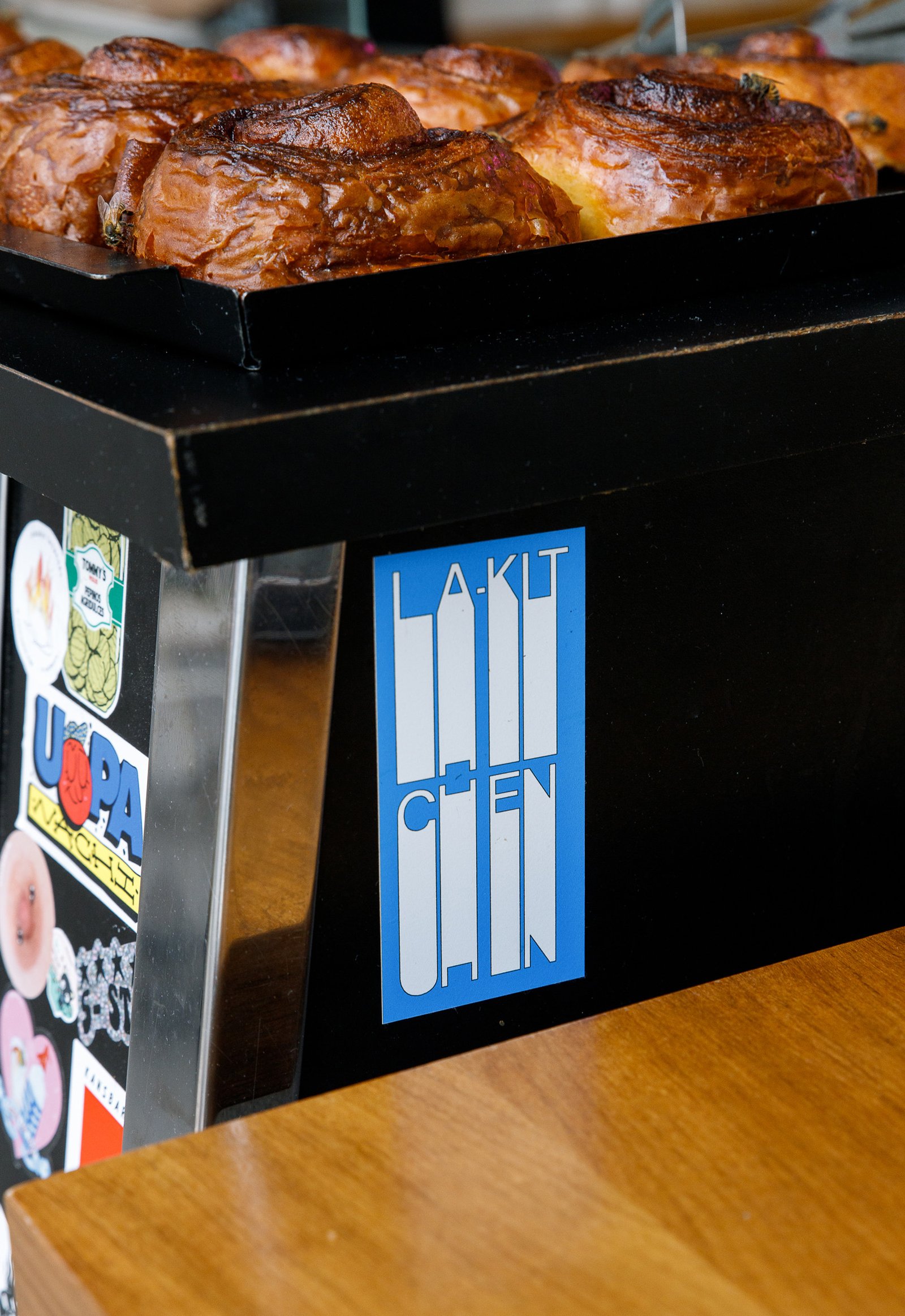
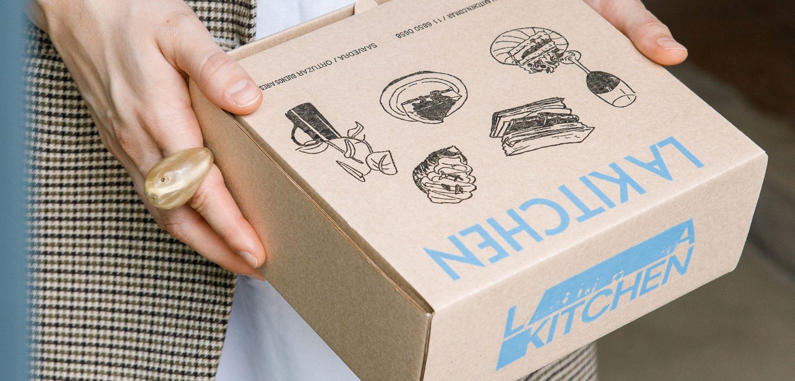
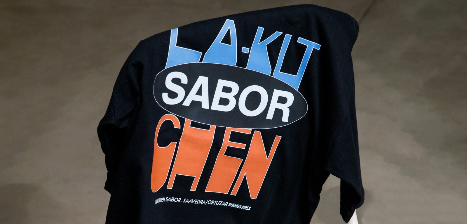
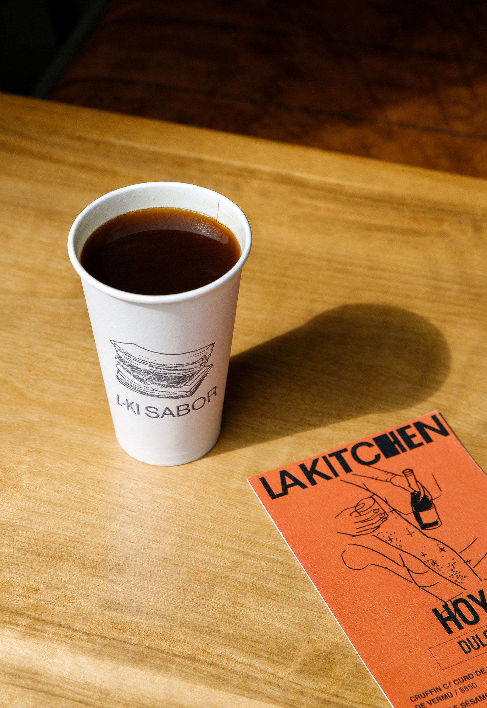
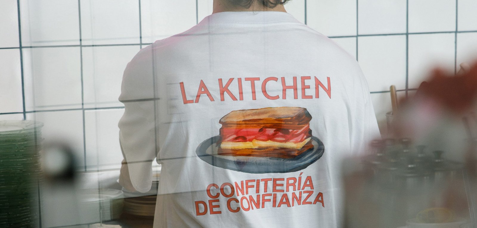
La Kitchen / Concept Development - Illustration - Packaging - Revamp
BackInspired by the traditional aesthetics of the Parisian boulangerie, adapted to the particular and beautiful local culture of the neighborhoods of Buenos Aires.
This new identity tries to combine the transparency and honesty that exists in its products and experiences, from a sincere and fun design.
Everything is related to the "mix", to the handmade, to an attitude of disruption against the established, and to a non-graphic identity full of content that makes its public, true fans.
A multi-logo strategy combined with handmade acrylic illustrations by the brilliant Gabriel Sciutto continues the idea of brand expression.
Team: Gastón Garcia Aja / Mauricio Gallegos
Illustration: Gabriel Sciutto
Photo: Malena Fradkin
Buenos Aires, Argentina (2023)
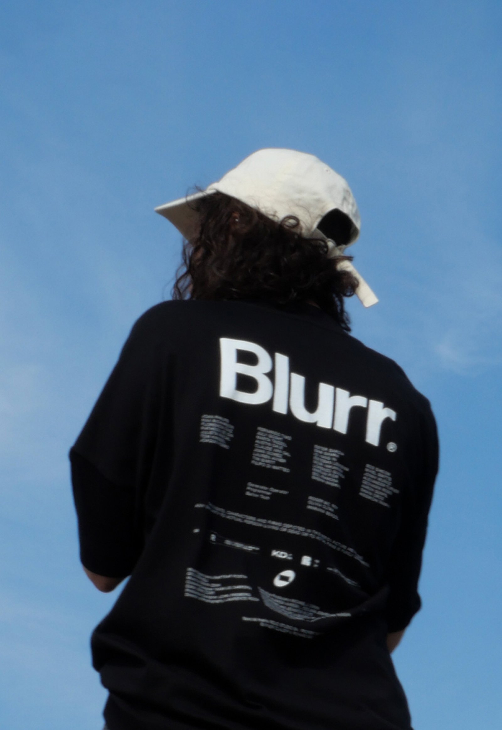
Blurr / Naming - Revamp
BackBlurr is a new independent film production company based in Buenos Aires, Argentina. The company tries to tell stories focused in an alternative and emotional way, outside the mainstream.
The narrative of "The Tunnel". Connecting a story with the audience, moving from one point to another, is usually represented by a bridge. In Blurr, this connection happens symbolically through a tunnel; a subaltern and different path. This new form appears throughout the graphic system, as a seal of a different and unique way of storytelling.
Graphically, the icon emerges from the oval shape of the mountain tunnels, together with a 16:9 horizontal rectangle representing a movie screen.
This new shape is displayed in dynamic layouts and static patterns, and alongside compositions inspired by the graphic art of credit titles.
Team: Mauricio Gallegos / Gastón Garcia Aja
Animation: Martín Cañadell
Buenos Aires, Argentina (2023)
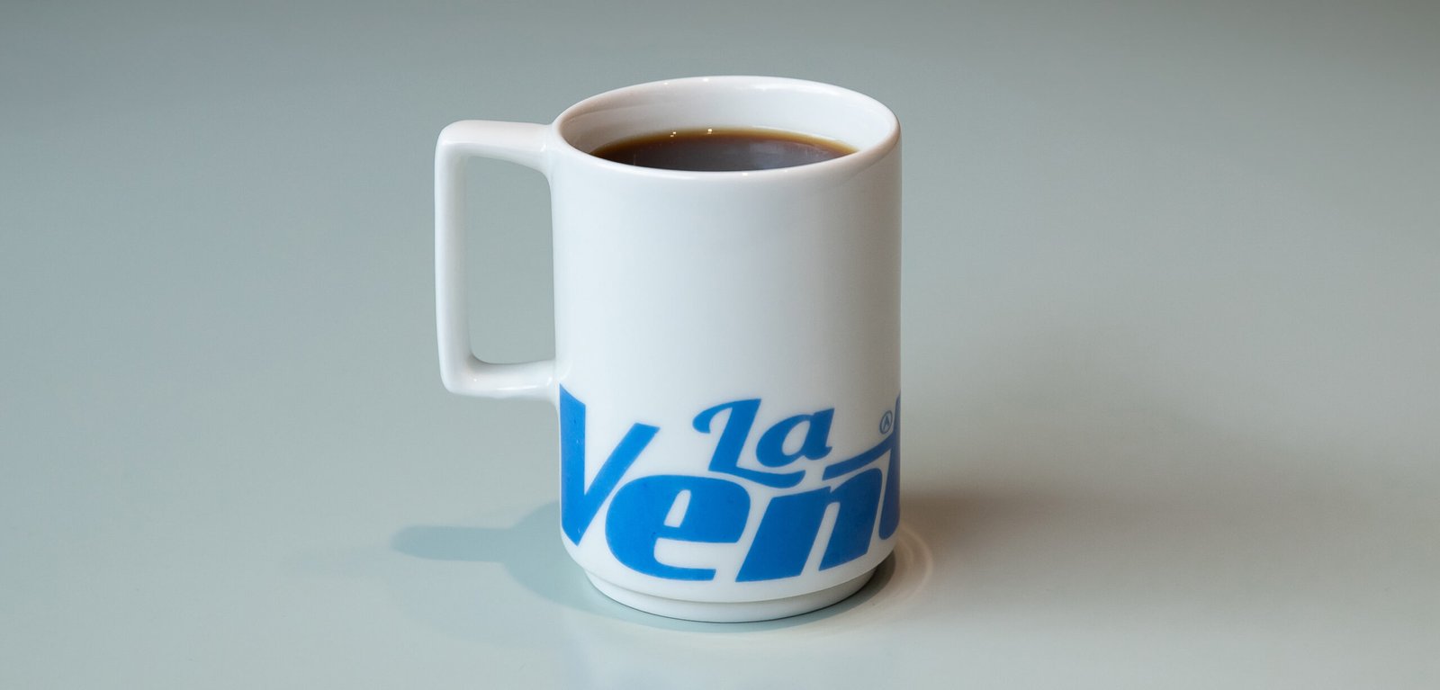
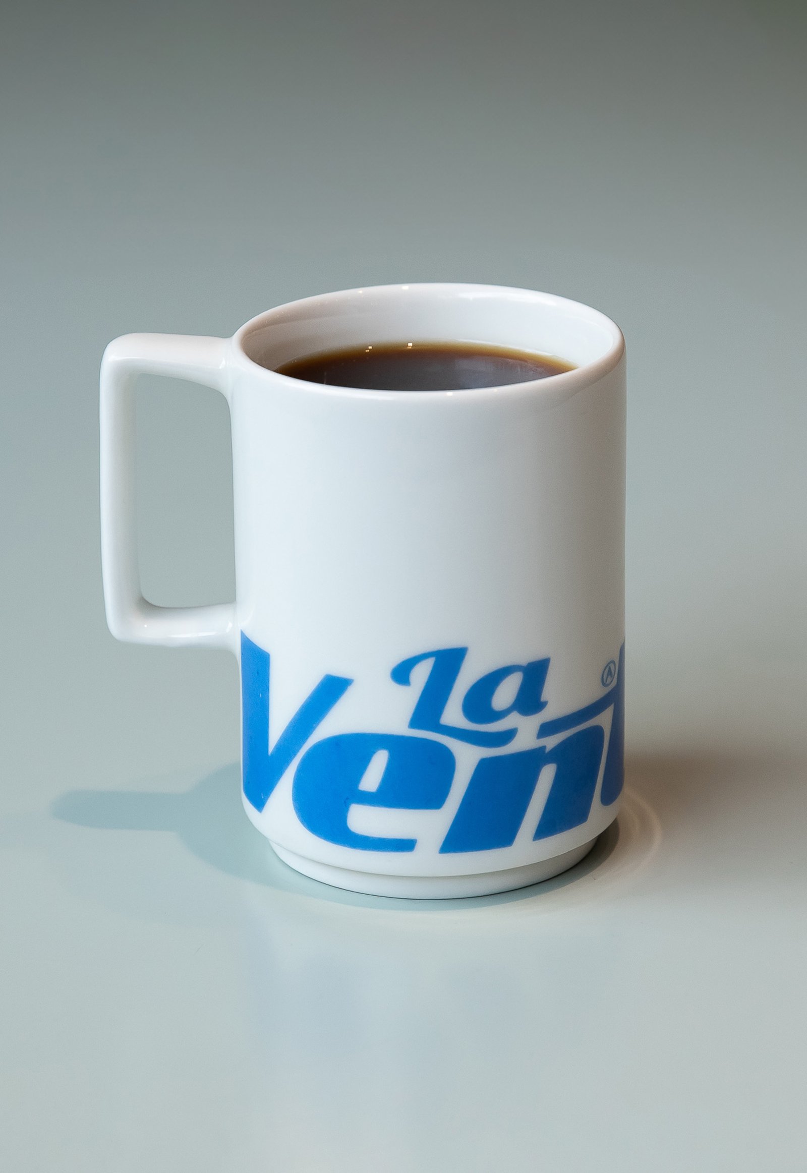
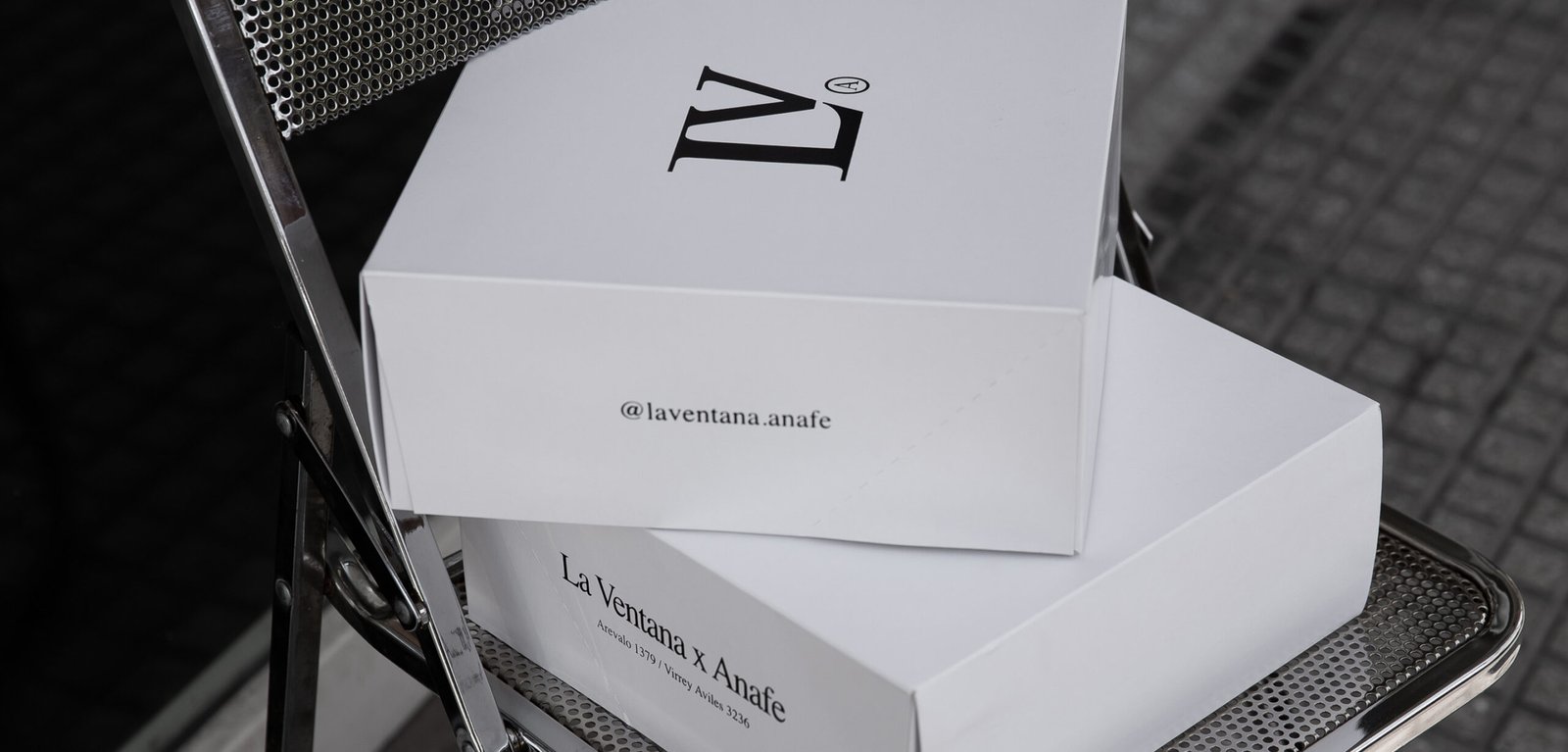
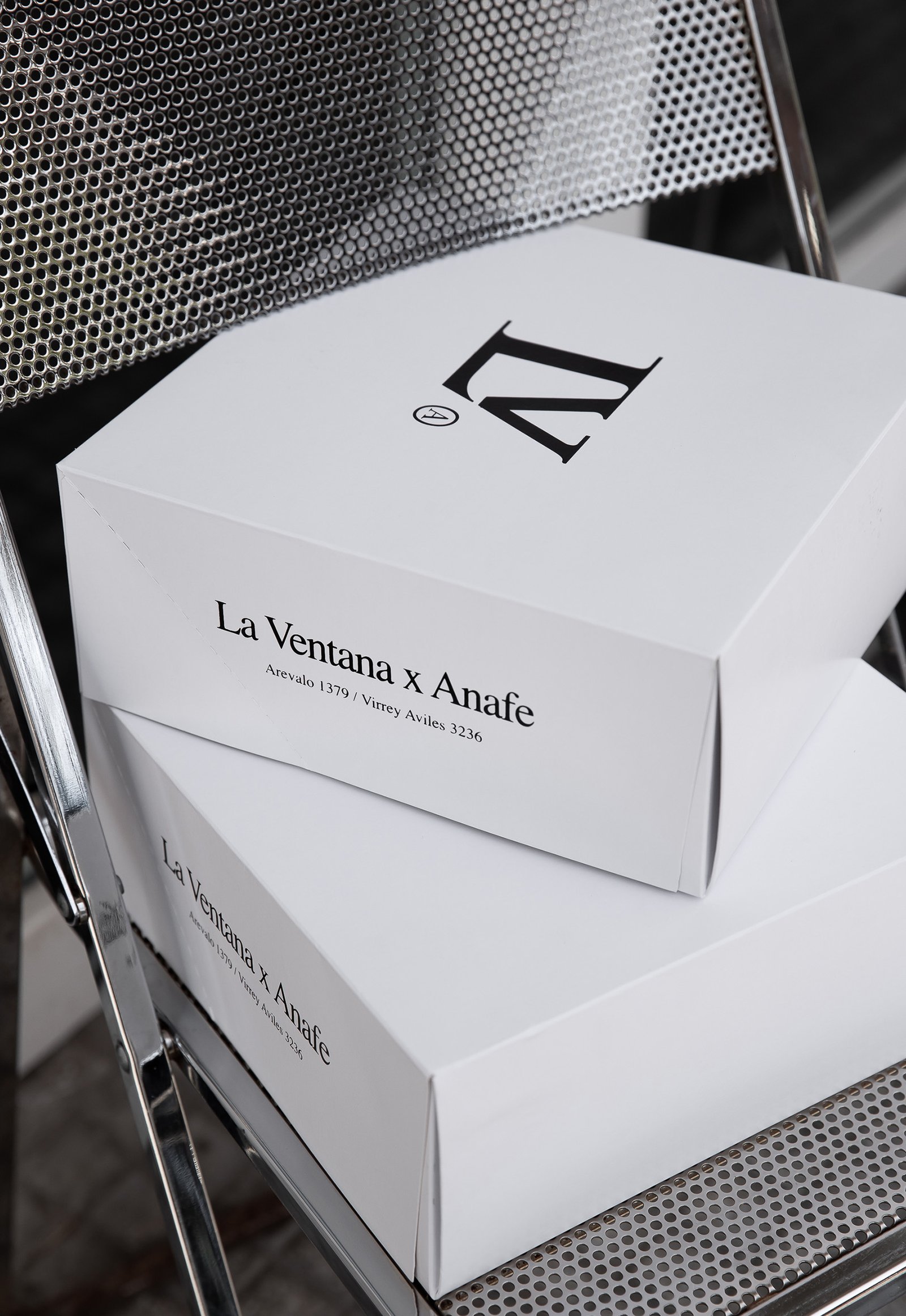
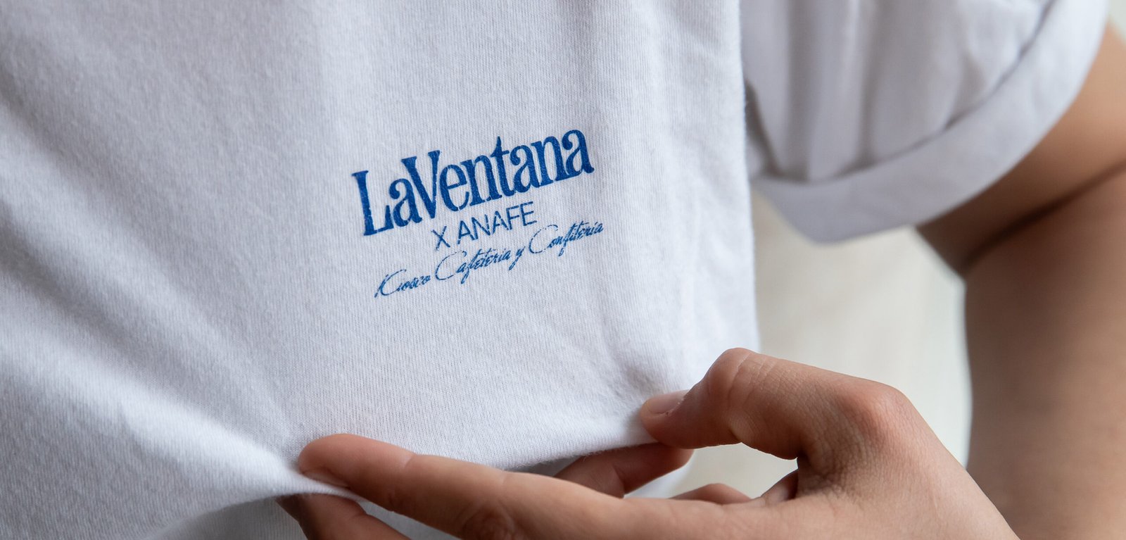
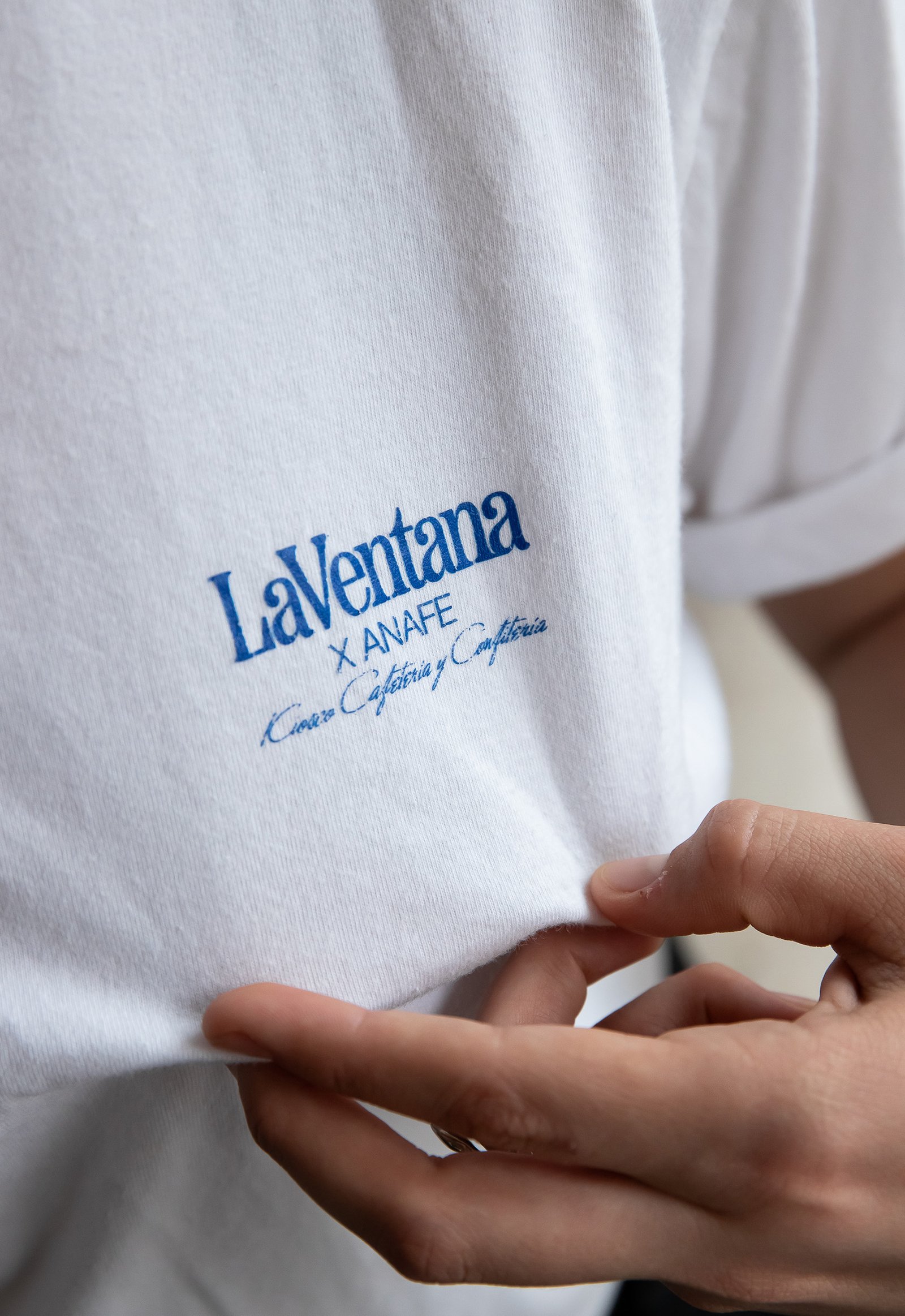
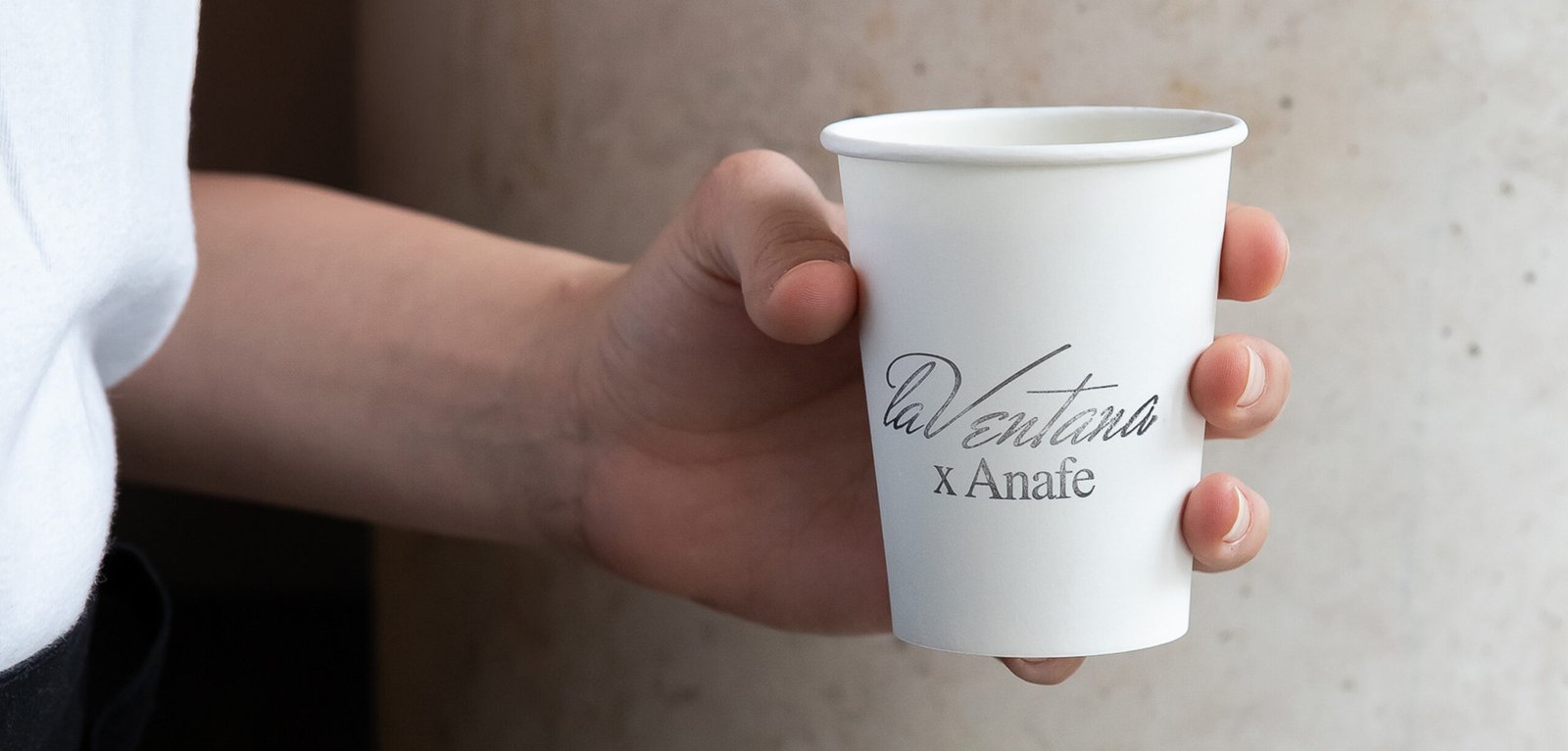
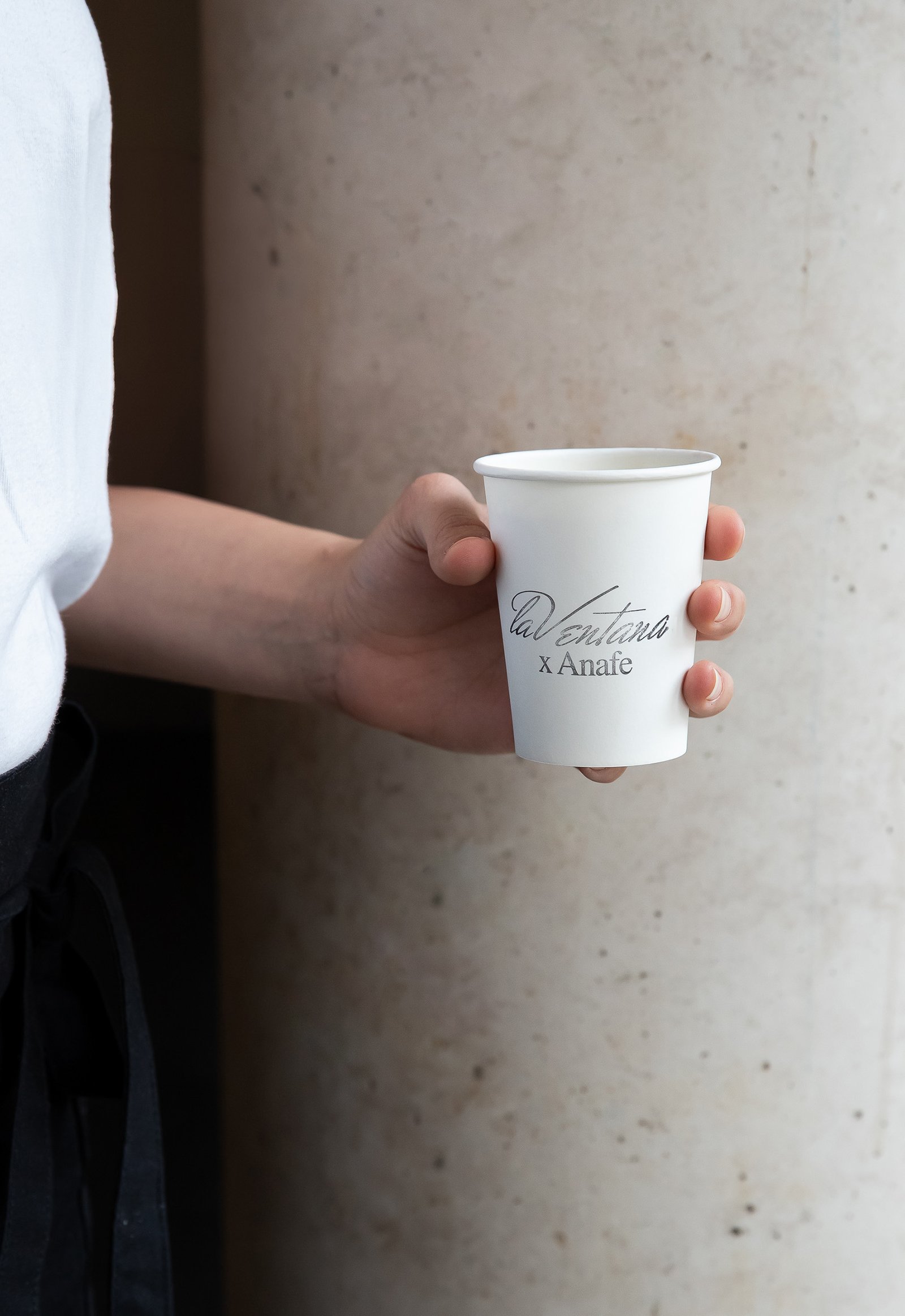
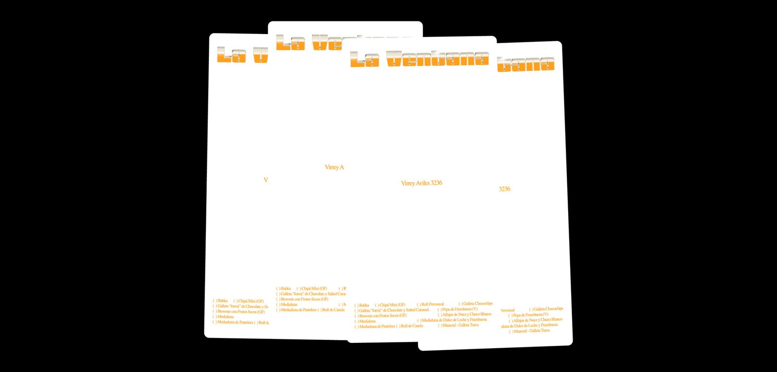
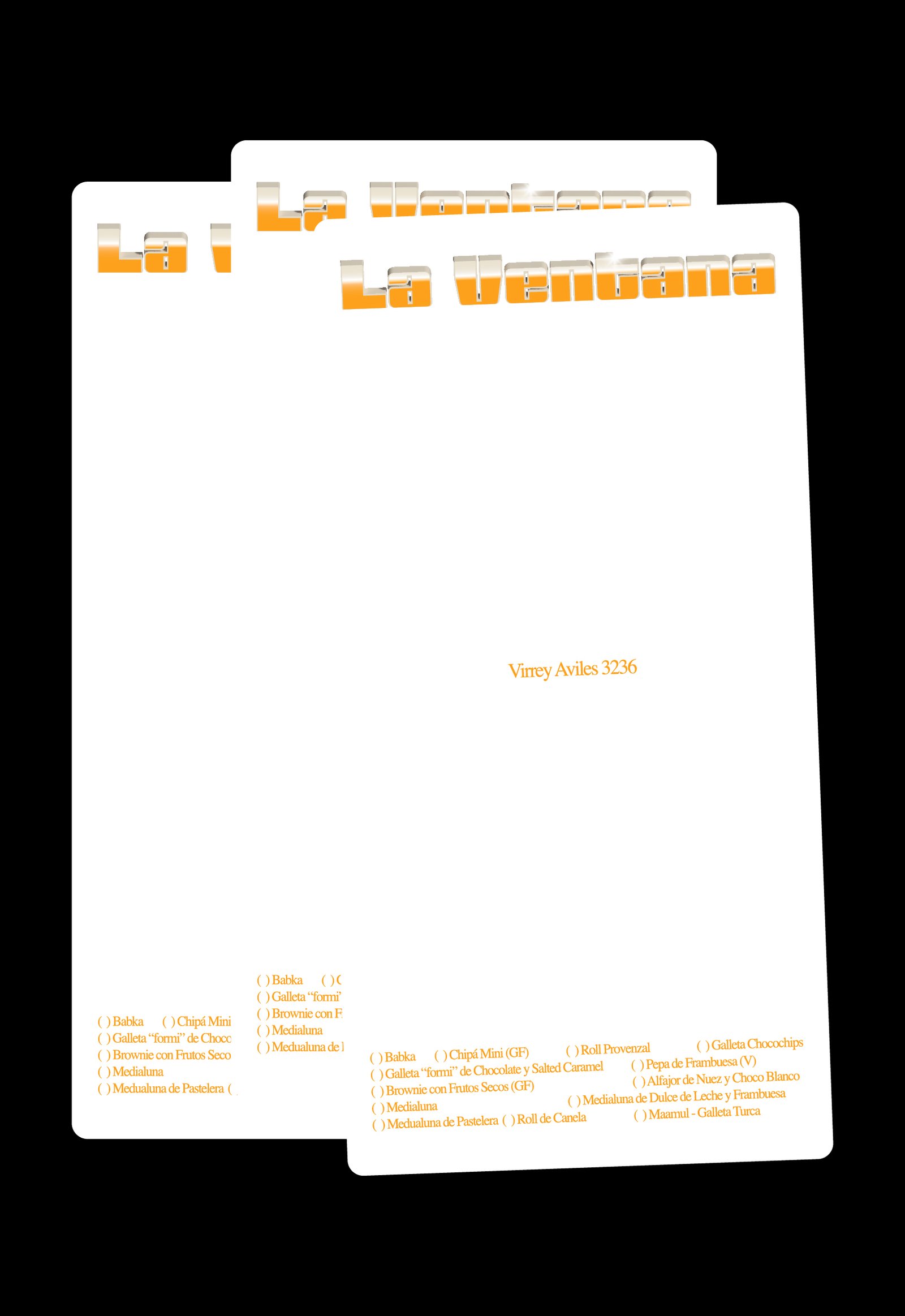
La Ventana / Packaging - Revamp - Type
BackLa Ventana is a specialty coffee shop located in the heart of Buenos Aires. Its new graphic identity seeks to celebrate not only the aesthetics, but also the spirit and emotions of the traditional cafés and confiterías found in the city’s iconic neighborhoods.
In recent years, many specialty coffee shops in the city have aimed to differentiate themselves from traditional establishments, both in terms of product and visual identity, often leaving aside the rich heritage of Buenos Aires’ café culture.
La Ventana strives to offer the best possible product and service meanwhile seeking the feeling of nostalgia and character of everyday local restaurants and cafés.
The new identity draws inspiration from the traditional graphic styles of Buenos Aires’ neighborhood gastronomic venues. Not from the large, well-known brands, but from the authentic local spots—those with intricate logos, dense typography, and a few artistic liberties. This visual approach seeks to capture the charm of these places, blending them into a design that feels both authentic and contemporary.
The new graphic identity not only represents La Ventana itself, but also pays tribute to traditional venues, conveying the idea that new influences can embrace the existing culture to create something unique.
Team: Mauricio Gallegos / Gastón Garcia Aja
Animation: Mauricio Gallegos / Martín Cañadell
3D Development: Martín Cañadell
Photo: Malena Fradkin
Buenos Aires, Argentina (2024)
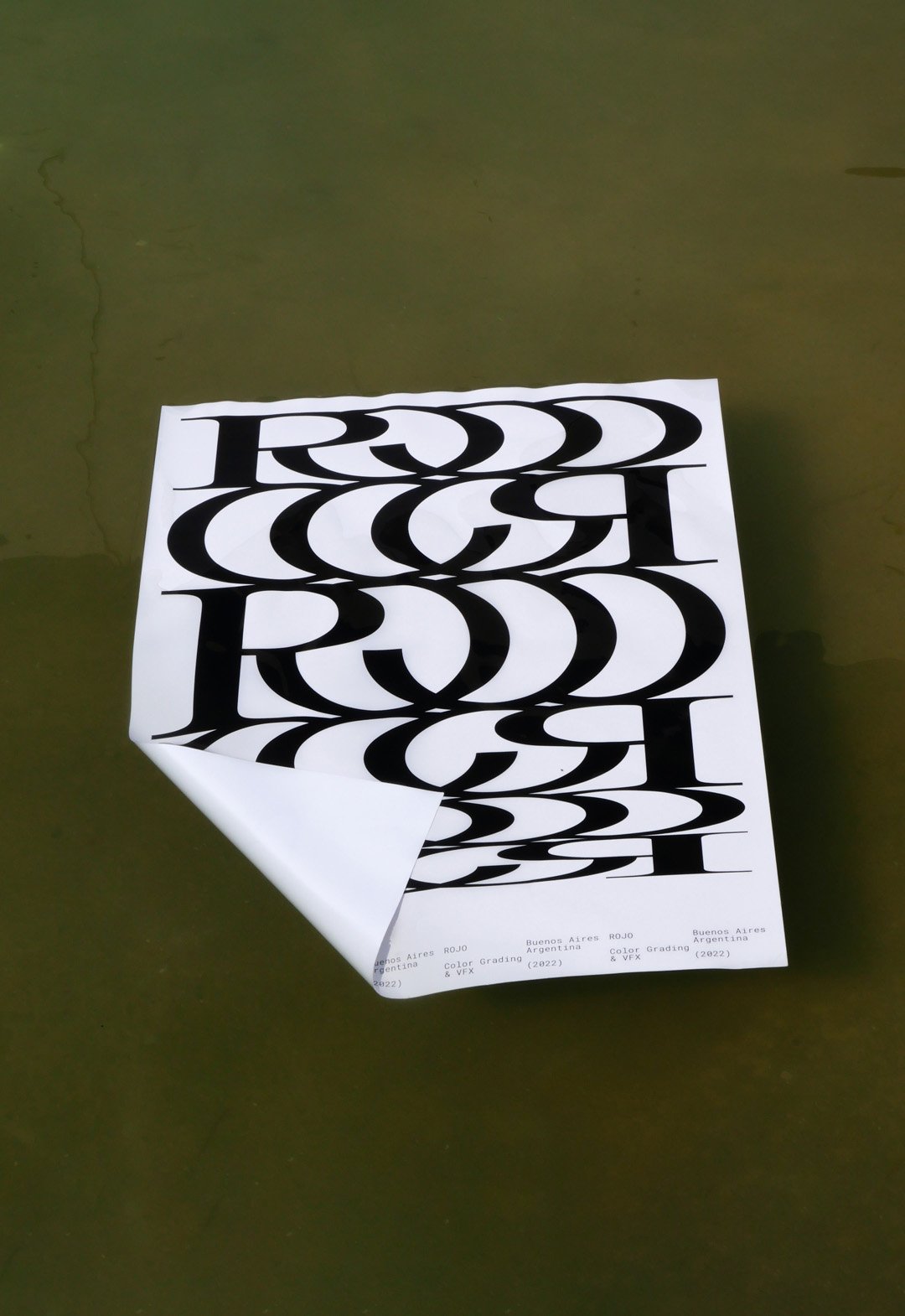
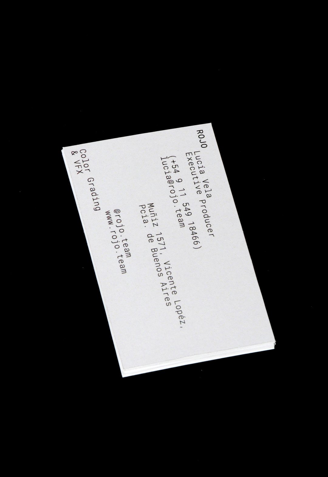
Rojo / 3D - Animation - Revamp - Type
BackROJO is a visual effects, post-production and colour grading studio working for films, TV series and commercials, based in Buenos Aires, working all over the world.
This company works with a large number of studios and collaborators, at different stages of an audiovisual project. In other words, they are always part of a team that is bigger than themselves.
This new logo tries to represent that connection in a very strong and aesthetic way, showing a lot of personality without the need for an elaborate graphic system.
The Rojo logo is big, bold and black. The background colors of the identity change all the time, whether they are video images or textures of real elements.
Buenos Aires, Argentina (2022)
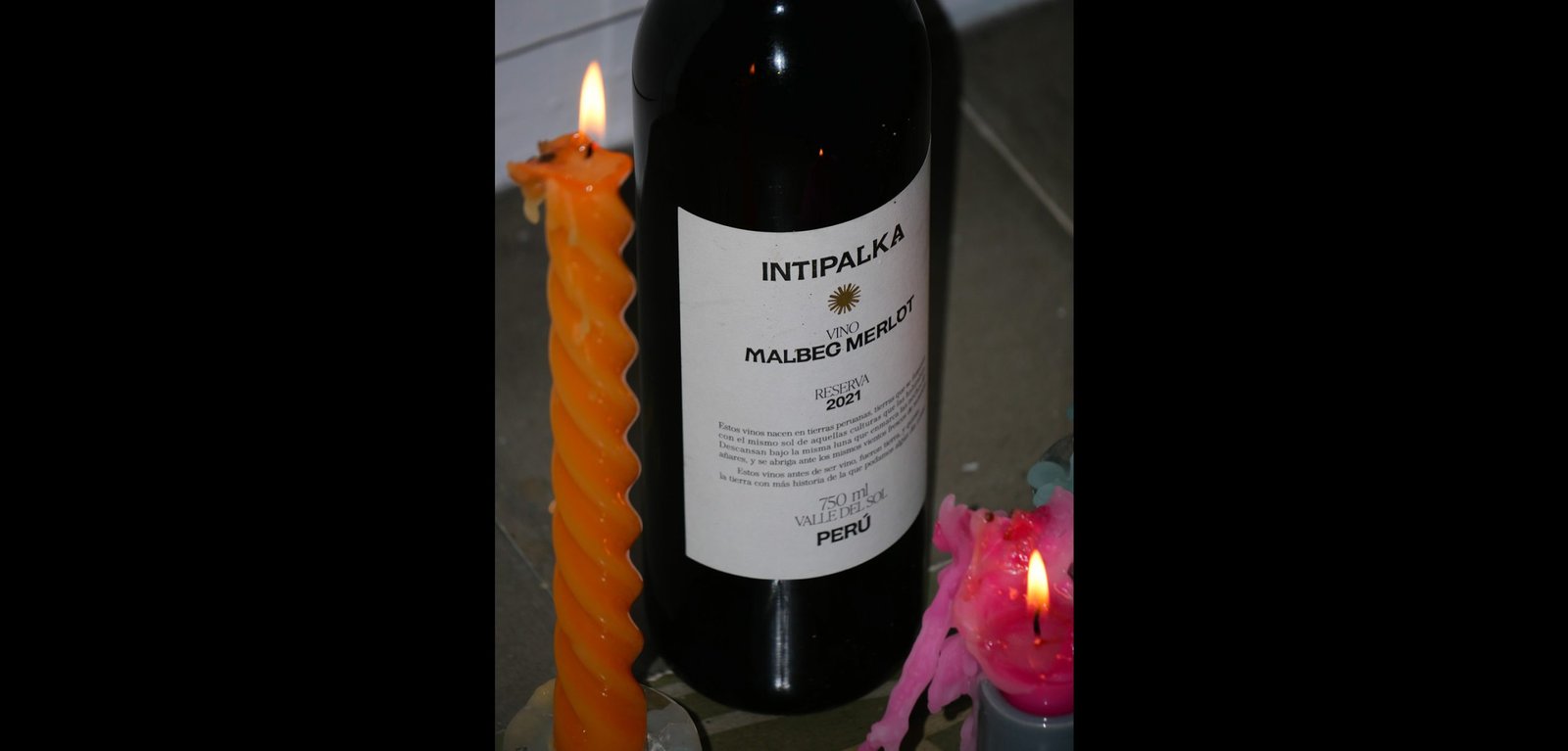
Intipalka Wine Type / Revamp - Type
BackIntipalka is the most important wine producer and wine brand in Peru. The microclimate of the Valle del Sol in Ica region allows it to produce incredible wines, despite not being in the traditional wine belt area.
The redesign process was based on the idea of positioning not only the wine brand in the international market but also to position the Peruvian wine category at a global level.
Under the concept that Peruvian wine must represent Peru, and understanding that the most honest way to share culture is through language, we developed an entire typography born in Peru, representing it in the most subtle and respectful way possible, without obviates.
The letters came from forms found in “Introducción a la Iconografía Andina by Ruiz Durand Jesus”, a book that brings together the aesthetics of the different native Peruvian peoples throughout history.
Each letter has between 3 and 5 variants that represent Peruvian culture's diversity and plurality.
This typography is applied in labeling Intipalka’s large family of wines and in much of its communication and content.
The new brand feeling provides a greater sense of belonging to both the brand and the category, inside and outside Peru, maintaining and improving the appreciation of the quality of both.
Colab: Fibra
Team: Gastón Garcia Aja / Mauricio Gallegos / Andrea Gálvez
Animation: Martín Cañadell
Music: Jin Yerei
Lima, Perú (2022)
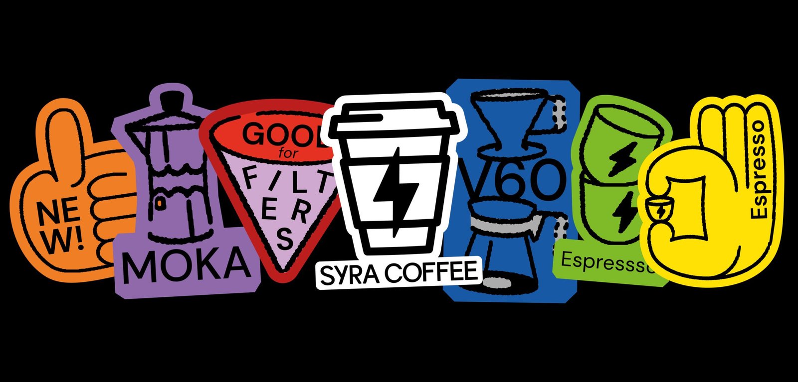
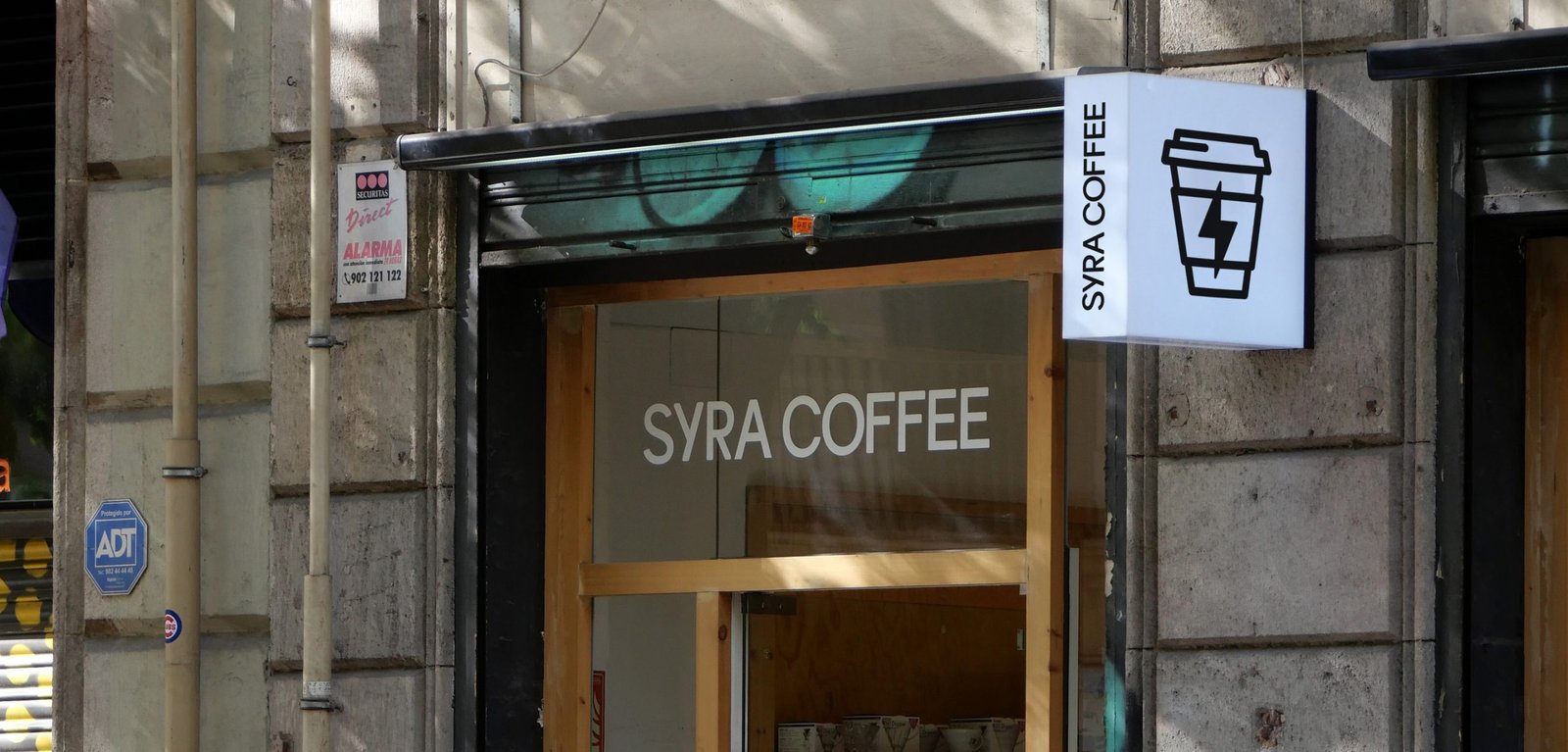
Syra Coffee / Concept Development - Illustration - Packaging - Revamp
BackSyra Revamp Project. Syra is one of Barcelona's biggest specialty coffee companies, with its own roastery and coffee shops, most in Barcelona and across Spain.
Under the idea of democratizing specialty coffee, and betting on small takeaway coffee shops in different neighborhoods of the city, Syra brings coffee closer to many people, offering a more inclusive product.
This new identity aims to modernize the brand's image, bringing it closer to a diverse public, from the design to the narrative. The change of logo allows for a better use and longevity of the icon, while the new typography brings a younger, bolder, and more fun main feeling. It also improves its performance in graphic compositions.
The new look is more colorful, bigger, and easier to use. New graphic resources such as illustrations and stickers help to generate more coherent layouts across platforms and content levels. These design and strategic gestures help the brand to adapt to the new digital era it is going through, where e-commerce, smartphone application, and social media content are at the forefront.
Team: Gastón Garcia Aja / Mauricio Gallegos / Maher M. Mansour
Motion: Martín Cañadell
Special Thanks: Maria Amaro
Barcelona, Spain (2022)
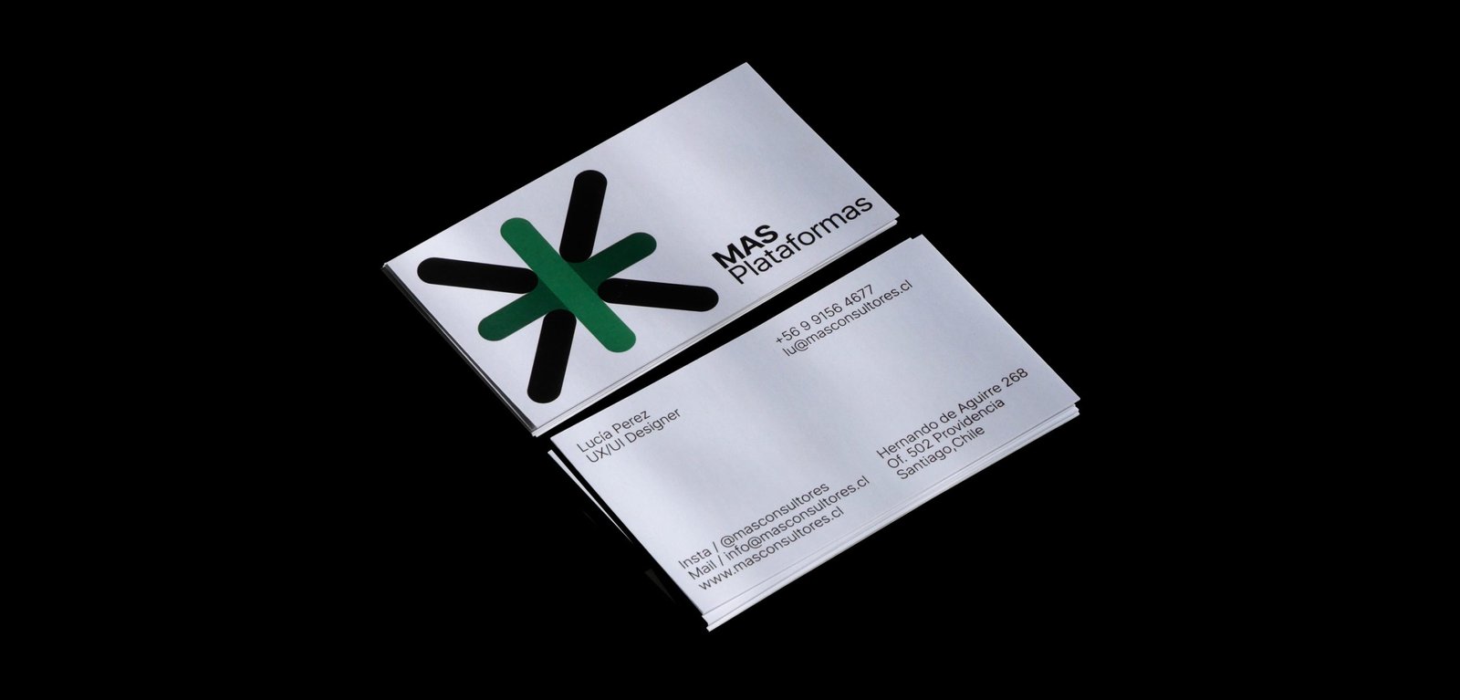
Más / Animation - Graphic Design - Revamp
BackThe new narrative, new brand architecture, and new graphic identity for MAS, a human resources consulting firm based in Santiago, Chile.
From autonomous identities for its business units to a power symbol and system that brings back all the importance and exposure to the main group identity. A new icon that represents a multiplication, rather than an evident addition, and a system that allows each unit to be identified while maintaining versatility and autonomy.
The new graphic system of MAS has two different worlds. Full color, white backgrounds, and clean elements go for the main group institutional communication. A limited color palette, grey backgrounds, and out-of-context size of the elements, go with the communication of each business unit. Both systems work together being different. Clean and noisy, simplicity and mess, serious and playful.
Team: Mauricio Gallegos / Gastón Garcia Aja
Animation: Martín Cañadell
Santiago, Chile (2018)
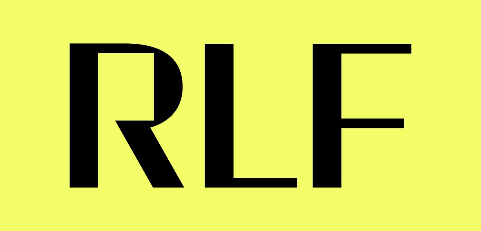
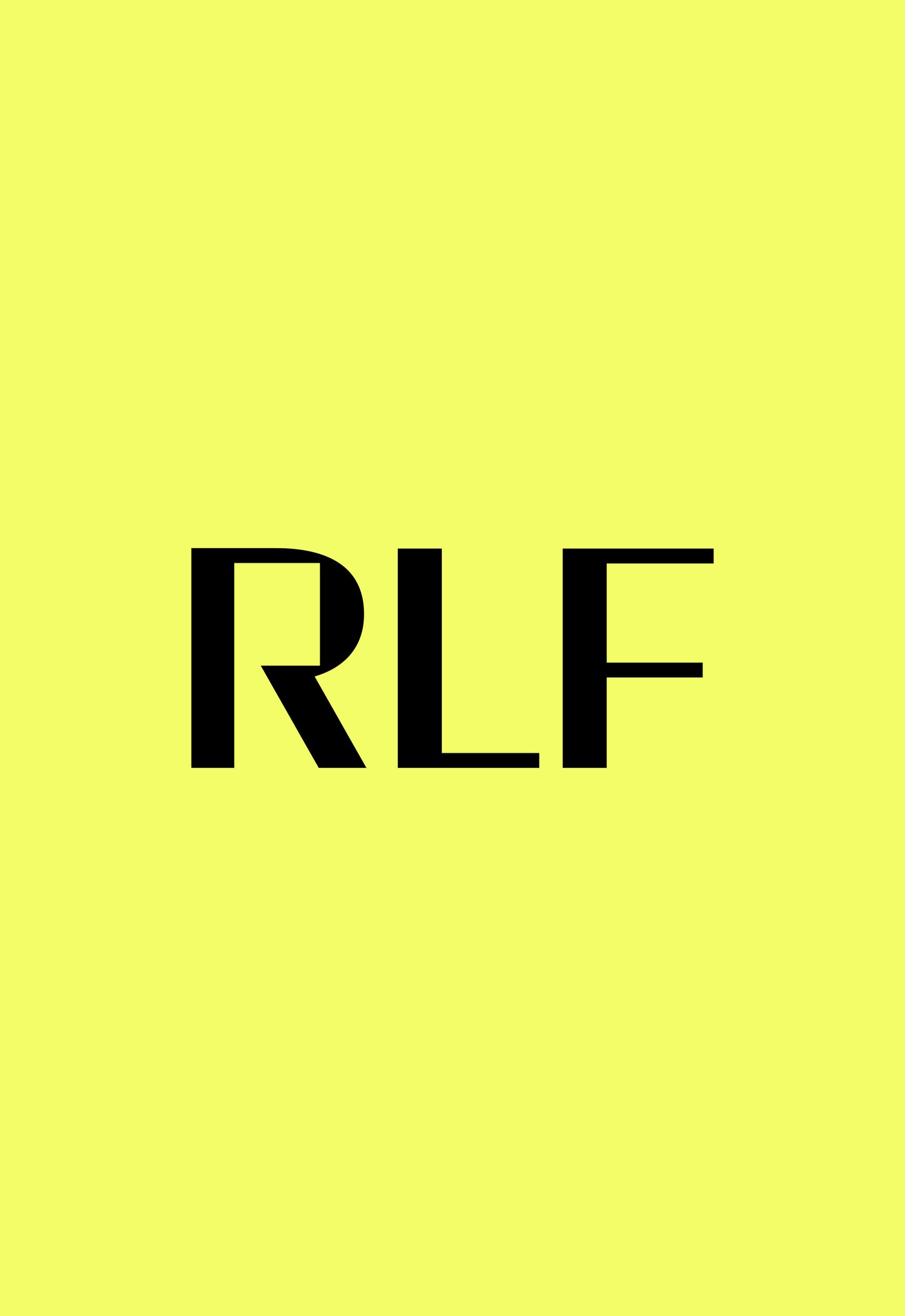
RFL / Revamp - Type
BackRodrigo Fernandez Lara is an expert training and development consultant based in Santiago, Chile. His talks reach universities, congresses and companies, motivating and sharing knowledge.
The graphic identity prioritizes the search for personality in its acronym RFL. The dialogue box formed by the letter R represents a dialogue box, a main element in its nature.
Santiago, Chile (2017)
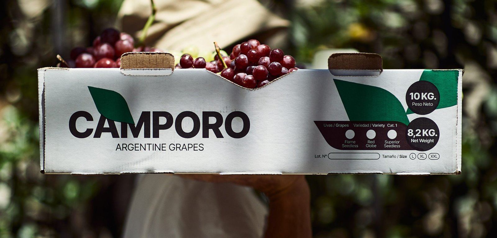
Camporo / Packaging - Revamp
BackCamporo is a grape farm located in San Juan, Argentina, one of the best places to grow grapes in the country. Much of its production is marketed in different parts of the world.
The graphic design focuses on generic images and feelings about the naturalness, freshness and quality of the fruits, so that they can be received even in countries that do not speak the same language.
Team: Mauricio Gallegos / Gastón Garcia Aja
Photo: Alvaro Picca
San Juan, Argentina (2021)
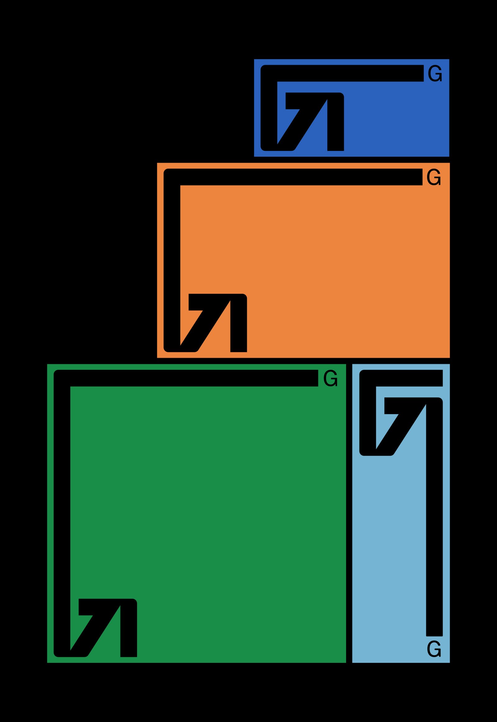
Georo / Graphic Design - Revamp
BackGeoro is a developer and construction company focused on the architecture and design of its projects, based in San Juan, Argentina.
Its main attribute is its versatility when it comes to carrying out projects and works at different levels and scales.
The redesign of its identity represents the evolution of the company, the idea of the future and the versatility to adapt to any context, in a simple and dynamic way, in a modern language prepared for new platforms.
Team: Mauricio Gallegos / Gastón Garcia Aja
San Juan, Argentina (2020)