La Ventana / Packaging - Revamp - Type
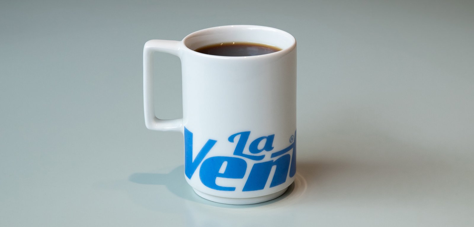
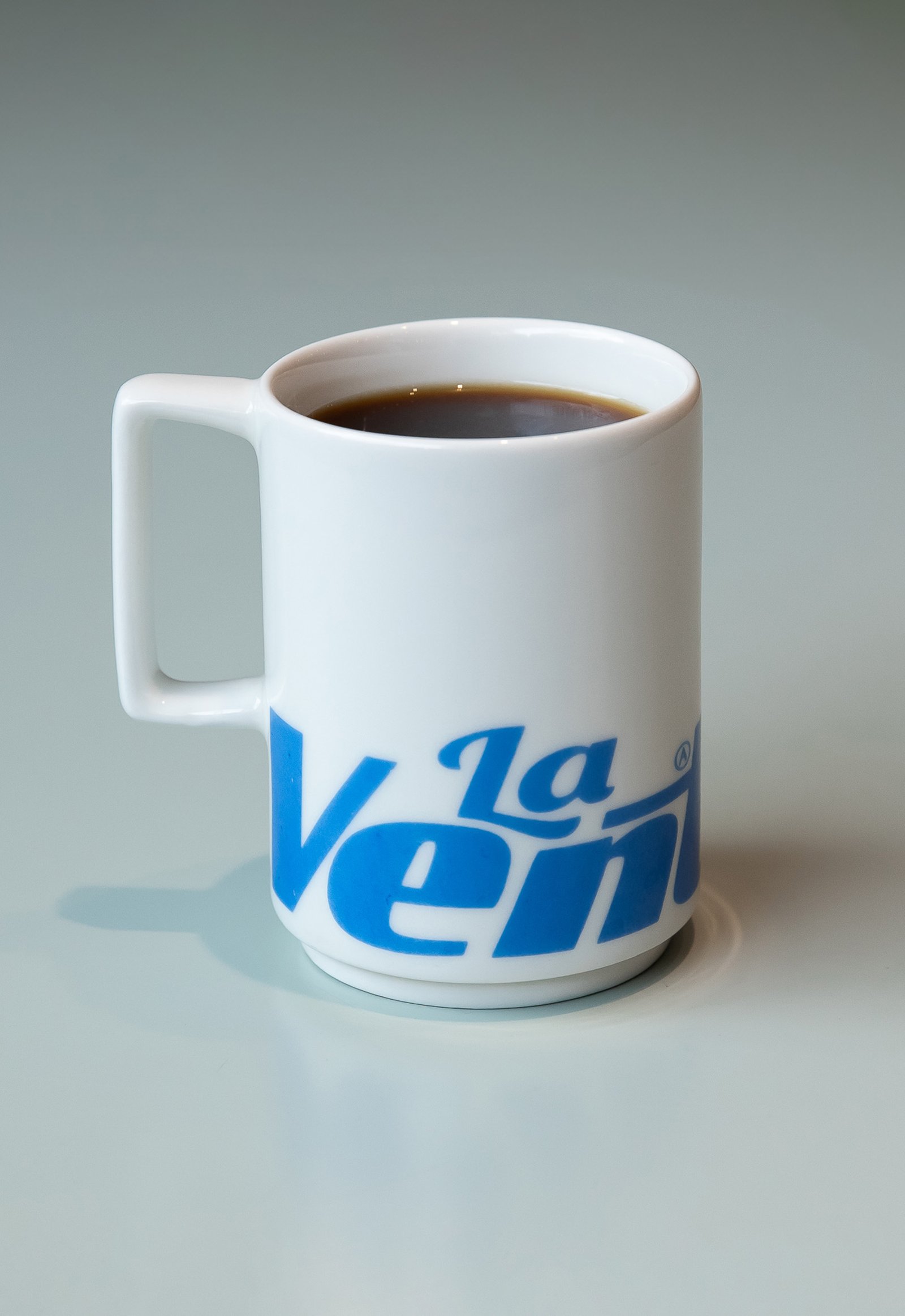
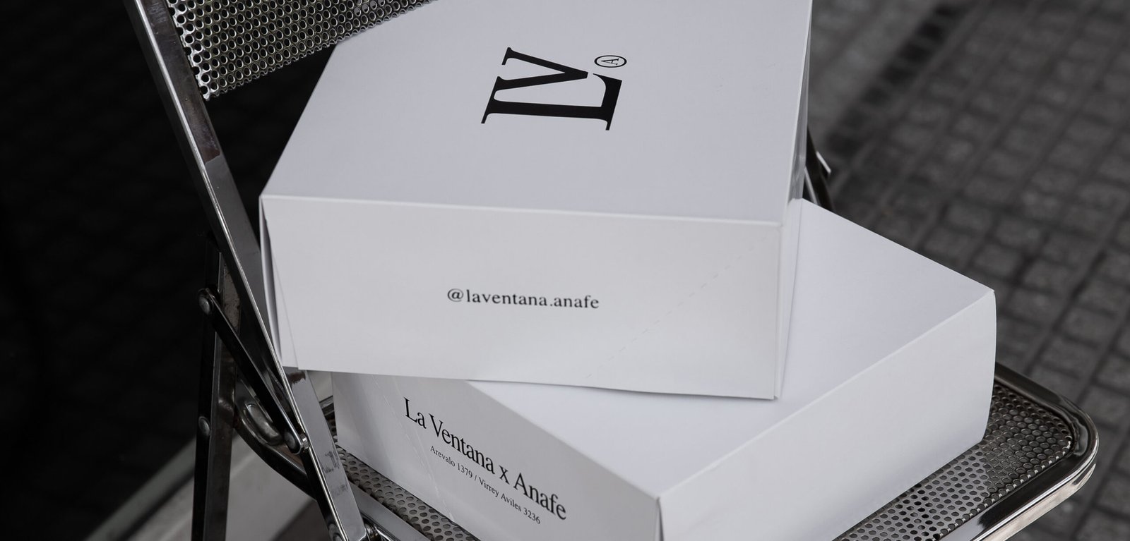
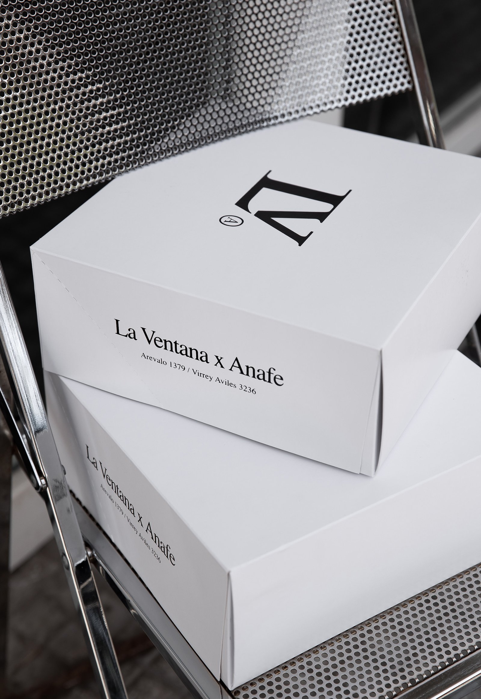
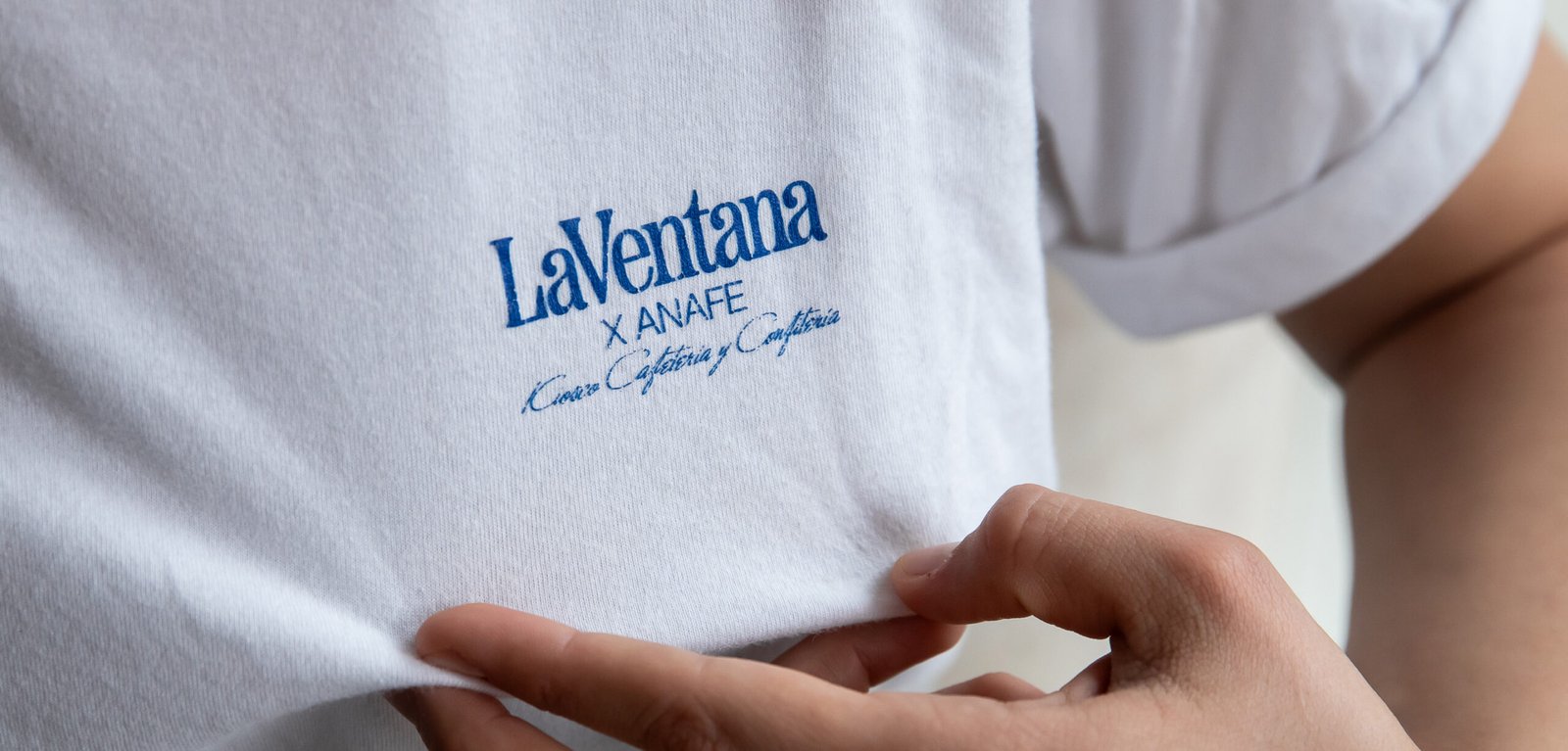
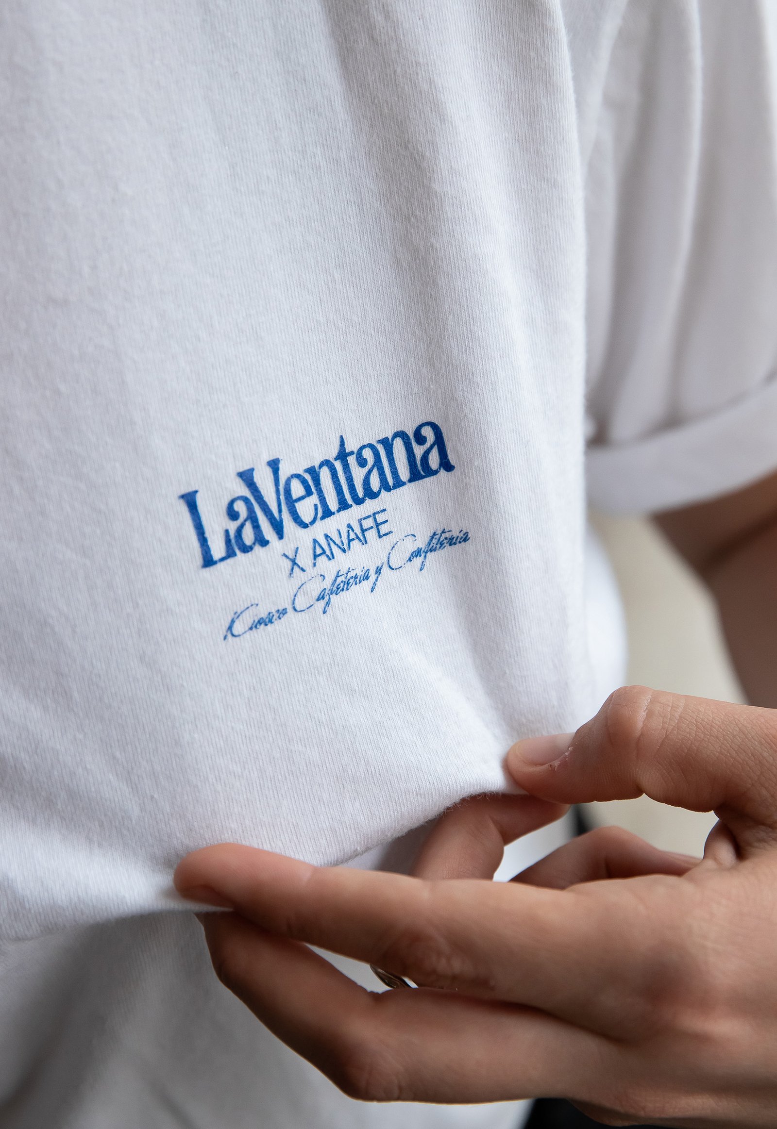
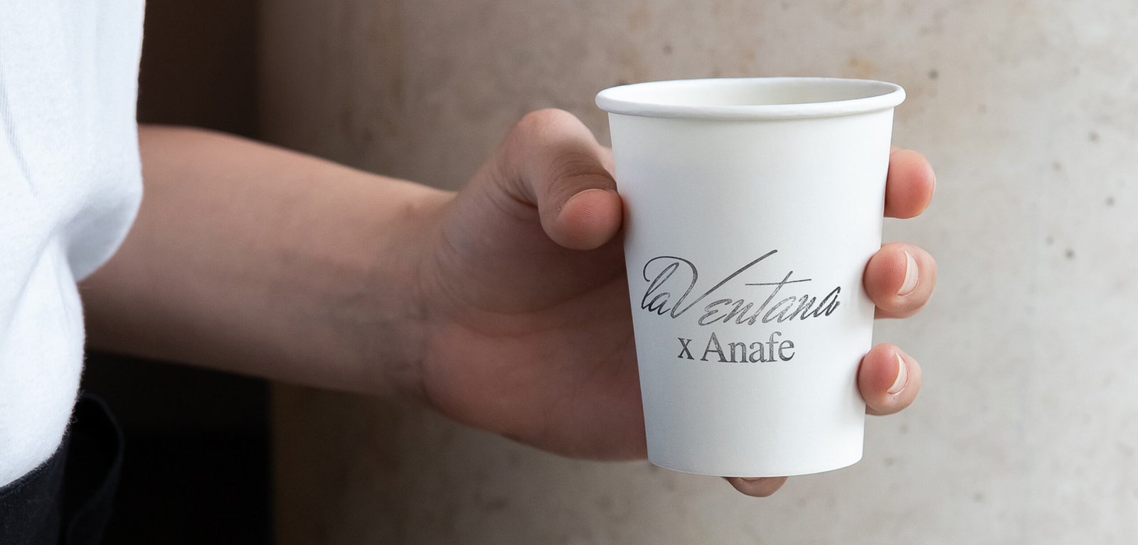
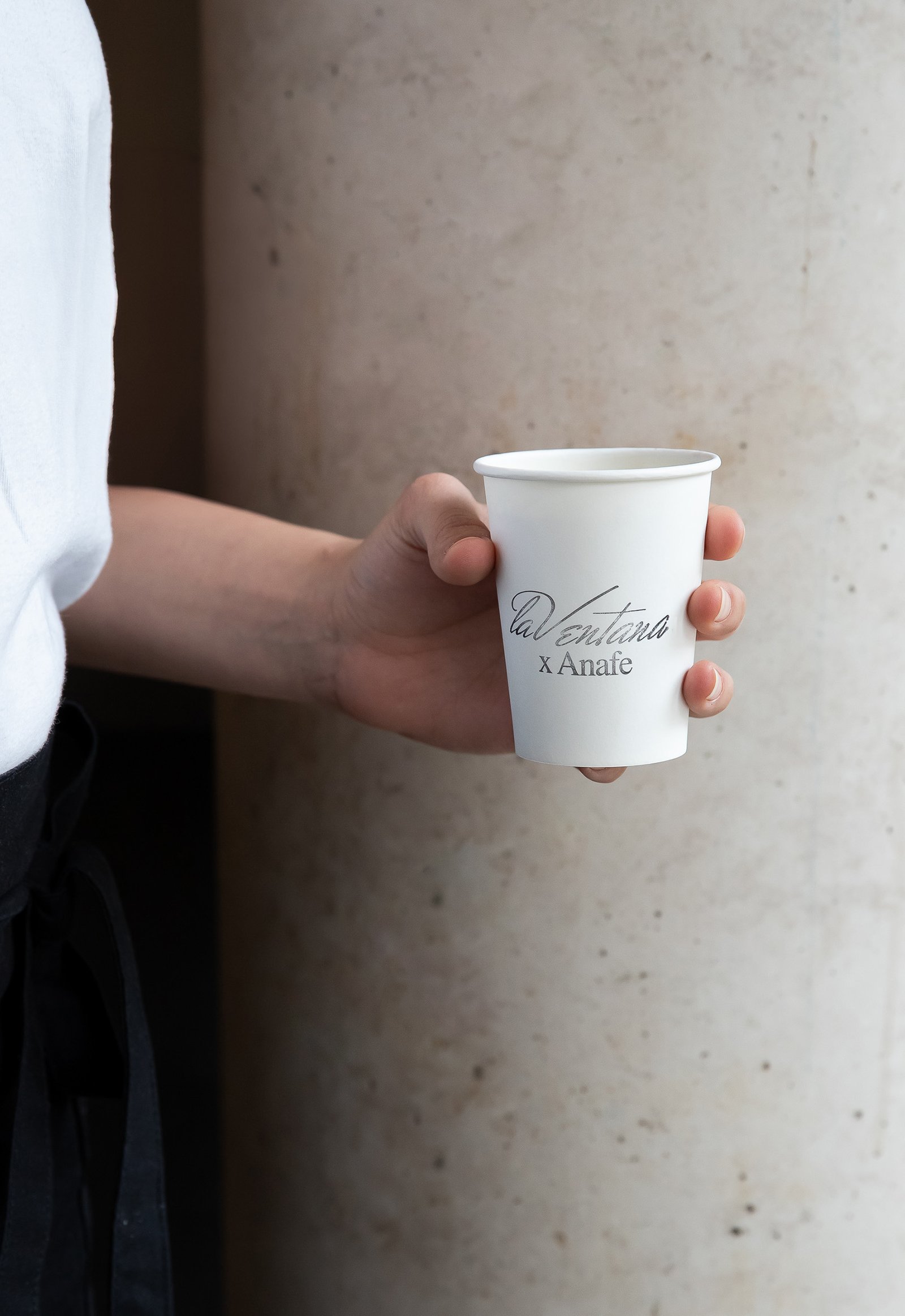
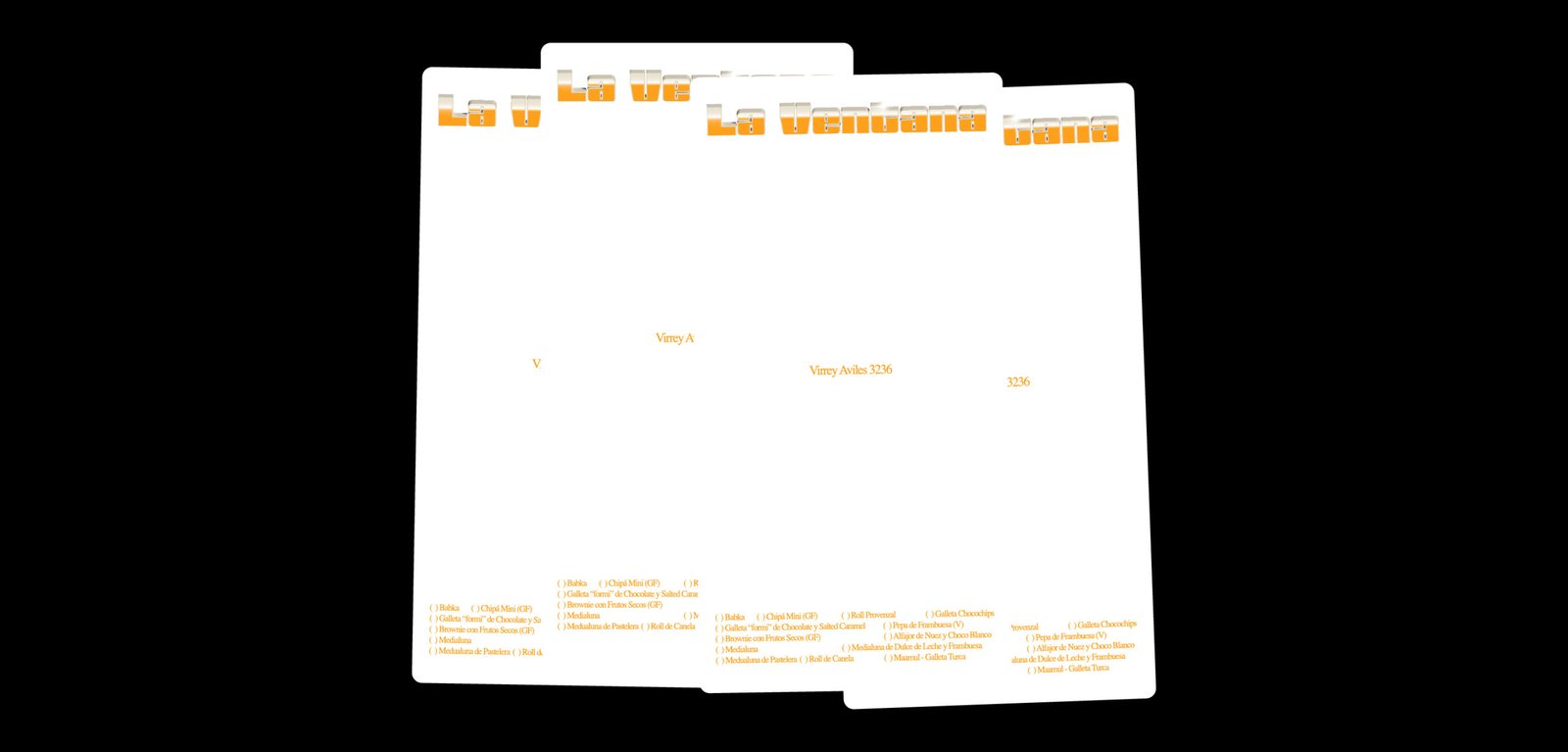
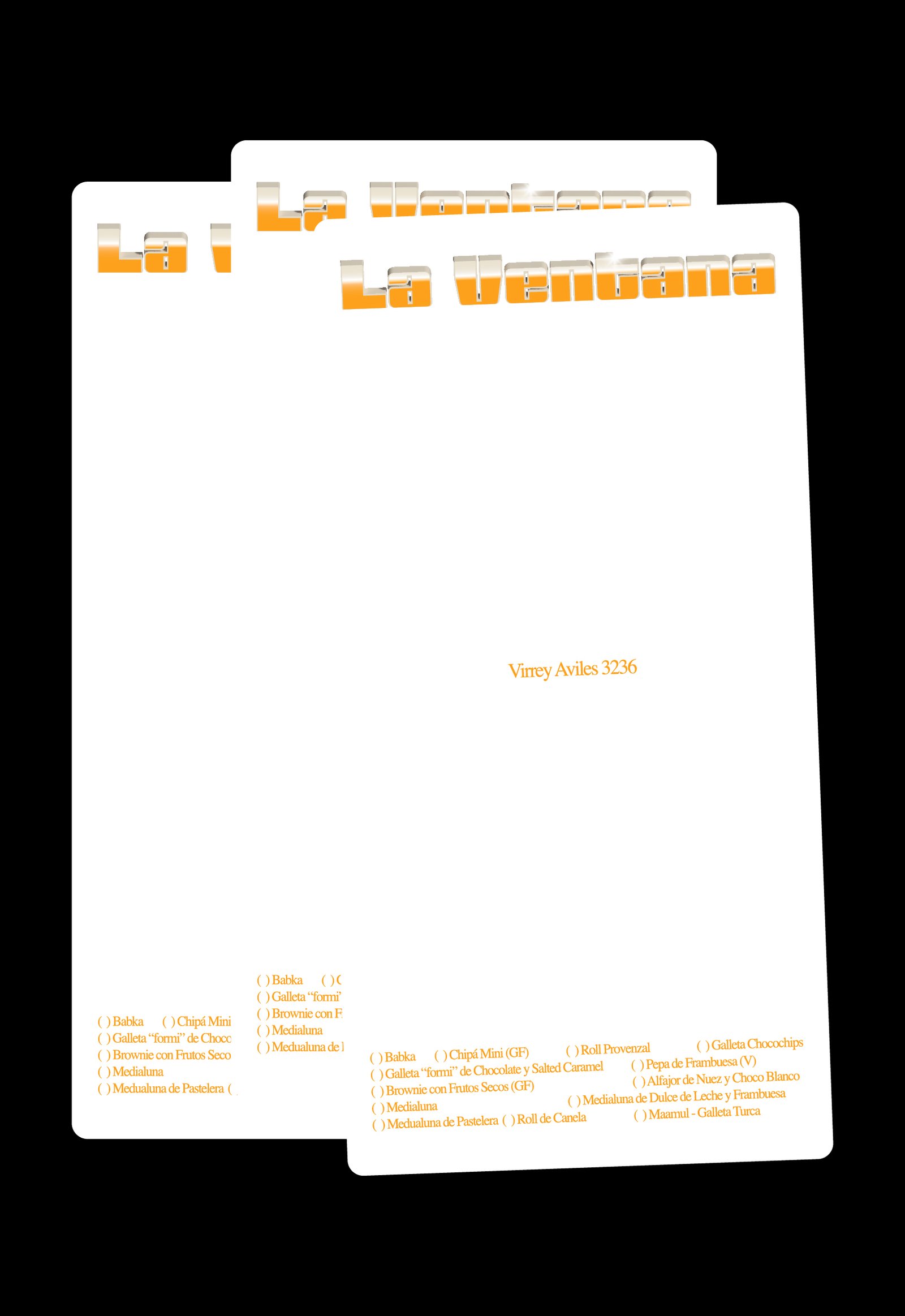
BackLa Ventana is a specialty coffee shop located in the heart of Buenos Aires. Its new graphic identity seeks to celebrate not only the aesthetics, but also the spirit and emotions of the traditional cafés and confiterías found in the city’s iconic neighborhoods.
In recent years, many specialty coffee shops in the city have aimed to differentiate themselves from traditional establishments, both in terms of product and visual identity, often leaving aside the rich heritage of Buenos Aires’ café culture.
La Ventana strives to offer the best possible product and service meanwhile seeking the feeling of nostalgia and character of everyday local restaurants and cafés.
The new identity draws inspiration from the traditional graphic styles of Buenos Aires’ neighborhood gastronomic venues. Not from the large, well-known brands, but from the authentic local spots—those with intricate logos, dense typography, and a few artistic liberties. This visual approach seeks to capture the charm of these places, blending them into a design that feels both authentic and contemporary.
The new graphic identity not only represents La Ventana itself, but also pays tribute to traditional venues, conveying the idea that new influences can embrace the existing culture to create something unique.
Team: Mauricio Gallegos / Gastón Garcia Aja
Animation: Mauricio Gallegos / Martín Cañadell
3D Development: Martín Cañadell
Photo: Malena Fradkin
Buenos Aires, Argentina (2024)
Rojo / 3D - Animation - Revamp - Type
BackROJO is a visual effects, post-production and colour grading studio working for films, TV series and commercials, based in Buenos Aires, working all over the world.
This company works with a large number of studios and collaborators, at different stages of an audiovisual project. In other words, they are always part of a team that is bigger than themselves.
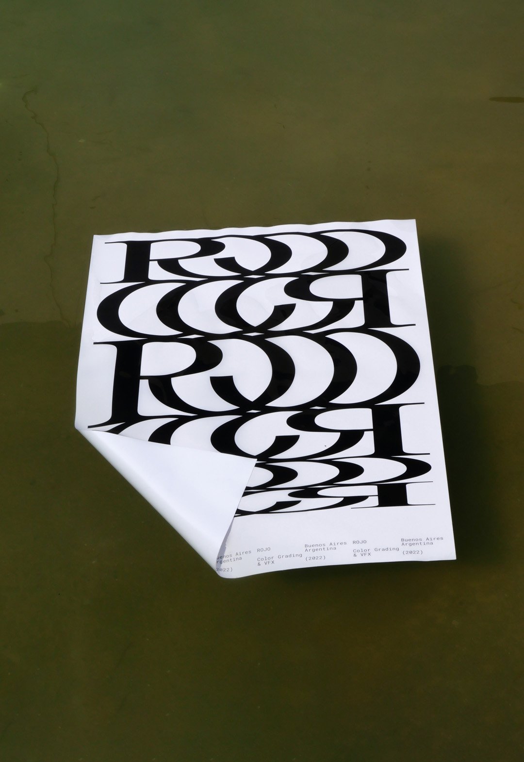
This new logo tries to represent that connection in a very strong and aesthetic way, showing a lot of personality without the need for an elaborate graphic system.
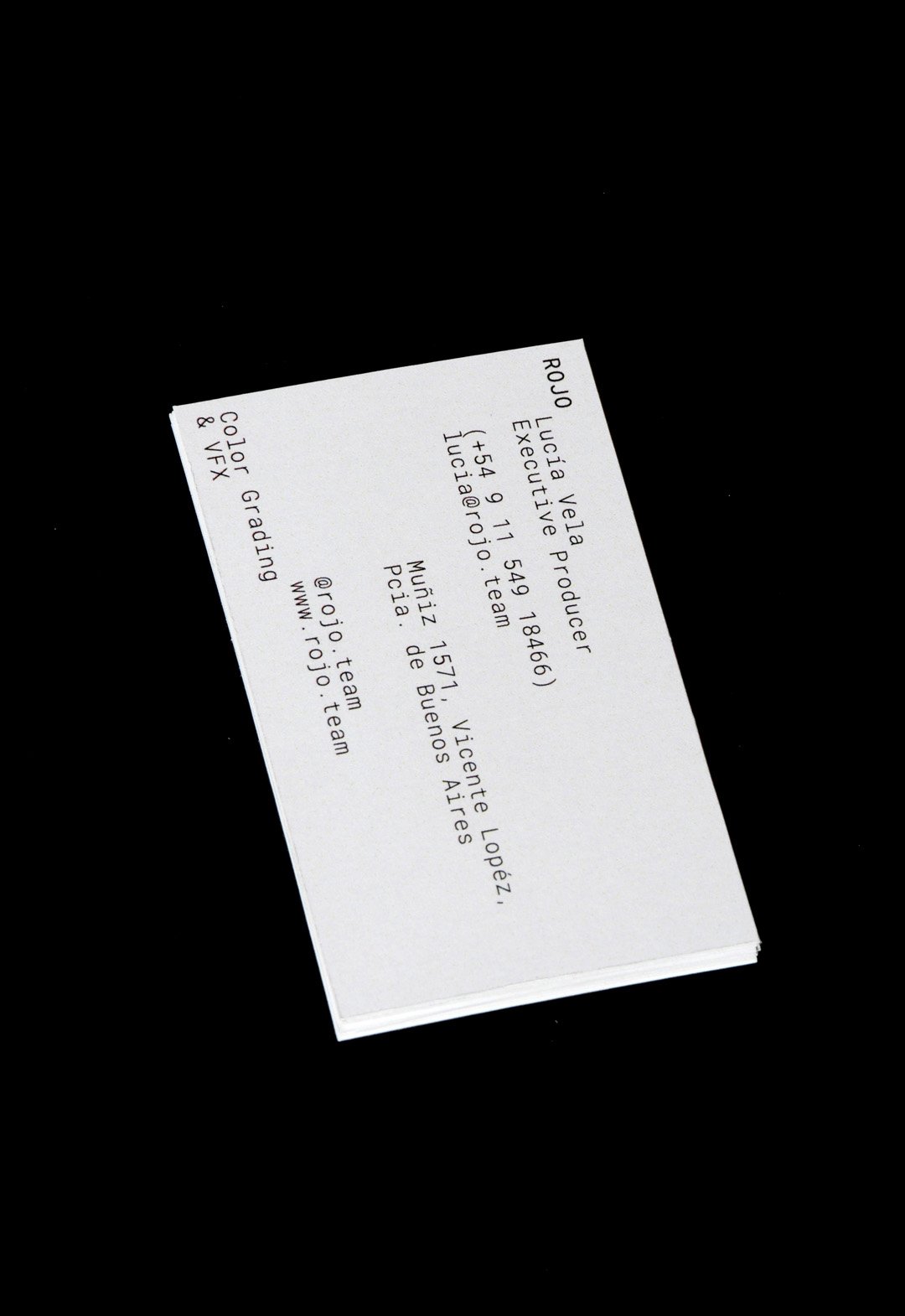
The Rojo logo is big, bold and black. The background colors of the identity change all the time, whether they are video images or textures of real elements.
Buenos Aires, Argentina (2022)
Monocle Type / 3D - Animation - Graphic Design - Type
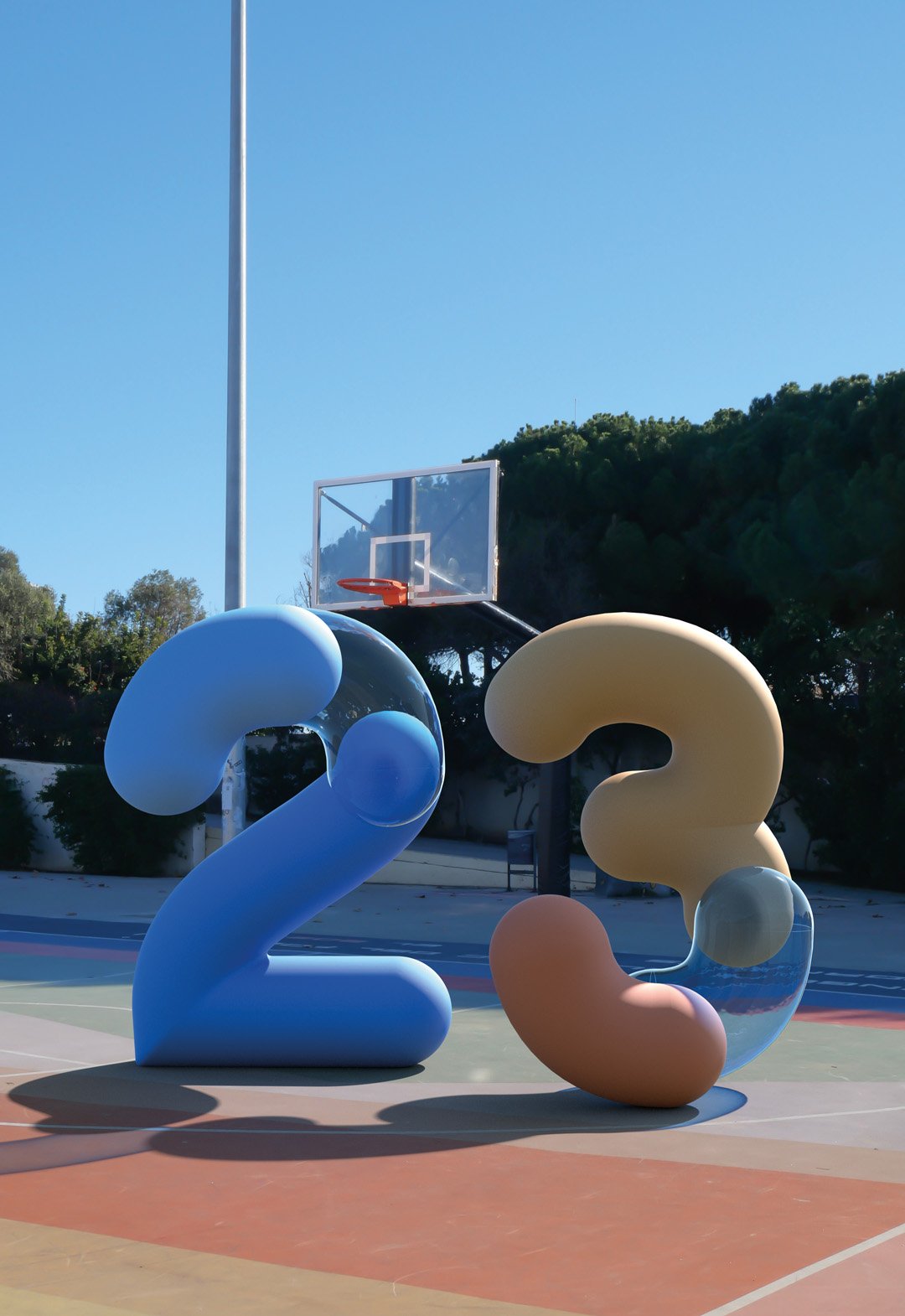
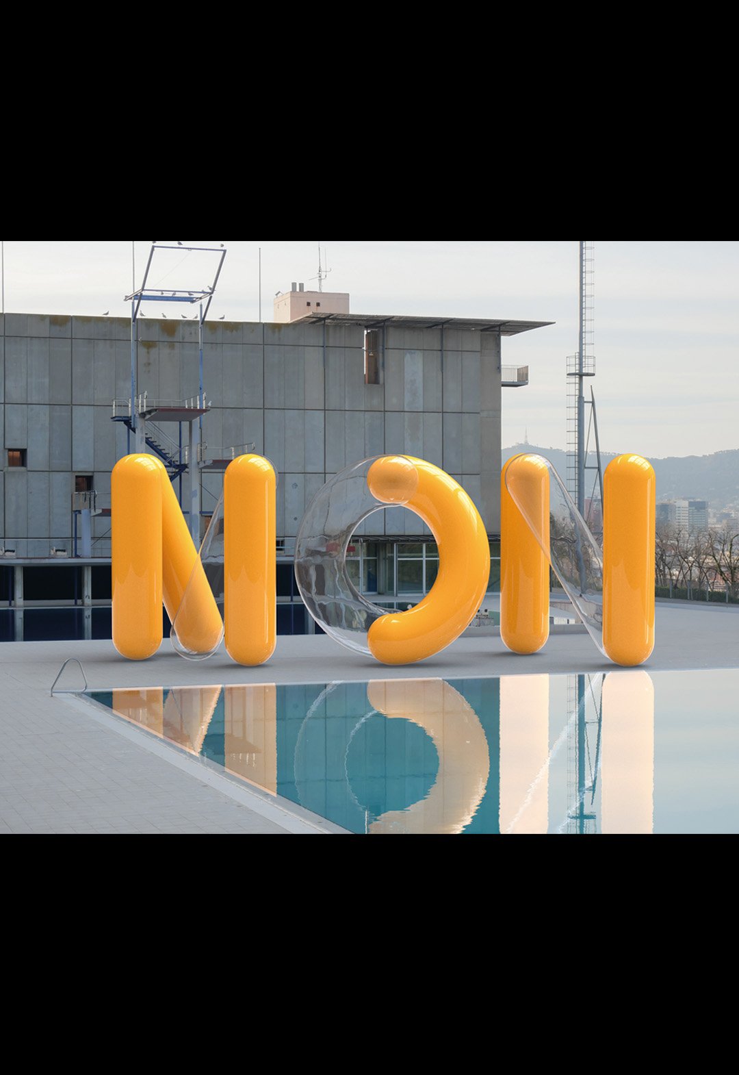
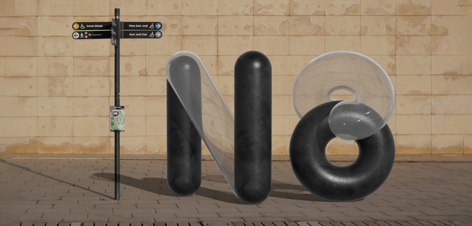
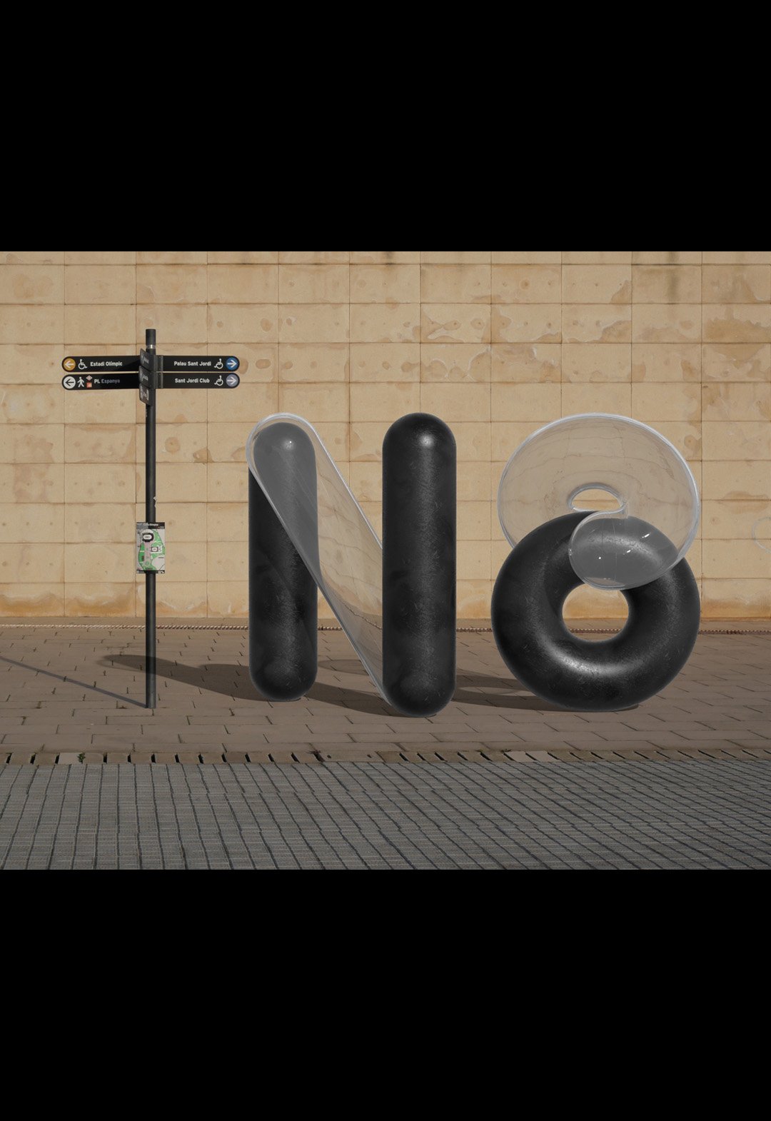
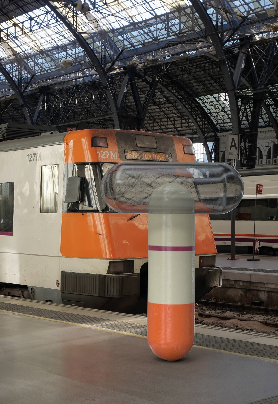
BackMonocle is a visualization typography inspired by ancient monocles, magnifying glasses and their refractive indexes. By passing a magnifying glass over any object, what happens inside changes and gives rise to something new and unpredictable.
The project recreates the shapes and colors of digital environments, mixing 3D development with animation.
The exercise of mixing worlds was done in the streets of Barcelona, recreating random compositions of a real light moving towards a 3D object and back.
The end result looks new and old at the same time, but best of all, it looks real, because it is real.
Team: Mauricio Gallegos / Martín Cañadell / Gastón Garcia Aja
3D: Martín Cañadell
Photo: Gastón Garcia Aja
Barcelona, Spain (2021)
Tallo / Identity - Packaging - Type
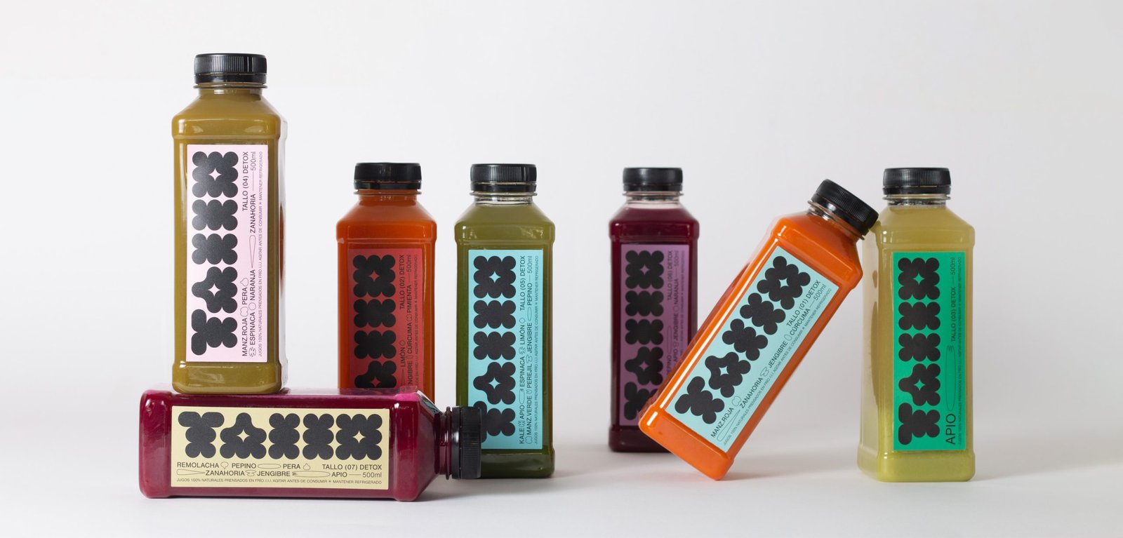
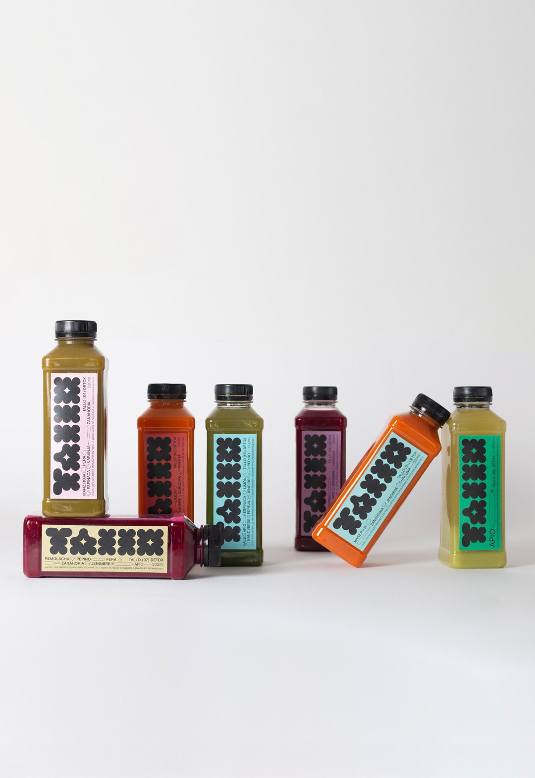
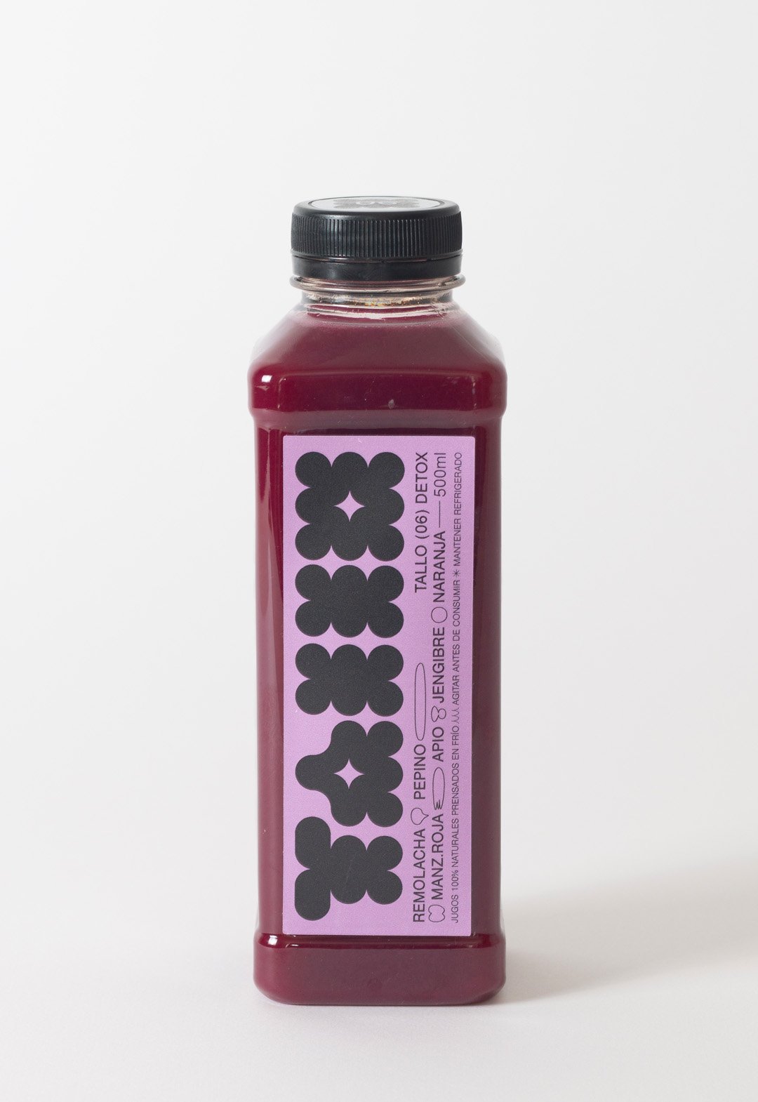
BackTallo is a local brand of cold-pressed juices produced in Buenos Aires, Argentina. The graphic idea represents a flower or a fruit instead of the stem itself (Tallo), which brings naturalness to the brand.
The colors of these juices are vibrant and pastel at the same time. The labeling palette vibrates in both directions, to create a fun environment focused on highlighting the main color of the juice.
In addition to a bold geometric logo, the design contains small lineal illustrations to represent the ingredients. This aesthetic is a reference to the drawing of the daughters of the brand's creators.
Team: Gastón Garcia Aja / Mauricio Gallegos
Photo: Rocío Fernandez Charro
Buenos Aires, Argentina (2022)
Intipalka Wine Type / Revamp - Type
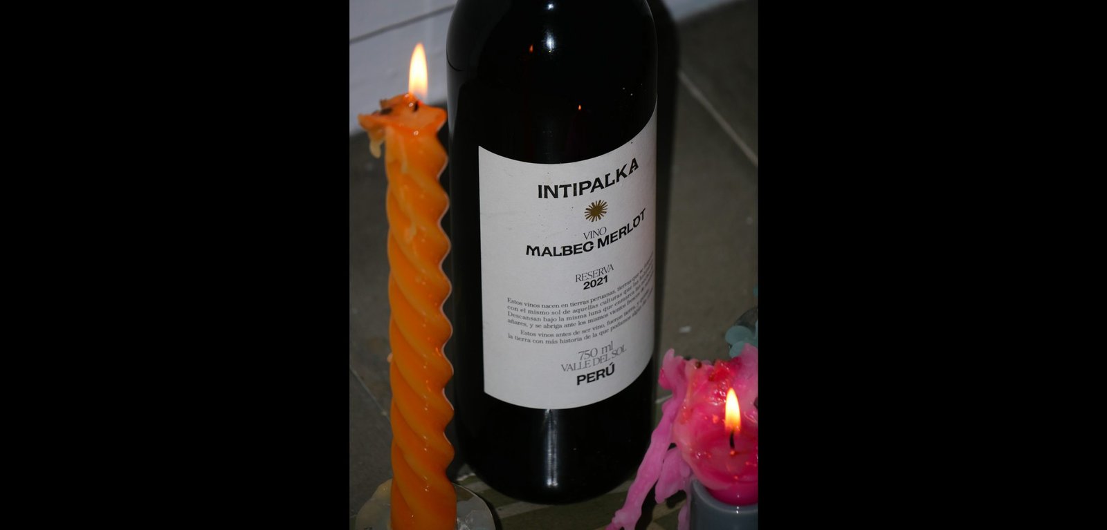
BackIntipalka is the most important wine producer and wine brand in Peru. The microclimate of the Valle del Sol in Ica region allows it to produce incredible wines, despite not being in the traditional wine belt area.
The redesign process was based on the idea of positioning not only the wine brand in the international market but also to position the Peruvian wine category at a global level.
Under the concept that Peruvian wine must represent Peru, and understanding that the most honest way to share culture is through language, we developed an entire typography born in Peru, representing it in the most subtle and respectful way possible, without obviates.
The letters came from forms found in “Introducción a la Iconografía Andina by Ruiz Durand Jesus”, a book that brings together the aesthetics of the different native Peruvian peoples throughout history.
Each letter has between 3 and 5 variants that represent Peruvian culture's diversity and plurality.
This typography is applied in labeling Intipalka’s large family of wines and in much of its communication and content.
The new brand feeling provides a greater sense of belonging to both the brand and the category, inside and outside Peru, maintaining and improving the appreciation of the quality of both.
Colab: Fibra
Team: Gastón Garcia Aja / Mauricio Gallegos / Andrea Gálvez
Animation: Martín Cañadell
Music: Jin Yerei
Lima, Perú (2022)
Apelie / Identity - Type
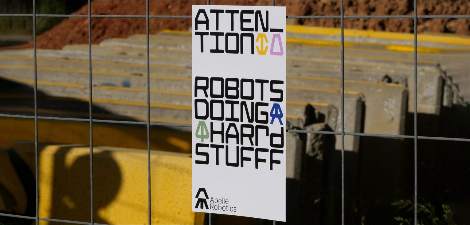
BackApelie is a new company that builds robots that help to solve multi-area problems. The team has the ideas, the tech, and the knowledge to create new robots for custom problems.
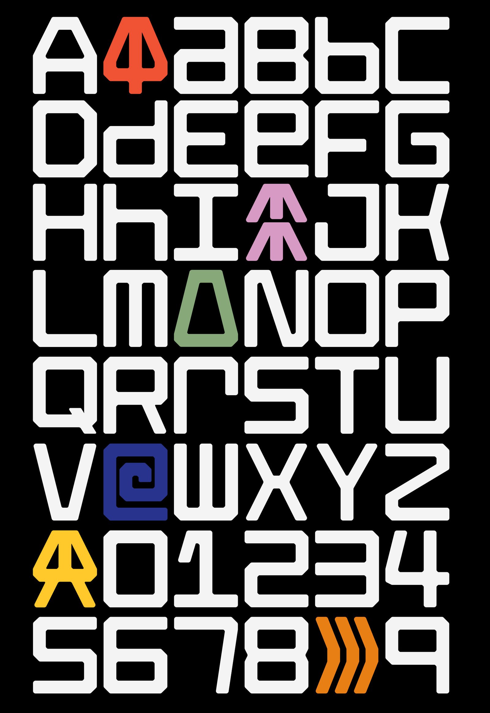
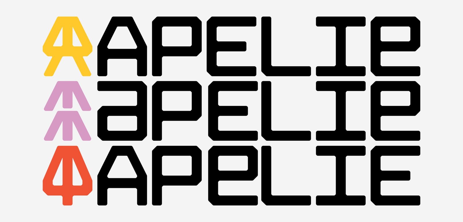
Inspired by the car brands that put an icon in front of the vehicle and the name on the back the project starts with the development of an entire typography, using the same main shapes to do the icon and the logotype. The rest of the system is based on grids that let the brand create many communication parts, digital, and print.
Part of this design project work on the final art of the aesthetic of the robots with 3D design and direction.
The identity navigates between old and new feelings, some nostalgia, binary language and symbols, and new ways to show it up. The inspiration for those feelings were Nasa, Nintendo, Star Wars, that kind of sensations summed up in this last thought; "let's make robots fun again, like when we were kids"
Team: Gastón Garcia Aja / Mauricio Gallegos
Animation: Martín Cañadell
Córdoba, Argentina (2022)
Cielo Argentino - Juegos Olímpicos Tokio 2020 / Animation - Graphic Design - Type
BackThere is nothing more important for an athlete than the Olympic Games and there is almost nothing further away from Argentina than Tokyo. The pandemic context made it impossible for people to cheer on the athlete in this edition.
The purpose of this design was to bring that missing ovation to the stadium, converted into something that travels in the plane's luggage and represents the spirit of Argentina.
This T-shirt was designed from real photos of the Argentinean sky, taken by athletes from all the provinces of the country with their phones. The photos were processed to form a pattern that unifies them into a single design, which more than a design, is a breath, which is born in the sky and felt in the chest, and if you get a little closer, it says: ¡Vamos Argentina!
Team: Mauricio Gallegos / Gastón García Aja
Production: Jacana
Client: Confederación Argentina de Atletismo
Film: Fernanda Scarafía
Athlete: Ezequiel Bustamante
Córdoba, Argentina (2020)
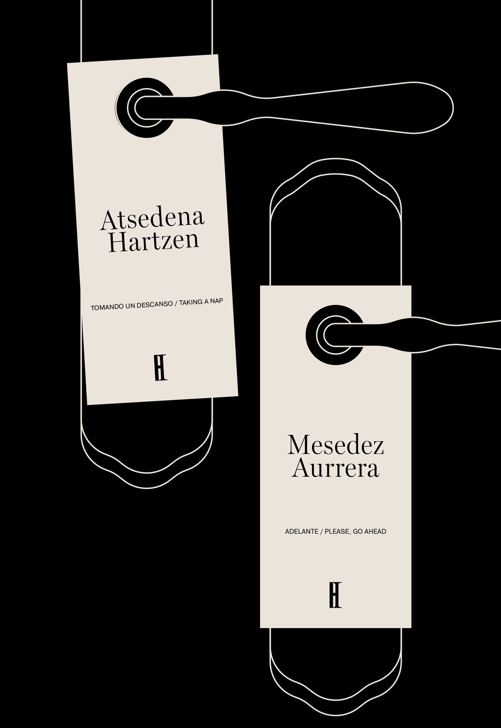
Haizea / Identity - Type
BackHaizea is a hotel located in the beautiful town of Bakio, Basque Country. The identity tries to represent the cultural mix of a project that counts with Argentinians and Basques, keeping the regional aesthetics of the place overall.
The combination of typographies evidences the mixture, the classic and the new, together. The changes in the formation of the word Haizea, go with its meaning; wind in Euskera; never static.
The icon development and the minimal graphic system try to maintain the identity under a classic, regional, and sincere feeling of a small hotel, aligned to the general concept of the brand to promote not only the hotel itself but also the surrounding environment.
Colab: Foguel Studio
Team: Mauricio Gallegos / Gastón Garcia Aja / Eugenia Foguel / Josefina Barbero
Animation: Martín Cañadelll
Bakio, Basque Country (2023)
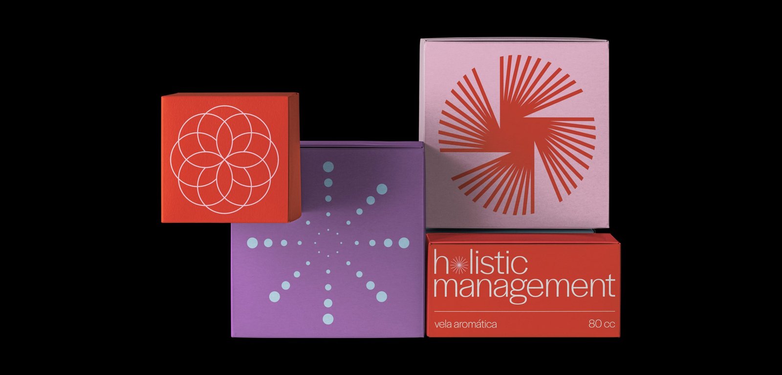
Hol Management / Identity - Type
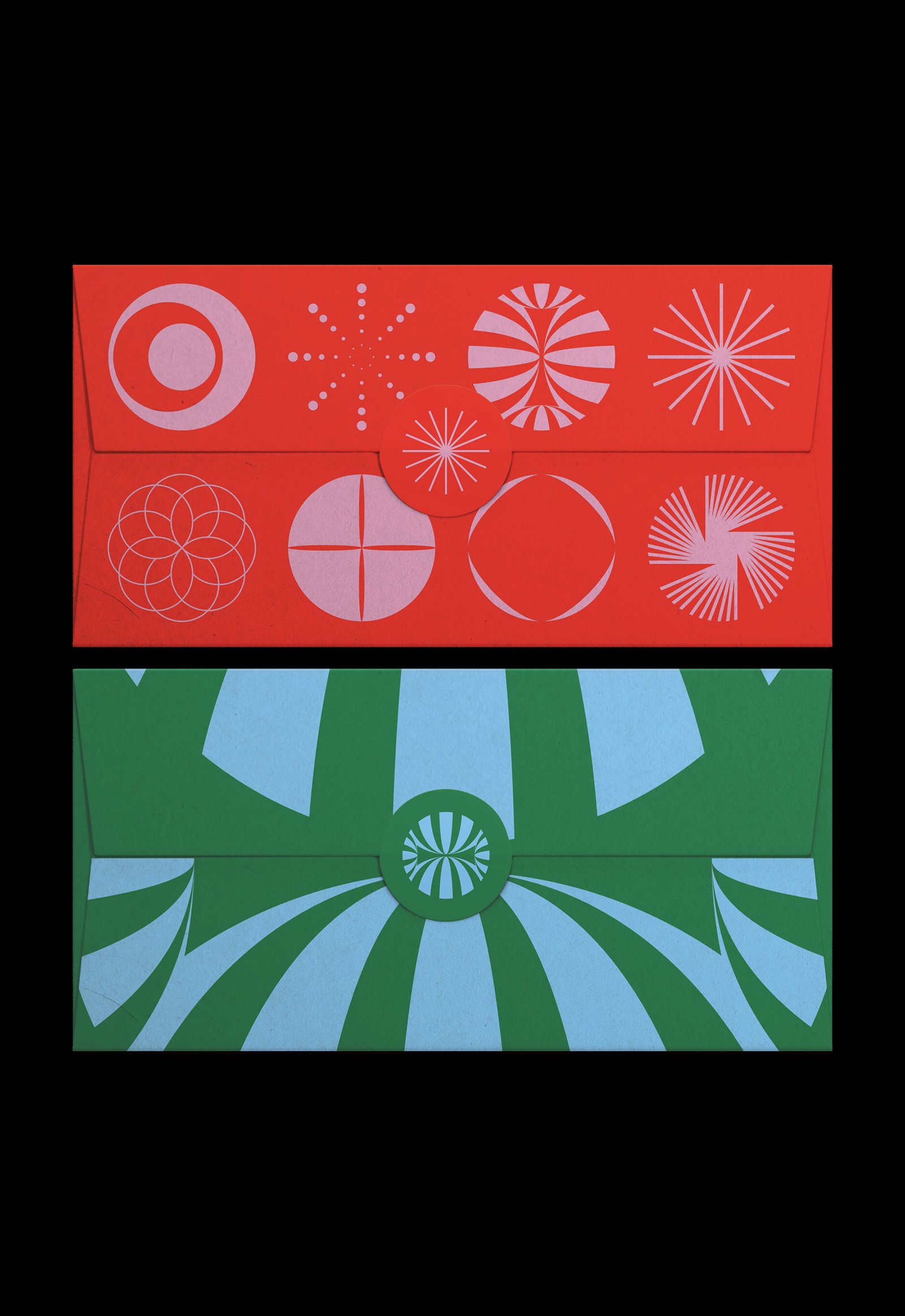
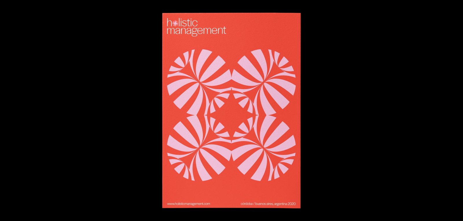
BackHol Management is a company that provides wellness tools to companies and individuals based on astrology as the main pillar and other holistic techniques such as meditation, mindfulness, yoga, constellations, among others.
The dynamic identity represents the different areas of the brand through portals that open to a new world of energy and information that can help people and companies to be better. Each icon is a portal, and together, they create a super dynamic system that prepares this new brand for any possible scenario.
Team: Mauricio Gallegos / Gastón Garcia Aja
Córdoba, Argentina (2018)
WIP / Animation - Identity - Type
BackWIP is a cultural venue that combines architecture, design, photography and art. Its concept, like its name, has to do with the creative process as a state of continuous search.
Its identity moves representing the before, during and after of a creative process, and also, the interaction of different disciplines in the same place.
Team: Gastón Garcia Aja / Mauricio Gallegos
Córdoba, Argentina (2018)
RFL / Revamp - Type
BackRodrigo Fernandez Lara is an expert training and development consultant based in Santiago, Chile. His talks reach universities, congresses and companies, motivating and sharing knowledge.
The graphic identity prioritizes the search for personality in its acronym RFL. The dialogue box formed by the letter R represents a dialogue box, a main element in its nature.
Santiago, Chile (2017)
