Más / Animation - Graphic Design - Revamp
BackThe new narrative, new brand architecture, and new graphic identity for MAS, a human resources consulting firm based in Santiago, Chile.
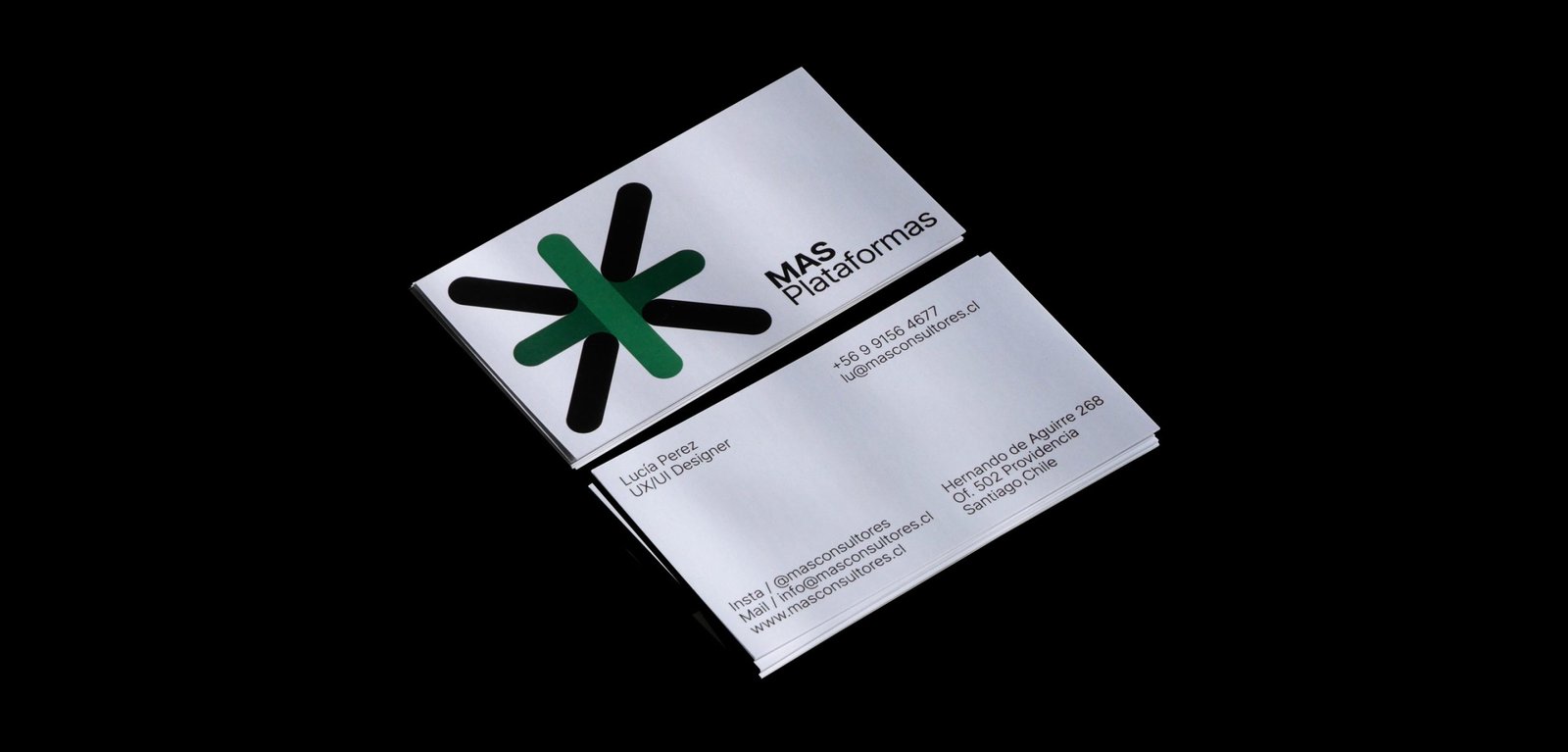
From autonomous identities for its business units to a power symbol and system that brings back all the importance and exposure to the main group identity. A new icon that represents a multiplication, rather than an evident addition, and a system that allows each unit to be identified while maintaining versatility and autonomy.
The new graphic system of MAS has two different worlds. Full color, white backgrounds, and clean elements go for the main group institutional communication. A limited color palette, grey backgrounds, and out-of-context size of the elements, go with the communication of each business unit. Both systems work together being different. Clean and noisy, simplicity and mess, serious and playful.
Team: Mauricio Gallegos / Gastón Garcia Aja
Animation: Martín Cañadell
Santiago, Chile (2018)
Koyan Hotel / Concept Development - Identity
BackKoyan is a hotel located in Panguipulli, Chile, that seeks to connect people with nature in a pure and simple way, taking advantage of the majestic surroundings of the region.
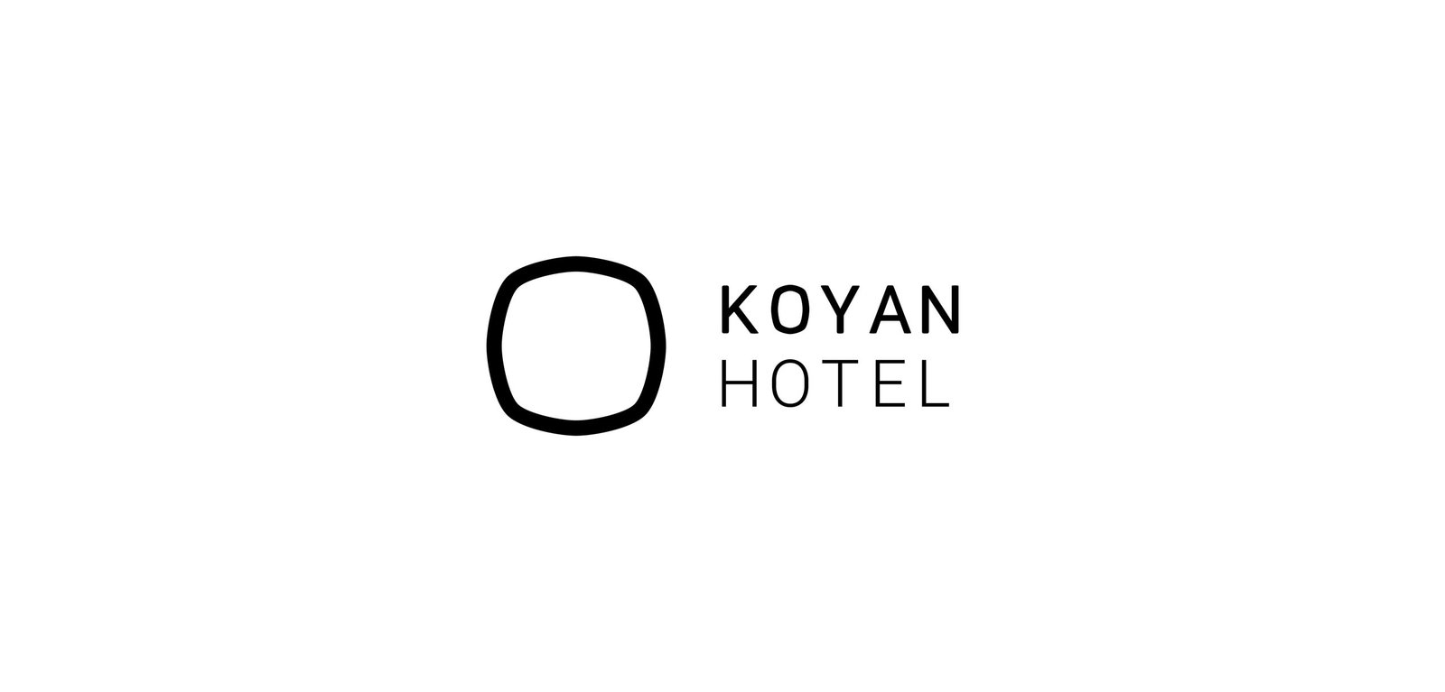
The isologo results from the combination of a square, which represents the systemic life of people in the city, and a circle, which represents the flow of things in nature. Ideally, the Koyan experience is located between these elements, with balance as the main value.
This intermediate form gave rise to the typography terminations, giving personality and distinction to the logo without losing simplicity.
Team: Mauricio Gallegos / Gastón Garcia Aja
Santiago, Chile (2018)
RFL / Revamp - Type
BackRodrigo Fernandez Lara is an expert training and development consultant based in Santiago, Chile. His talks reach universities, congresses and companies, motivating and sharing knowledge.
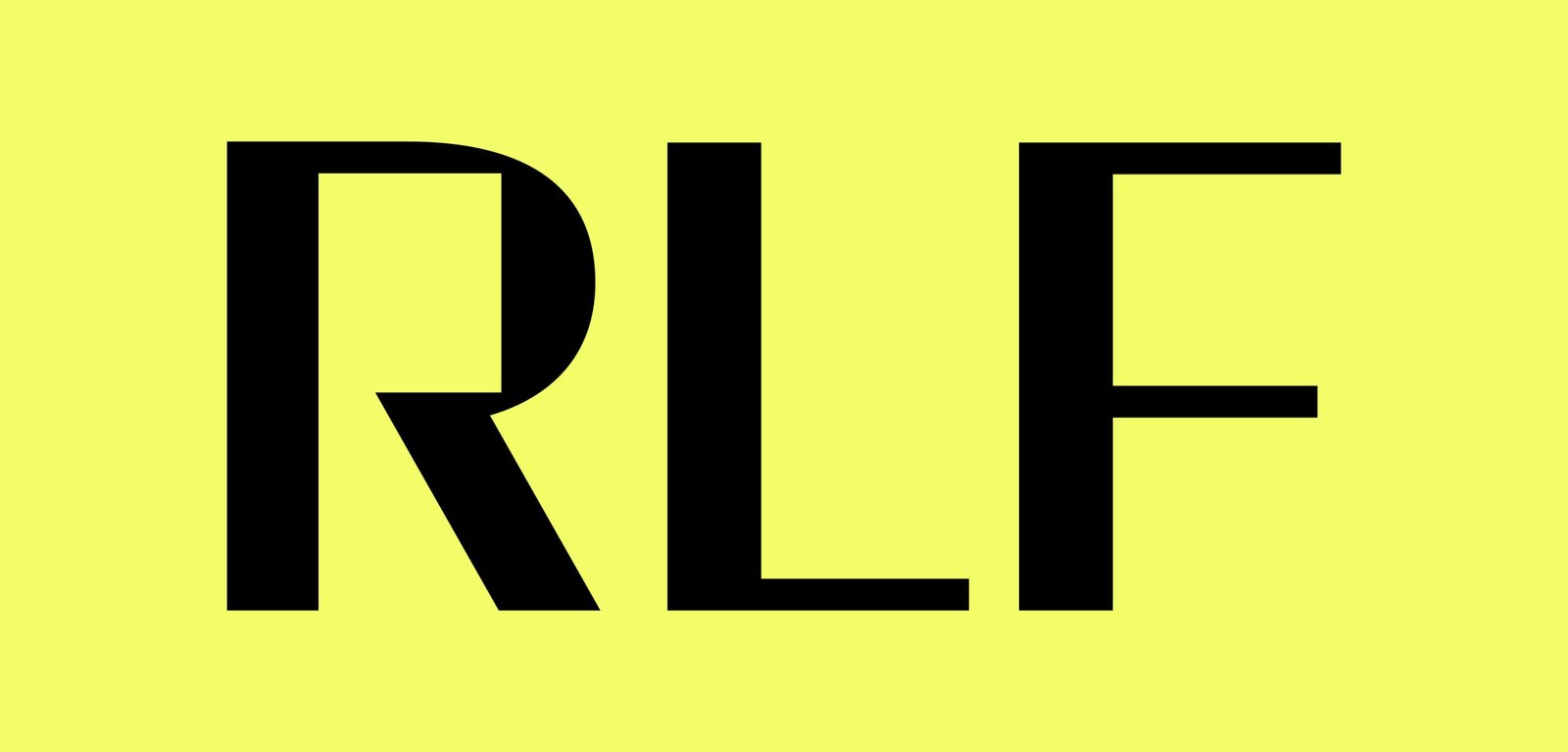
The graphic identity prioritizes the search for personality in its acronym RFL. The dialogue box formed by the letter R represents a dialogue box, a main element in its nature.
Santiago, Chile (2017)


